by abduzeedo
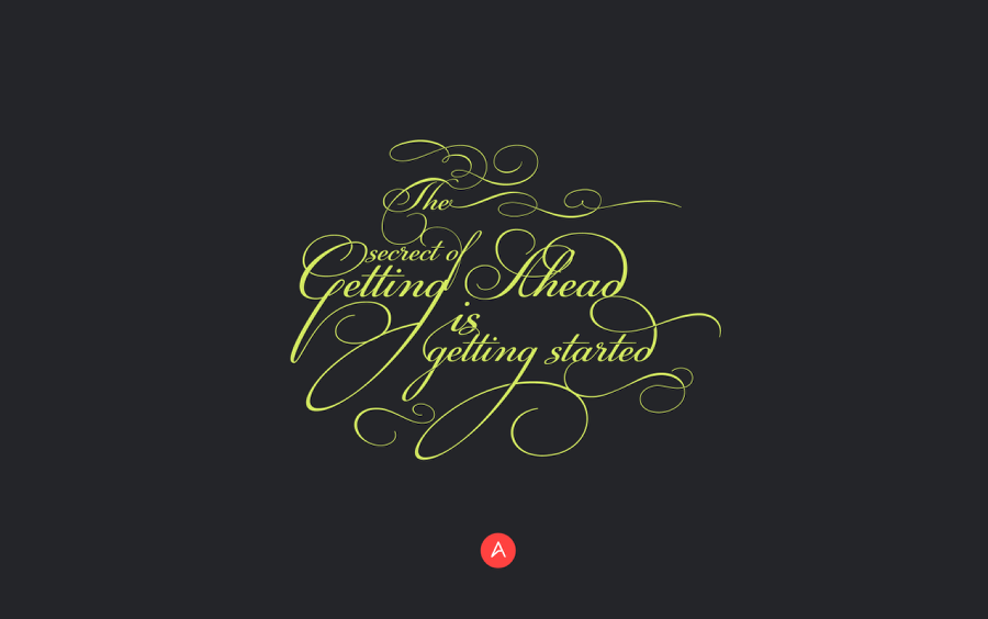
Last week I posted a couple articles on typography, more precisely ligatures, and despite the fact I have never been a huge fan of this style it is extremely popular. With that in mind I decided to practice and learn more about it. For this first image, I've created a simple composition in Illustrator using a popular quote. The process is quite simple, I just played with text sizes and tried to connect the ligatures albeit in different rows. So for this post I will walk you through my process very briefly though I must admit it took me quite some time to achieve a work that satisfied.
Step 1
Create a new document in Illustrator and with the Horizontal Type Tool add the text you want to use for the composition. I am using a quote that was said to be Mark Twain's but there are controversies. The font I am using is PF Champion Script and it can be purchased at https://www.myfonts.com/fonts/parachute/pf-champion-script-pro/
Step 2
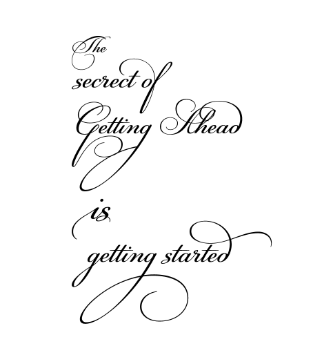
Reorganize the words and try to connect them by the ligatures.

Step 3
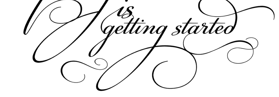
The font comes with fantastic glyphs and they are perfect to fill some areas between words.
Step 4
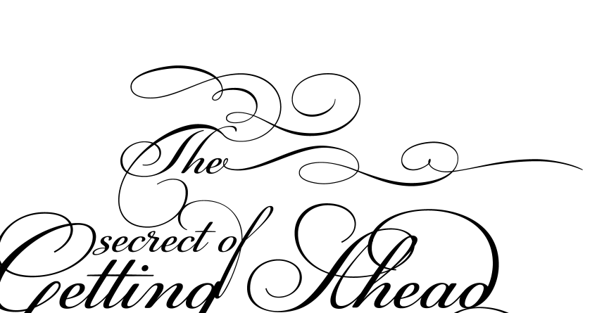
For the "The" I used to glypch, one connected with the "T" and the other with the "e".
Step 5
Here's the final text composition.
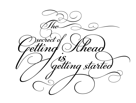
Step 6
Now let's start adding some subtle shadows. I used this effect for letters that have crossing segments and any looping form.
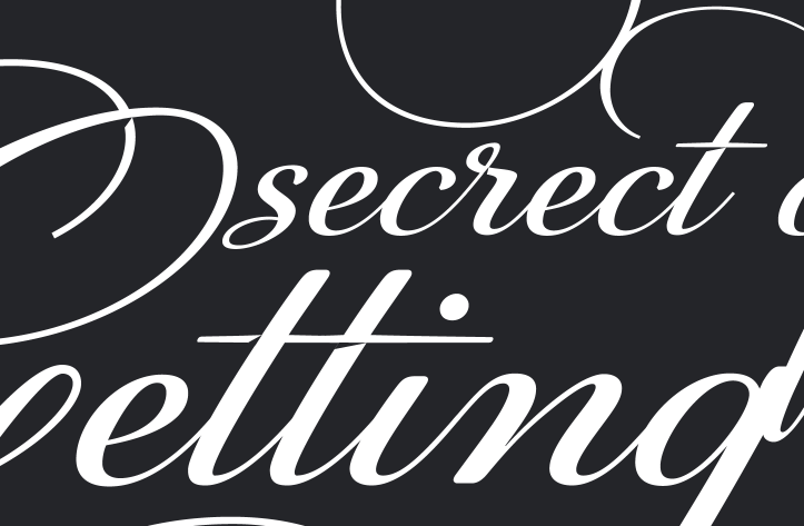
Step 7
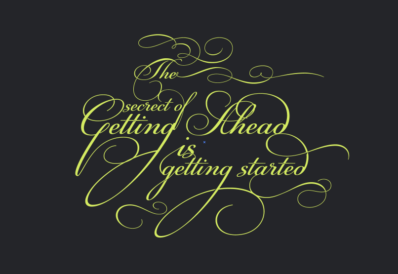
The final colors I used were #242529 for the background and #D4EA61 for the text.
Conclusion
The final composition is fairly simple, the goal is to drive all the attention to the text and ligatures. I also added the Abduzeedo logo using #FF4240 to create some contrast. Besides that I also created another version with a super cool pattern from The Pattenr Library titled Shattered Island (http://thepatternlibrary.com/#shattered-island). You can try different variations, but now it's up to you, meanwhile I will keep playing and trying to refine my ligature skills.
