by abduzeedo
This graduation project presents or develops the visual identity of the Laró Prazeres brand, a multi-artist, which operates in three segments: beauty, hair and fashion design. Through a proprietary methodology, inspired by TXM Branding, or thematic project with the objective of developing a consistent visual identity that is appropriate to the values, audience and purpose of the client. As a result, we have a simple and extremely efficient solution, an elegant, bold, authentic and strong brand as well as the artist Laró Prazeres.
We live in a highly connected and consumerist world, where the race for profit and market is insatiable, in this scenario countless brands are born daily, the vast majority without planning and without purpose, thus contributing even more to a shallow, futile, often oppressive and without character where brands are created just to sell. Design has the power to change this scenario, to encourage and develop projects, with values and purposes, to help good brands reach their customers in a healthy way and thus gradually making a better world. This Course Completion Project will describe Laró Prazeres’ brand development process. With it we will diagnose the brand’s concepts, identify its goals and audience in order to build a visual identity that includes and communicates everything that the brand has to offer.
Laró Prazeres is 30 years old, is a mother, lesbian and feminist, has lived in Florianópolis since 2014. She left the outskirts of São Paulo at the age of 14, with a daughter and no family structure. She never had the opportunity to go to college but she struggled a lot. She worked for years as a party hostess, bar manager and mall attendant. Always very attuned and connected in the fashionista world, she gradually entered the fashion market. Today she is a reference when it comes to beauty in the fashion market, she created her own clothing brand where she creates, designs, models and sews. In addition, she specializes in haircuts. Currently, his main focus is on beauties, being one of the first names sought by brands for fashion essays, in addition to physical work, he is gradually starting the process of developing online courses. However, in the face of so many obstacles, she never had the possibility to develop and plan the strategic and visual part of her brands.
Today Laró is divided into three profiles, @laroprazeres, @laroprazeresbeauty and @laroprazereshandmade. The three separate market niches are saturated with professionals and brands without purpose and personality, which opens up a lot of space for Laró Prazeres to stand out, encompassing the three pillars in a strong, unique, authentic and purposeful brand.
Golden Circle
The Golden Circle is a concept created by Simon Sinek, a reference in the subject of leadership and entrepreneurship. It aims to create and develop the value of a new idea, business or campaign. It is a simple methodology, but very efficient, causing great impact and making brands more inspiring and increasing their success in the market. The Golden Circle methodology was developed to systematize an innovative method of thinking, acting and communicating with the aim of impacting the world.
- What? Beauty and fashion with creative freedom
- How? With Beauties, courses, hair and clothes that stimulate creativity and respect the plurality of each one.
- Why? Helping people to free themselves from the current aesthetic and fashion standards that oppress instead of releasing and stimulating.
Based on the answers, it is possible to define the purpose of the brand, presented below.
Purpose
Together with the client, after defining the answers proposed in the Golden Circle and maturing of ideas. It was defined, the phrase of the purpose:
“Helping people to break free from aesthetic and fashion standards”.
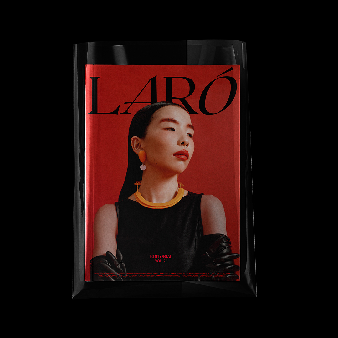
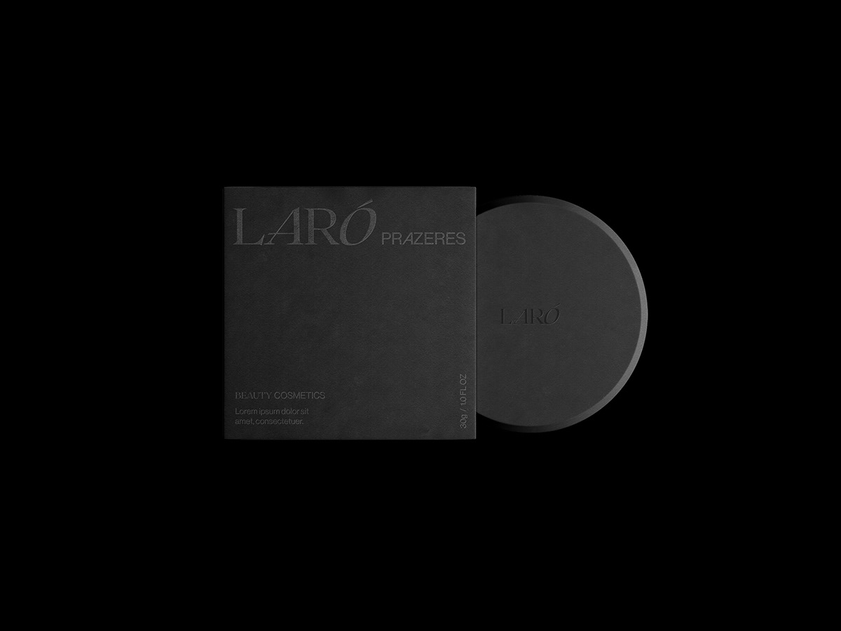
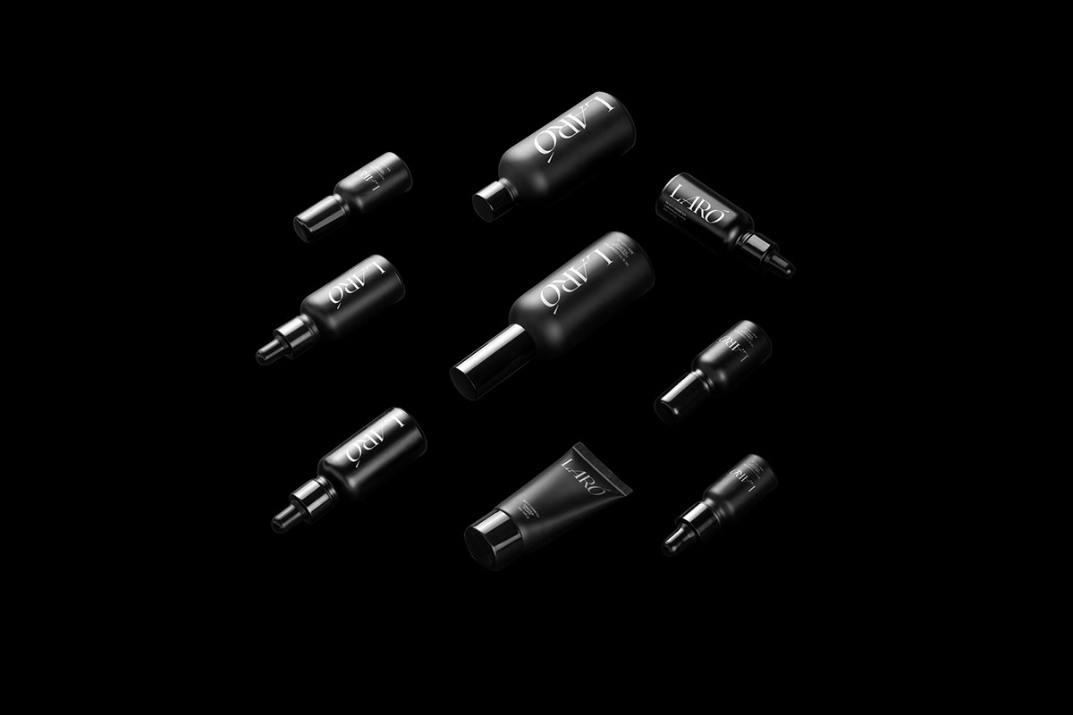
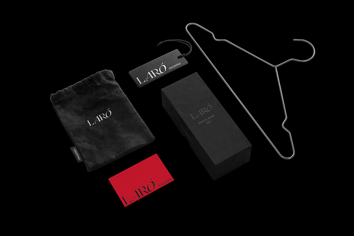
Visual Identity
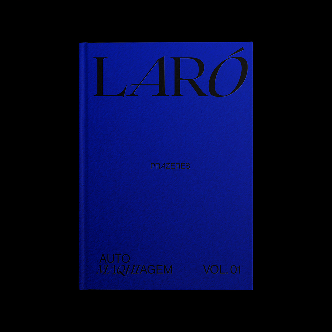
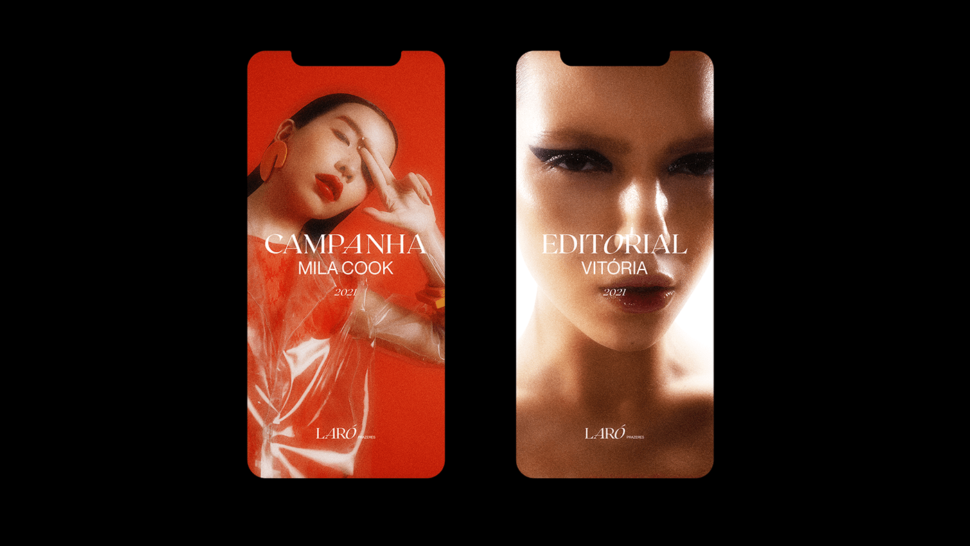
After an analysis of the images presented on the panels that make up the visual thermometer and also the set of references and all other information collected up to that point, it was decided that the brand should be simple and impactful, just as it happens in major brands in the world from fashion such as: Prada, Louis Vuitton, Gucci among others. Thus, it was decided to bet on a logo composed only by strong and authentic lettering.
It is believed that the font chosen for the logo – Roxborough CF – evokes tradition and refinement, as it is serif. This turns text into art, just like Laró. Dramatic and fashionista influenced by calligraphy and hand made letters, which perfectly represents the artistic and manual works made by the artist.
Laró’s personality – empowered, feminist and courageous – was represented through the emphasis given the letters ” A ” and “O ” presented in stylized and expressive italics, which indicates the movement to go forward, open chest and head up They bring authenticity together by changing the usual flow of the chosen typography.
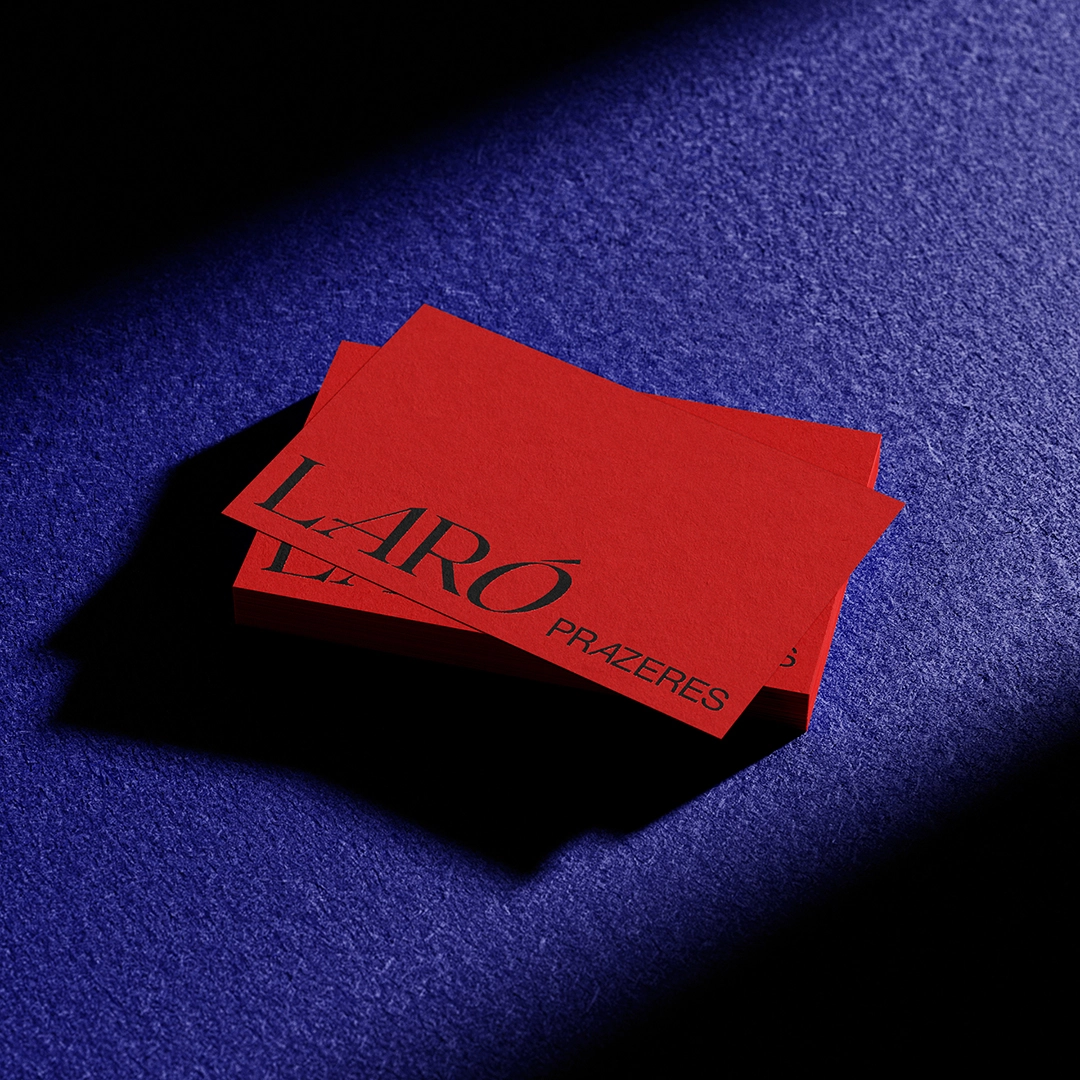
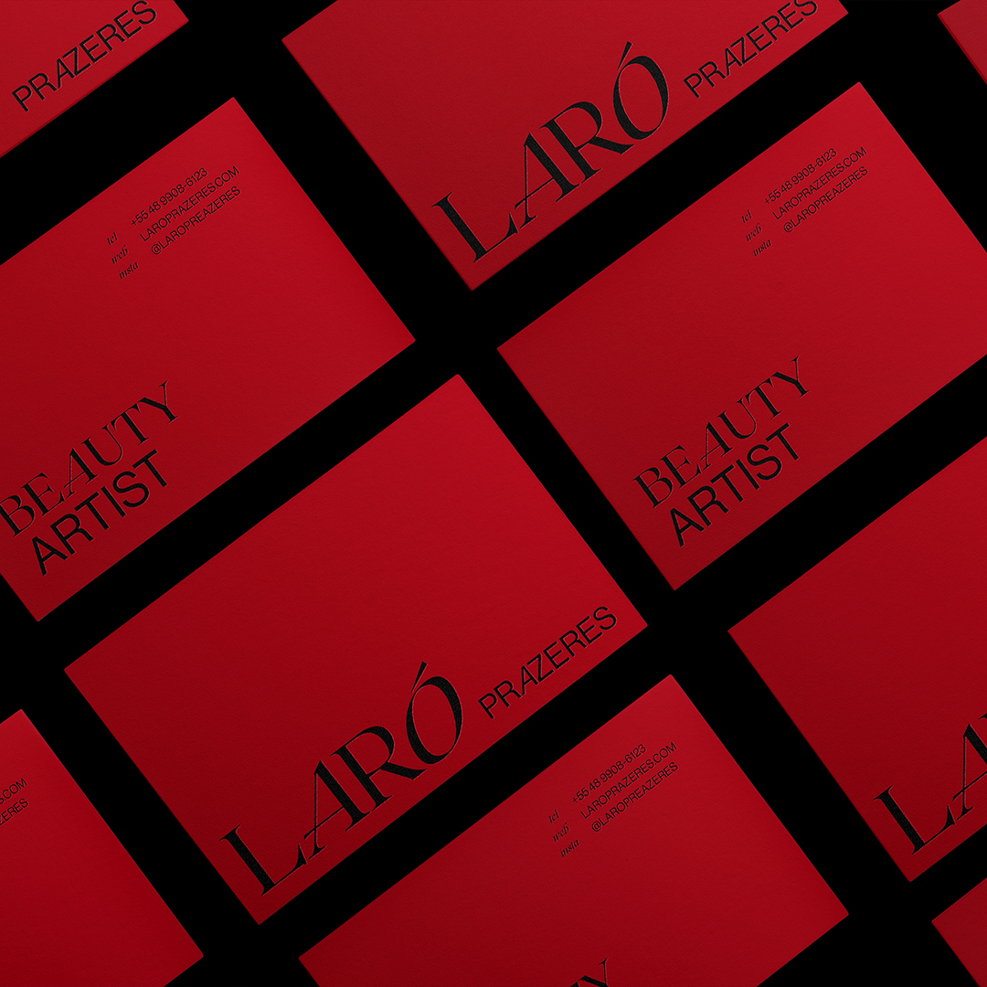
For the surname ” Prazeres “a simple and well-designed typeface (Neue Haas Grostesk) was chosen, which fulfills its role by completing the logo in a subtle way without stealing attention from the main typography. In order to harmonize and maintain the previously mentioned concept the letter ” A ” was italicized again.
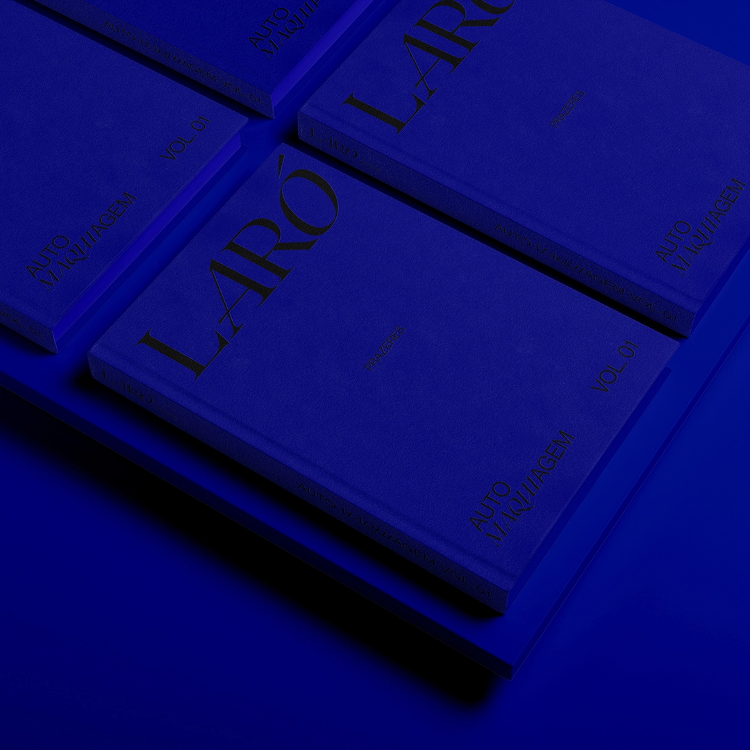
Typography
The institutional typographies of the brand are composed of the same as the logo. For titles and calls, “Roxborough CF” should be used in the “Regular” and “Regular Italic” weights and for running text, the “Neue Haas Grostesk” in the “Roman” and “Roman Italic” weights.
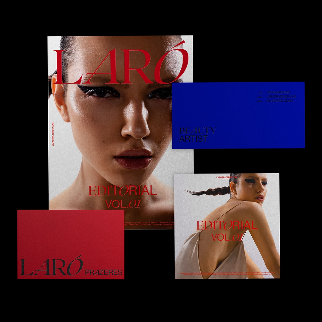
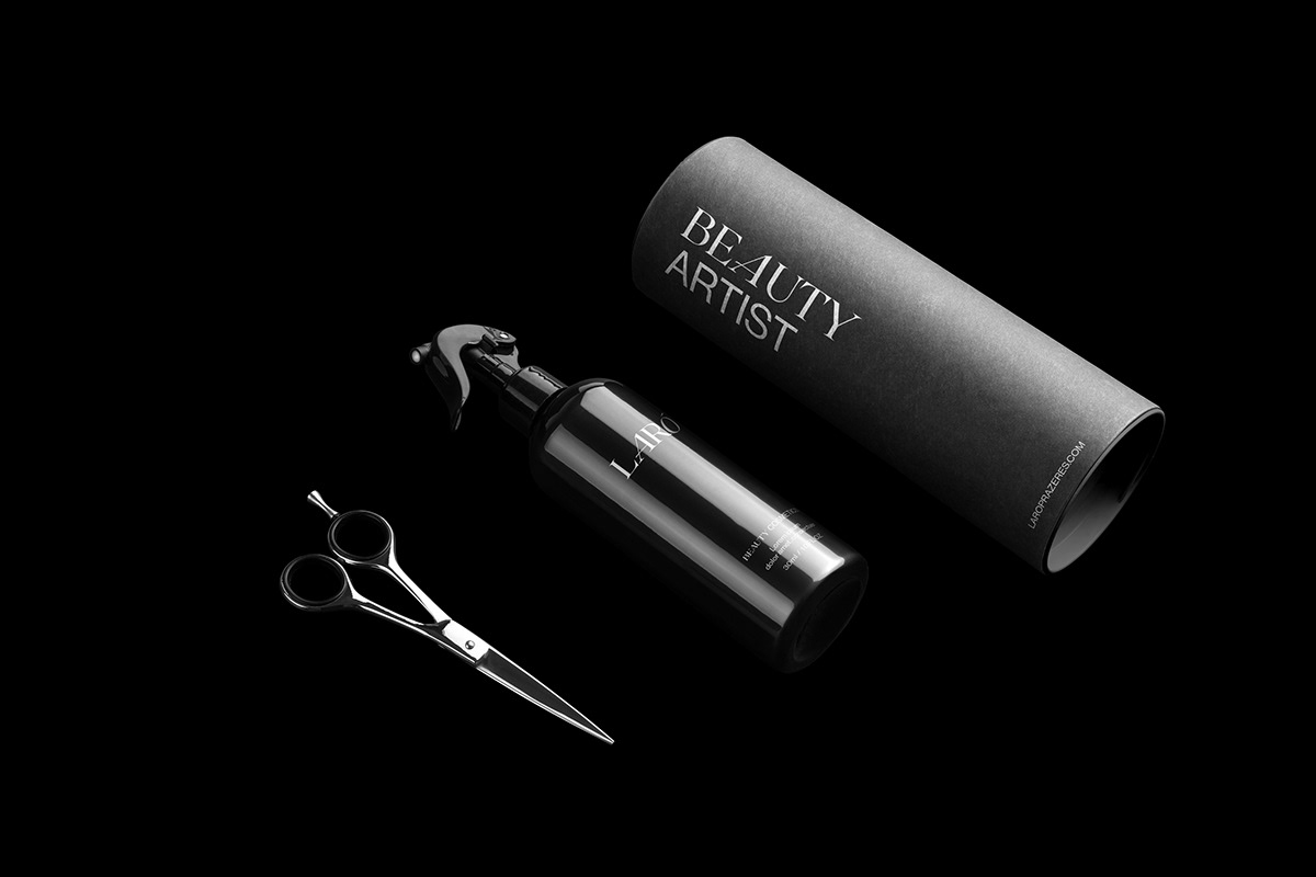
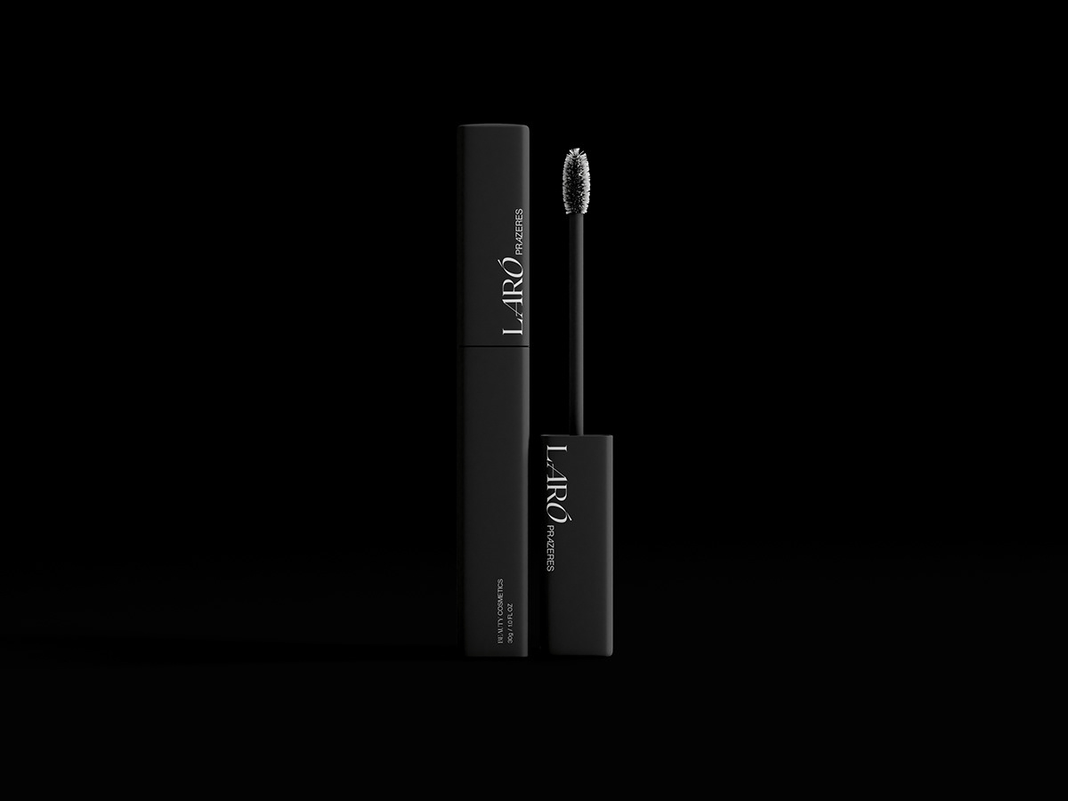
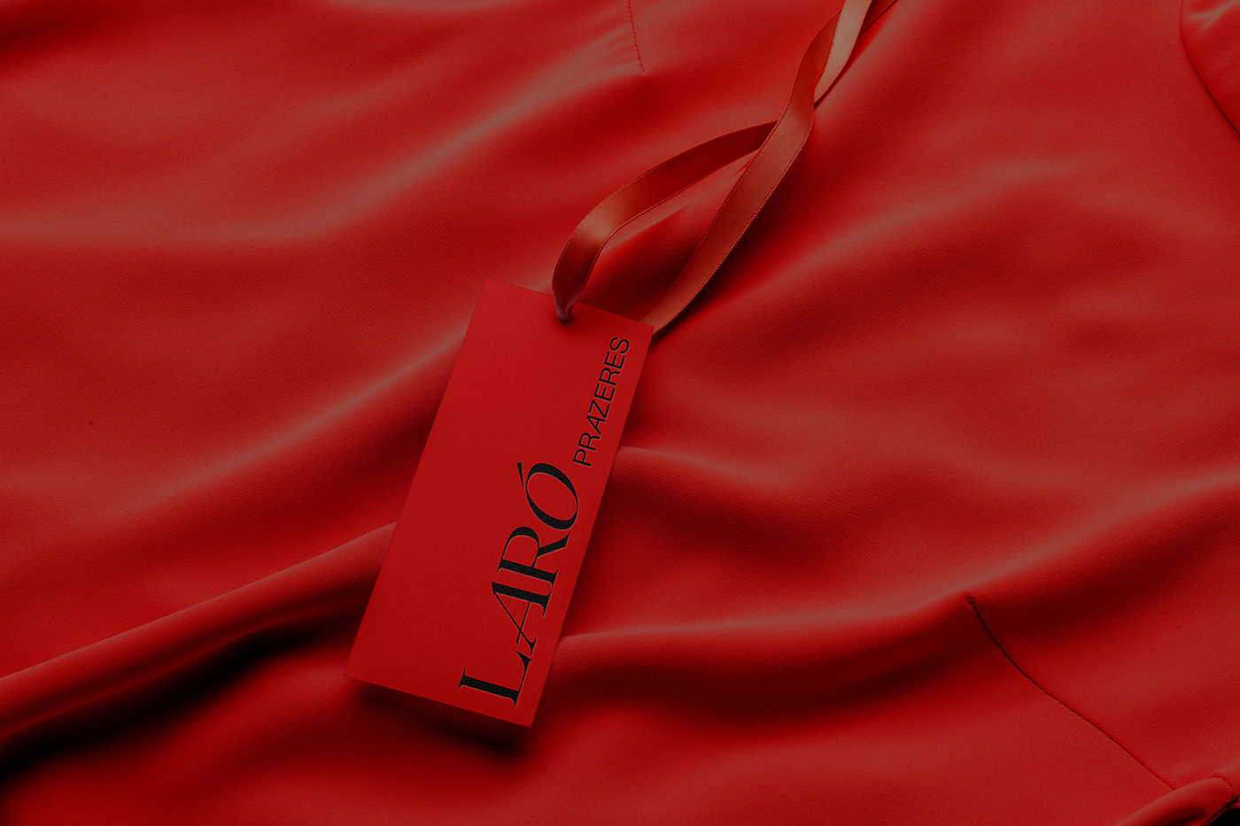
Color palette
The color palette of the Laró Prazeres brand is formed by the colors red, blue and black, presented below:
- Red: Red has great association with fire and blood. Color that represents passions, from love to hate, from good to bad intentions. It is also related to eroticism and seduction, it is also associated with forbidden and immoral things.
Red is used by most reformist movements, including socialists, communists, and left parties in general, and never by conservative parties or reactionary agendas. For this reason, red became associated with women in the fight for women’s rights. Eva Heller (2012) shows that only 5% of respondents mention red as a masculine color, while 25% consider it a feminine color.
We conclude that red represents several of Laró’s personalities, strong, feminist, empowered, courageous and often controversial. - Blue: Of all colors, blue is the favorite. 46% of men and 44% of women declared blue to be the most appreciated color. It symbolizes sympathy, harmony and honesty.
- Black: The symbologies attributed to black are unique and incomparable. Favorite color of young people who associate black with sophistication, power and elegance. The combination of the colors black, red and blue is cited by Heller (2012) as a representation of strength, a concept that clearly represents the artist Laró Prazeres and her brand.
Credits
- Design and branding: Mateus Yuzo
- Client: Laró Prazeres
- Photography: Re Cechinel
- Photography: Manuella Secco
- Model: Vitória Faustino
- Model: Mariana Pesenti
- Model: Mari Ouchi
- Briefing: Michel Refatti
For more information please check out Monga Design


