by abduzeedo
Christmas is already past and we are going to the end of another year. For this holidays season I created a simple card in which I designed a Christmas tree using the word XMAS, the idea was make some typographic experiment with that. After sketching and playing with Illustrator I ended up in Photoshop to finish the composition that was used for the card.
So in this case study/tutorial I will show you my creative process on that, from the very beginning all the way until the end.
Step 1
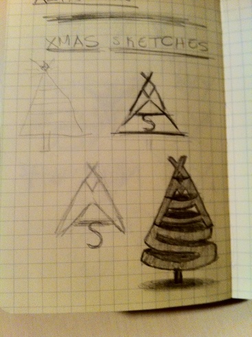
When I was thinking about creating a Christmas card I didn't know exactly what I wanted to do, then I got this idea of creating a little Christmas tree using the word XMAS. I got this idea while I was running. Then once I got back home I went straight to my desk and got my sketch book to see how that would look like in real life.
My drawing skills are quite terrible, but at least I can have an idea of how things will look like. So I started off with a simple cone, then played with the word "xmas" to see how the characters would look like. In the end I played with some shades as you can see in the image below.
Before we move to the next step I would like to reinforce the idea of the importance of sketching before going straight to the computer. You don't need to know how to draw perfectly well, the whole point of sketching is putting ideas on paper pretty quickly, you will never find another way as quick and that gives you more freedom as pencil and paper.
Step 2 - Illustrator
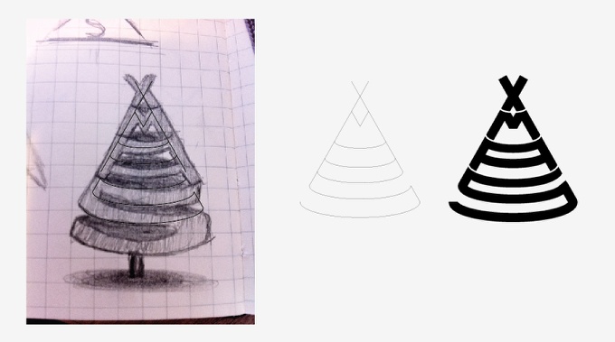
With the sketches, I took a photo of it and import it in Illustrator. After that using the Pen Tool (P) I started creating the basic lines of the XMAS tree. For the curved parts I used the Ellipse Tool (L) and then just delete some segments of it. You can have an idea of how the process went in the image below.
Another very important detail is the space between the characters lie the X M A S. Without that the word would be unreadable.
Step 3
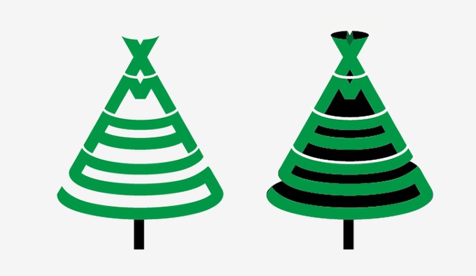
After the vectorization part I started playing with colors and some 3D effects. However none of them caught my attention that much.
Step 4
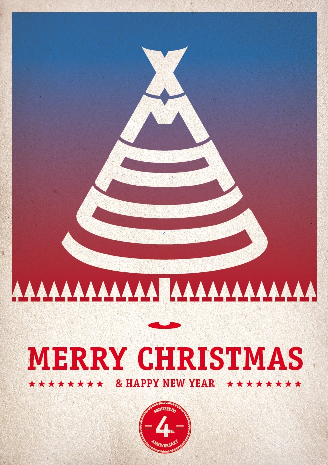
With the basic object done I started playing with some compositions. The first one was done in Illustrator and I just added an old paper texture over it with the texts and other elements. My first idea was exactly that, create a sort of vintage style card, however I wasn't still satisfied with the result.
Step 5
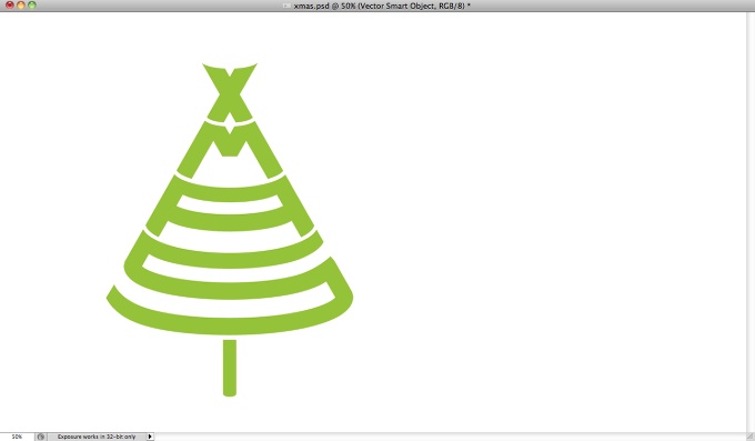
As I wasn't pretty happy with the results in Illustrator I decided that it was time to go to the always reliable and savior Photoshop. So I copied the basic XMAS tree from in Illustrator and pasted in Photoshop.
Step 6
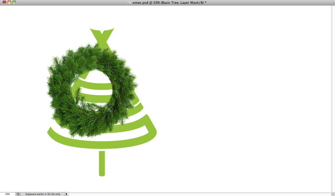
To create the effect I wanted I imported a photo of a christmas wreath from Shutterstock. You can find the one I used at http://www.shutterstock.com/pic-63153112/stock-photo-christmas-wreath-o…
Step 7
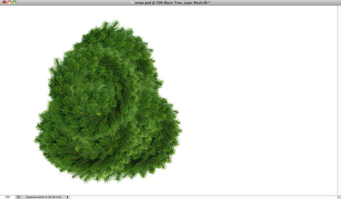
Once I had the christmas wreath with no background I duplicated it several times until I got a bunch of them covering all the area of the XMAS tree.
Step 8
Here I grouped all the wreaths in one folder then I created a marquee selection of the XMAS tree vector from Illustrator.

Step 9
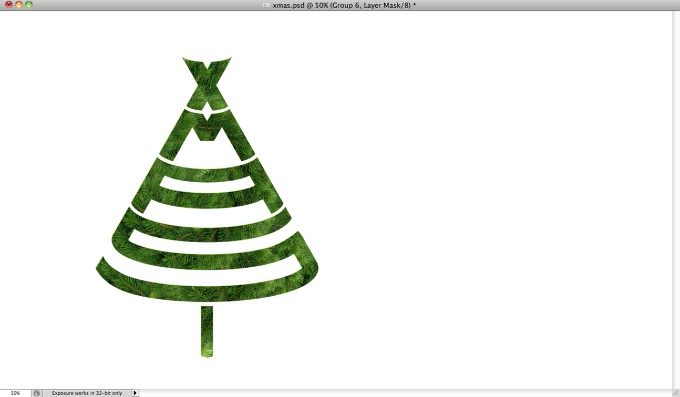
Then I applied a mask in the wreaths folder so they would be visible only in the area of the XMAS tree. But as you can see in the image below, the result is not that realistic. The edges are too uniform and perfect, but to fix that problem is super simple.
Step 10 - Creating a Brush
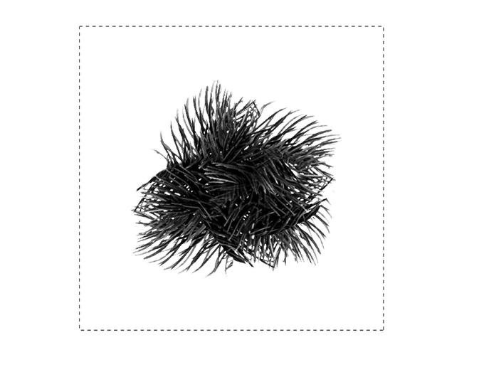
Select some areas of the christmas wreath and copy then, after that duplicate and rotate until you get a uniform object with the edges with the leaves. Merge the layers into a new one and go to Image>Adjustments>Desaturate. Now that you get the object in greyscale, go to Image>Adjustment>Levels. Increate the black input so it gets very dark, also increase the white input to increase the contrast.
Once you have the object in a very nice black and white tone, create a squared selection with the Rectangle Marquee Selection Tool (M) holding SHIFT. After that go to Edit>Define Brush Preset.
Step 11
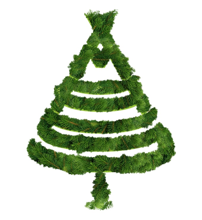
With the brush created in the step below, I started painting on the edges of the mask with white in order to make them more realistic. After that I duplicated the group and merged it into a layer so I could apply some layer styles.
Step 12
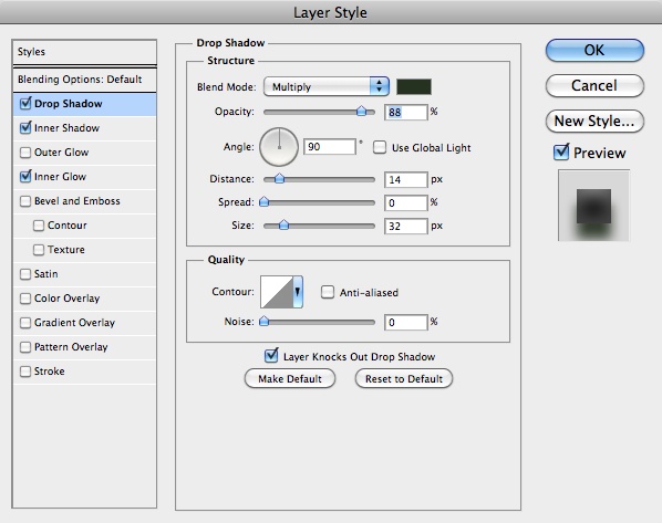
With the layer selected go to Layer>Layer Style>Drop Shadow. Use Multiply for the Blend Mode with black for the color, 90% for the Opacity, 90º for the Angle. For the Distance use 15 pixels, the Spread use 0? and the SIze 30 pixels.
Step 13
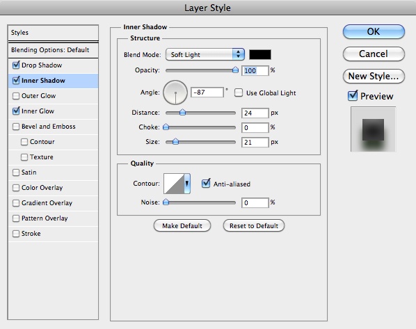
After that I used Inner Shadow to give some depth and create a sort of 3D effect. For the values I use Soft Light for the Blend Mode, 100% Opacity, -90º for the Angle, 25 pixels for the Distance, 0% for the Choke, and 20 pixels for the Size.
Step 14
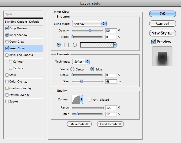
The last layer style was Inner Glow. I used Overlay for the Blend Mode, light grey for the color, Edge for the Source and 70 pixels for the SIze.
Step 15
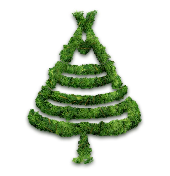
Here is the result I got after all these steps. It was already a much better result, however I wanted to add some cheesy Christmas decorations :)
Step 16
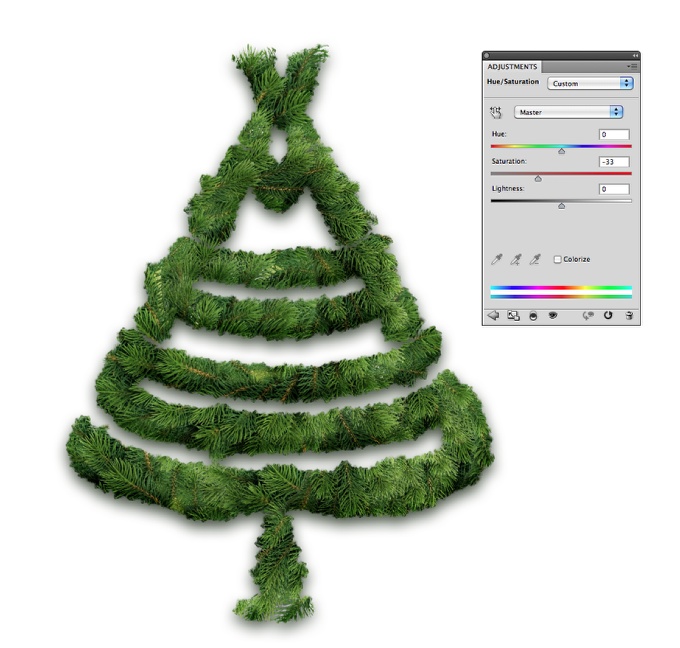
The first thing I did before adding the decorations was to reduce the saturation.
Step 17
Here I added some red christmas balls. I got them from a photo from Shutterstock. You can get it at http://www.shutterstock.com/pic-67508086/stock-photo-girl-with-christma…
As you can see I used the same red ball several times, however I used different rotations. But they looked too fake in there because they looked like they were simply put on the wreath.

Step 18
To fix the red ball problem and make them look as they were more integrated with the tree I duplicated the tree and cleaned the layer styles. Moved this new copy so it was in front of the other layers and then I went to Layer>Layer Mask>Hide All. After that with the Brush Tool (B) and the brush I created in the step 10 I started painting on the layer mask with black hiding some parts of the balls.

Step 19
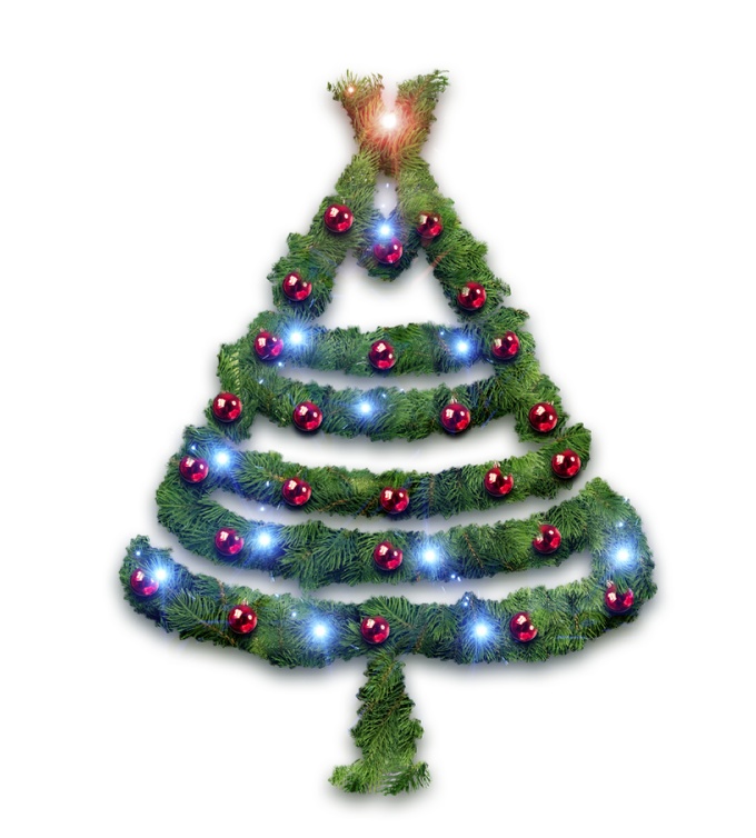
Here I added some cheesy light effects, as the tradition of my family's Christmas Tree, the lights are alway present, and lots of them. I used a photo of a light burst then simply duplicated it several times. LIke I did with the red balls, I changed the angle and the size of some lights.
Step 20
For each light I applied a different Hue and Saturation, so I was able to create some red, green, blue, pink and yellow lights.

Step 21
Select all layers and duplicate them, after that merge all the duplicated layers into a new one and go to Filter>Blur>Gaussian Blur. Use 15 pixels for the Radius. After that duplicate this layer once.

Step 22
For the 2 blurry layers use 50% opacity, however the Blend Modes will be different. For the one on top use Screen and the one beneath use Overlay.

Conclusion
The last thing I did was adding the text and the Abduzeedo logo. The font I used was Helvetica Neue Ultra Light. I also added an old paper texture on top of everything using Multiply for the Blend Mode at 20% opacity.
So the whole idea of this case study/tutorial was show you how I went from a simple idea all the way till the final result. I hope that might help you on your future projects and also motivates you to try to sketch more before jumping to the computer.
