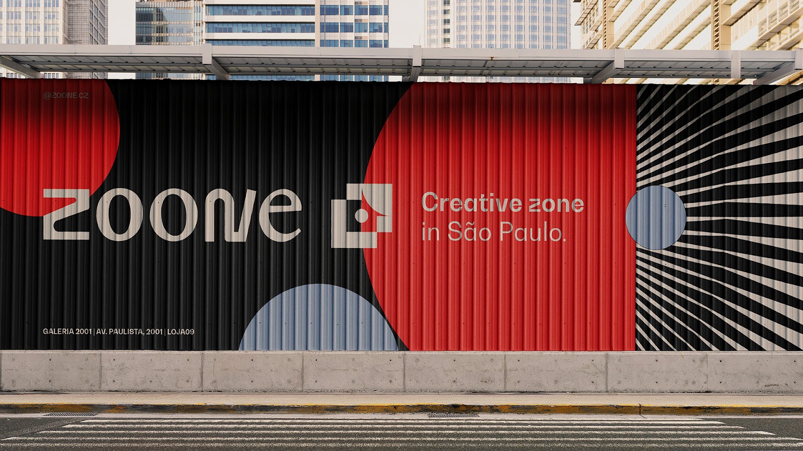
ZOONE | Creative Zone Branding Design By Beatriz Ricci
What you are about to get to know is the brand of a space made for those looking – consciously or unconsciously – to break out their own bubble and expand their horizons, finding other sensations, perceptions, and possibilities.
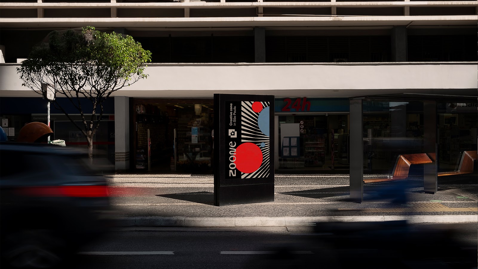
Beyond a place, an environment that invites you to expand. Projected by Jeferson Branco Architecture and equipped to inspire all the senses, it contrasts with the commercial center around it.
The first structure to receive the project is located in the heart of Paulista Avenue – São Paulo, Brazil – a creative space of 18m², totally designed for the creation of new stories.
To spend the day or a few hours. To read, write, create, scribble, think, discuss, have a meeting, meet people, or find yourself. Find the reason. This is the place.
Concept
To be authentic in their process, through the usual context, is the biggest challenge for those who are not satisfied to stay in the same place. For the unquiet, the comfortable generates discomfort. The necessity to pop their own bubble, to expand themselves. This means improvement and evolution on their journey.
The challenging reality added to the particularities of each person, making it able to enrich the way they stare at the present and celebrate, who knows, the narratives of a near future. At the end of the day, for those who are not a comodist person, surrendering to the transformation of the external world is part of evolution.
"Nothing is permanent except change." To accept the movement, and not be resistant to what is mutable, is to consider that all things change all the time in the world, including humanity. So why not focus on exploring new perspectives on your own existence as individuals, plus many things that come with you, and refute some standards disguised as truth? When you accept to live the contrast, the possibilities that exist in and out your bubble, the unpredictable begins to exist in your favor.
When you ask yourself why there are so many patterns in the narratives of your life, creativity wins out within your own atmosphere. And what about breaking the protocol? What about looking for new pieces that contrast with your own scenario? To explore new sections of your existence? The world is an endless complex of bubbles, and you have an incredible chance to observe the beauty of each one.
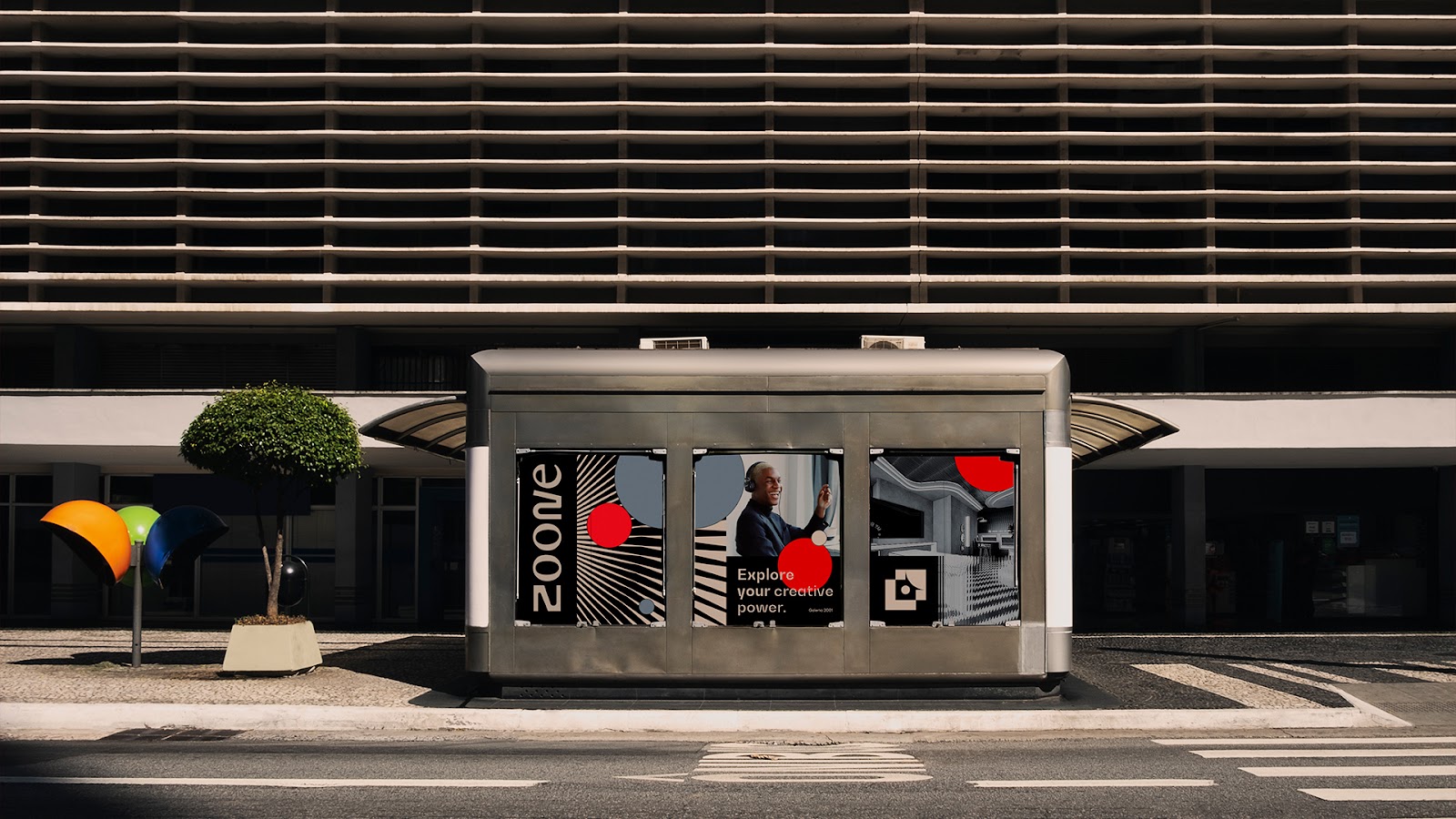
Colors
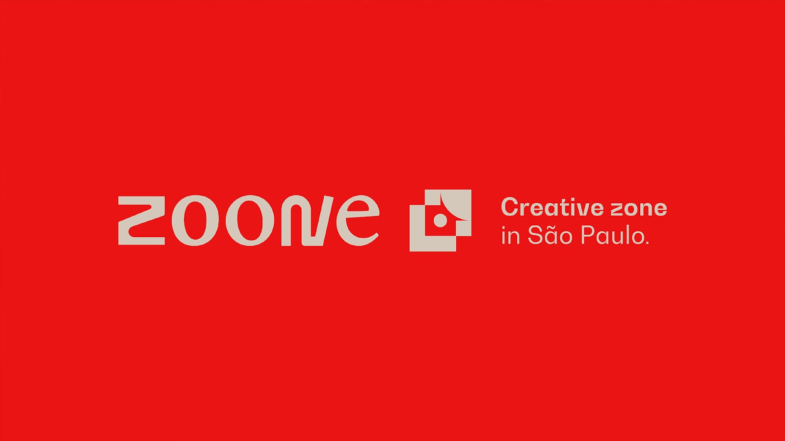
Red is intense, capable of representing the entire process. From the deep immersion in their own circumstances and narratives, before accepting the unknown, to the moment when the unpredictable feels friendly.
Blue is the accentuation of this experience, a comfortable place. We acquired stability when we understood that we are in constant transformation, that living the new can be a beautiful experience.
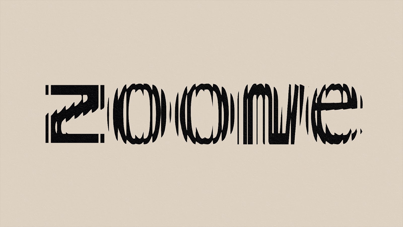
Logotype
When we want to observe the details that compose the totality, we naturally take our thumb and forefinger, bring them together at the center, and separate them in opposite directions, usually following a diagonal line. This expanding motion, or zoom in, helps us to pay attention to very specific parts of an atmosphere and, as a consequence, we focus on specific important points.
Type
The letters bring the essence of the brand into your existence. Being creative is about taking risks and exploring the unusual. In a disruptive and uncommon way, the composition still has a harmony and a visual balance. In order for the entirety to be able to promote distinct visual codes in an intelligible and uncomplicated way, the mix of geometric and organic elements and different typographic families is part of the strategies of this creative conception.
The vowels are designed based on a traditional, classic serif font style. The letters "Z" and "N" follow the opposite, and were shaped to transmit a more informal and unconventional idea. The weight and proportion, dissimilar among the elements, were adjusted so that they wouldn't go unseen, but the transition from one letter to another wouldn't cause weirdness, and the composition would be understood as a unity. Different elements need to have a certain affinity.


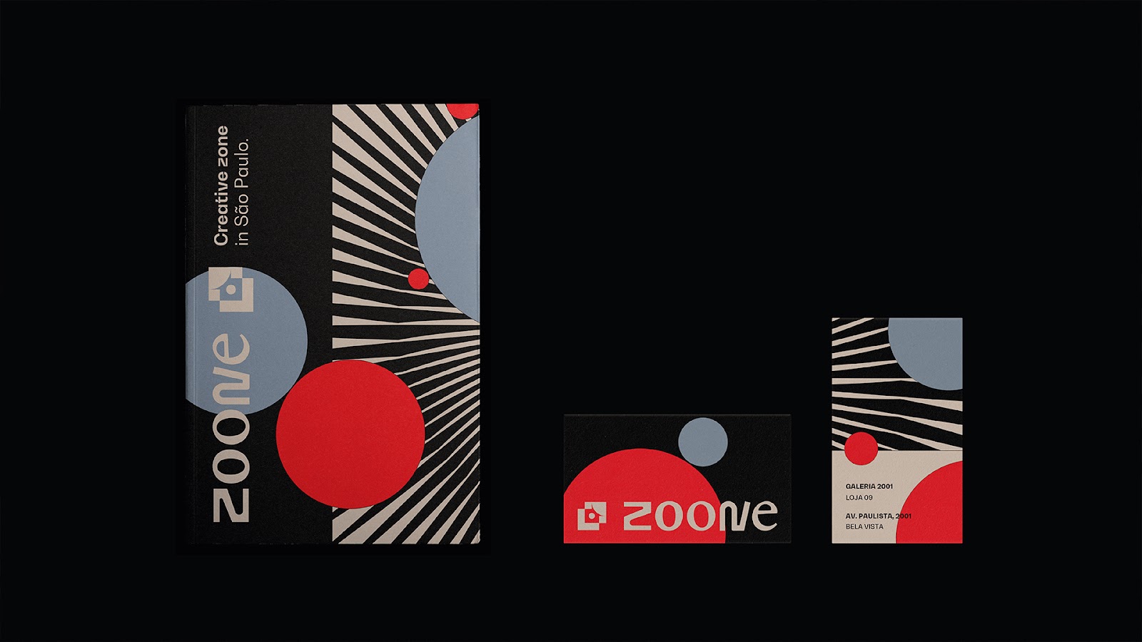
Disruptive circle
The optical illusion present in the circle, represents imagetically the expansion movement itself, starting from the center to the outside. The pointed ends give the sensation that they would easily pop something, especially what we came to pop: bubbles.
The layers that form the element, represent the different narratives we have built up over time and that, together, form a circle inside – the comfy place we are. The result is formed by elongated “arrows” that turn counter-clockwise. Fall back to change, but do it differently.