by abduzeedo
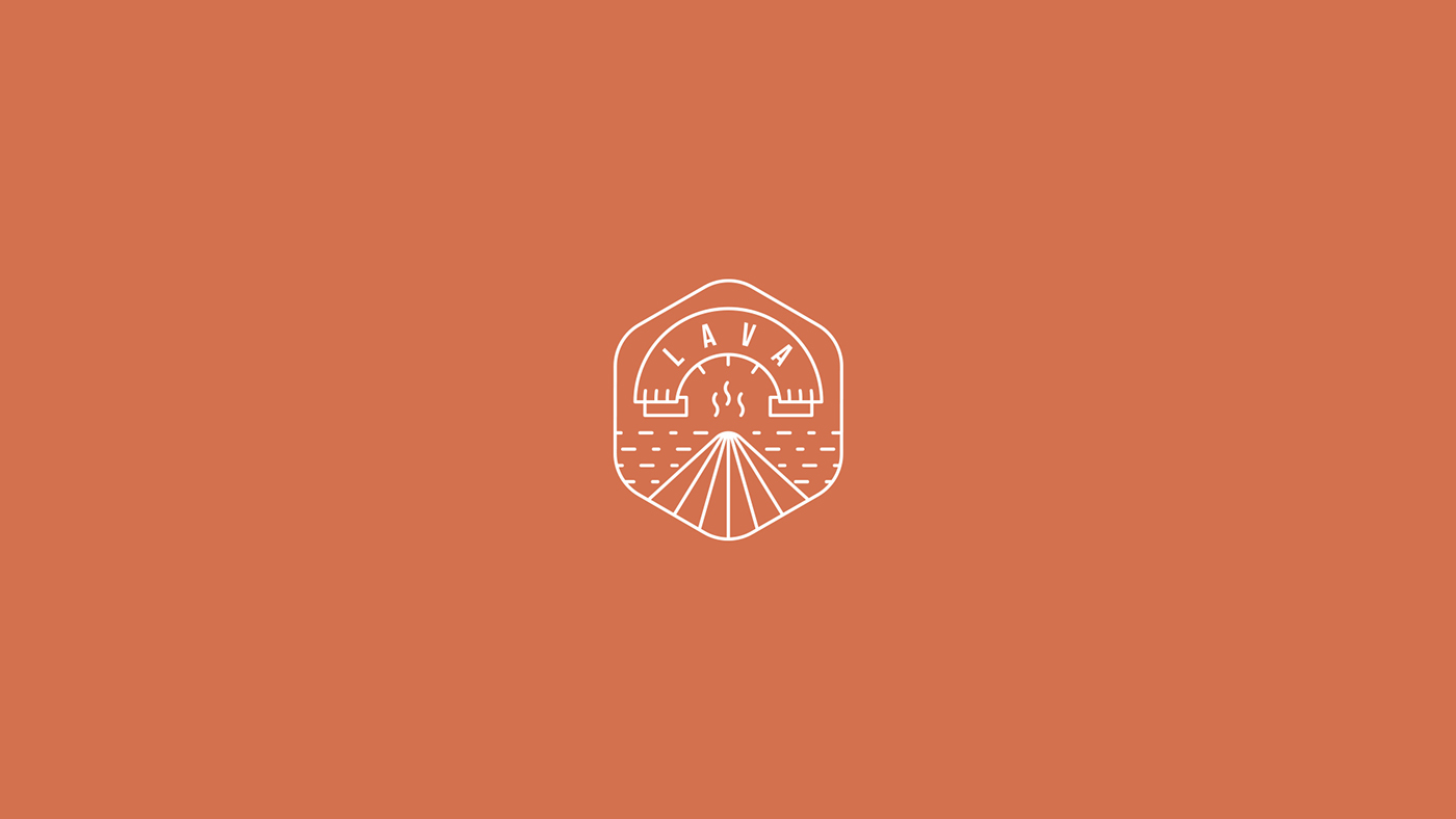
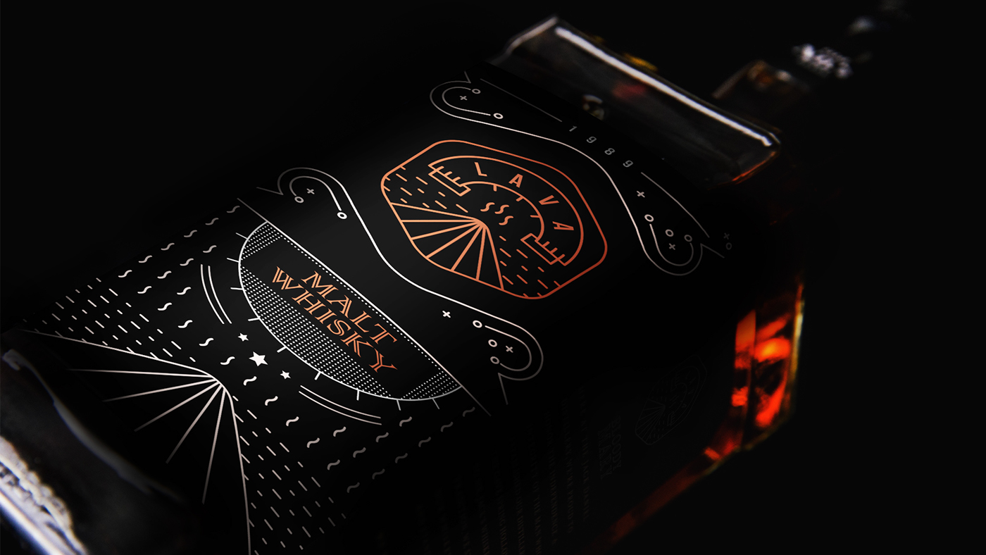
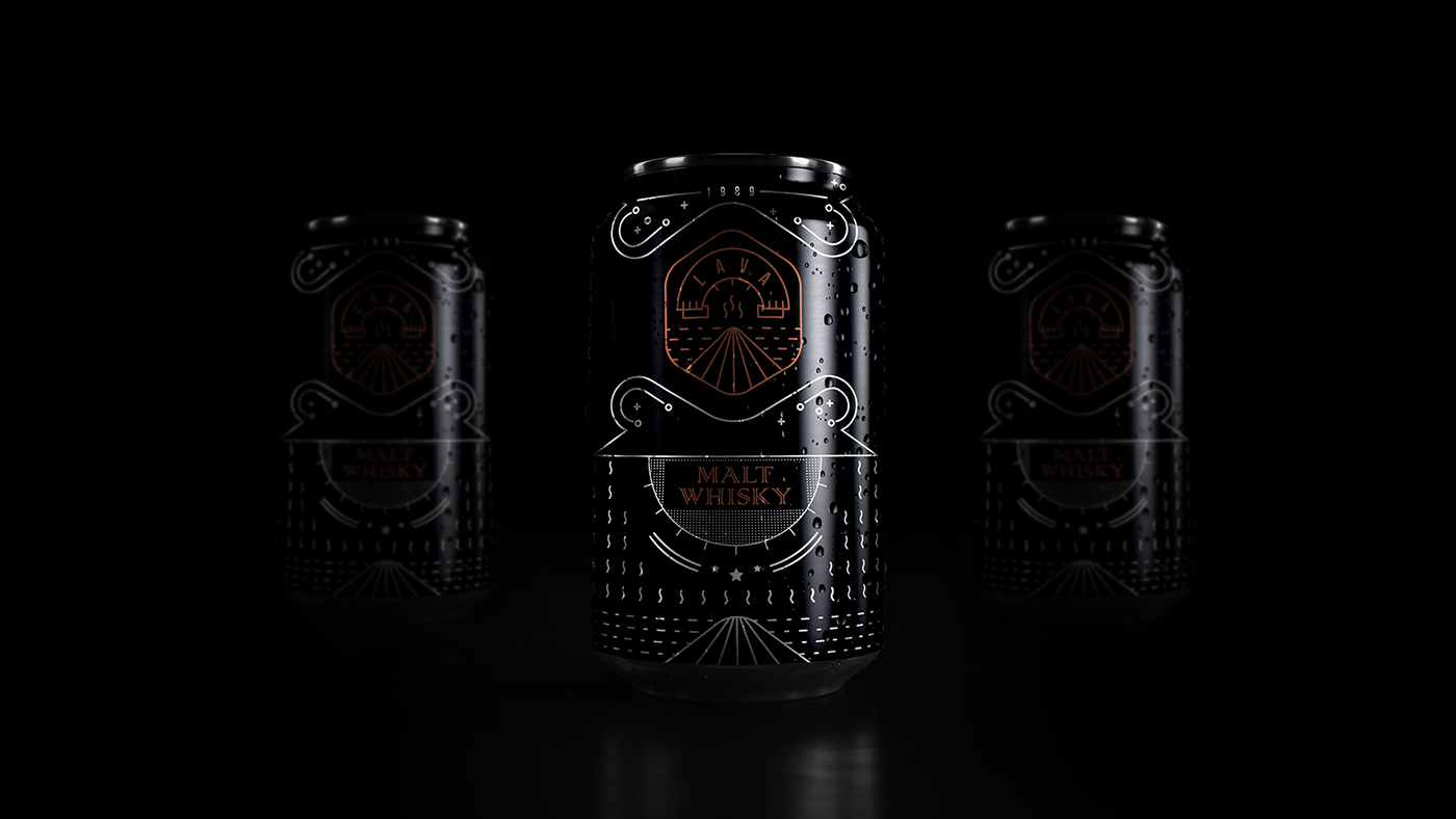
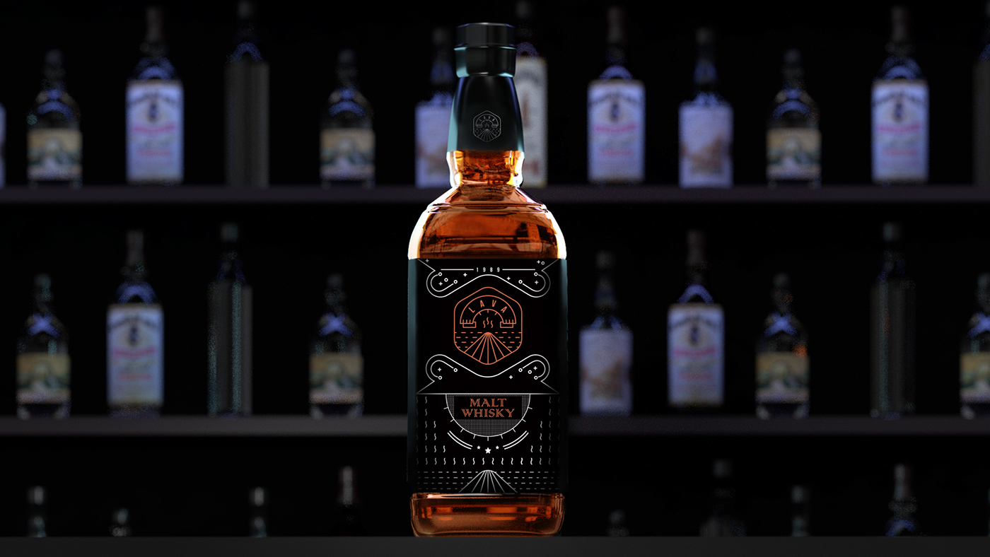
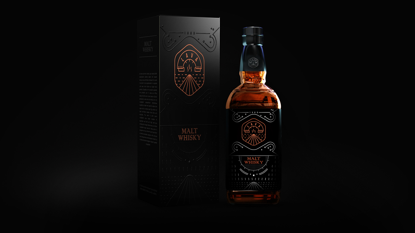
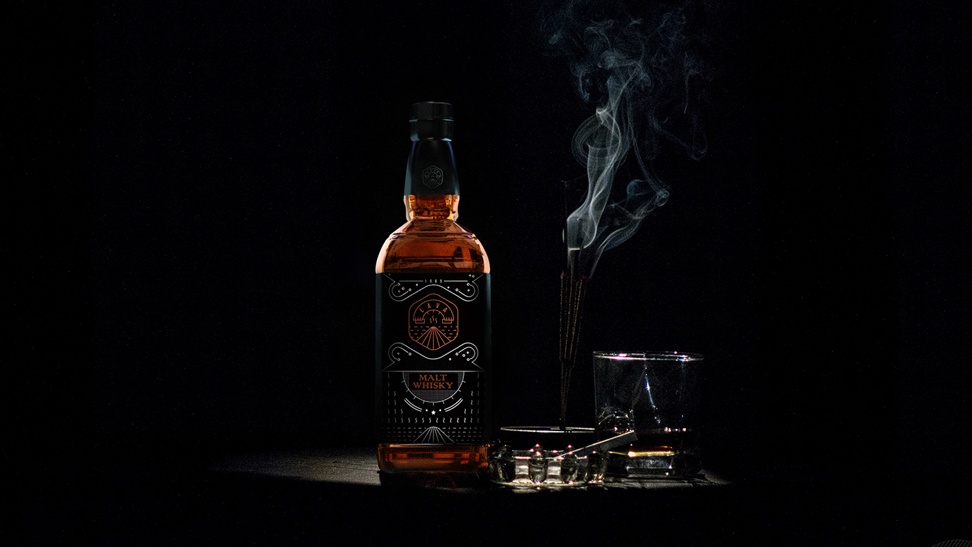
BrandMills Studios shared a cool Brand Identity and packaging design project they created for a whiskey brand. The name os Lava and they design a quite intricate, yet simple identity that feels modern but works quite well for their purpose. They were super nice to share some of the ideas behind it as well as some images. Enjoy it!
Project description
What is that feeling you get when you hear "Lava" a mysterious mass flowing in fluorescent colors. It is mysterious more than it is scary.
This brand concept can literally and non literally can be connected with the name.
Ingredients to make the whiskey is coming from volcanic soils which make them an epitome of quality and bit prime. Same time it denotes the ambiguous flavor it can present.
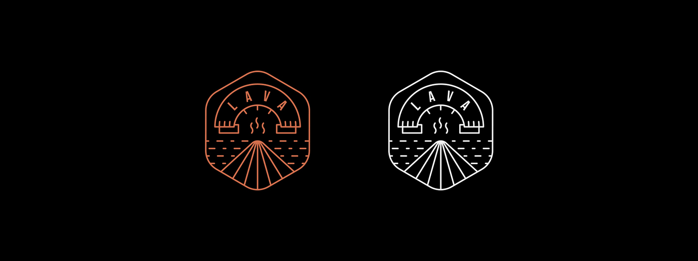
The icon and the branding theme needs to conduct the vibe the name creates.
To usher it, we need to make something more than an icon, when someone sees this product if we can steer the same feeling we are trying to conduct, then we can call it as a good brand identity.
Brand Identity

Make sure to check out:
