Invicta — Brand Identity Redesign by Valkiria Inteligência Criativa
Valkiria Inteligência Criativa, a design studio based in Porto Alegre, Brazil, has completed the brand identity redesign of Invicta, a Brazilian company with over 70 years of history as a reference in thermal containers.
The project focused on modernizing the brand while preserving the emotional connection it has built with consumers over decades. The studio created a new brand strategy, value proposition, voice, tagline — all guided by the purpose of transforming simple moments into meaningful connections.
The uppercase lettering was kept to reinforce authority and lend a more premium feel, while the typography evolved with softer, more rounded strokes that convey comfort and humanization. The new symbol synthesizes key brand elements: the appreciation of time, the silhouette of Invicta's most iconic products, and visual references to the previous identity.
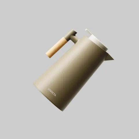
The shape references the "V" in Invicta, clock hands, and the silhouettes of the brand's most recognizable products. The new color palette introduces a distinctive green as the primary brand color — one that steps away from the traditional hot/cold duality, instead representing balance, life, and the present moment.
The result is a visually consistent, emotionally relevant brand identity, prepared for the next chapter of its story.