JNS Coffee - Branding and Packaging Design
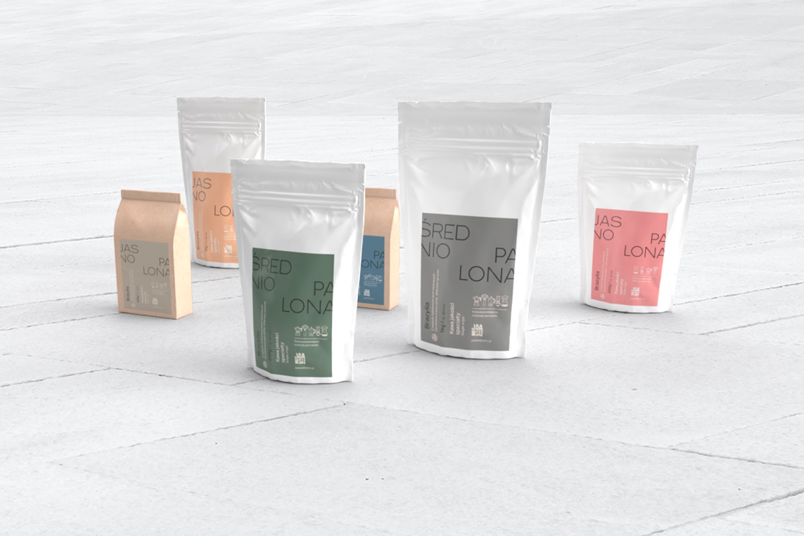
Val Nogues / Wide Vision Agency shared a branding, packaging design and visual identity project for JNS Coffee. Specialty coffees have made their way to the Polish market, and are here to stay. Jawa Nie Sen is a new brand offering farmers coffee for those who care about quality.
Inspired by the founder’s background as a health specialist for the government, JNS (Jawa Nie Sen / Reality, not the dream) is a new coffee brand structured around a model based on subscription plans. The brand’s message is focused on the health and nutritional benefits of premium farmer’s / specialty coffee as opposed to industrial ones. The early goal was to create a polarizing yet premium experience for the audience. Being based on an alternative model, packaging the brand and creating a consistent visual language was the main priority so we could then set out to develop an online presence. The online aspects of the brand are directed towards lead generation through different funnels in order to increase the numbers of subscribers.
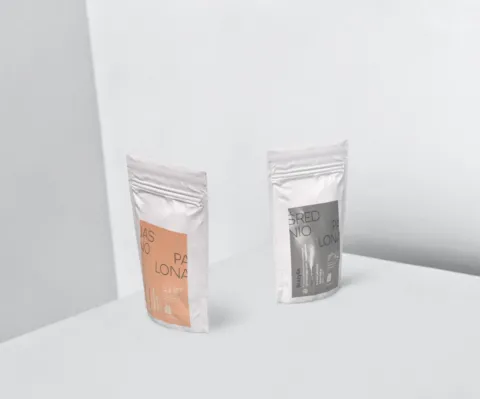
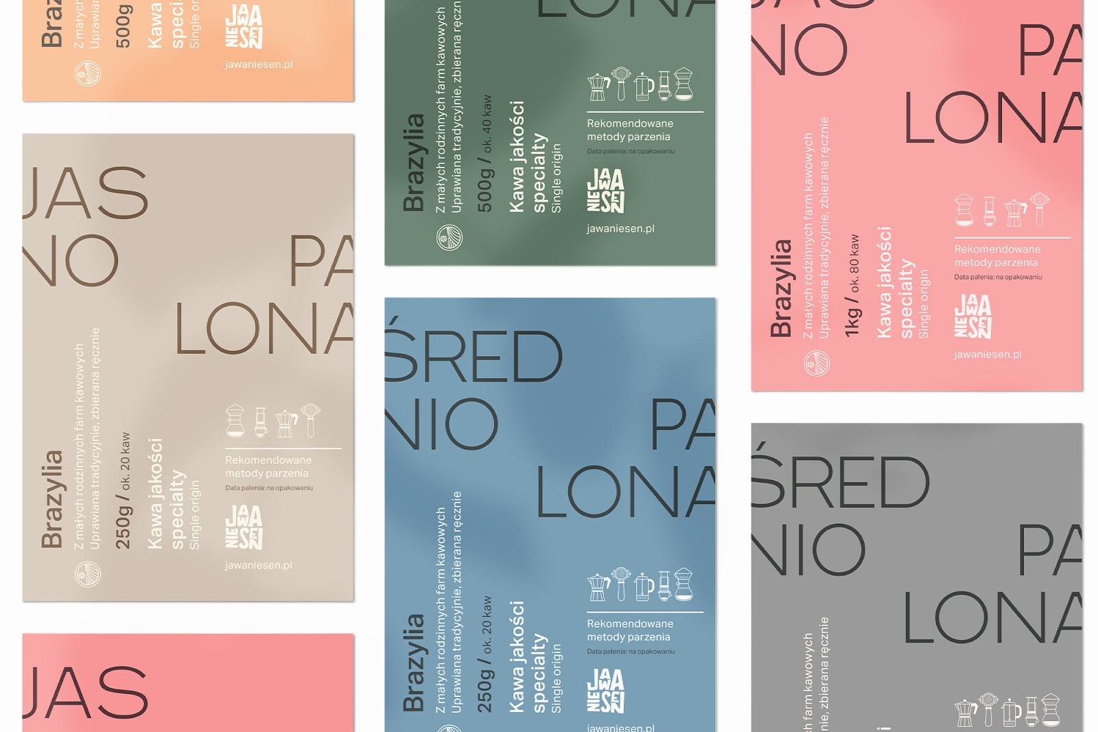
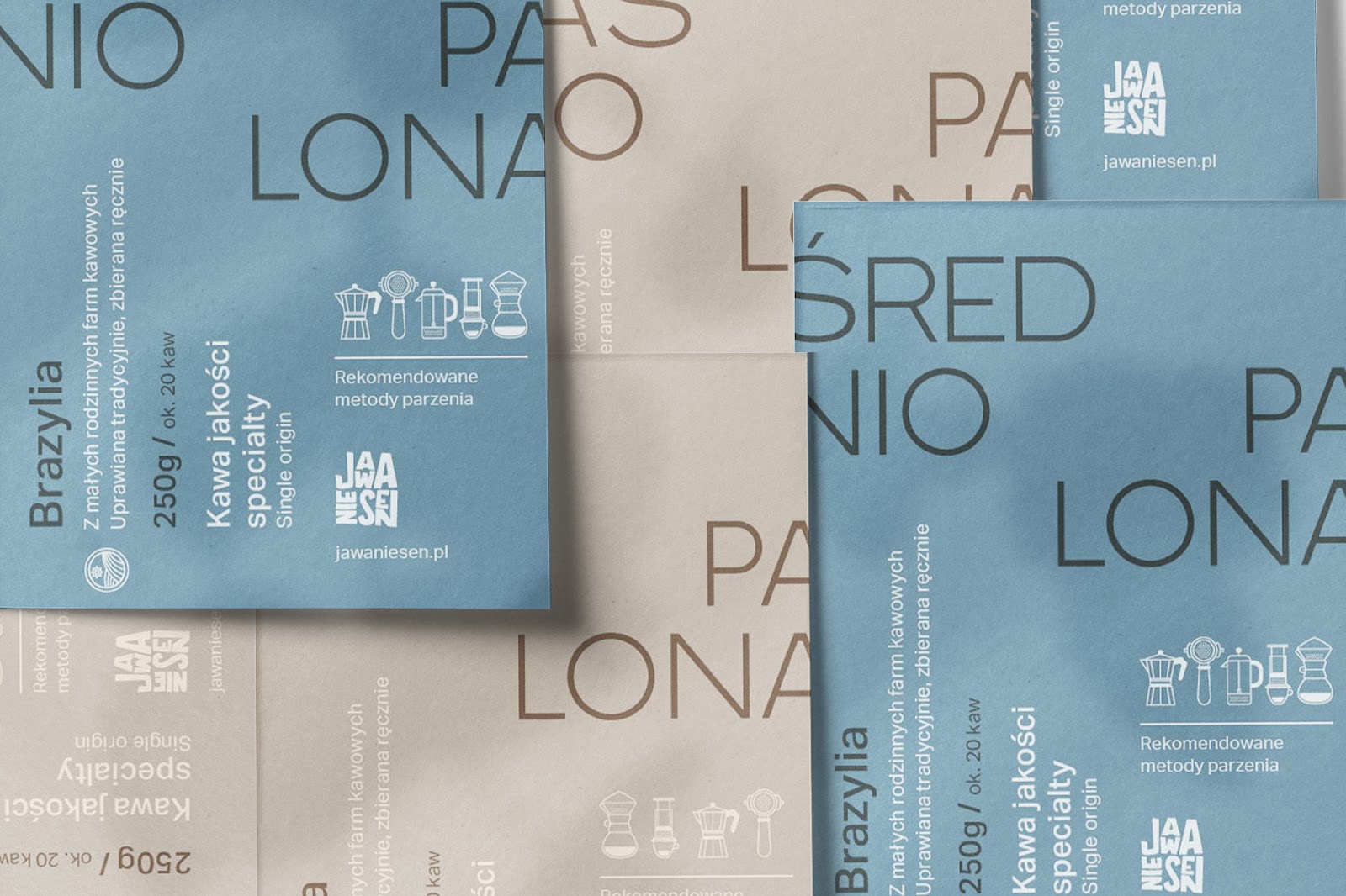
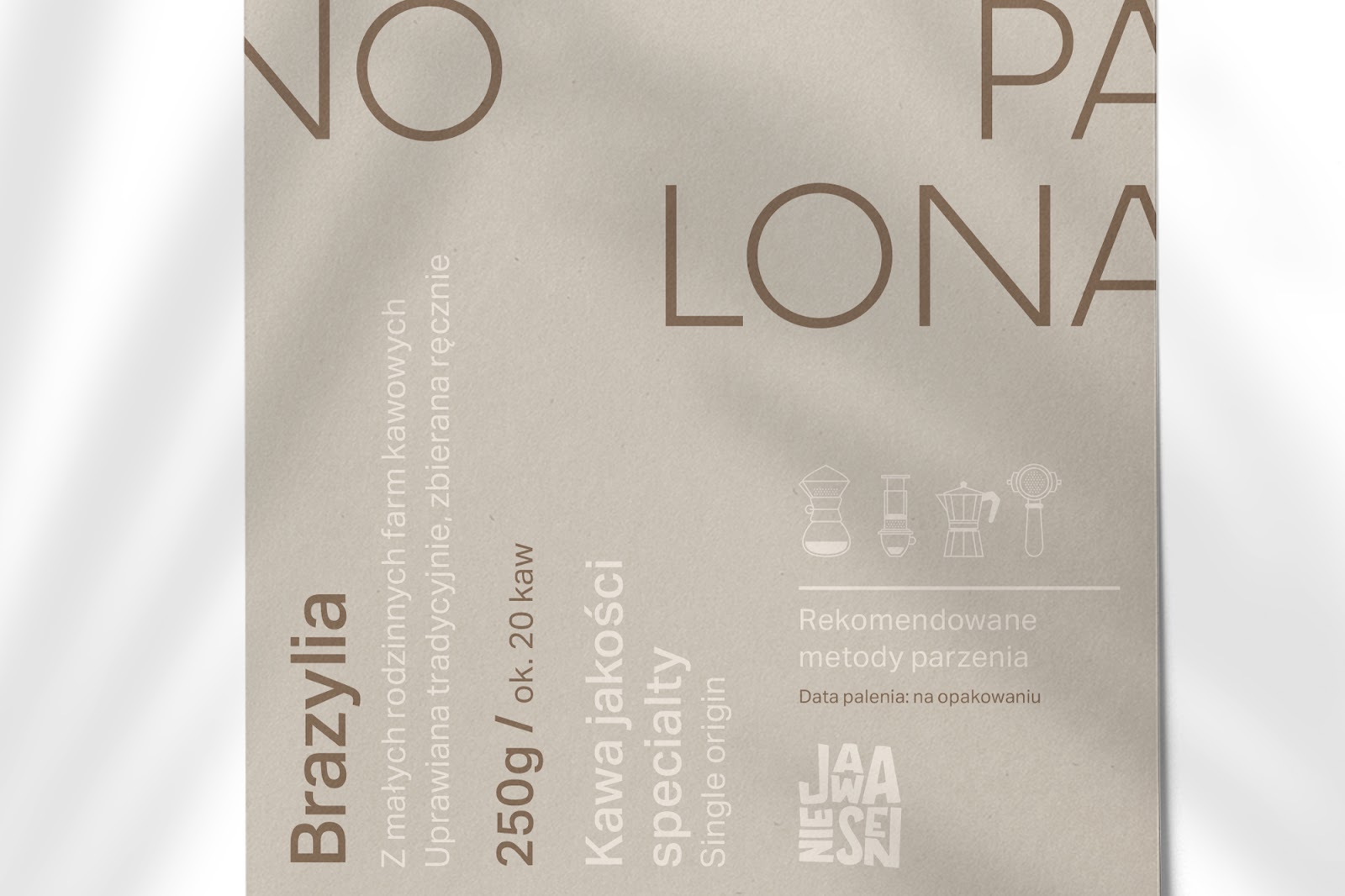
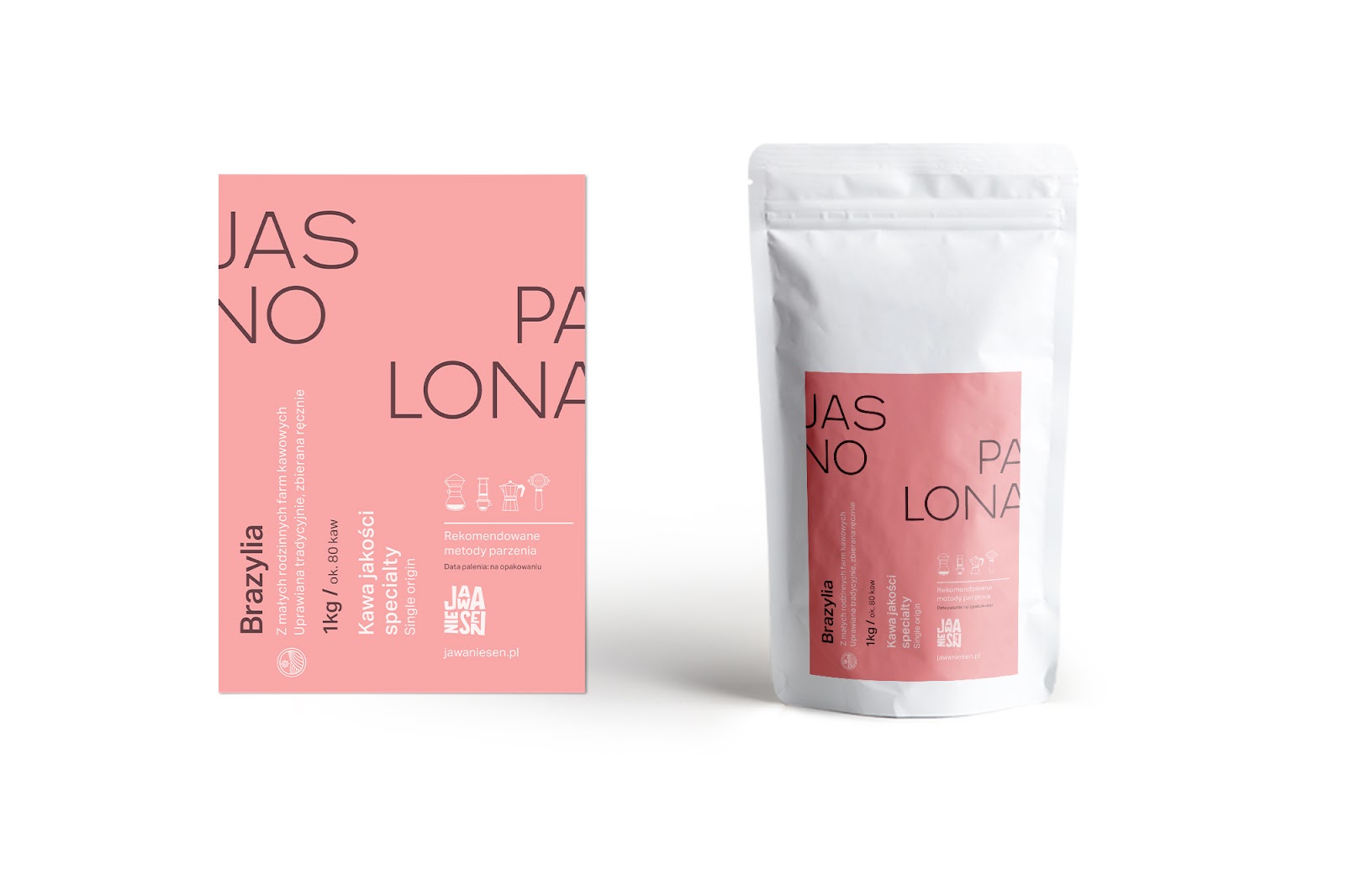
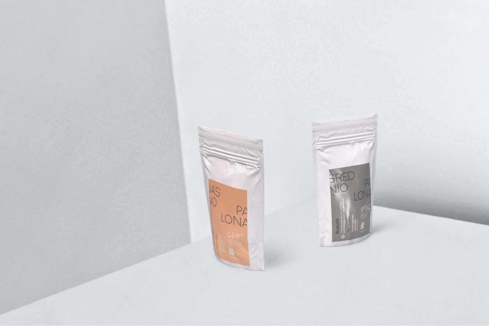
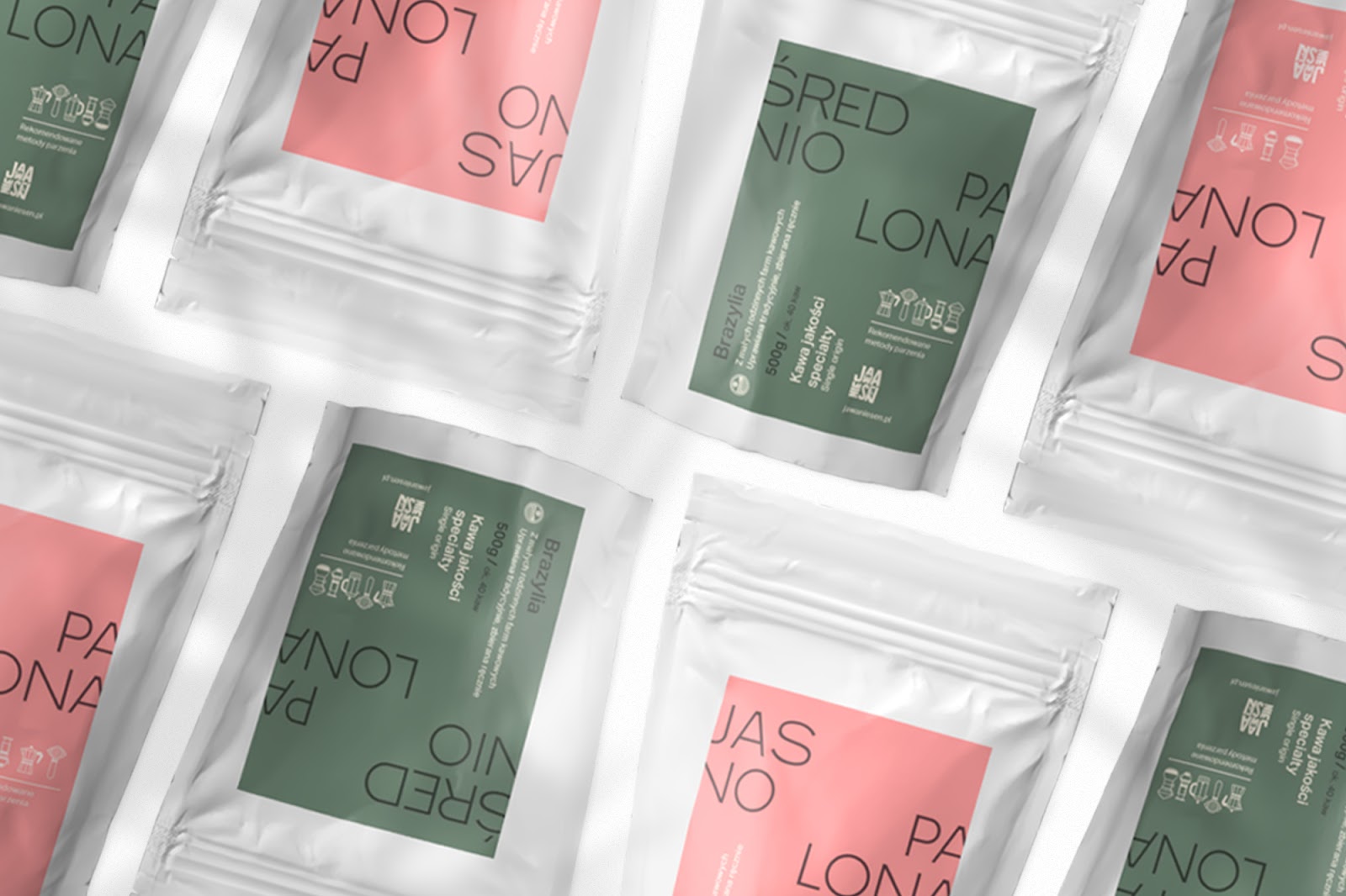
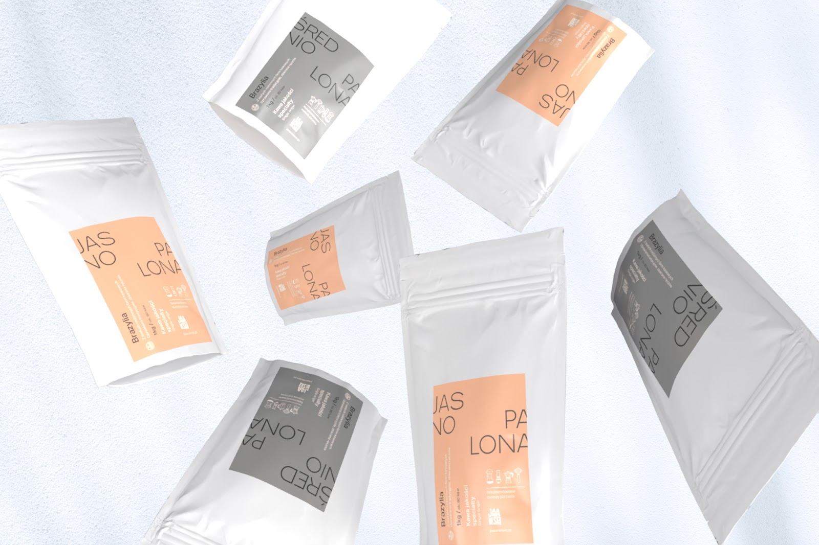
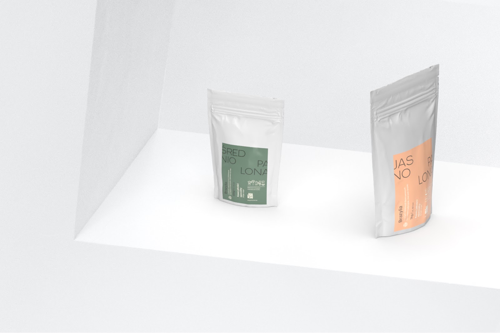
The offer is composed of two products (medium and light roasted coffee) selected in small independent farms in the Brazilian mountains. The tonal palette was established in order to differentiate each pack per quantity. Design-wise, inspiration was taken from the pharmaceutical industry as a reference to the founder’s history, but was also a way to emphasize the health and nutritional benefits of high quality coffee.
The refined design aims at positioning the roasting process and the origins in the first place rather than the flavor notes or the variety of the beans. Traditionally, coffee brands tends to hide the roasting level while it is the primary factor responsible for the flavor when it comes to coffee.
For more information make sure to check out Wide Vision on: