Jupi: Surreal Simplicity in Branding & Visuals
Explore Jupi's unique branding and visual identity. Discover how surreal illustrations and thoughtful design create clarity.
This article examines a standout branding project: Jupi. How Studio's talented team designed it. It shows how strong branding simplifies complex ideas.
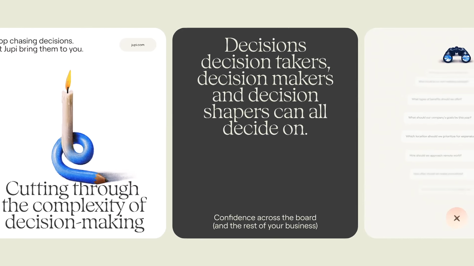
Jupi wants to cut through corporate complexity. It replaces "noise, bureaucracy, and bottlenecked decision-making" with consistency. The design team embraced this. They created a "surreally simple" approach. This core idea is clear in all visuals.
The Thinker, Reimagined
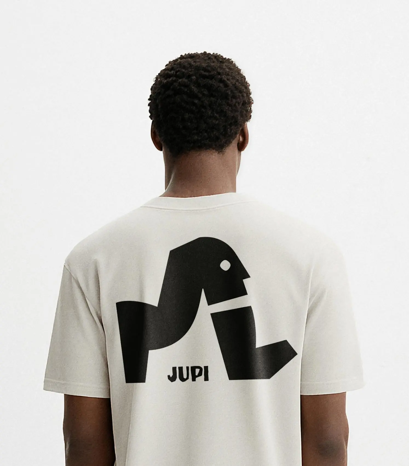
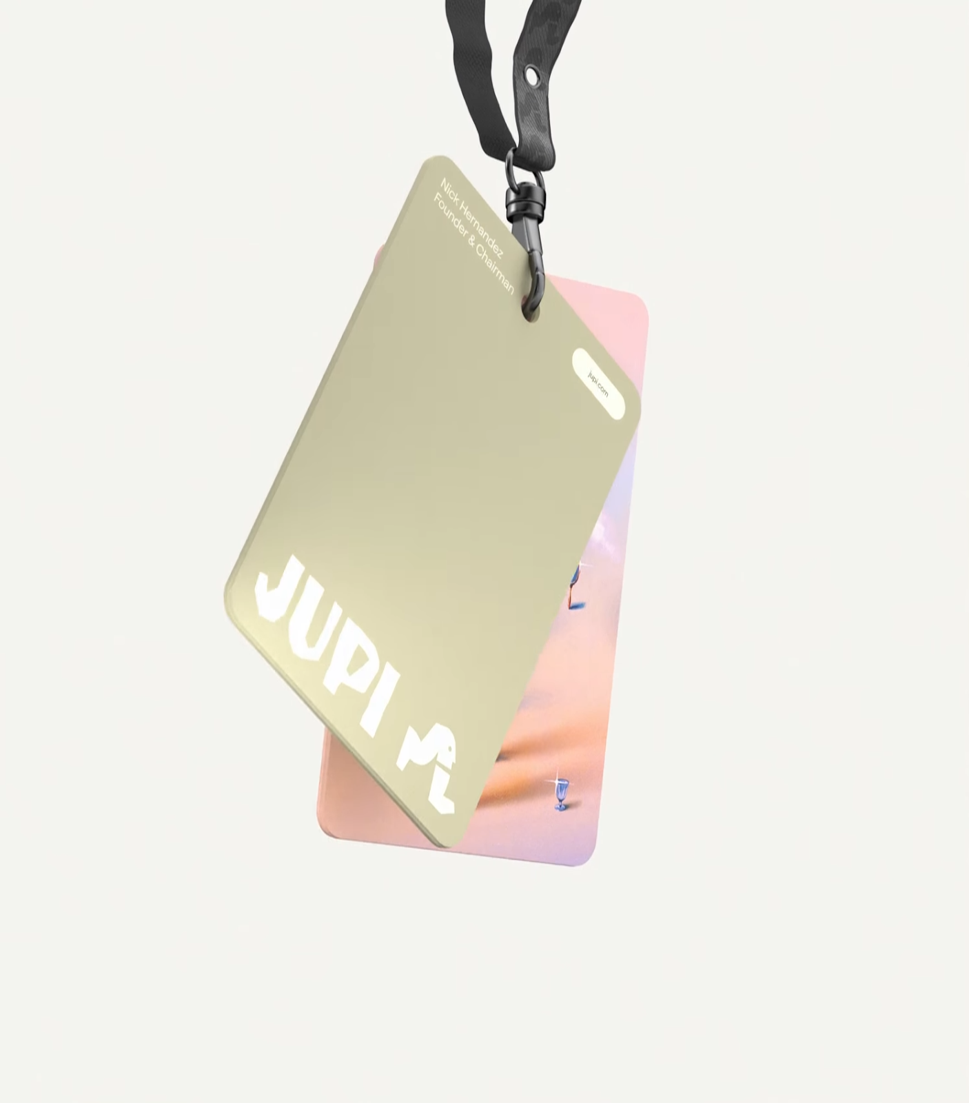
The Jupi logo is based on Rodin's Thinker. But there's a twist: "Imagine Rodin's Thinker standing up." This active figure shows "cerebral and poetic intelligence." It moves the brand forward with a clear purpose. It smartly shows a brand focused on action and clarity. This figure forms the base of their icons. It uses "rugged forms." You can see this distinct logo on a t-shirt and a lanyard. This shows its many uses.
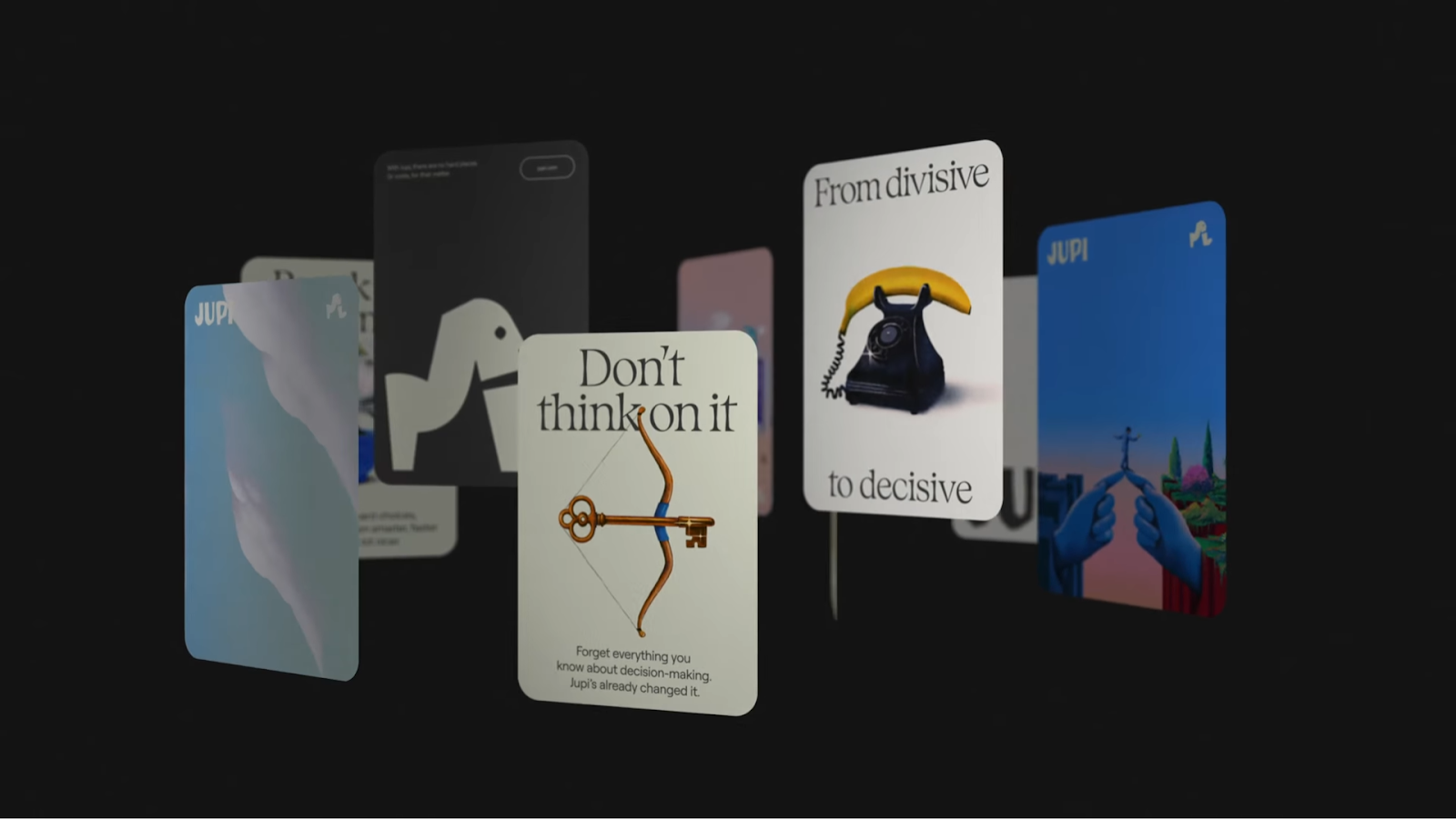
Magritte-esque Illustrations
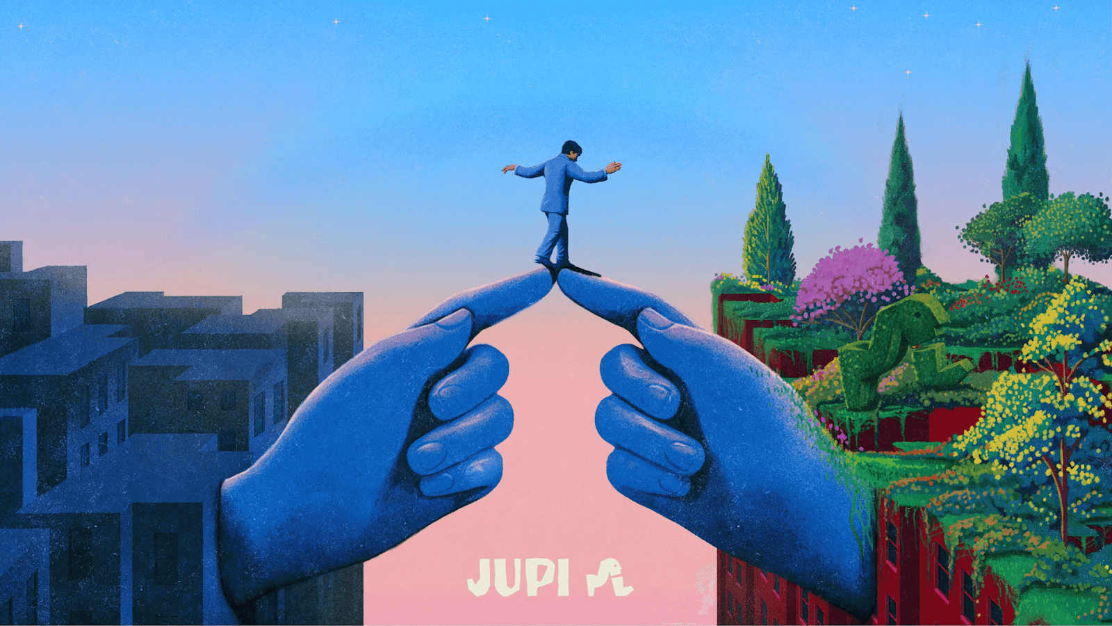
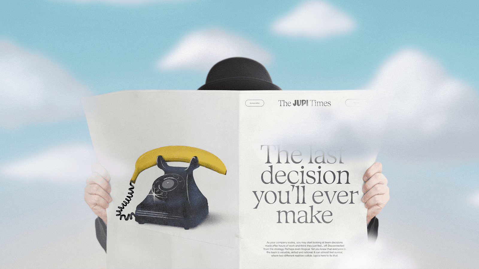
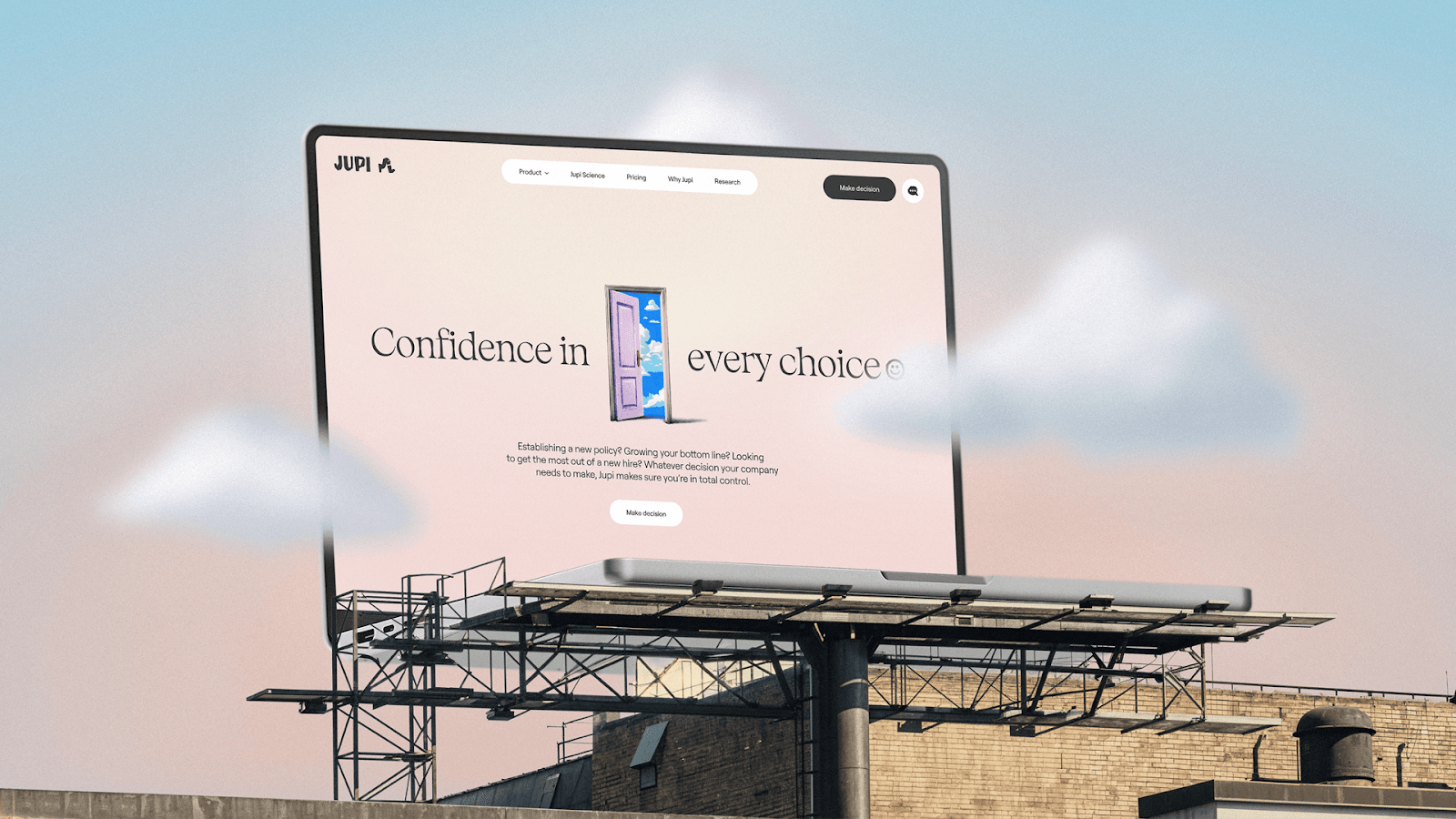
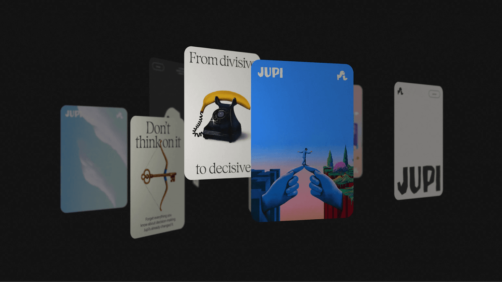
Jupi's "Magritte-esque illustrations" are truly captivating. These surreal images show the challenges Jupi solves. For example, one image shows a person balancing on giant hands. This symbolizes "walking the tightrope of complexity." Another striking visual features a billboard with clouds. It conveys "Don't cloud your judgment." Daniel Liévano created these illustrations. They are playful yet deep. They communicate "themes of harmony, collaboration, and trust."
Typography and Motion
The brand uses a "serious typeface that's not straight-laced." This balances professionalism with an open feel. This choice supports the brand's voice. That voice is "decisive in both message and tone." For motion, the design team looked to Dali. They created effects that "melt like Dali's clocks." This subtle animation adds more interest to the brand.
A Unified Brand System
Jupi's branding works very well. All its parts fit together. The reimagined logo, the striking illustrations, and the chosen typography and motion graphics all work together. This creates a "brand system as effective as the decisions Jupi makes." The overall feeling is confident and clear. This perfectly matches Jupi's promise to simplify decision-making.
The impressive team includes Christian Beck (Design Director), Daniel Liévano (Illustrator), and Robbie Isaacs (Motion Designer), among others. FNDR developed the brand story.
This project reminds us that good branding is more than just looks. It's about understanding a company's goal. Then, it's about turning that into a strong, unified visual story. Every element, from a logo to an illustration, reinforces the main message.
Ready to see more inspiring branding projects? Learn more about How Studio's work on Jupi's branding at https://how.studio/branding/jupi
Branding and visual identity artifacts