by abduzeedo
Discover Match Agency’s fresh branding and web design strategy, featuring a bold palette and minimalist design.
Match Agency, a creative force in branding and web design, has just unveiled a fresh visual identity to celebrate its second anniversary. The agency’s redesign emphasizes simplicity and functionality, perfectly balancing creative flair with clarity. In an industry where brands are constantly evolving, Match Agency’s updated look is both modern and timeless, making it a prime example of effective design in today’s digital landscape.
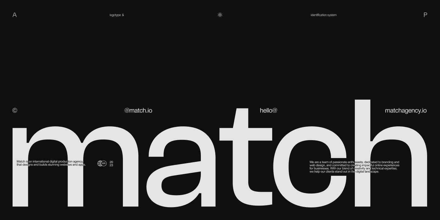
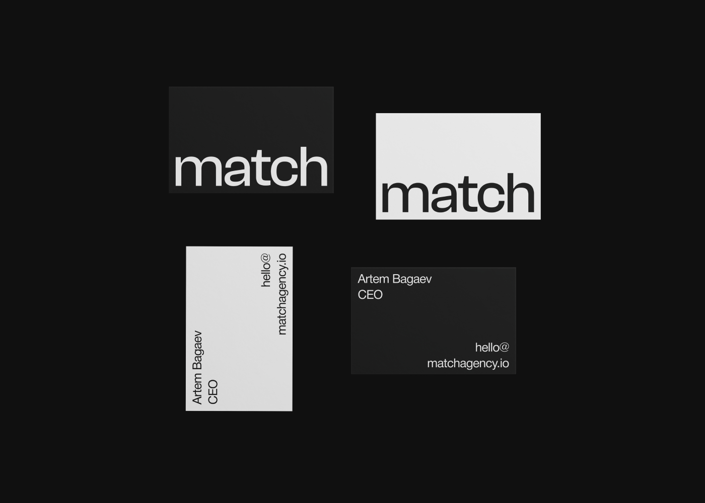
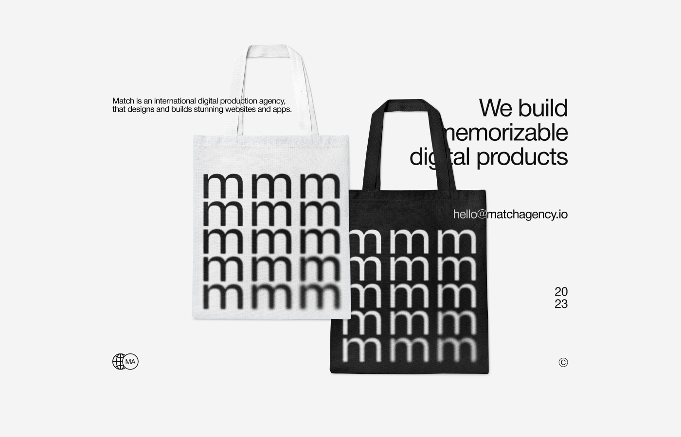
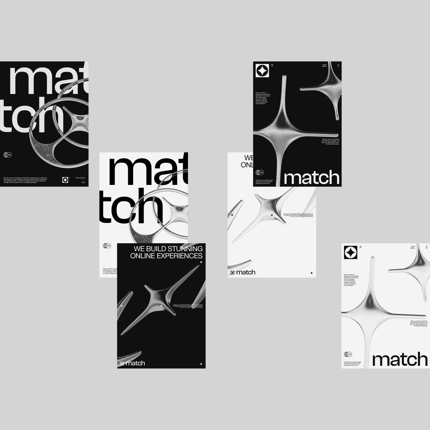
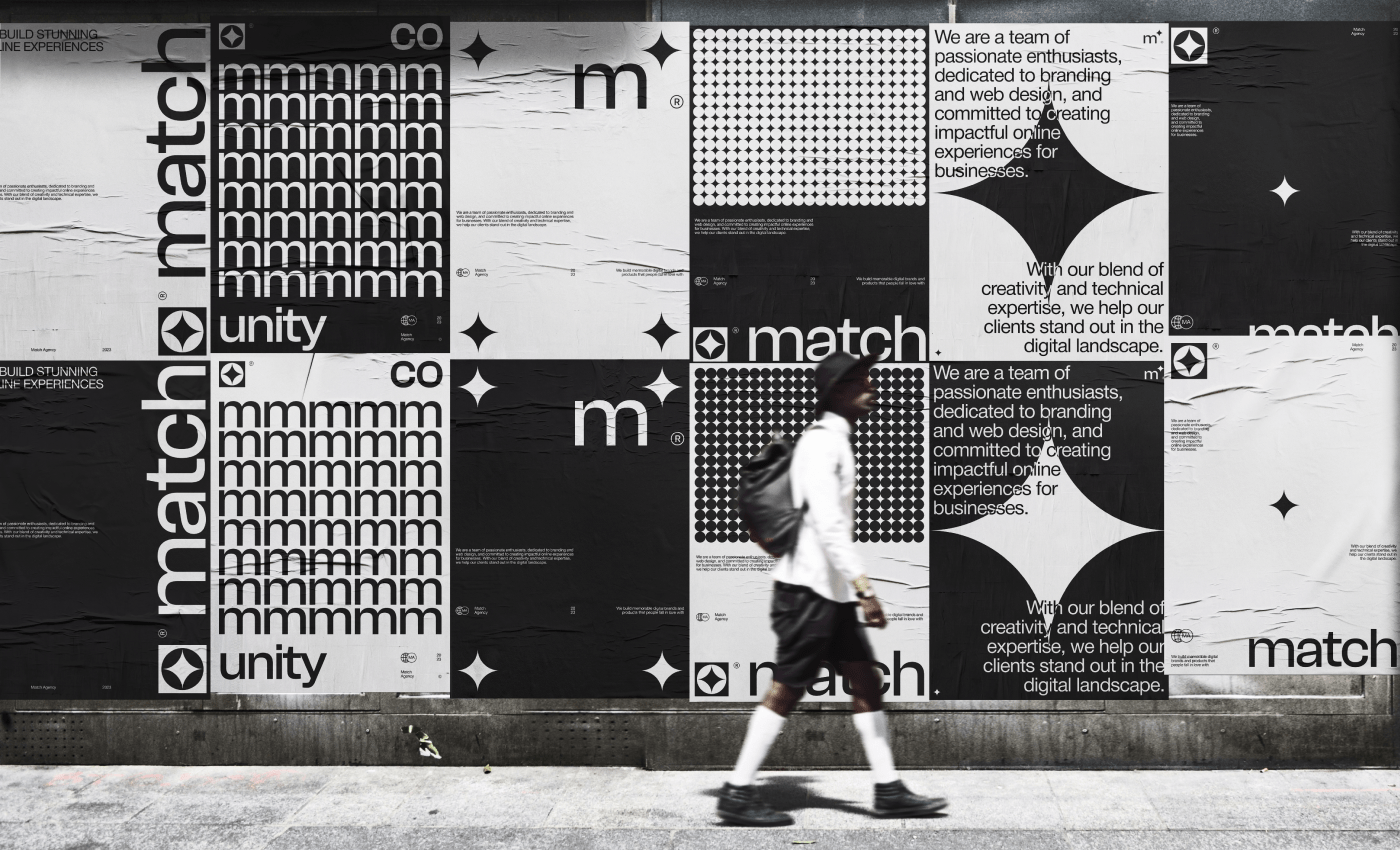
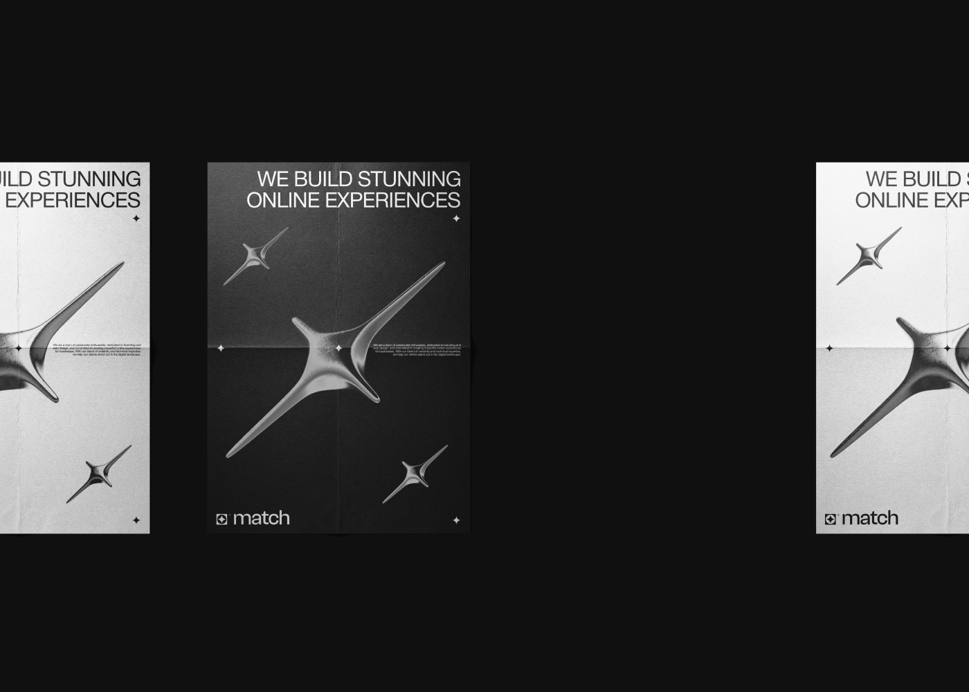
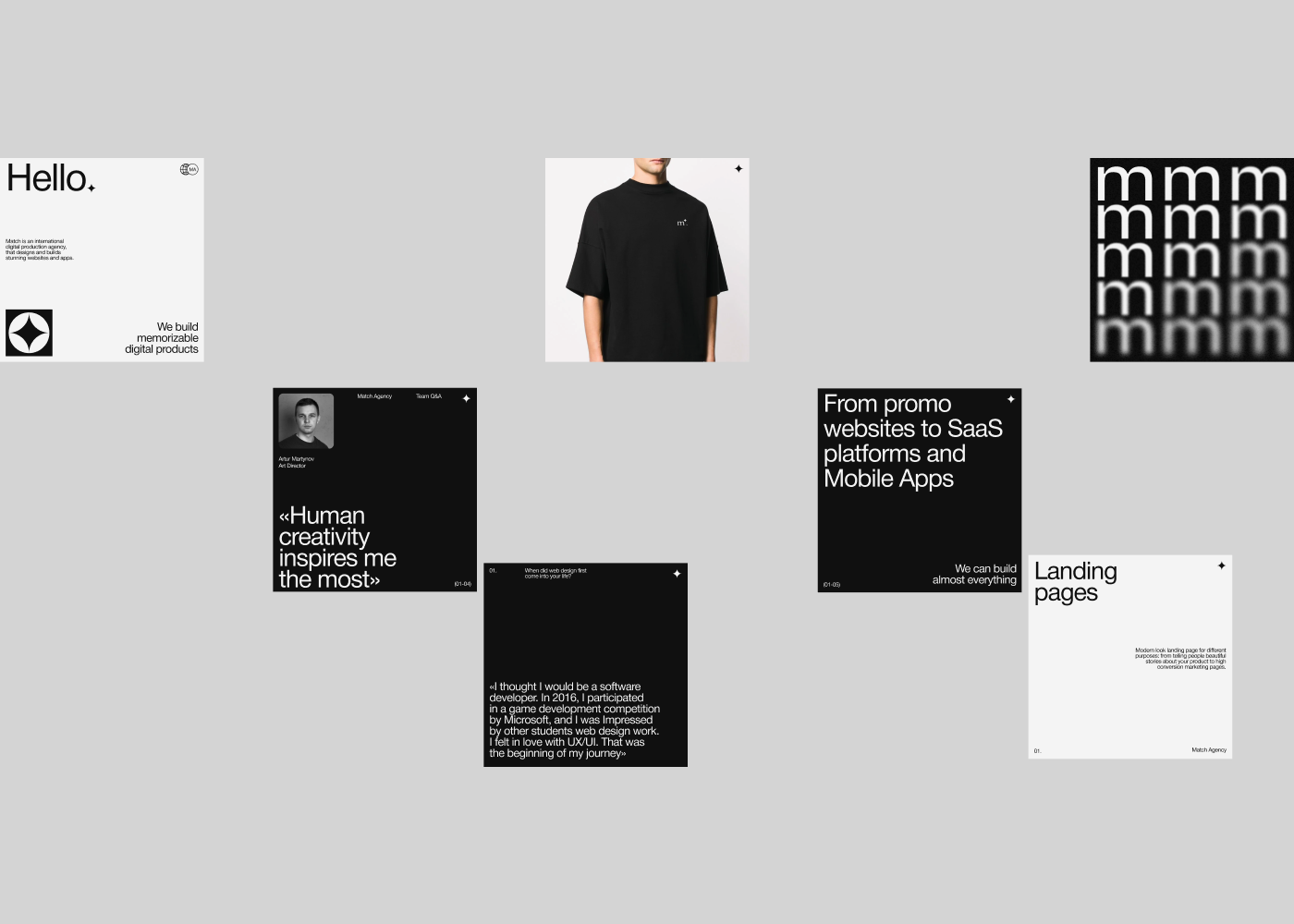
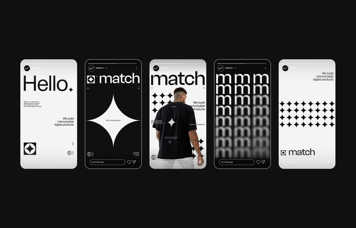
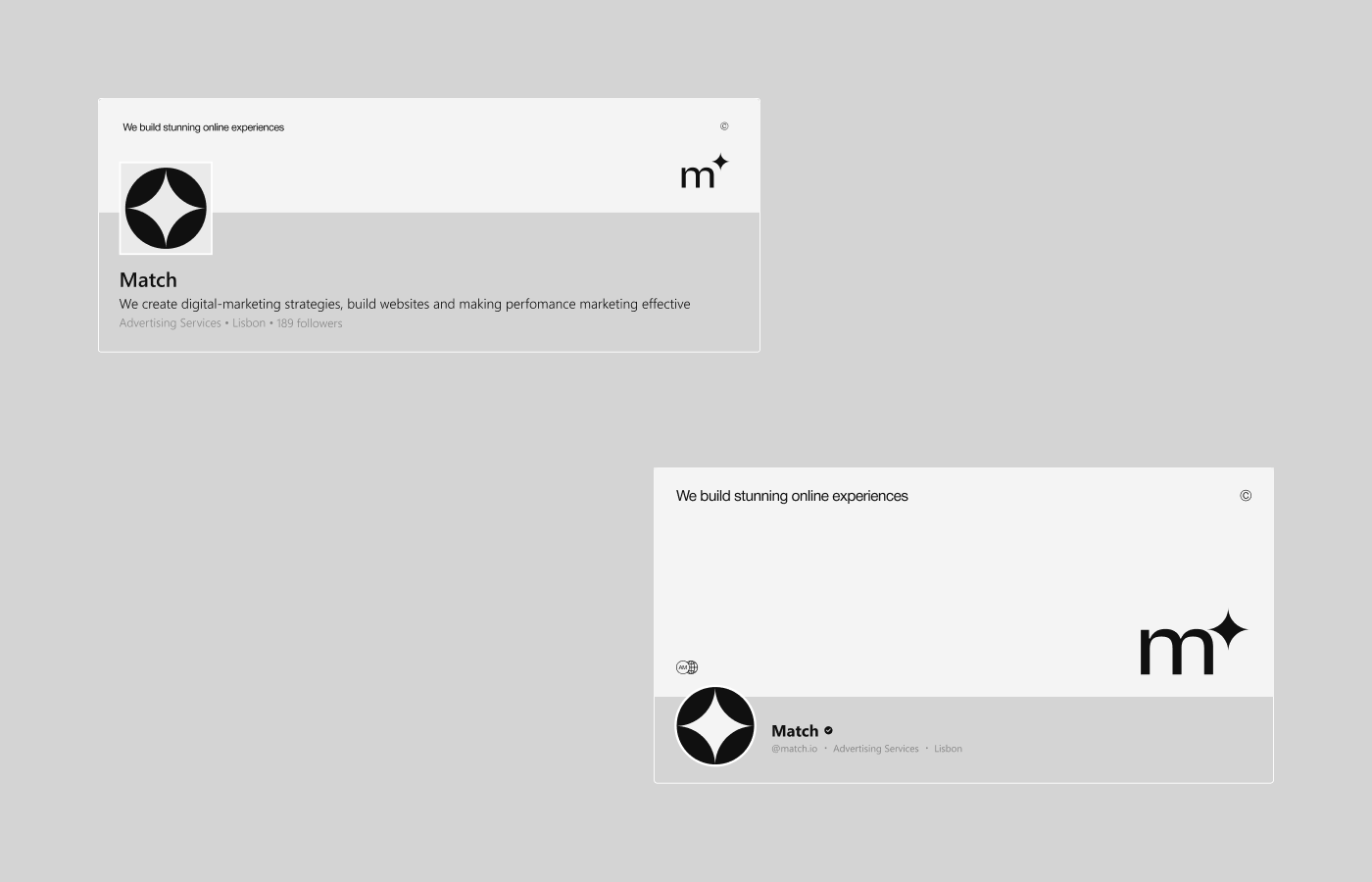
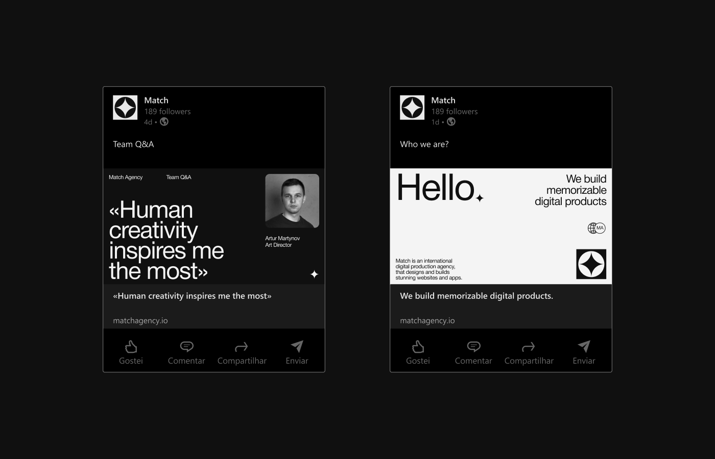
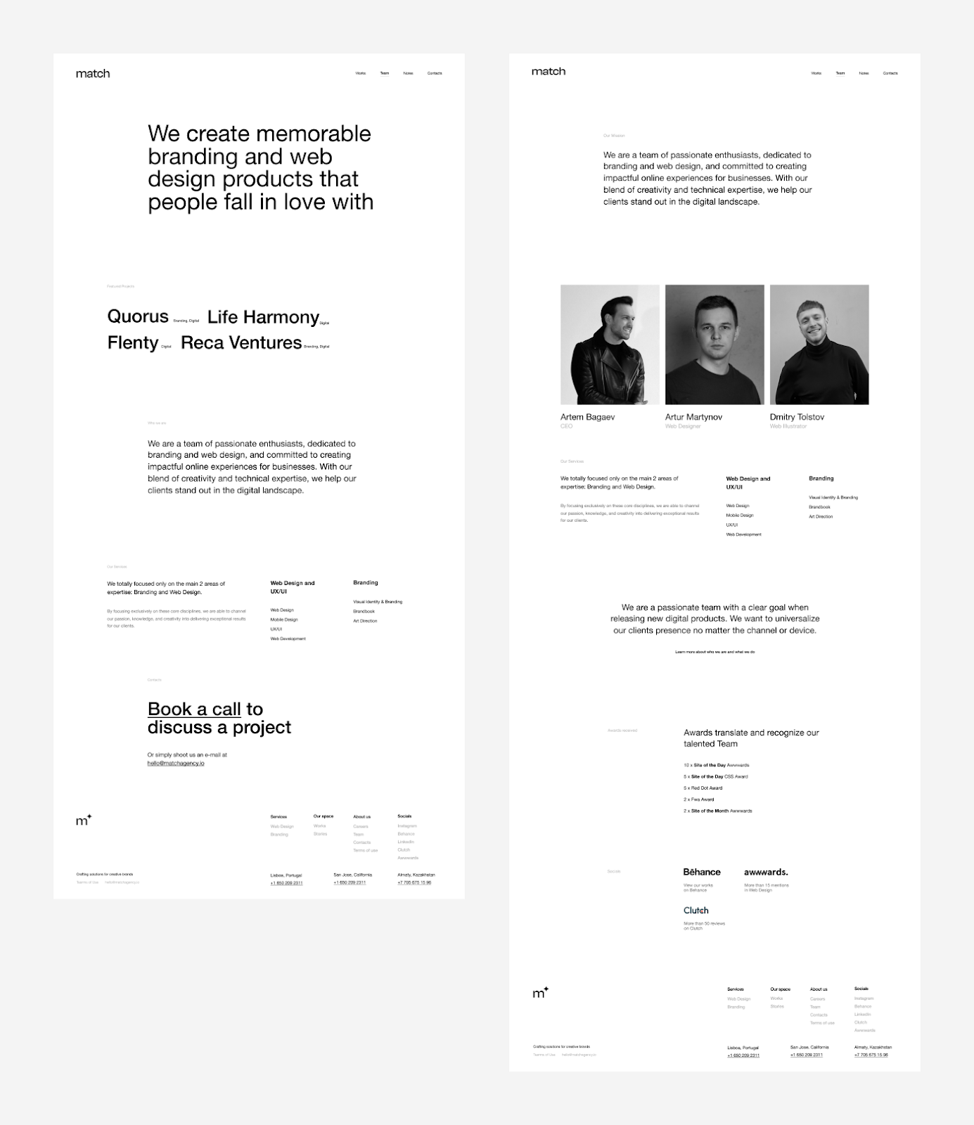
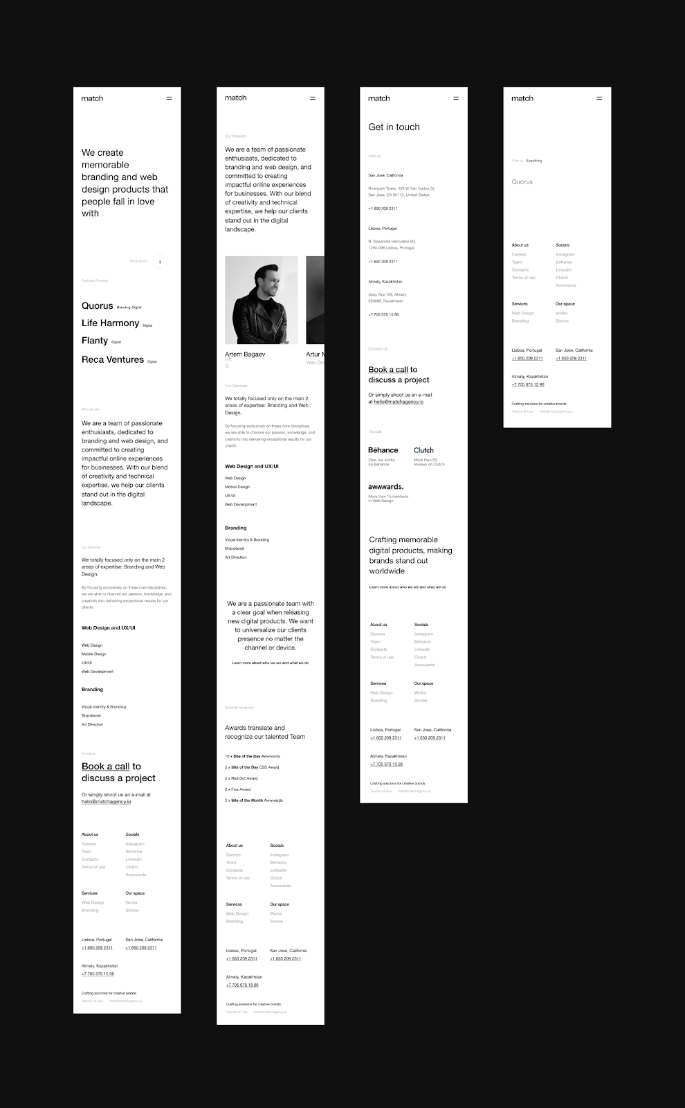
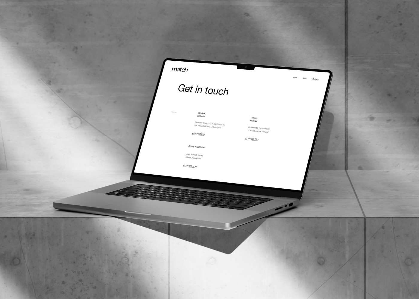
One of the standout features of Match Agency’s new brand identity is its black-and-white color palette. It’s a bold choice that conveys both elegance and modernity. Monochrome designs are often a popular choice in the design world for their ability to simplify the visual experience, making key elements pop. In Match Agency’s case, the stark contrast allows their branding and web design elements to remain sharp and distinct, guiding the viewer’s focus to what matters most.
The decision to go black-and-white reflects their confidence in minimalist design—stripping away unnecessary details and distractions. This minimalist approach is evident throughout the agency’s branding, from their printed materials to the web experience.
Typography plays a central role in this new identity. Match Agency chose beautiful, clear fonts that align with the overall clean look of the website. Their choice of type is not only aesthetically pleasing but also highly functional, allowing users to navigate content effortlessly. This decision echoes the essence of good web design, where form must follow function.
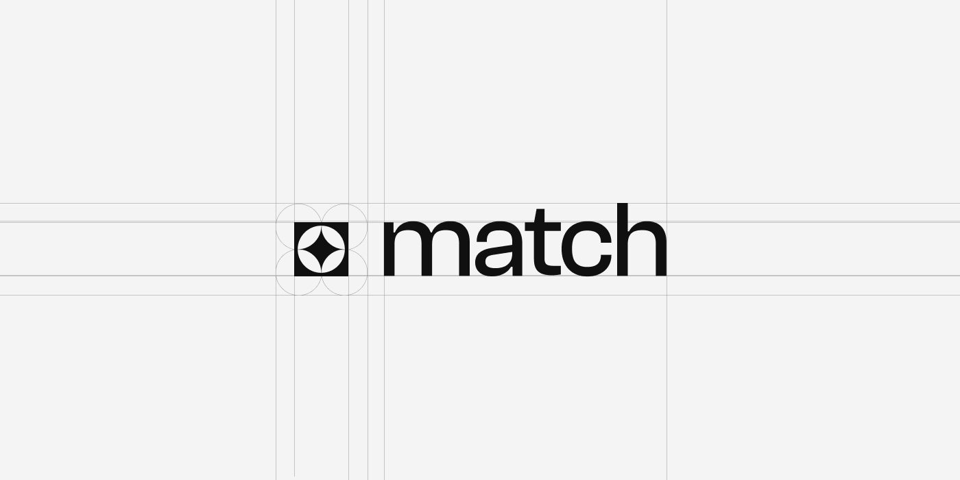
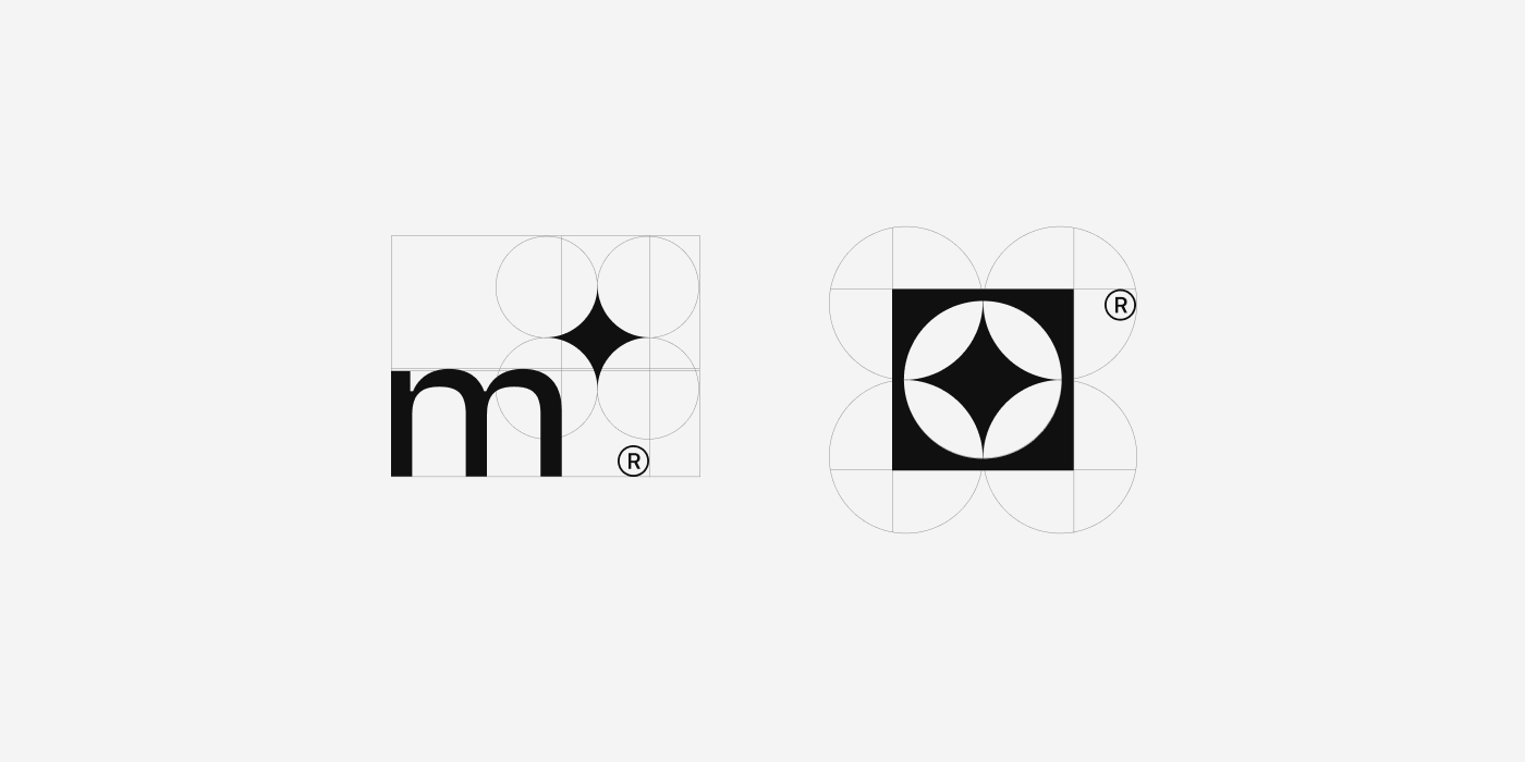
Another crucial component is their use of a grid system. Grid layouts are fundamental in design because they provide structure and harmony. For Match, it serves as an invisible guide that brings order to the layout, ensuring each element has a place and enhances the overall flow. The balance achieved by their grid system is subtle yet impactful, providing a seamless user experience across devices.
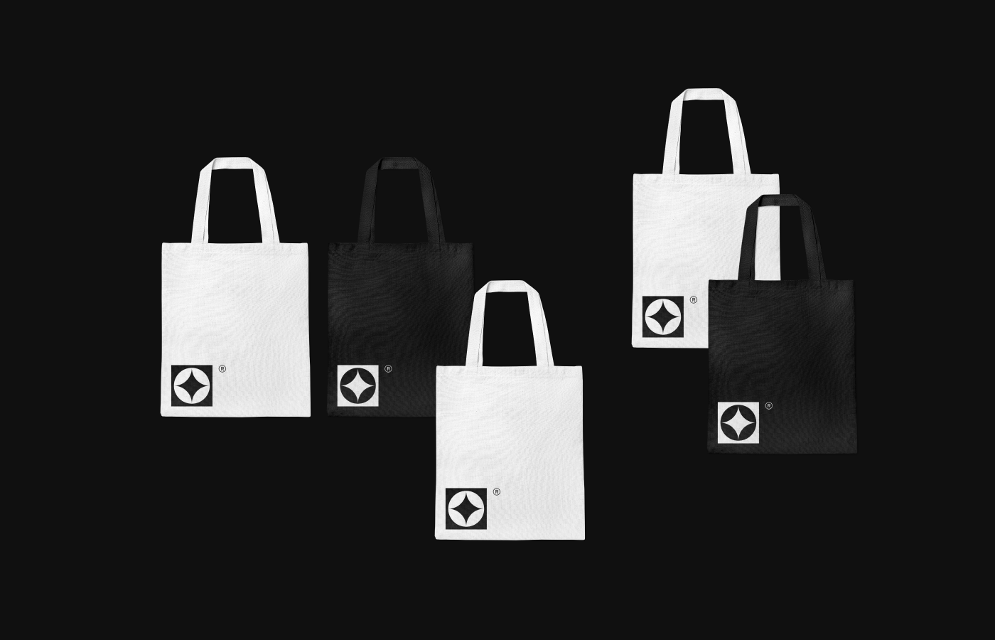
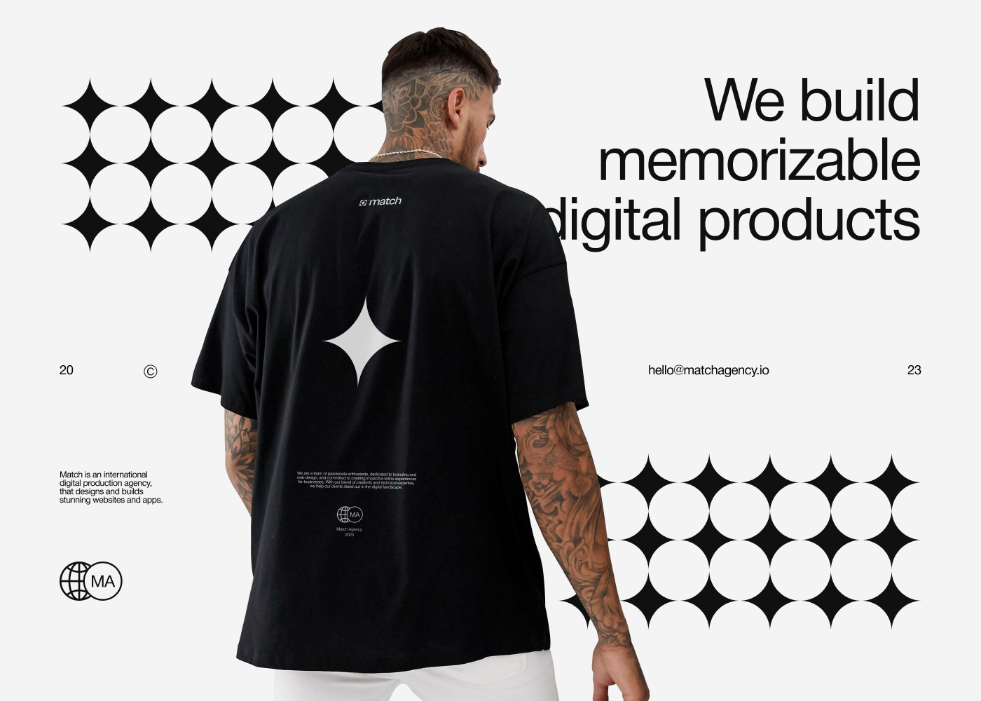
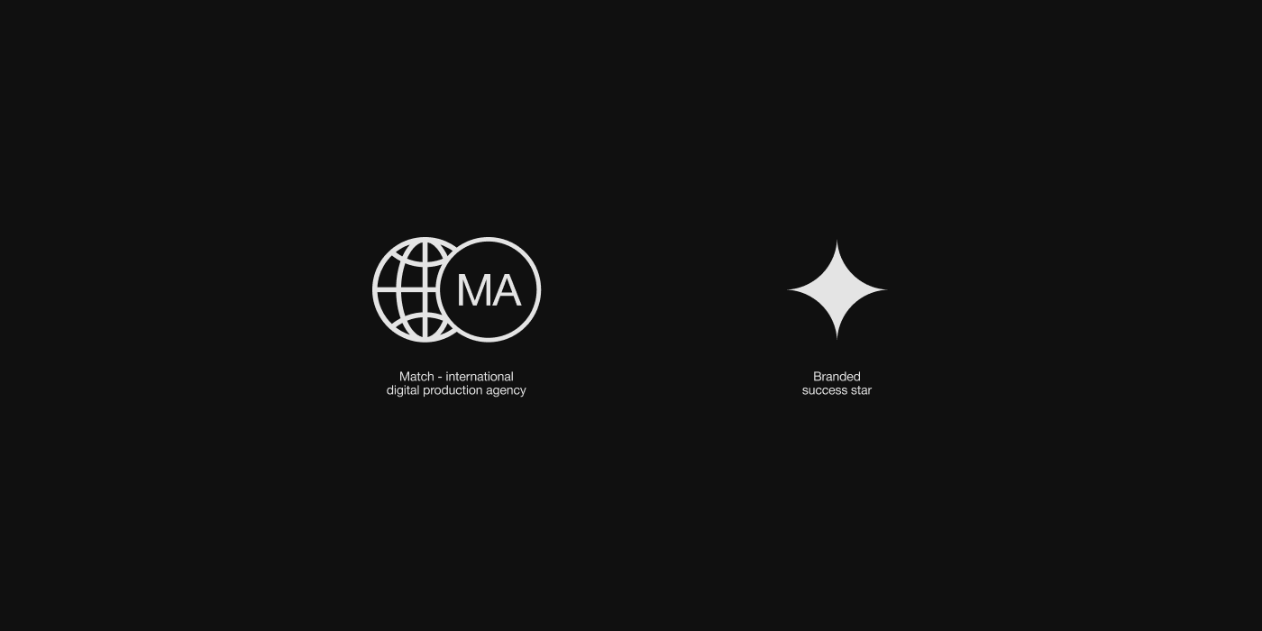
A notable addition to the brand identity is what the agency refers to as a “brutalist symbol.” Brutalism in design is known for its raw, unpolished, and often geometric approach. This simple yet striking logo reflects the agency’s ethos—direct, impactful, and not afraid to take bold steps. Geometrically simple symbols communicate trust and professionalism without overwhelming the audience.
The web design follows suit with a focus on simplicity, ensuring that users can find the information they need without clutter or confusion. The layout, consistent with the overall brand refresh, uses clean lines, negative space, and functional design elements to deliver a user-friendly experience.
This simplicity is what makes the website both beautiful and efficient. It encourages engagement while maintaining an air of professionalism. By minimizing distractions and guiding users naturally through their services and portfolio, Match Agency ensures that visitors stay focused on their message.
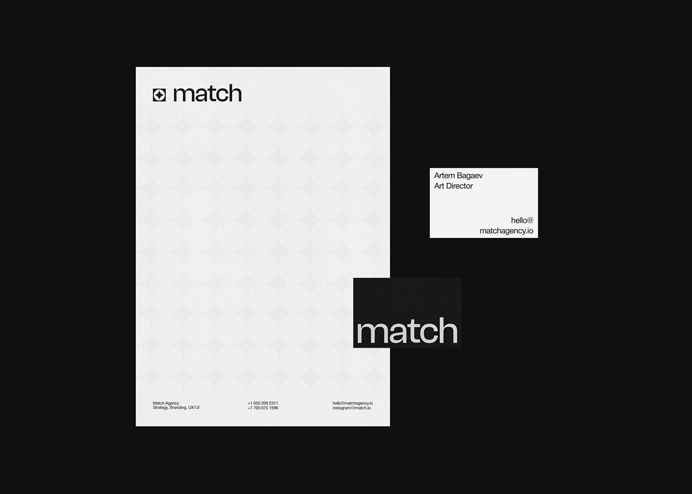
In addition to the website, Match Agency has also enhanced their physical brand elements. Their printed materials, including business cards, brochures, and other collateral, maintain the same minimalist ethos. These materials are sleek, embodying the agency’s philosophy of clean, high-quality design.
Whether interacting online or in person, Match Agency ensures consistency across all touchpoints, providing a cohesive brand experience.
Match Agency’s new branding and web design set a high standard for other agencies in the industry. Their bold use of a black-and-white color scheme, geometric simplicity, and clean typography create a striking, memorable brand presence. The emphasis on function, seen through their thoughtful grid layout and streamlined web design, proves that less can indeed be more. This redesign highlights the importance of aligning brand identity with web design for a unified and powerful customer experience.
To see the full brand transformation, visit their website at matchagency.io .
Branding and web design artifacts
For more information make sure to check out matchagency.io


