Matternity’s Bold Take on Branding and Visual Identity: Unveiled!
Discover Matternity’s refined approach to branding and visual identity, blending bold design with smart strategy.
Matternity’s approach to design stands out for its thoughtful integration of simple, yet strategic visual elements. The consultancy’s work, designed by GRUND – Creative Studio ( ), demonstrates a clear vision: to shape ideas that not only challenge traditional consulting but also generate positive change for brands and society.
A Clear Concept in Every Element
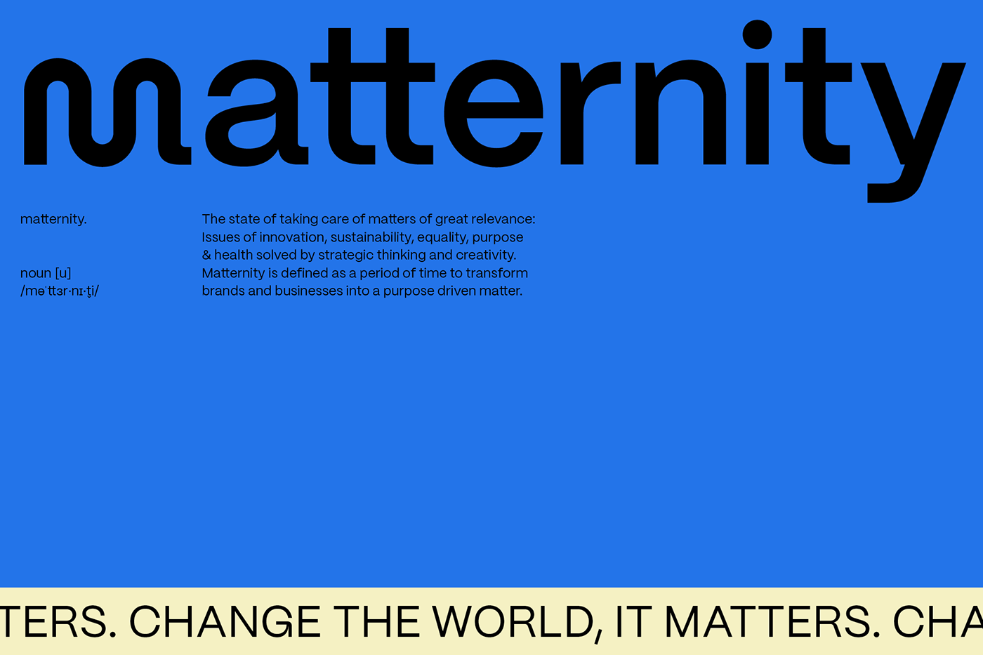
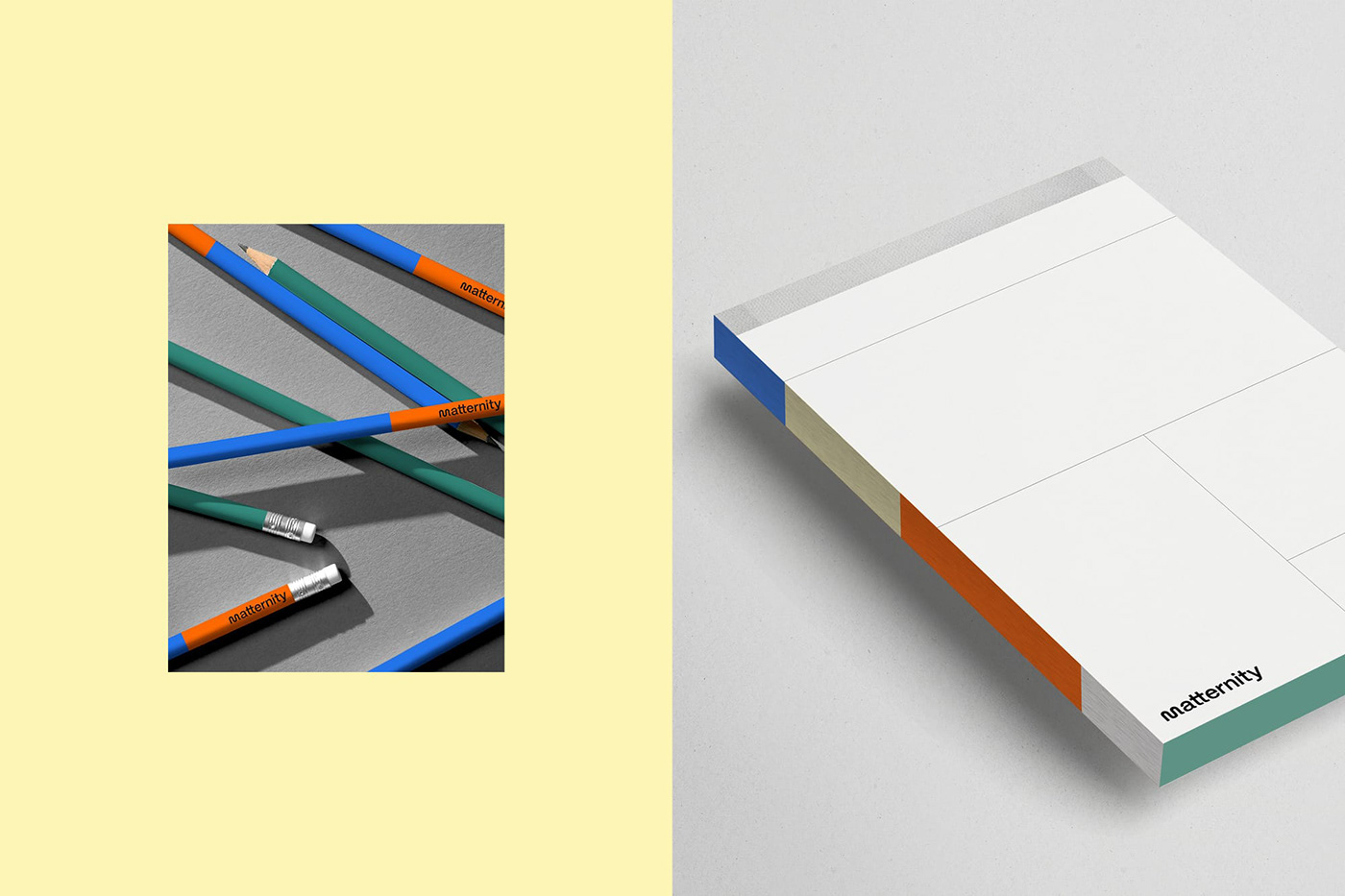
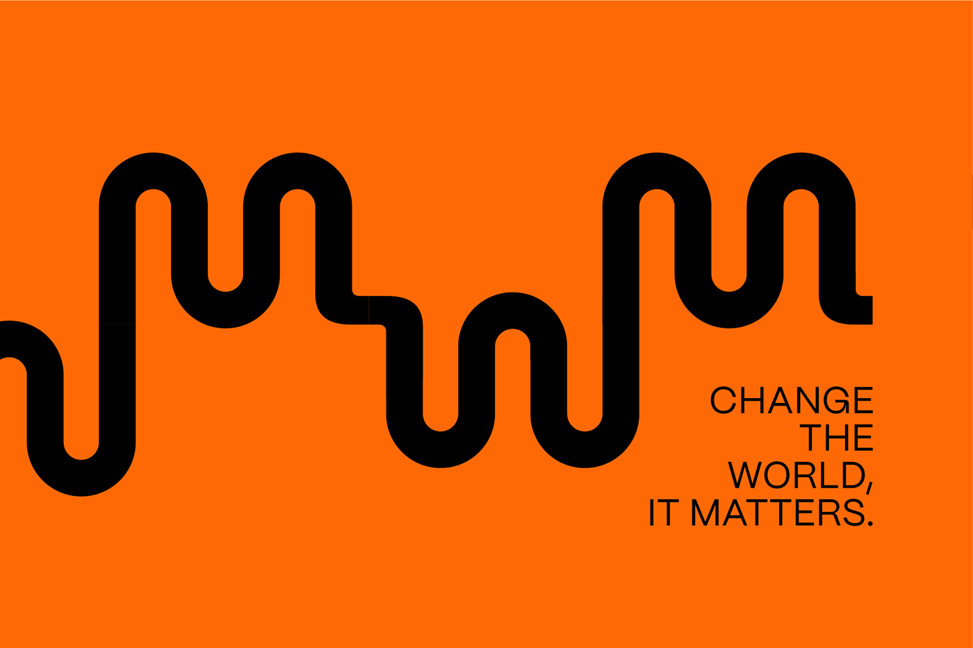
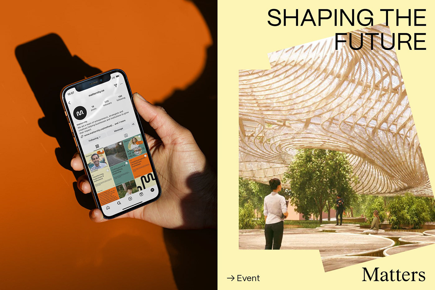
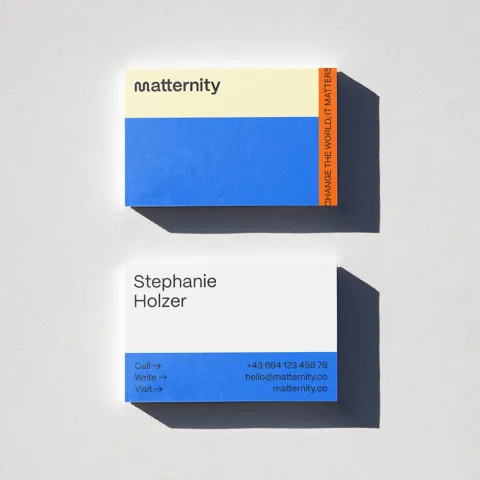
The work is anchored by a simple yet powerful logo—a customized “m” that signifies the beginning of something new. This singular mark works well on its own as a logomark, and when presented in a continuous form, it guides the viewer through Matternity’s forward-thinking narrative. By using a minimal symbol, the design communicates both clarity and modernity without relying on elaborate details.
Typography and Color: The Foundations of Visual Identity
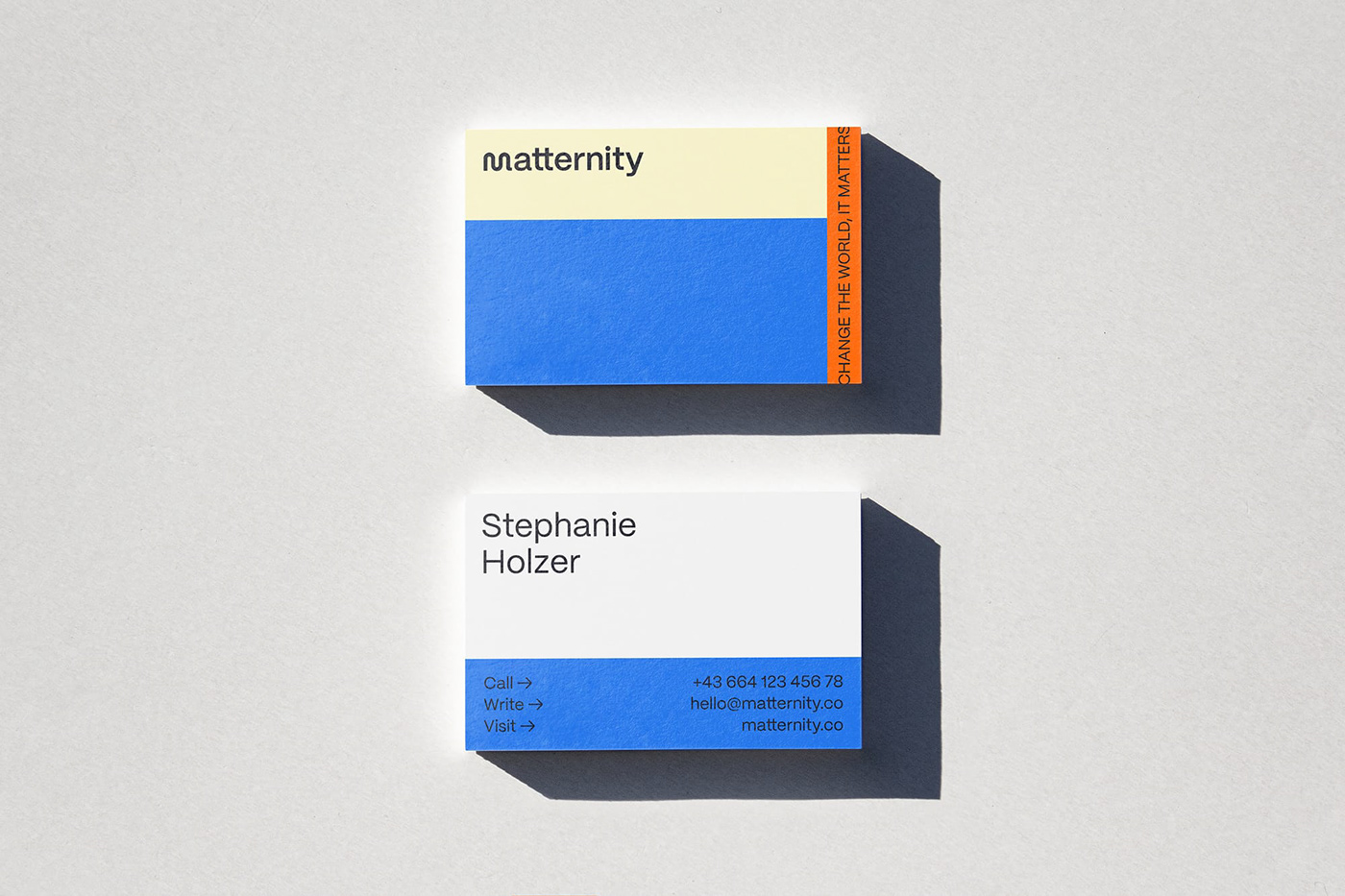
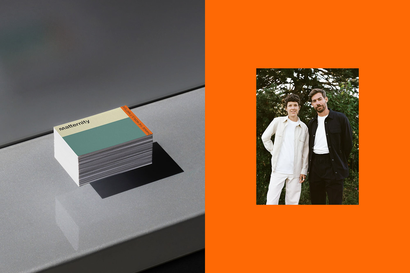
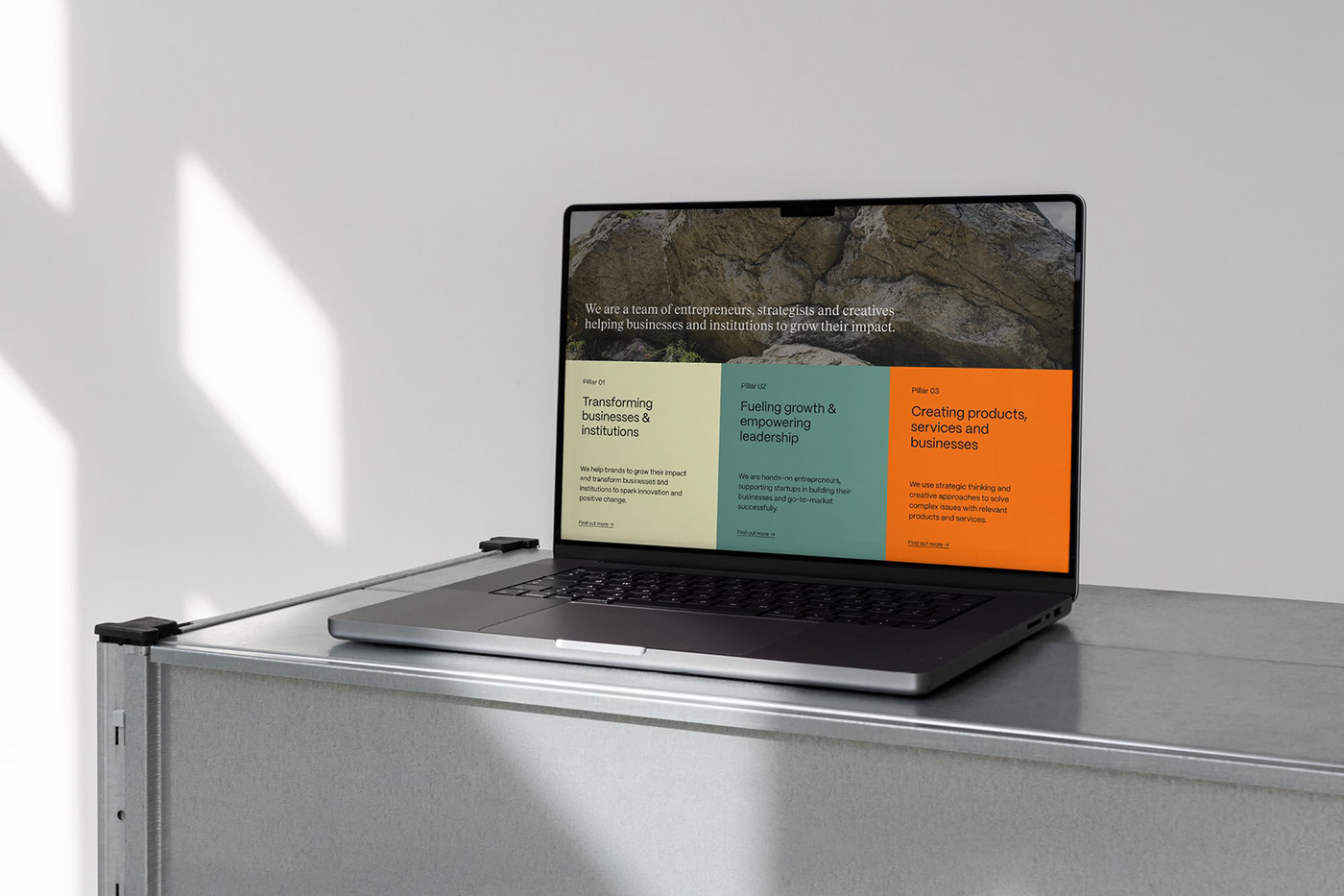
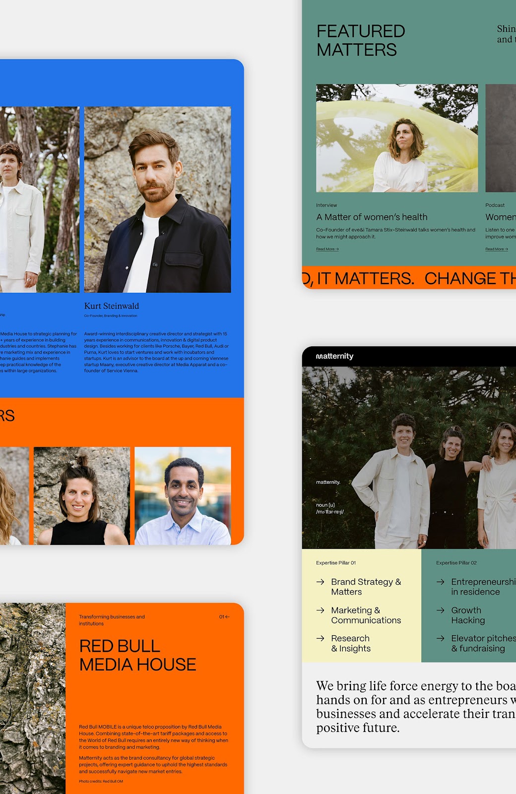
Drawing inspiration from contemporary Japanese design, the selected sans serif typeface adds strength and sophistication to the overall visual identity. The typography is chosen not for its flashiness but for its ability to reinforce a clean, strong presence. The modern color-blocking system adds another layer of clarity by highlighting key design elements, ensuring that every aspect of the branding supports a unified message.
Digital elements, like the animated marquee, further enhance the design by creating a dynamic space for current topics. This digital integration is a nod to the evolving landscape of design, where motion and interactivity have become essential to communicating a brand’s story. Each element—from the typography to the color palette—is selected with a clear purpose, resulting in a design that feels both accessible and refined.
Design with Purpose and Precision
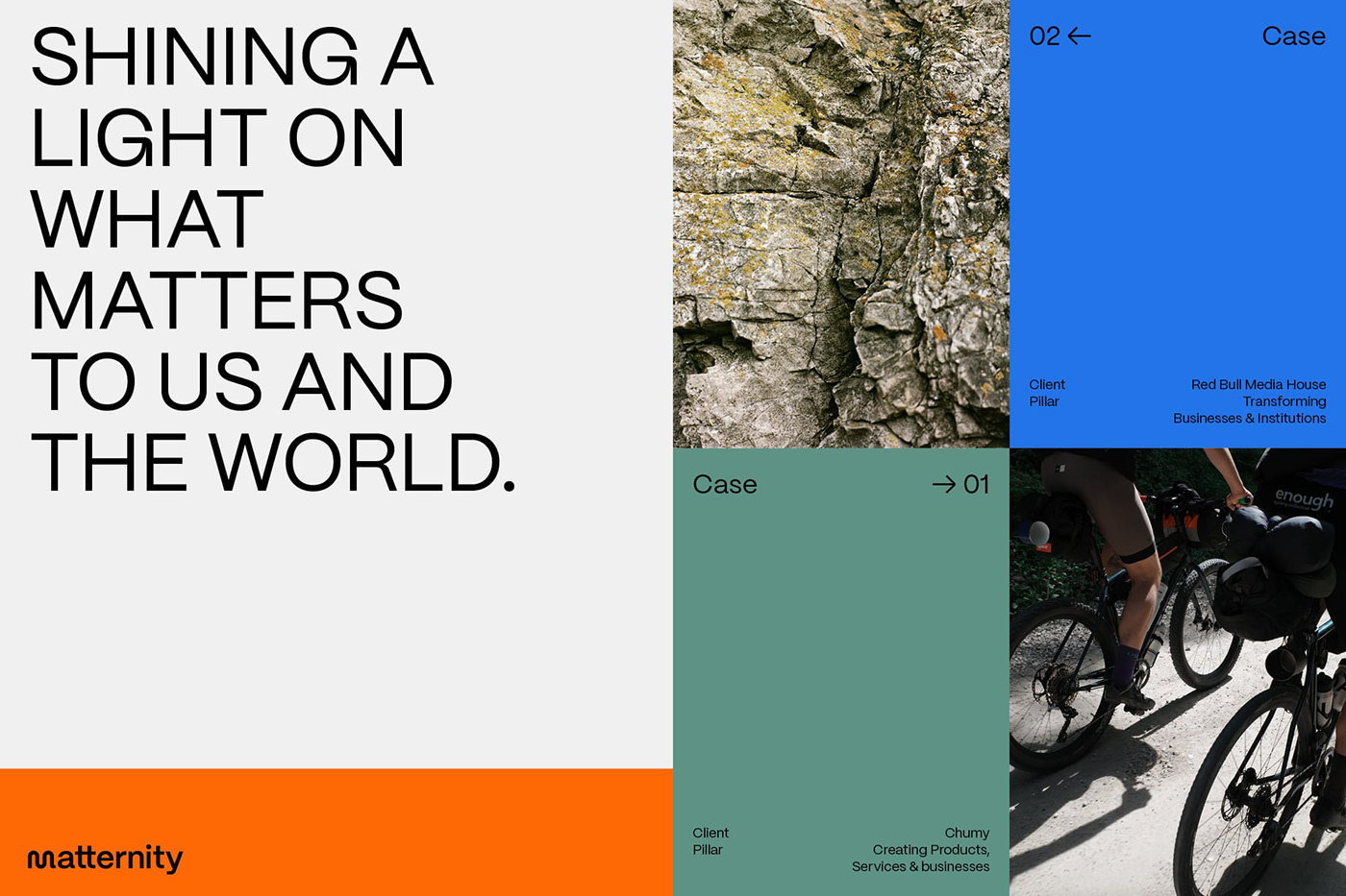
Matternity’s work emphasizes smart solutions for socially relevant issues. The use of a bold yet restrained color palette underlines the urgency of addressing modern challenges without resorting to overly dramatic statements. Instead, the design stays true to principles of clarity and honesty, echoing the advice of advertising legend David Ogilvy. This adherence to purpose over pretense ensures that the work speaks to a discerning audience.
The visual identity has been showcased across several platforms, including detailed project pages on Behance. These pages ( ) offer an in-depth look at the design process, revealing how each decision contributes to a cohesive narrative. The inclusion of multiple links to Behance projects illustrates a transparent approach, inviting viewers to explore and understand the thoughtful details behind the branding.
Key Takeaways
- Simplicity: A minimal logomark and straightforward typography serve as the backbone of the visual identity.
- Modern Approach: The use of digital elements and color-blocking reflects a keen understanding of contemporary design trends.
- Purposeful Design: Every element is chosen to support a clear message and to solve real-world challenges in a smart, visually appealing manner.
Matternity’s project stands as a refined example of effective branding and visual identity. By focusing on clarity and purpose, the design not only captivates but also communicates essential values without resorting to exaggeration. Readers are encouraged to explore further details via the Behance pages linked within the project description.
Learn more about this inspiring work at: https://studiogrund.com/
Branding and visual identity artifacts