by abduzeedo
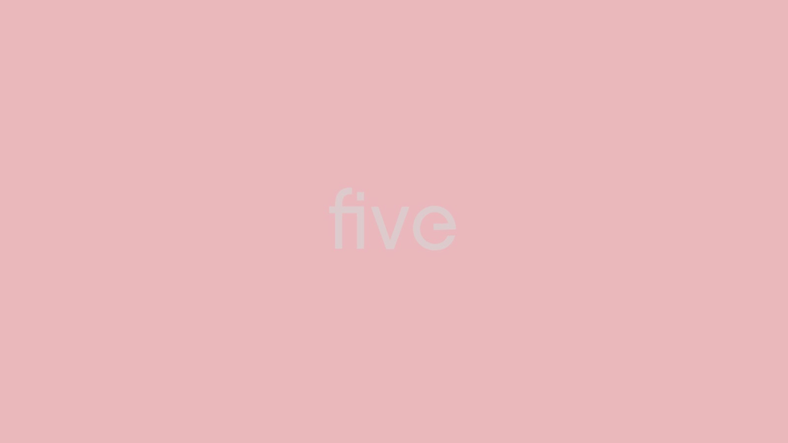
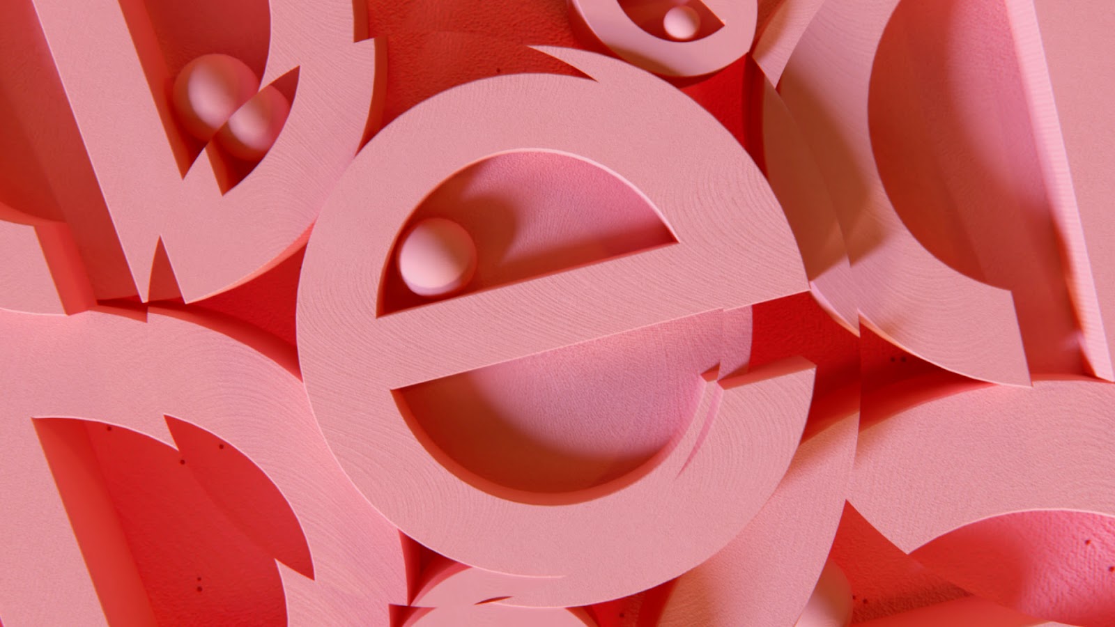
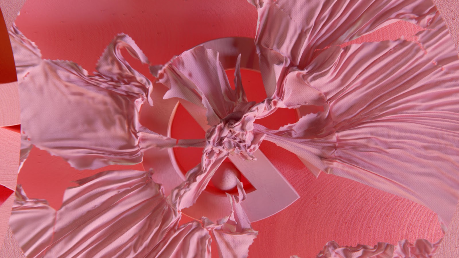
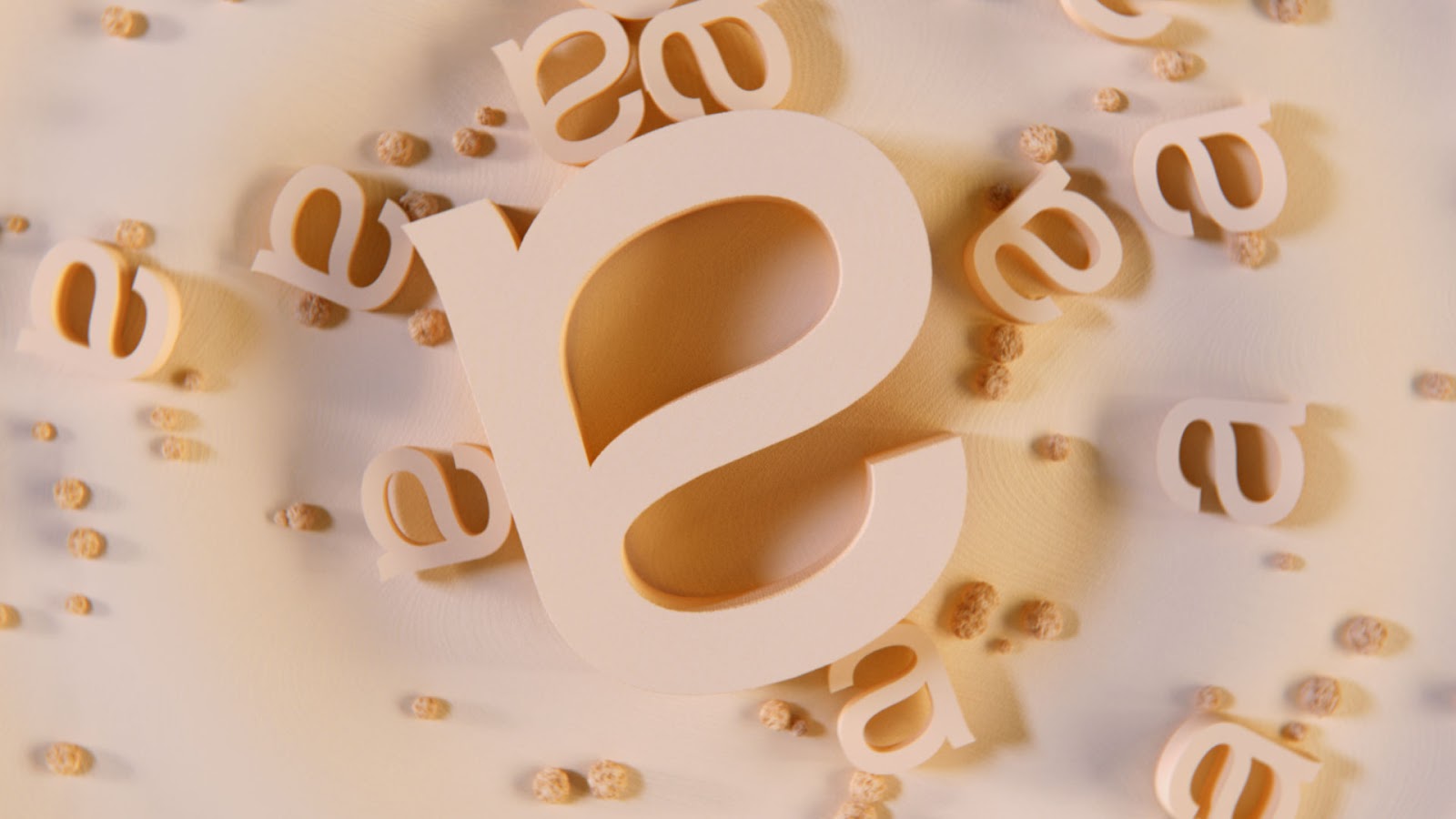
‘Five’ is a typographic romp through the five senses by 3D artist Sebastian Helene and London based sound studio Resonate. In other words, it's a beautiful motion design achievement playing with typography.
Sebastian has always been inspired by what can be achieved through design within limitation. For ‘Five’ the rule was: Use the letters of the five senses as the foundation of the film, they are the driver, and everything must derive from them. This limitation sparked some interesting and unexpected results.
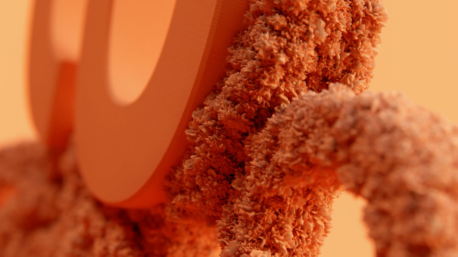
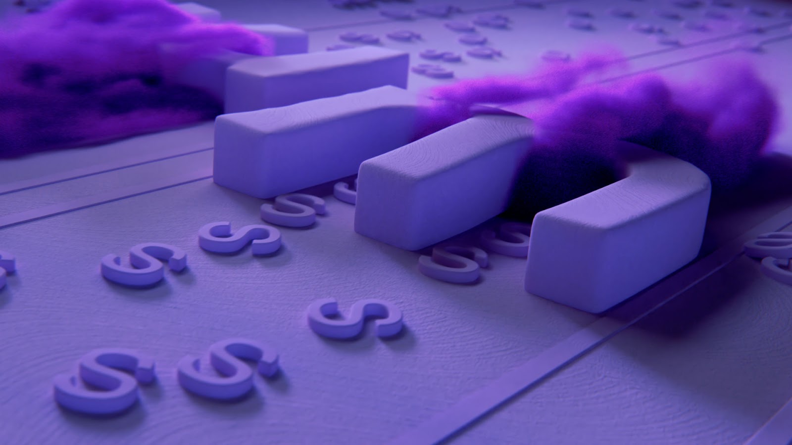
Visualizing each sense came with its own unique set of challenges and required some lateral thinking. For example, how do you visualize hearing something with letters?
Sebastian decided to represent the act of hearing by having letters drawn to a source, almost like they are incoming sounds. The ground they move on also undulates reminiscent of the way sound interacts with water. Accompanying the letters are furry spheres, a visual nod at microphone wind muffs.
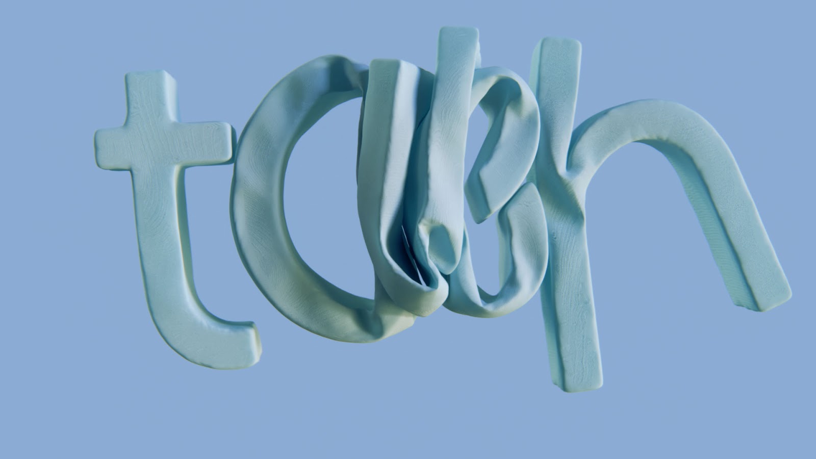
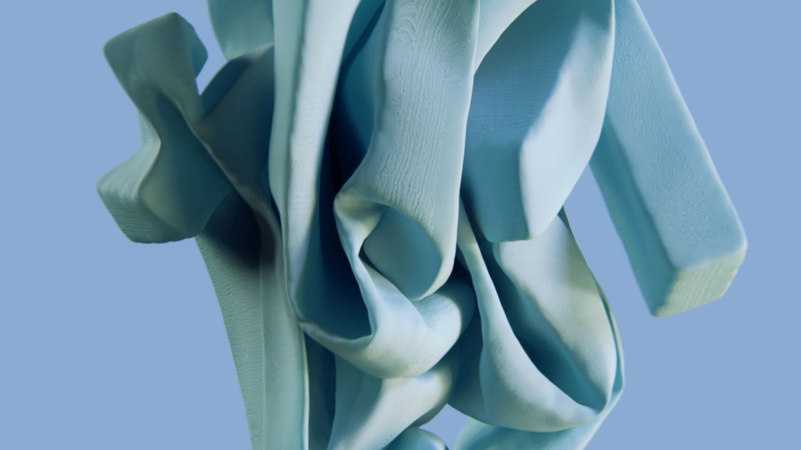
As the film is about multiple senses, it made sense to have multiple styles of animation, both 2D and 3D. Sebastian opted to have each sense be introduced by a typographic title screen where all the letters found within that sense would animate in a way which represents it.
For more information on the project and how Sebastian ideated the other senses go to: http://www.sebastianhelene.com/five-short-film
Film
Stills