by AoiroStudio
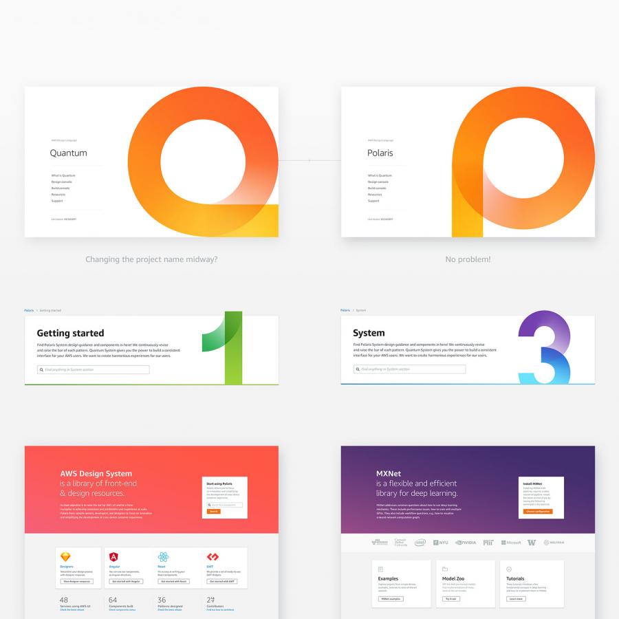
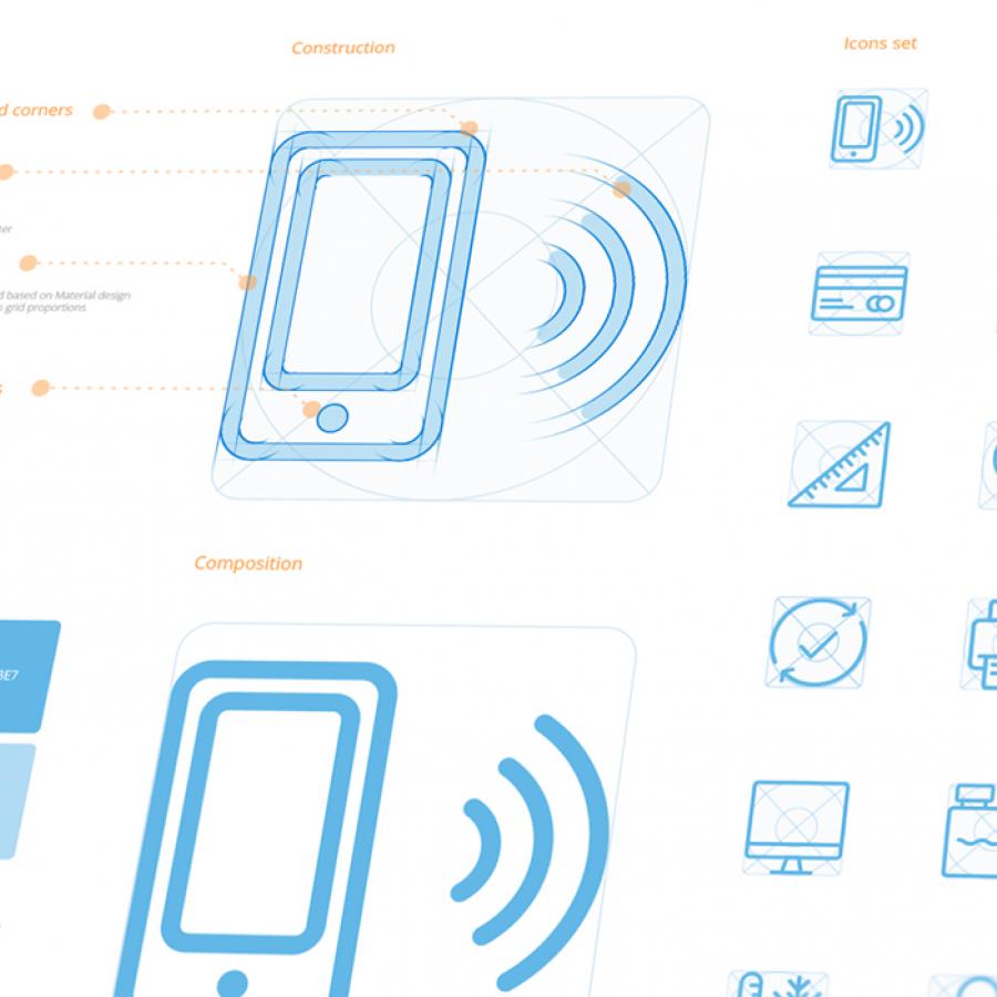
As of late, I have been building my second 'design system' at my workplace. It's funny how much things go smoother, faster, and what I have learned on my first visual system months ago are now applied. For this inspiration, I wanted to share what inspired me during this process in terms of 'visual design', what inspired me in terms of typography style, layouts, colors, and presentations applied to their component libraries. Essentially how their 'design system' is presented, I believe we all follow somehow a similar standard in terms of UI components and how we build our pattern libraries. This roundup is more a visual study to see how various studios, brands, and companies actually share their 'design system' internally and/or through the design communities.
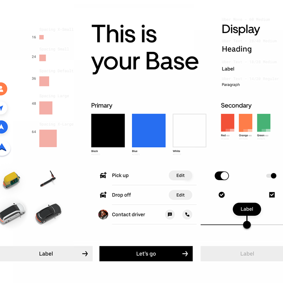
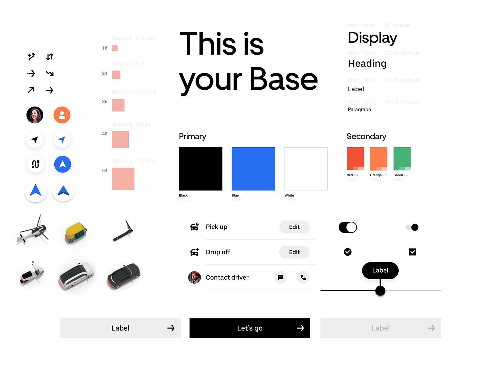
By Uber
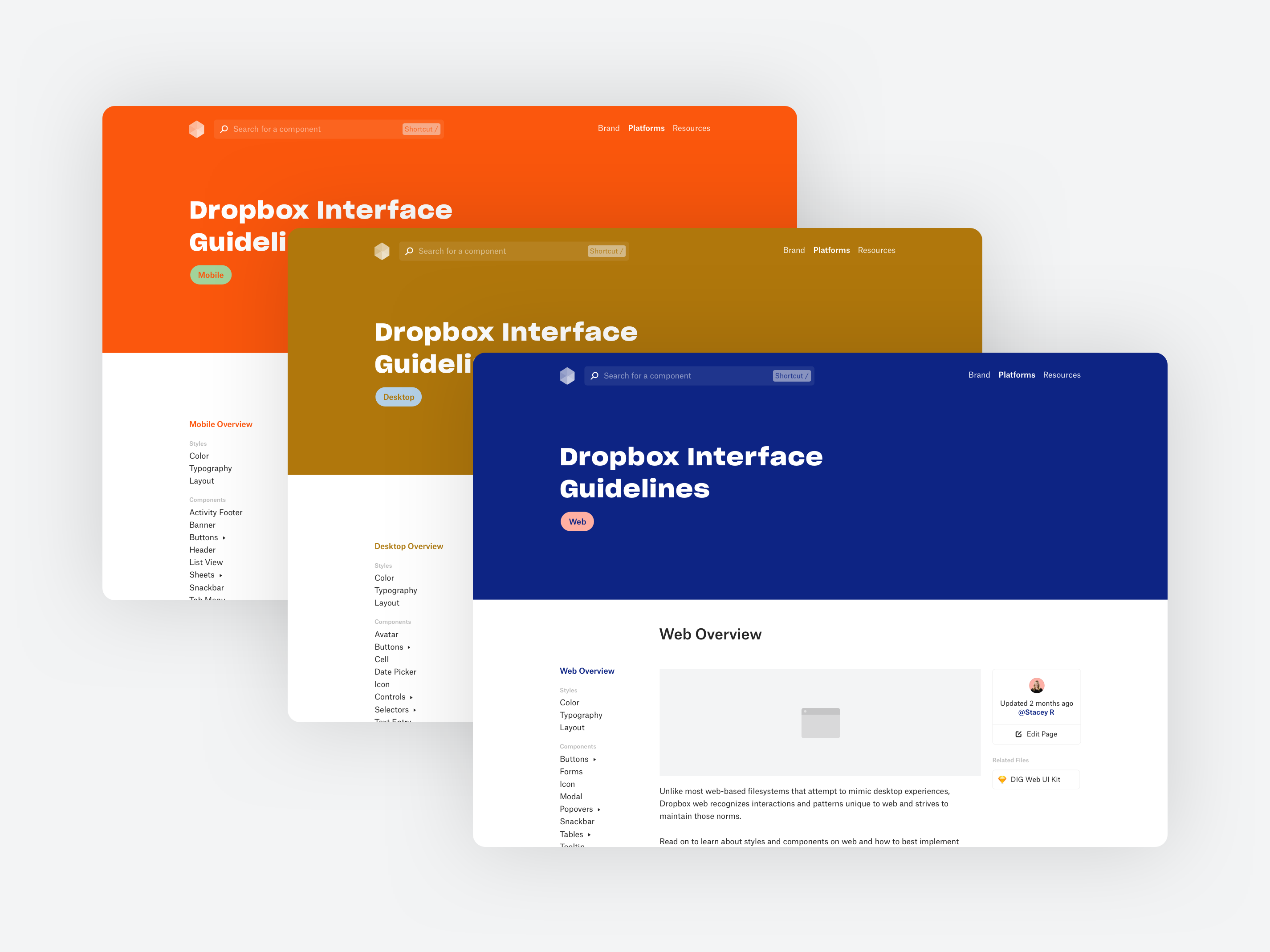
By Dropbox Design
By Filip Justić
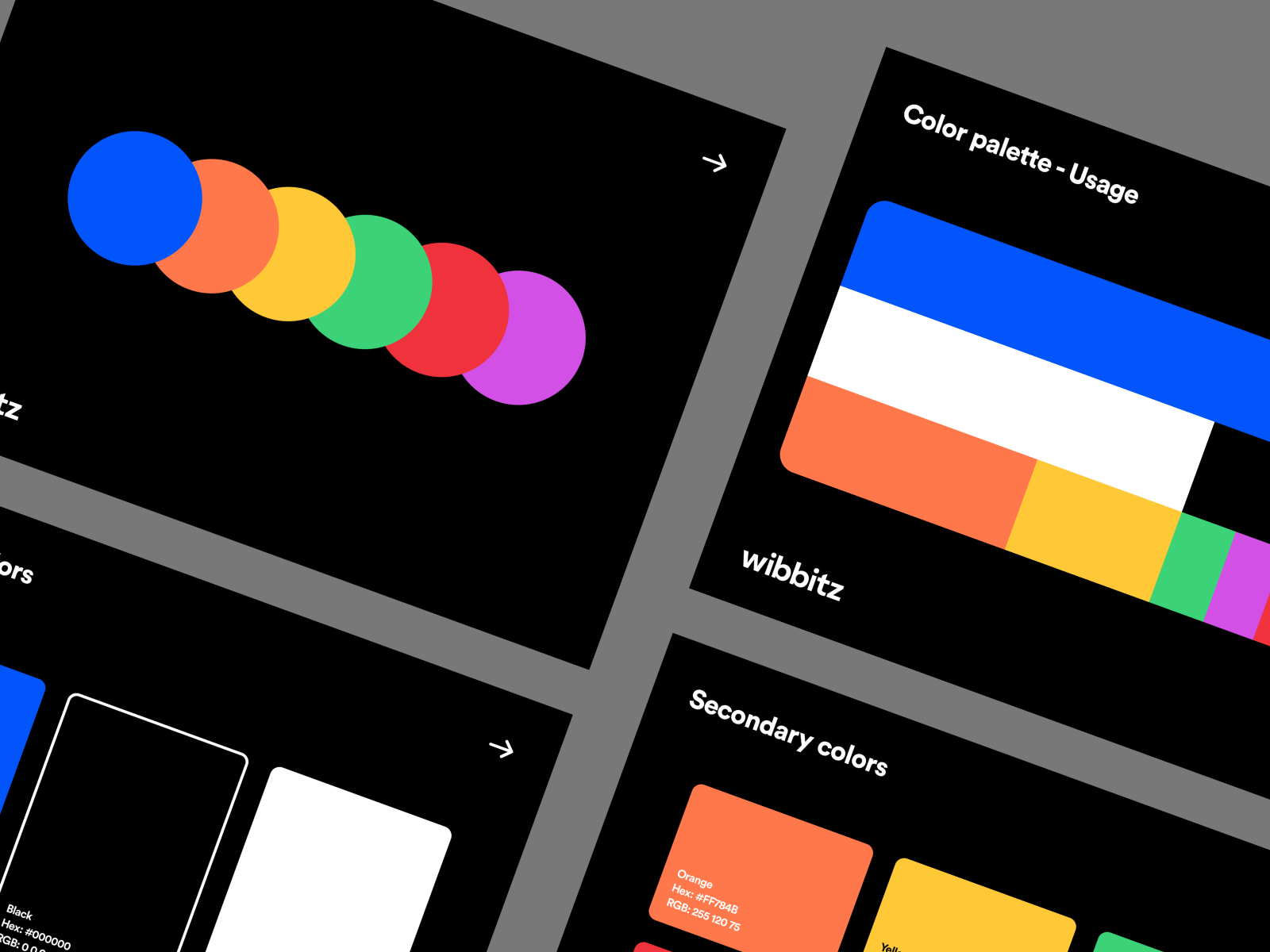
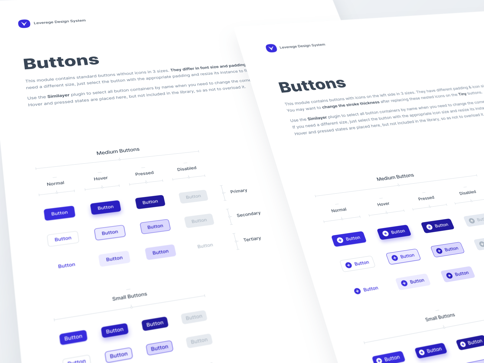
By Leverege
By Craftwork Inc.
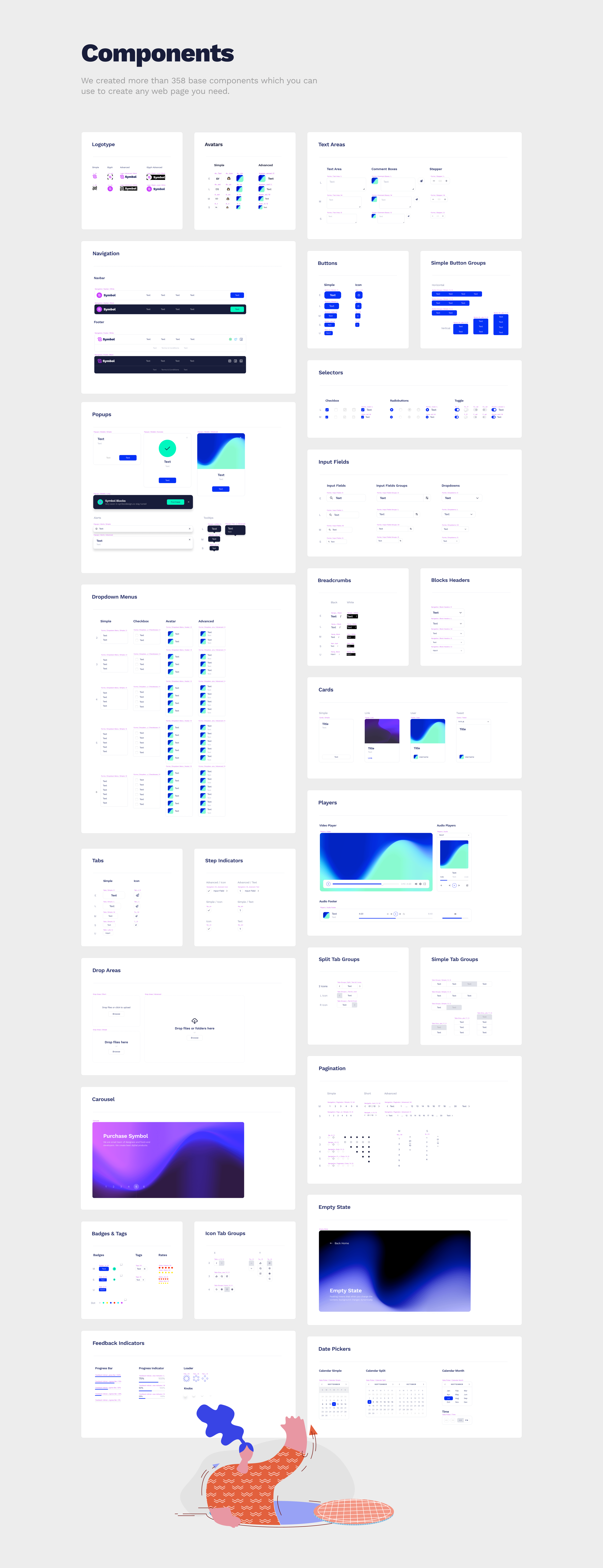
By RED
By Nguyen Le
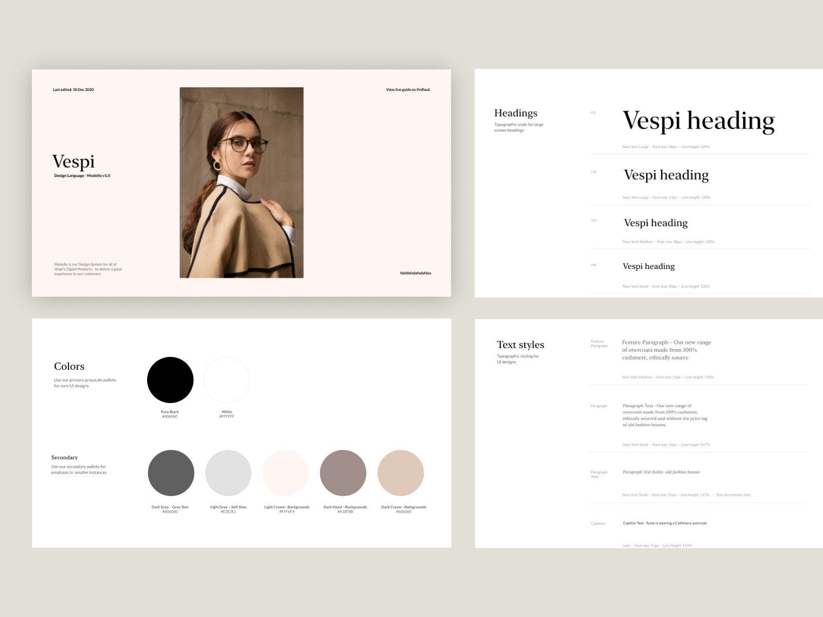
By Aaron Poe
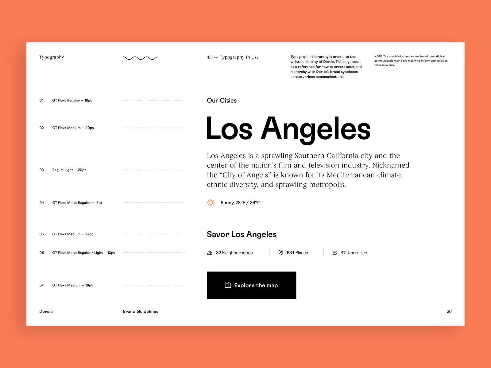
By Julien Renvoye
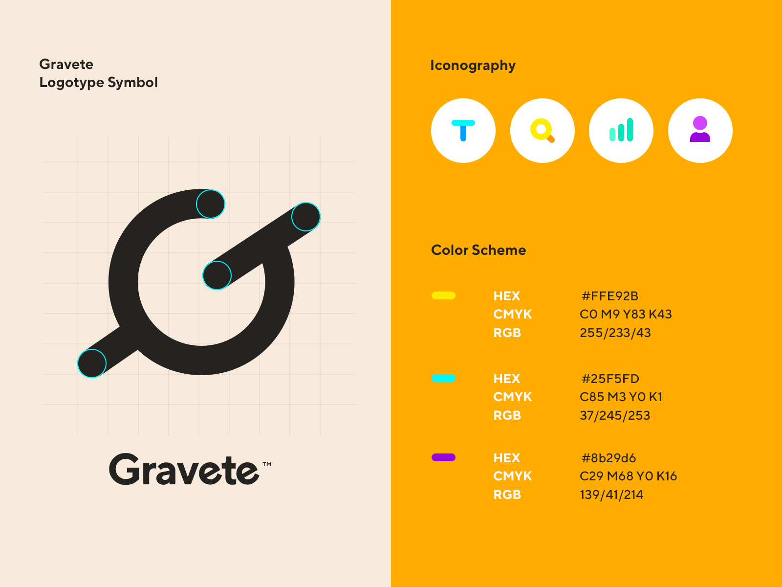
By Wojciech Zieliński
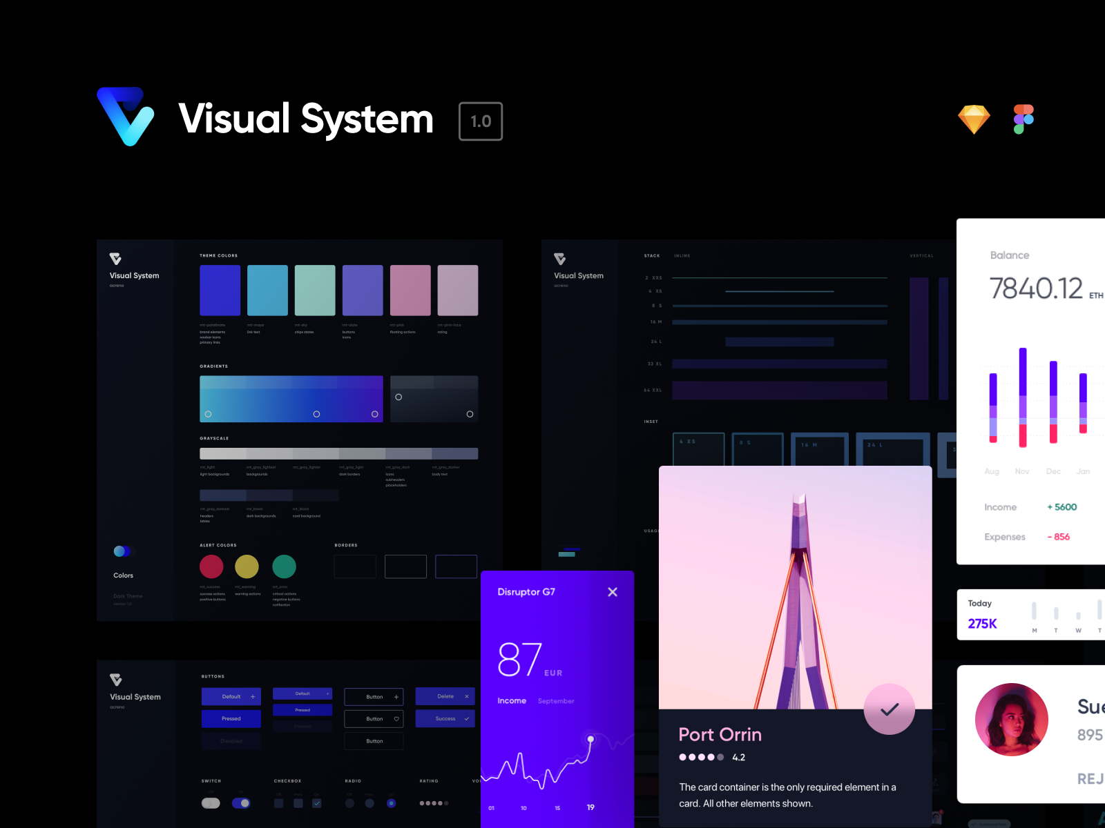
By MetaLab
By Handsome
By Wisely
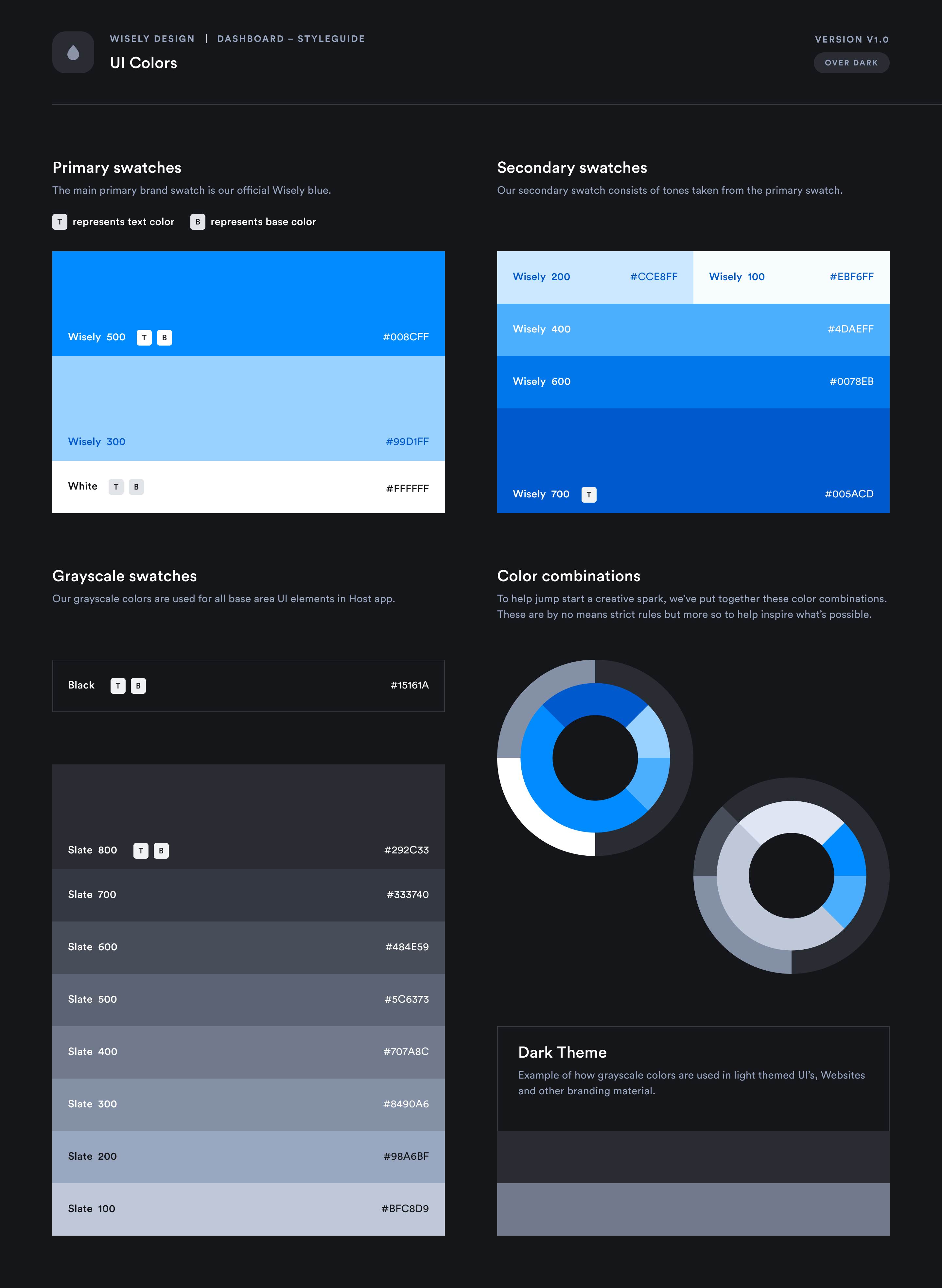
By Adam Ho
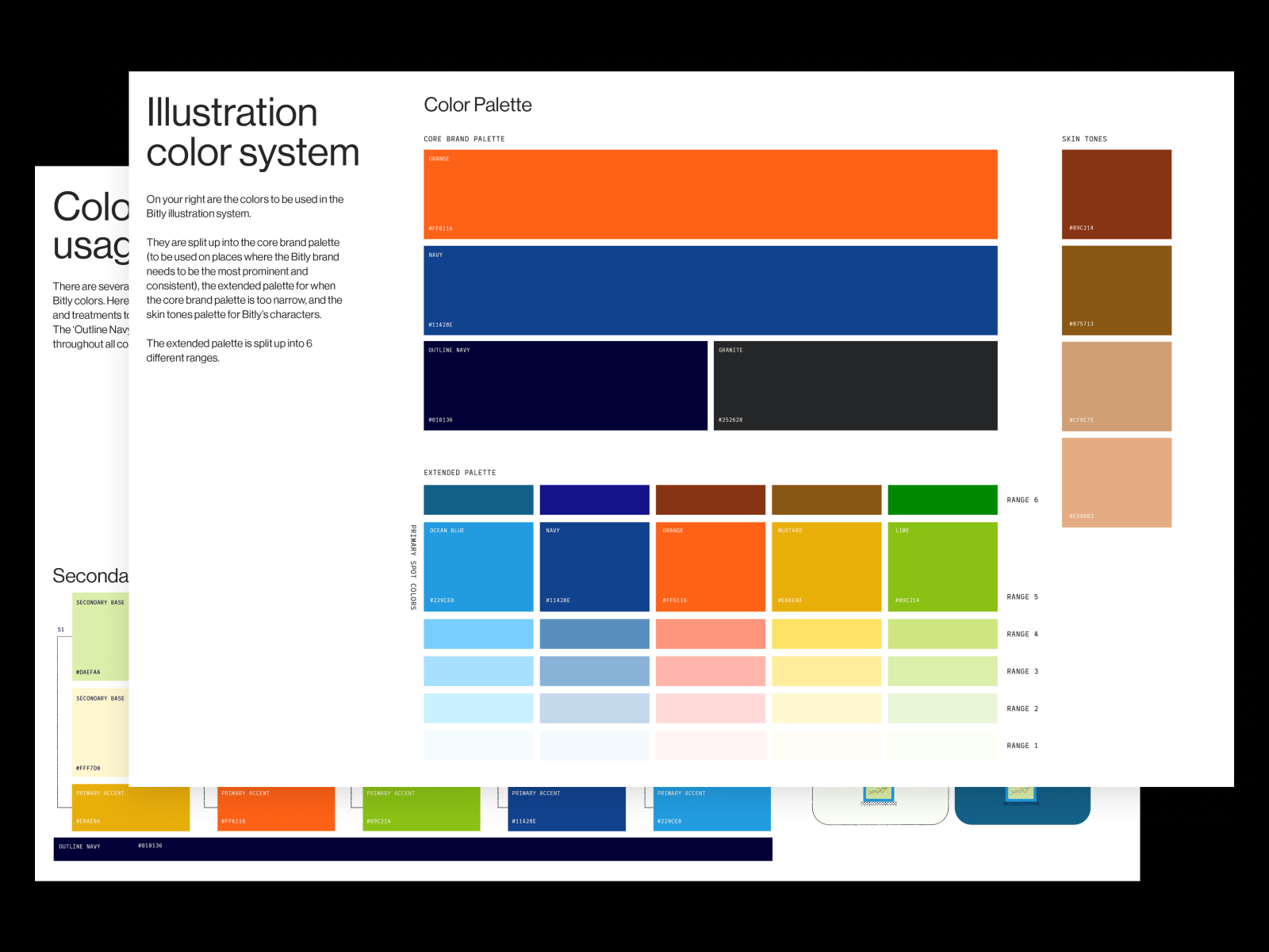
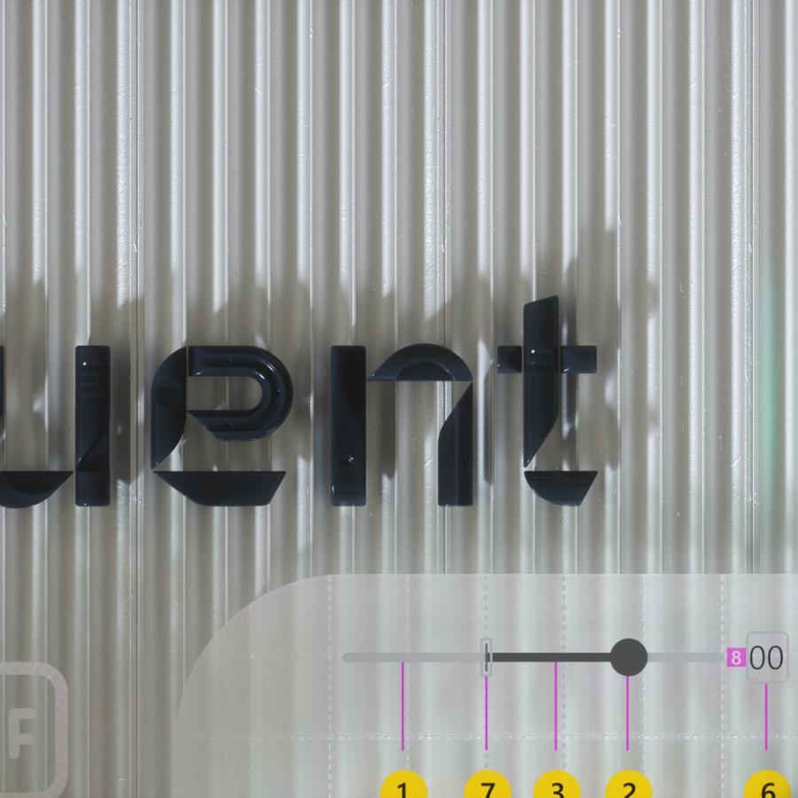
By intent
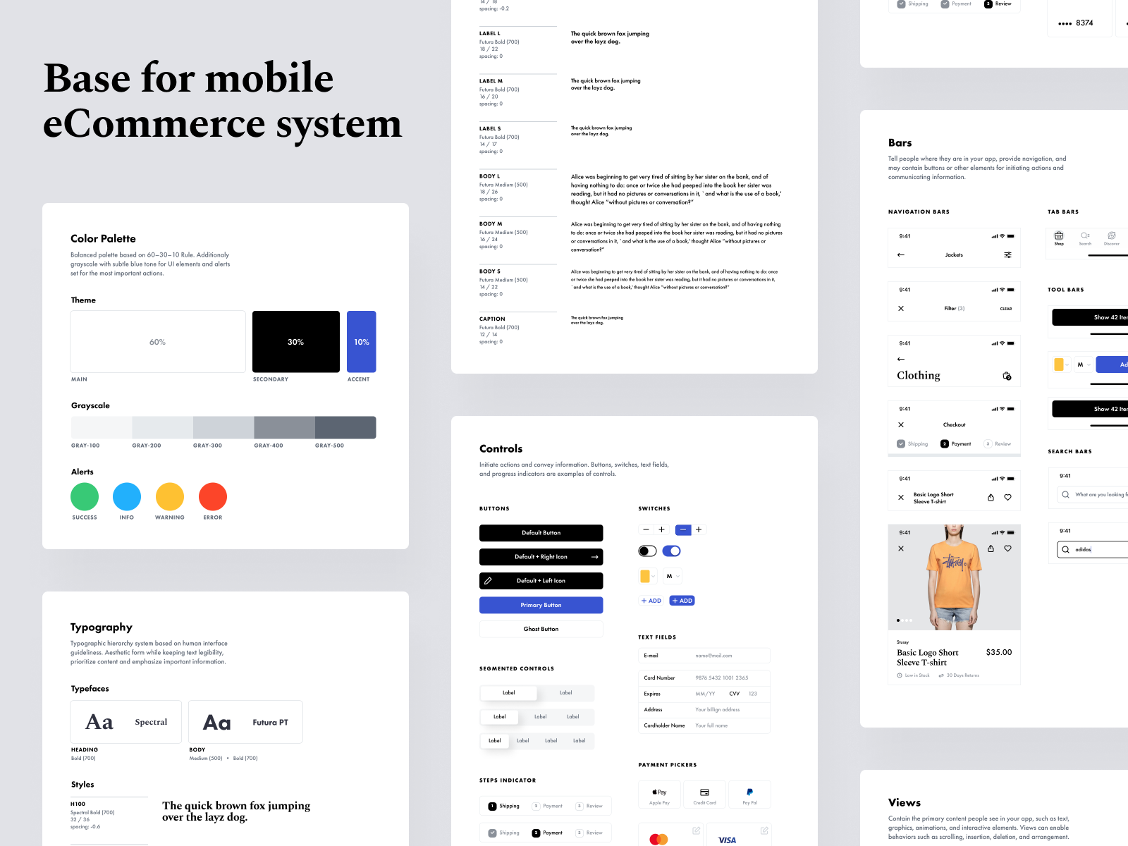
By Heartbeat Agency
By Greg Dlubacz
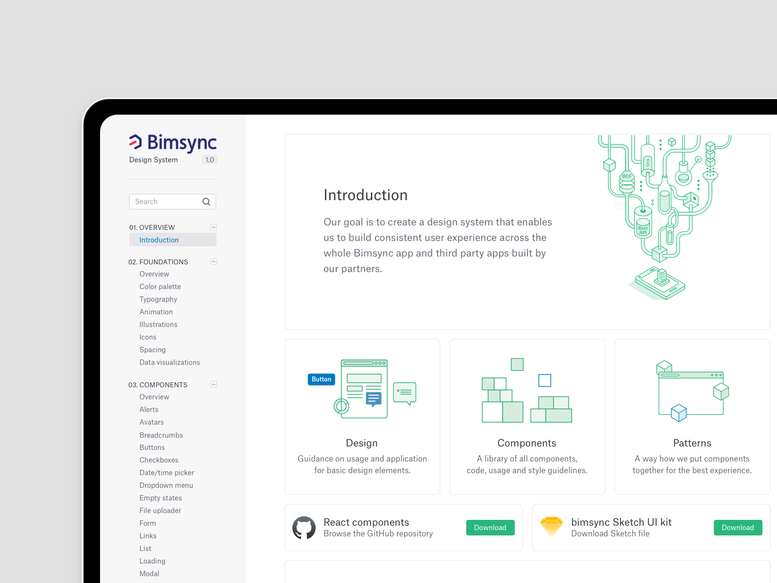
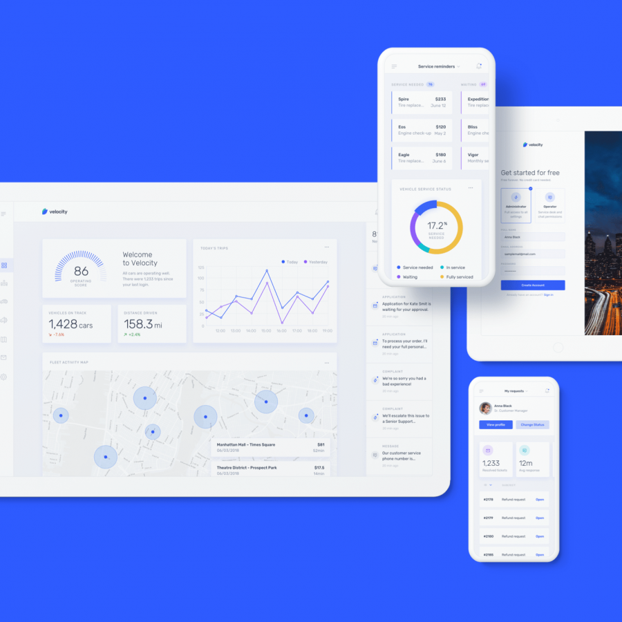
By Leverege
