by abduzeedo
okay so is an online platform that targets Gen Z, in which teenagers can ask questions about sexuality, identity, and relationships. The app is supported by experts on a wide range of topics that are readily available to provide accurate and well-informed answers.
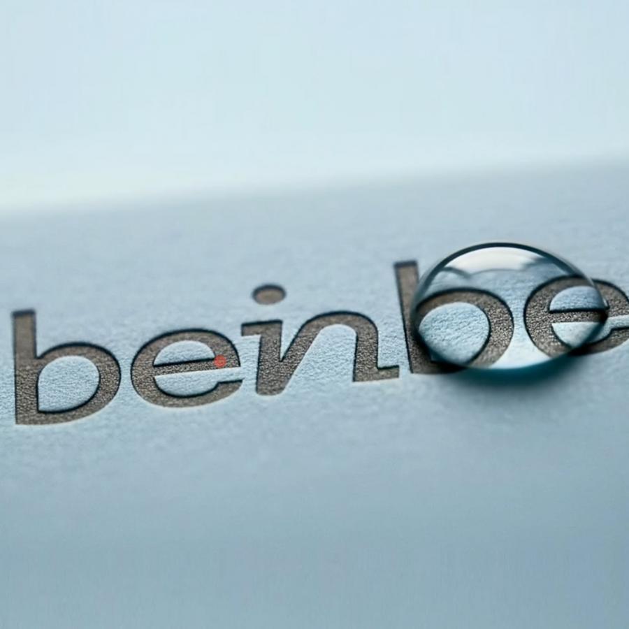
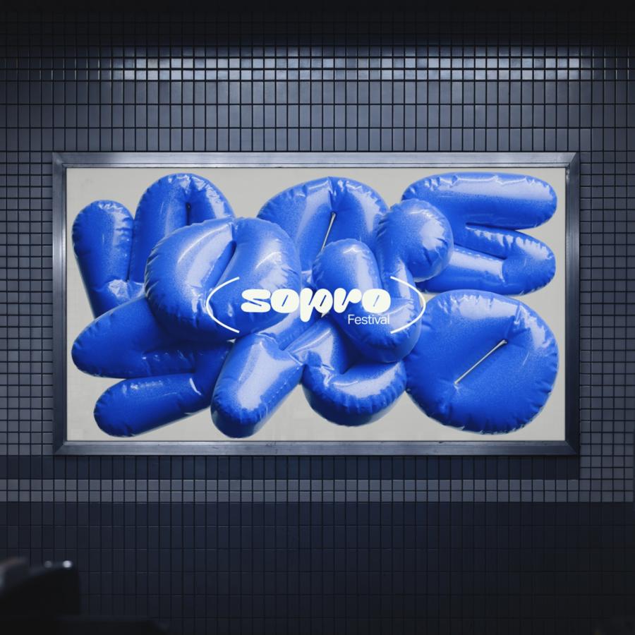
The Branding People — tbpmx created a graphic system that visually combines fun and seriousness to educate and make their audience feel safe, creating an open and shameless community. Therefore a high-contrast pastel color palette was curated along with a progressive logotype and a friendly emoji iconography set. These elements are complemented with suggestive illustrations related to sexual education were created.
Okay So playful perspective is represented through a caring and a mischievous design that transmits an inclusive, informative, and helpful brand that always provides the correct answer. The answers you’re looking for.
For more information make sure to check out the branding people on:

