by abduzeedo
Discover how Fable&Co. revitalized Conrad Group's branding and visual identity, emphasizing its core values and future-forward vision. This case study explores the strategic use of design elements, color palettes, and typography to create a modern, impactful brand presence.
Fable&Co. embarked on a transformative journey to revitalize Conrad Group's brand identity, aiming to capture its established reputation, creative spirit, and ambitious growth plans. The design agency sought to create a visual language that resonated with Conrad's core values of independence, trust, and results-driven operations, while highlighting its focus on innovation and collaboration.
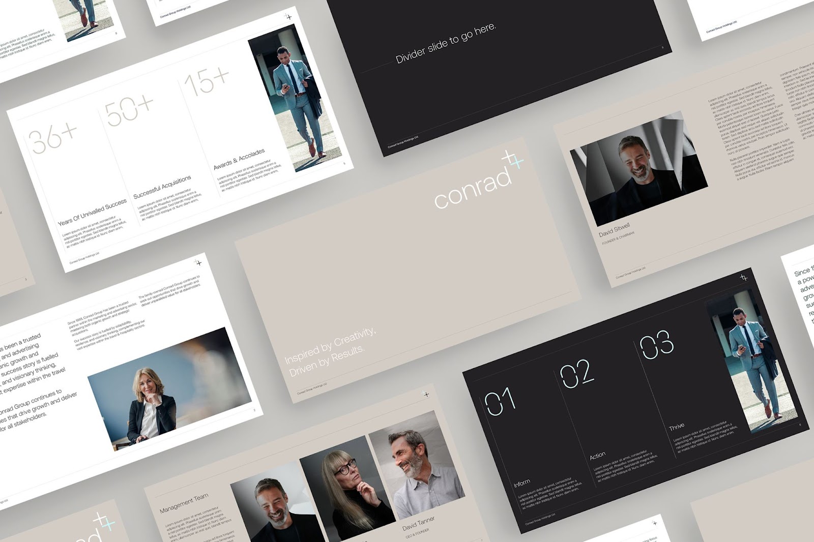
The new brand identity needed to strike a balance between professionalism and creativity, appealing to both new and existing audiences. Fable&Co. achieved this by infusing Conrad's rich history with a modern, sleek aesthetic. The resulting design exudes a sense of sophistication and forward-thinking, reflecting the company's commitment to growth and its potential for future success.
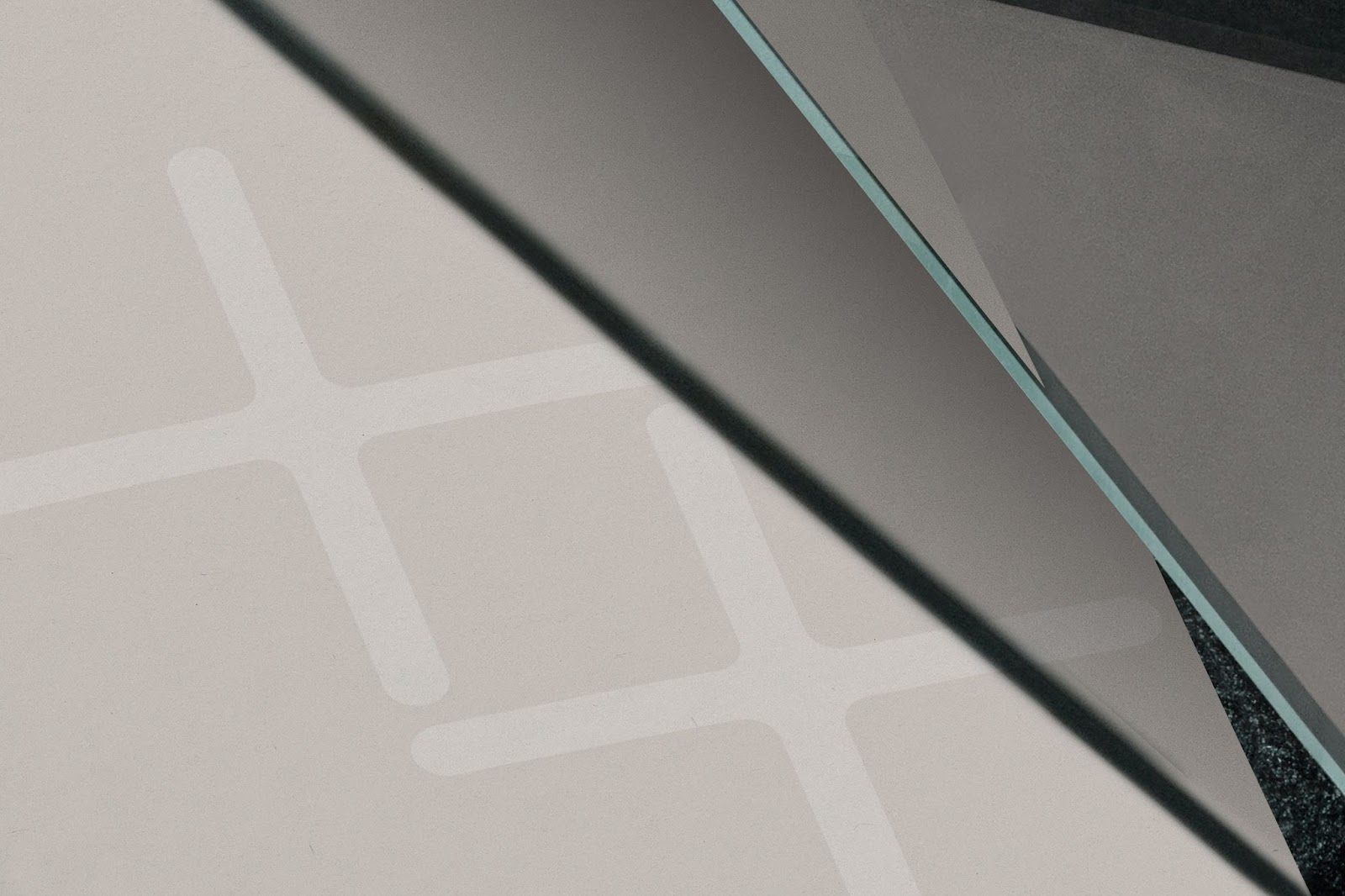
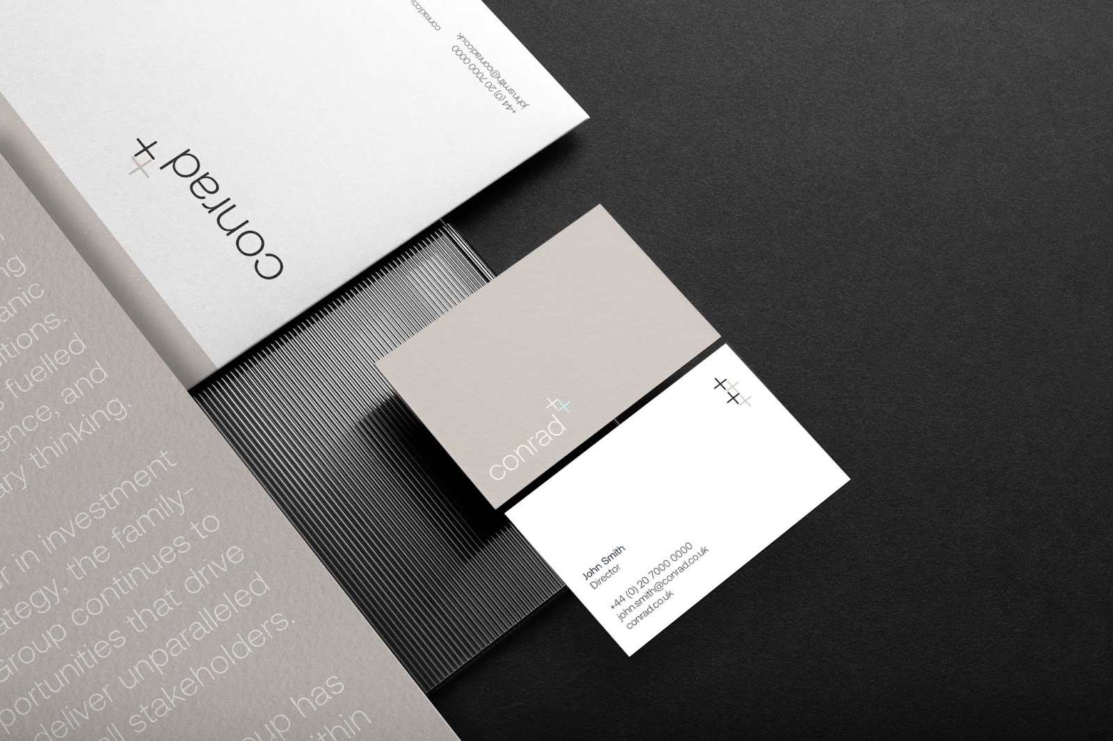
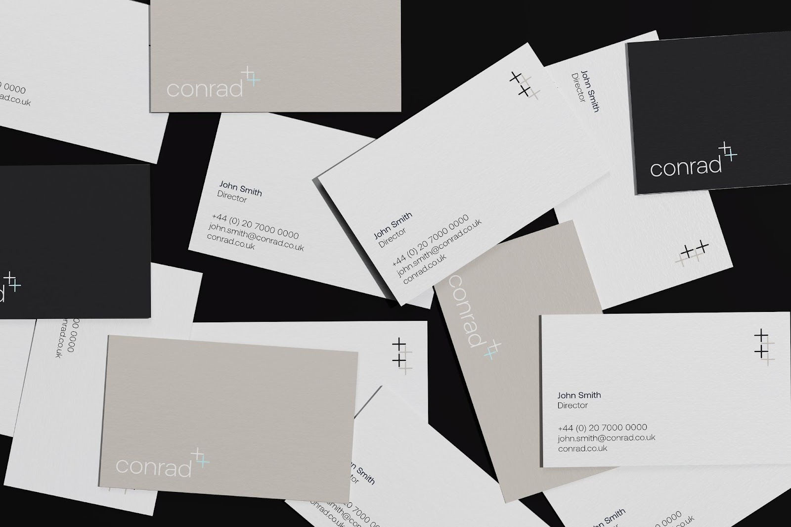
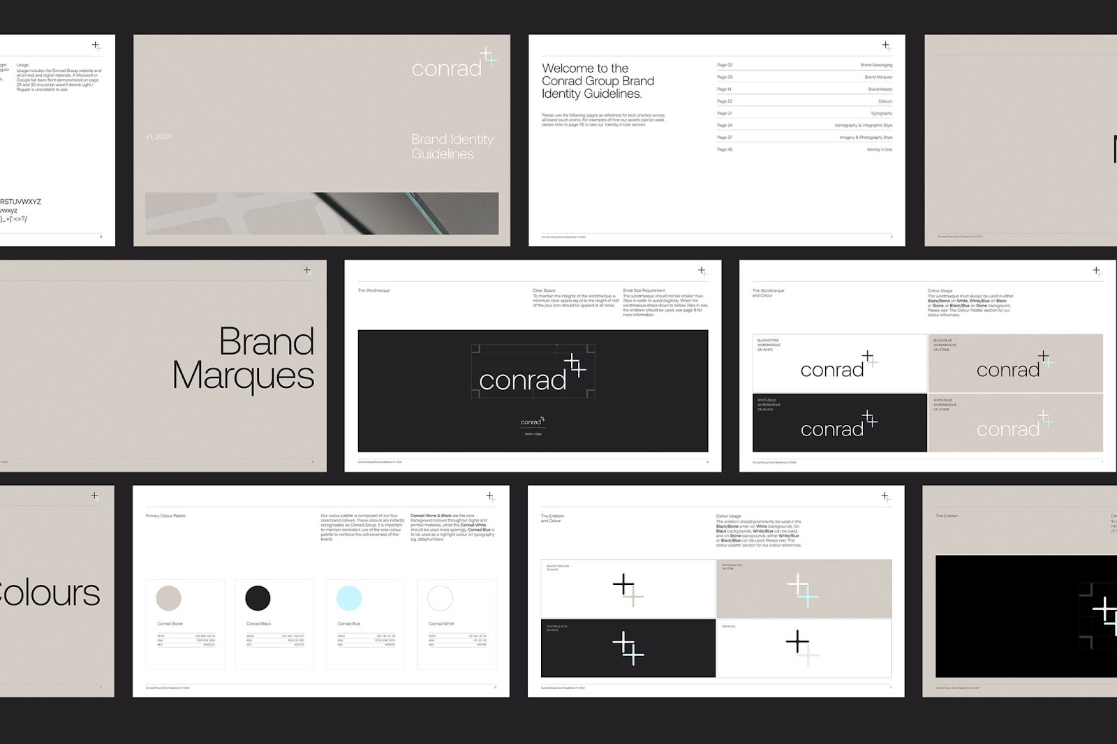
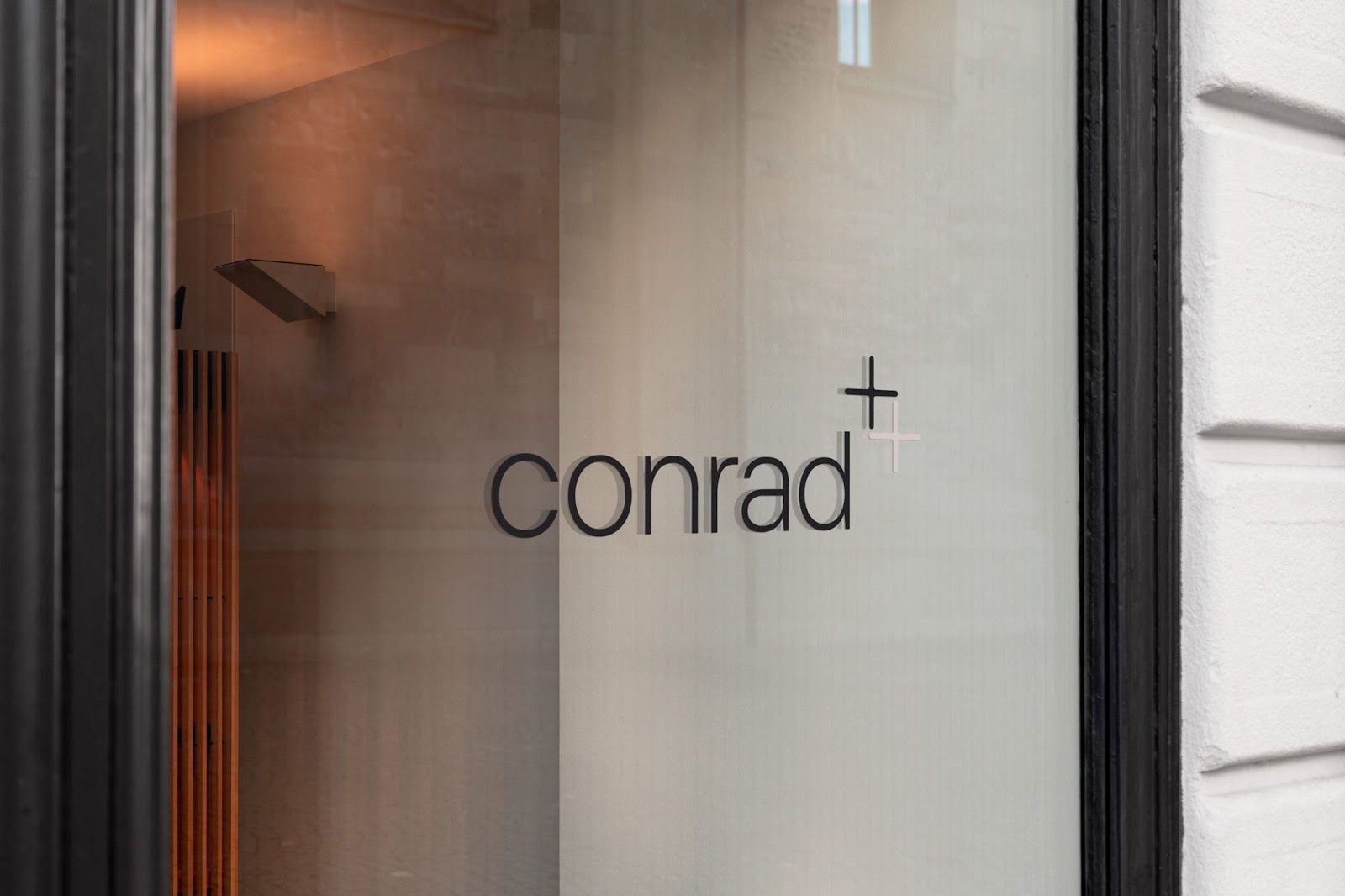
The reimagined Conrad logo features a clean, modern typeface and subtle geometric elements, embodying the brand's minimalist yet impactful approach. The incorporation of the "+" symbol serves as a visual metaphor for Conrad's collaborative spirit and its commitment to building strong partnerships with clients and acquired businesses.
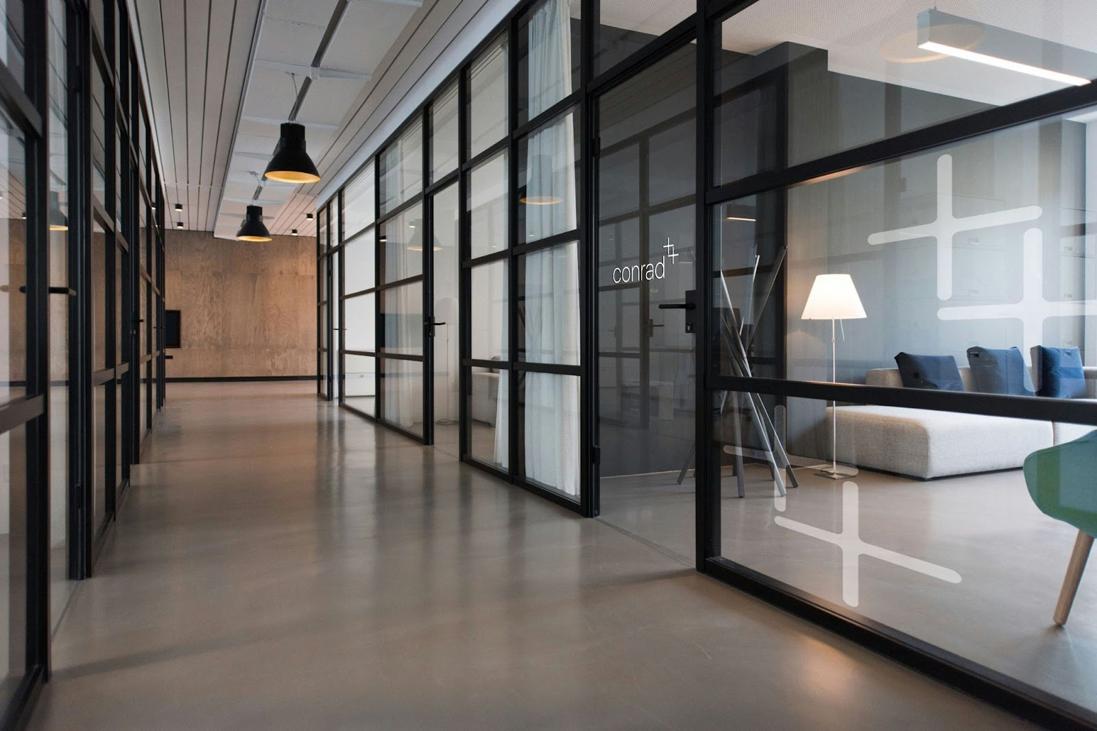
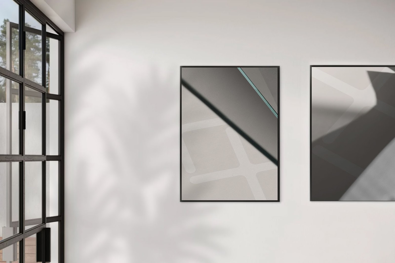
Fable&Co. developed a color palette that reinforces Conrad's brand attributes. Neutral tones, primarily soft beiges and grays, convey professionalism, stability, and warmth. These understated colors are complemented by subtle accents of cool blue, evoking trust, calmness, and a future-focused orientation.
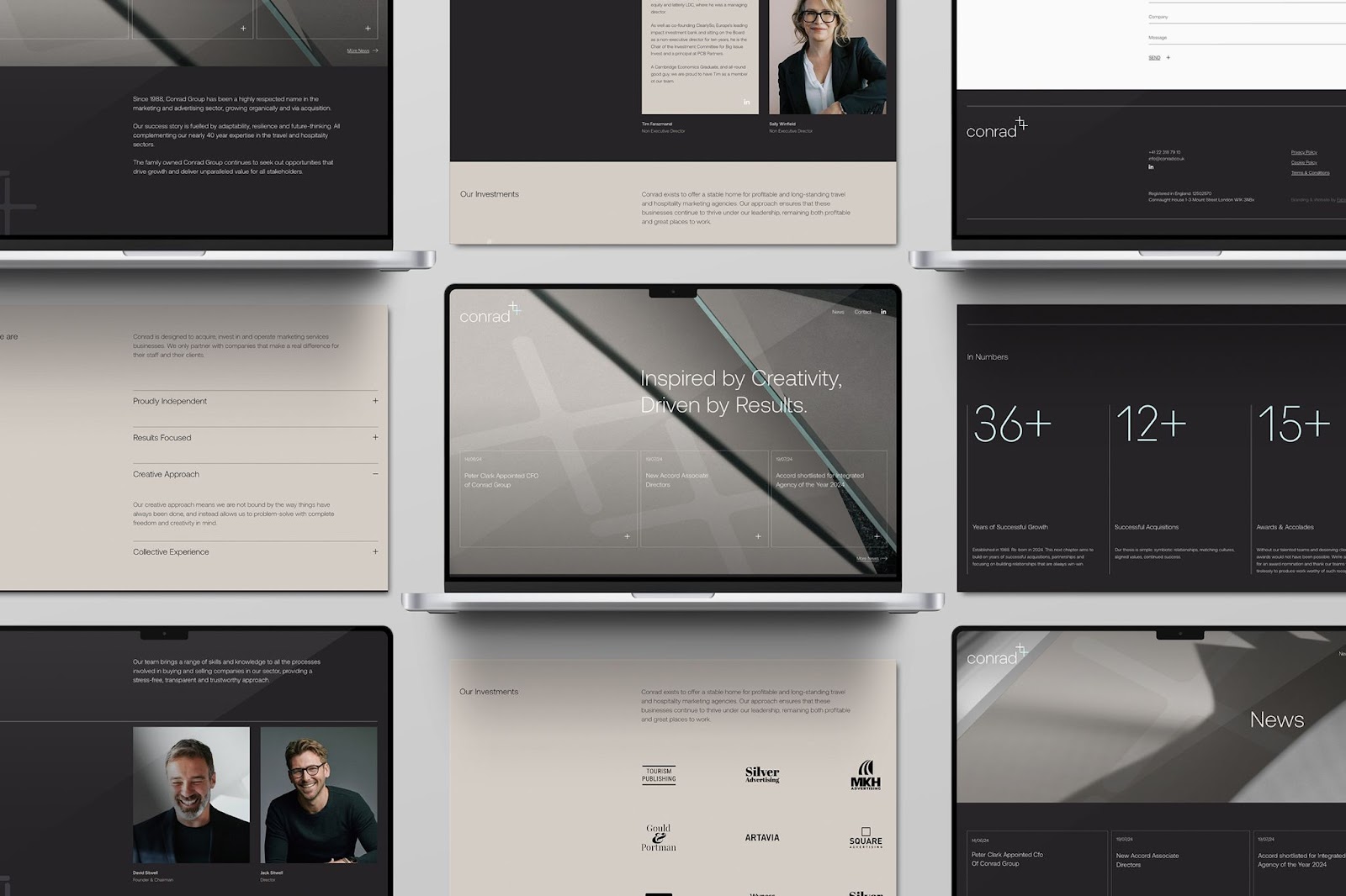
Conrad's website underwent a complete overhaul, resulting in a modern, intuitive user interface. The minimalist layout, featuring bold typography and clear navigation, effectively showcases the company's 36+ years of expertise in travel, tourism, and hospitality marketing. The design seamlessly blends a monochrome palette with subtle accent colors, enhancing clarity and user experience.
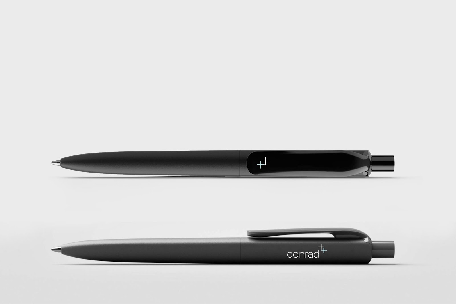
Fable&Co. extended the new brand identity across a suite of collateral materials, ensuring consistency and sophistication. The business cards, crafted with high-quality materials and finishes, offer a tactile experience that complements the minimalist design. The strategic use of the "+" symbol throughout the branding reinforces Conrad's core message of growth, collaboration, and excellence.
Through this comprehensive rebranding effort, Fable&Co. has successfully positioned Conrad as a modern, dynamic brand that honors its legacy while embracing future challenges. The new visual identity projects confidence, creativity, and integrity, attracting potential partners, clients, and acquisition prospects. By aligning Conrad's image with its strategic goals, Fable&Co. has empowered the company to continue its trajectory of growth and value creation for all stakeholders.