by abduzeedo
Discover how editorial design and graphic design merge in ISA International Style, emphasizing simplicity and structure with bold typography.
Editorial design has always played a critical role in shaping visual storytelling. When combined with graphic design, the result is often powerful and cohesive. One striking example of this is the ISA International Style of Architecture, a minimalist yet compelling design movement that bridges the gap between form and function. In this article, we explore how editorial design intersects with graphic design through the lens of the ISA International Style, shedding light on its influence and relevance today.
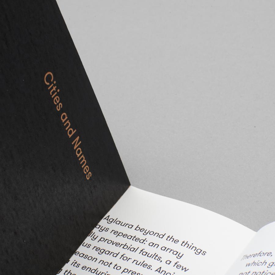
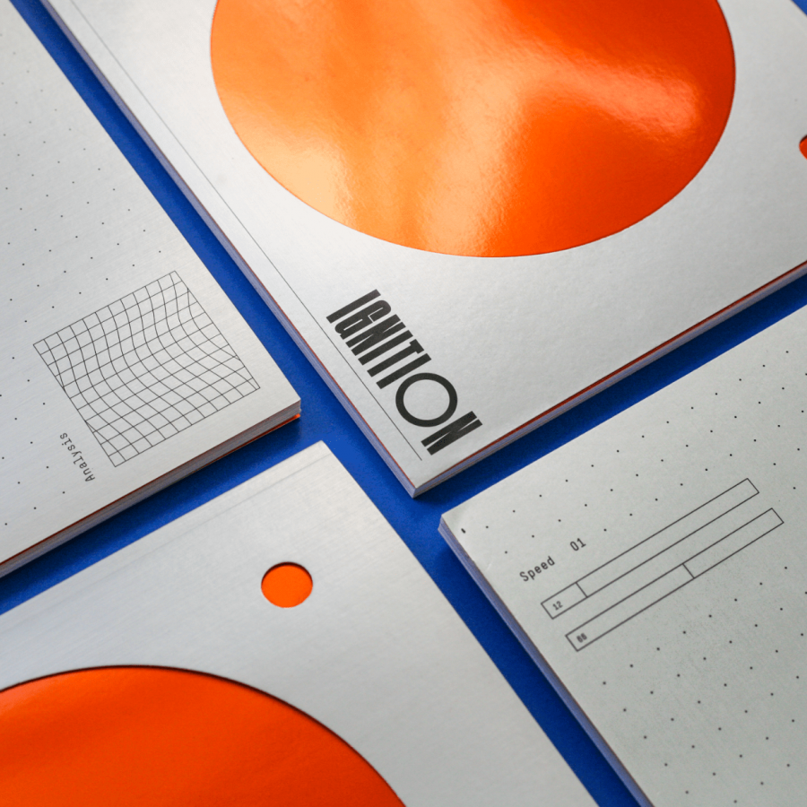
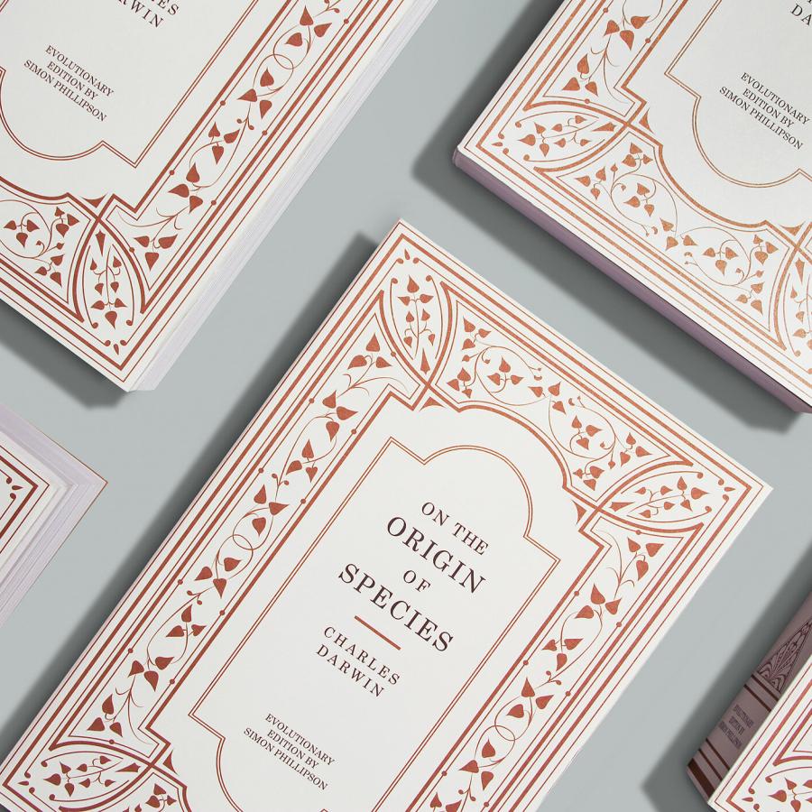
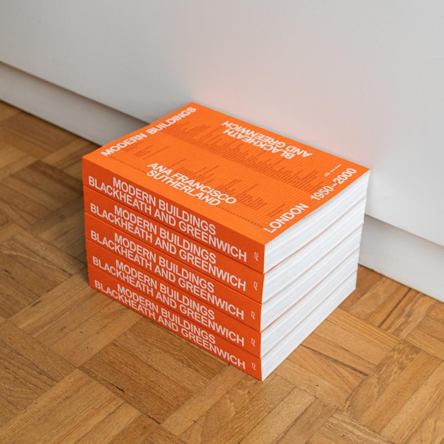
The ISA International Style, designed by Brando Corradini, is rooted in clean lines, simplicity, and structure. Originating in the 1920s, it emerged as a response to overly ornate designs, embracing modernism’s preference for function over excessive decoration. While it began in architecture, its influence extends far beyond that, touching on various design disciplines, including editorial and graphic design.
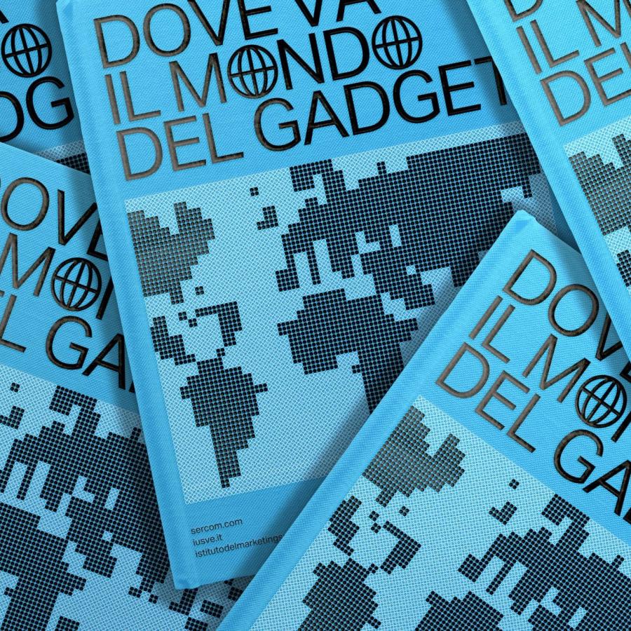
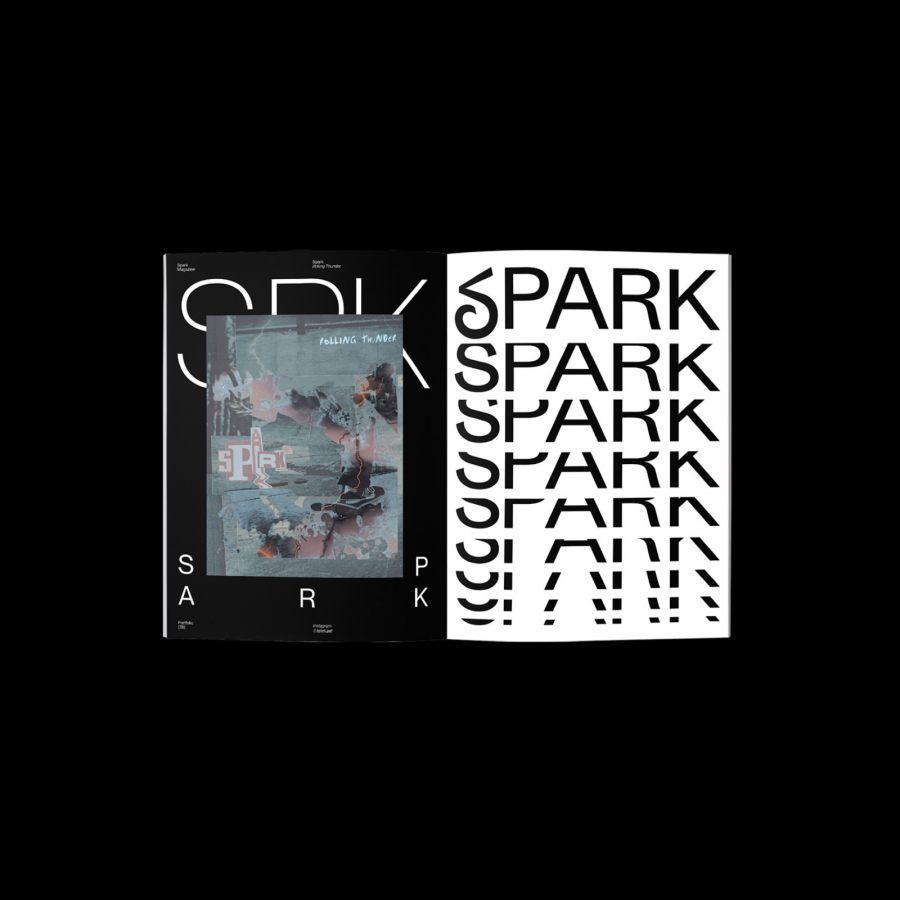
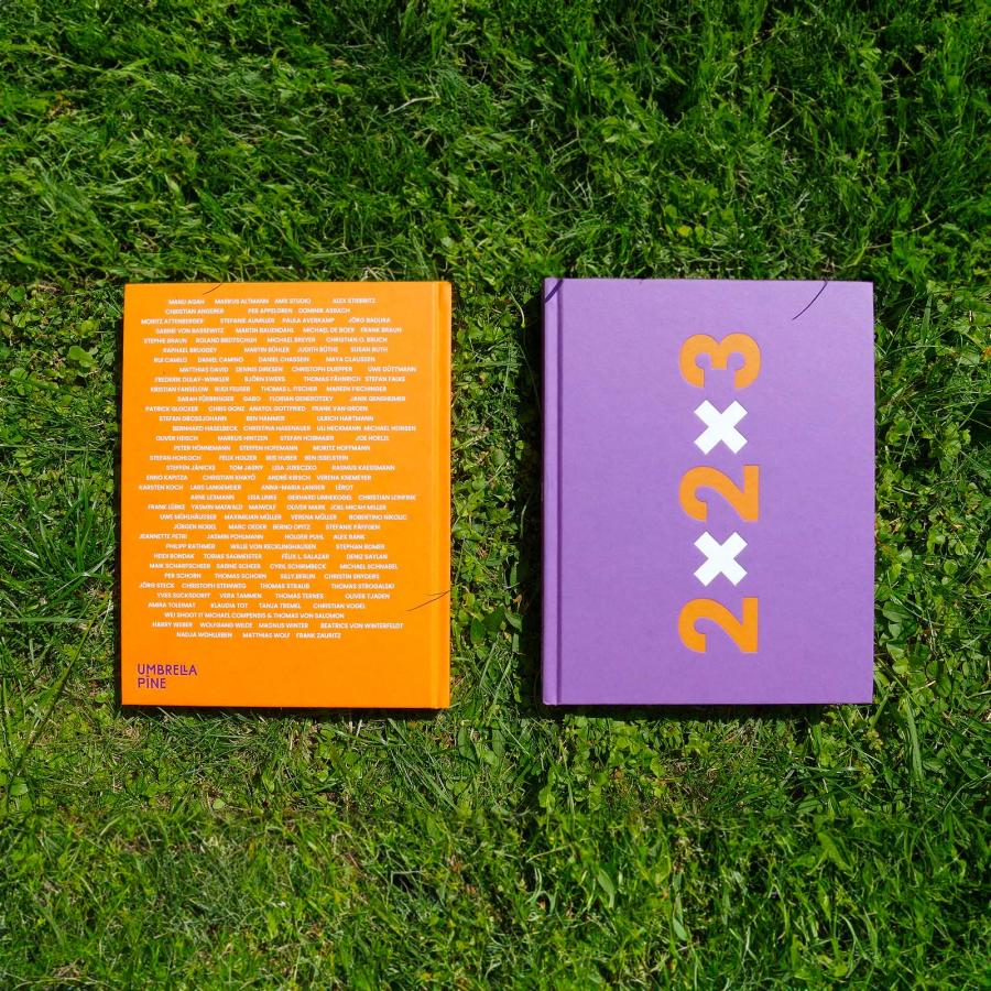
At its core, ISA champions minimalism, using grids, asymmetrical layouts, and sans-serif typography to create balanced yet dynamic visuals. This design philosophy is highly applicable in editorial design, where the content must be communicated clearly and attractively, often in print or digital media.
Editorial design focuses on presenting text and images in a way that enhances readability and aesthetics. It often relies on principles of graphic design, like hierarchy, spacing, and typography, to organize information. The ISA International Style naturally lends itself to this because of its disciplined approach to structure and clarity.
One of the key aspects of ISA is its grid system. In editorial design, grids help maintain a consistent layout across pages, ensuring that text and images are harmonized. By incorporating the minimalistic approach of the ISA style, editorial designers can create layouts that feel open and uncluttered, allowing the content to take center stage.
Typography is central to both editorial and graphic design. The ISA International Style’s preference for sans-serif fonts, like Helvetica, reflects modernism’s clean and utilitarian ethos. For editorial work, sans-serif typefaces improve legibility, especially for long-form content. A well-chosen typeface enhances the editorial design by making it not just readable but also visually appealing.
While the ISA International Style originated in the early 20th century, its principles remain highly relevant. Modern editorial designers continue to apply its minimalist ethos in both print and digital spaces. Websites, magazines, and brochures often use the ISA-inspired grid systems and typography to present information clearly and efficiently.
For example, many digital platforms use these design principles to improve user experience, ensuring content is easy to navigate. The simplicity and functionality at the heart of the ISA style help create a design that not only looks good but also works seamlessly, a key objective for any editorial or graphic designer today.
Editorial and graphic design are intertwined, and the ISA International Style offers a perfect example of how these disciplines can complement each other. Through its focus on simplicity, structure, and clarity, ISA continues to influence designers who seek to create impactful yet functional designs. As we move further into the digital age, the timeless principles of the ISA International Style will likely remain a valuable guide for future generations of editorial and graphic designers alike.
This exploration of ISA International Style demonstrates its continued relevance in editorial and graphic design, showing how timeless design principles can evolve with new media. For more on Brando Corradini’s work and insights, visit brandocorradini.com .
Editorial design and graphic design inspiration
For more information make sure to check out brandocorradini.com
