by abduzeedo
Blasphemy redefines editorial design with chaotic layouts, biblical subversions, and bold typography that mirror its rebellious culinary ethos.
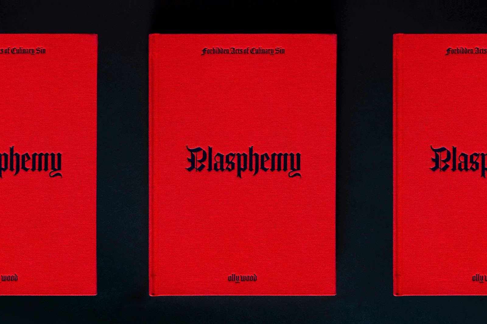
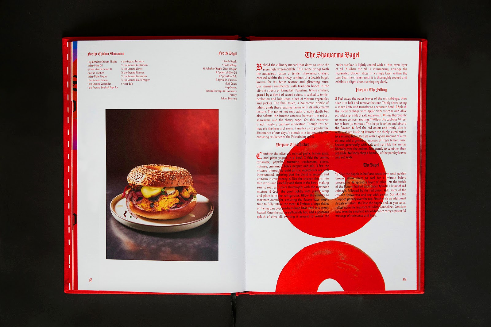
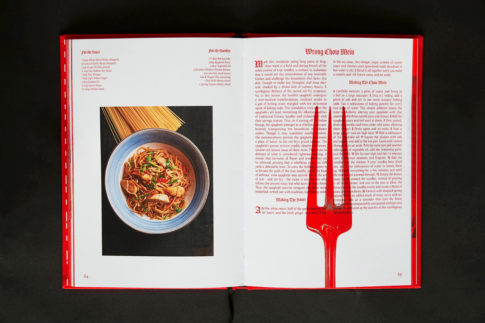
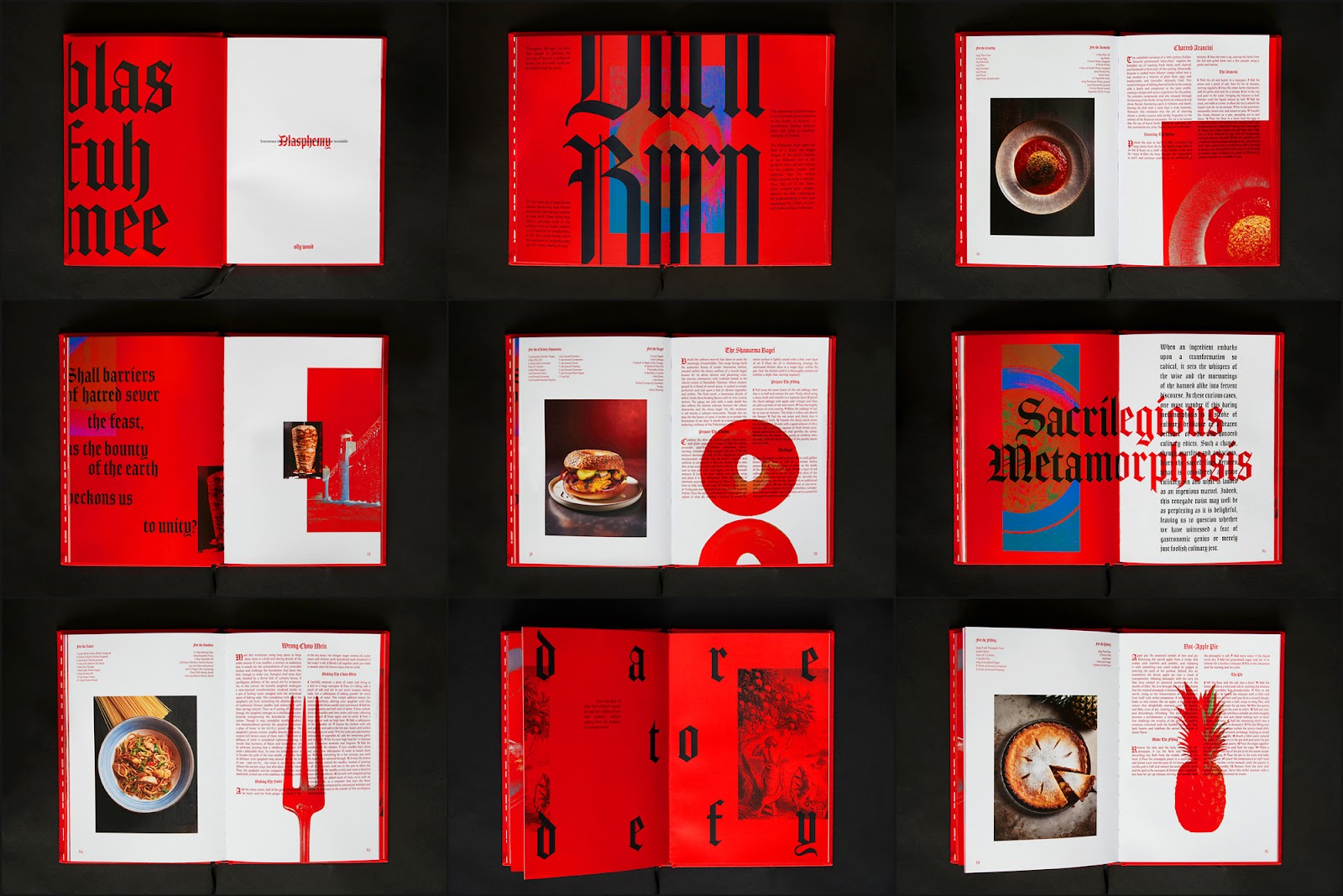
Cookbooks tend to follow a formula—clean layouts, mouthwatering imagery, and neatly structured recipes. Blasphemy does the opposite. Created by Olly Wood, Creative Director at McCann London, this 104-page manifesto shatters conventions in both food and design. It is an editorial design experiment that rejects traditional aesthetic norms, mirroring the book’s provocative culinary themes.
A Sacred Subversion of Design
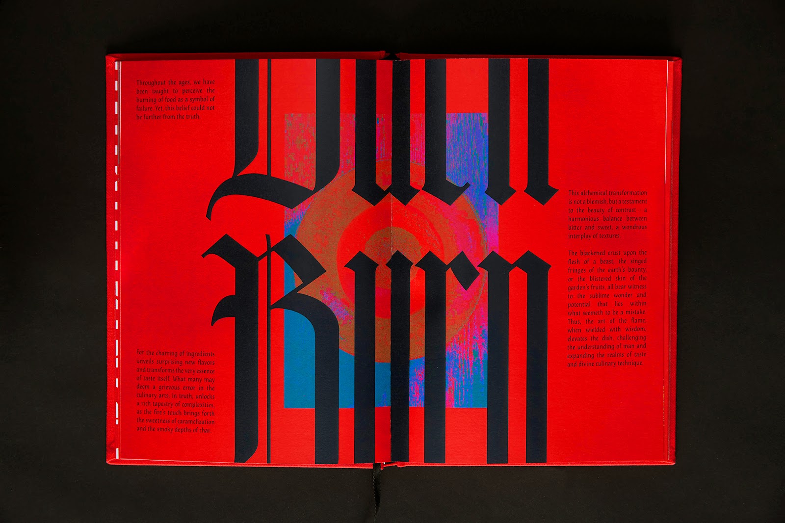
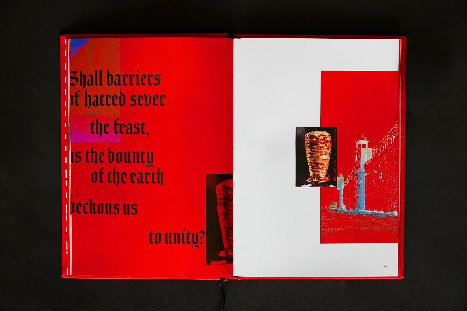
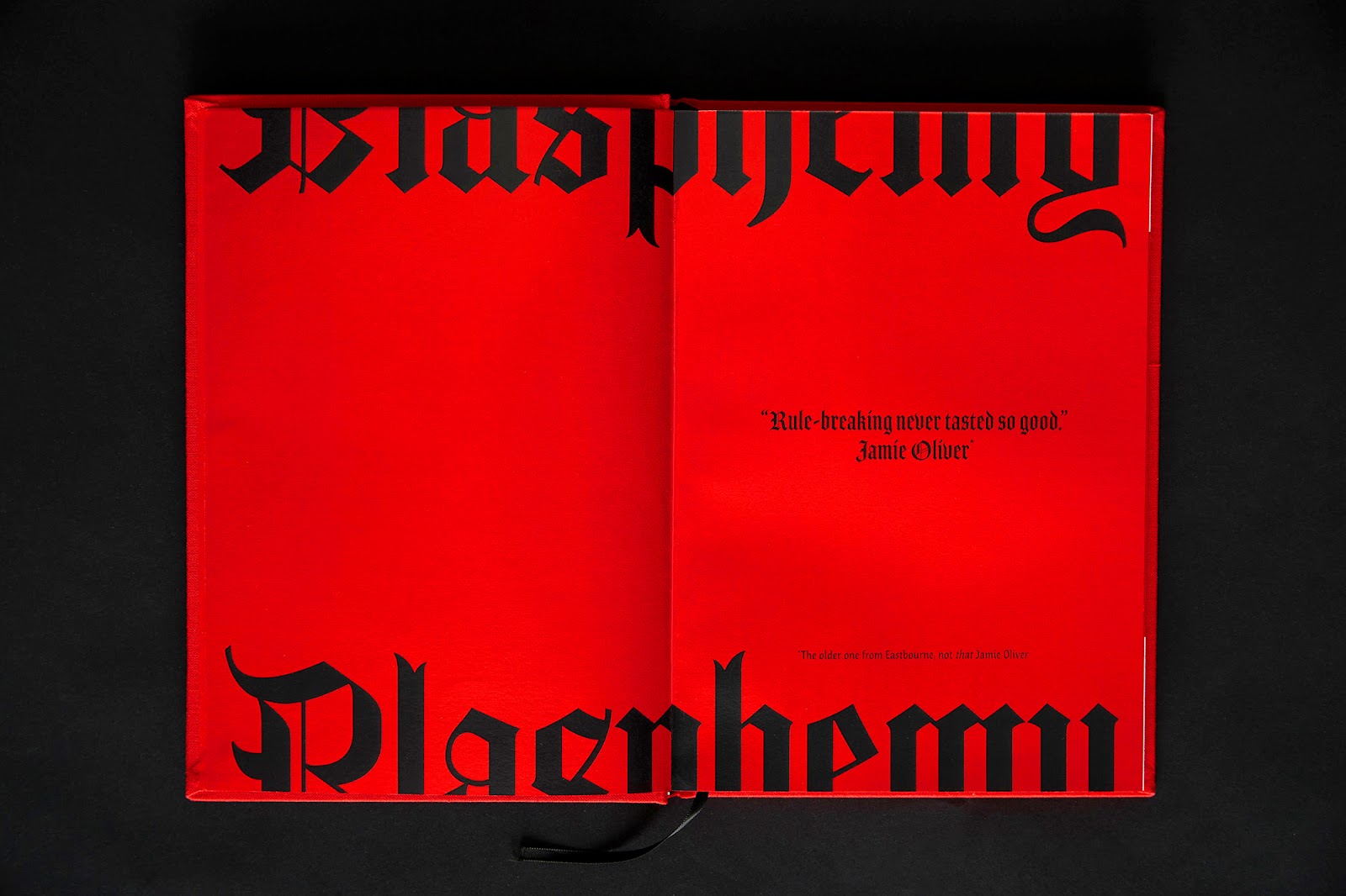
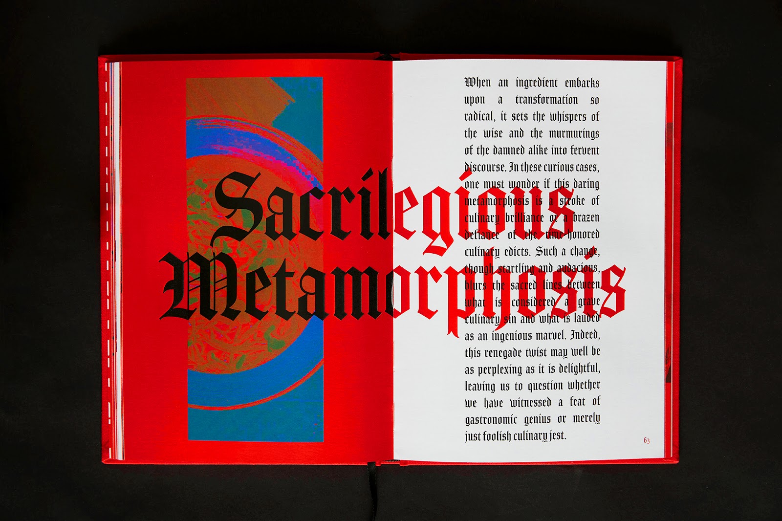
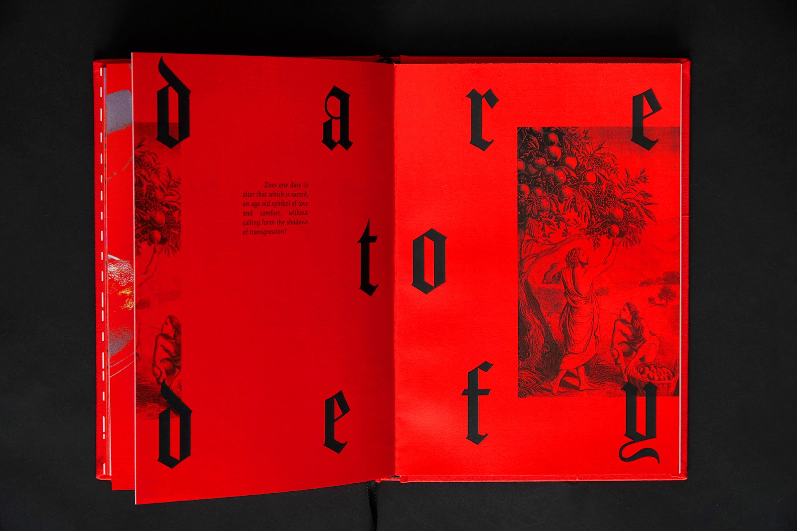
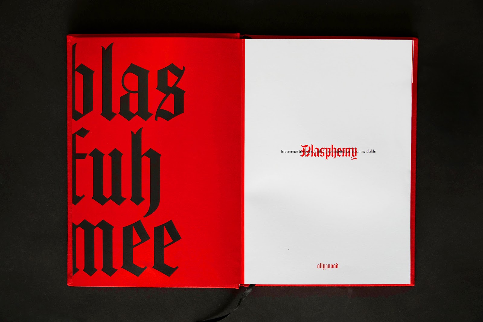
The visual language of Blasphemy takes direct inspiration from the Bible—historically regarded as the ultimate book of rules—but upends its authority with irreverent twists. Layouts ignore classic typesetting conventions, verse annotations are misused, and overlays create intentional chaos. Misalignments, pixelated images, and jarring typographic choices work together to establish a visual rebellion that perfectly complements the book’s culinary defiance.
Typography plays a crucial role in setting the tone. Harsh kerning, mirrored letters, and heavy distortions introduce a punk aesthetic, making each spread unpredictable. The chaotic design isn’t just aesthetic; it’s part of the storytelling. Each visual inconsistency echoes the book’s core theme—challenging the status quo, whether in food or design.
The Art of Imperfection
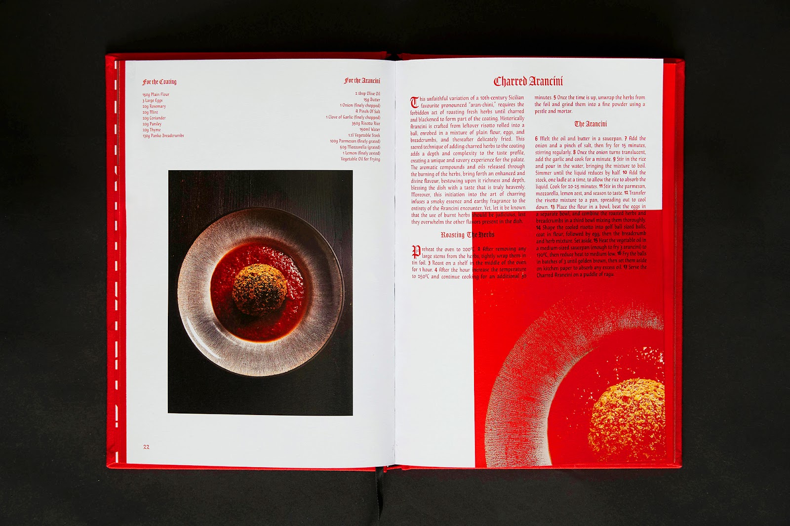
Rather than the polished precision typical of high-end cookbooks, Blasphemy embraces imperfection as a design principle. Typos, grammatical quirks, and broken alignments aren’t mistakes—they are deliberate choices meant to reinforce the book’s anti-establishment stance. The writing style reflects this philosophy, favoring raw, unfiltered narration over conventional editorial polish.
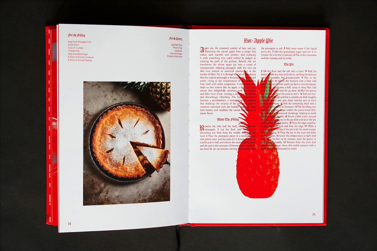
Photography, too, follows an unconventional approach. Pixelation, heavy Photoshop edits, and distorted compositions replace the usual hyper-realistic food imagery. The result is a visual experience that feels more like an art piece than a cookbook.
A Statement in Print
Beyond its disruptive design, Blasphemy is a statement about what editorial design can be. The hardcover is bound in woven fabric, reminiscent of old religious texts. The print production—handled by Yintuan Net Printing Co. in Fuzhou, China—emphasizes craftsmanship while retaining the book’s intentionally unpolished aesthetic.
This fusion of radical editorial design and culinary rebellion makes Blasphemy more than a cookbook. It’s a manifesto for those willing to challenge norms, whether in the kitchen or in print.
Blasphemy can be purchased for £20 at www.blasphemybook.com
Editorial design artifacts