by abduzeedo
Discover how Michele Verze uses character-led brand identity design to transform Gry, a Swedish leadership consultancy, through warmth and illustration.
Leadership development often feels stiff. The industry relies on cold colors. It uses safe fonts. Michele Verze decided to break this cycle for Gry. Gry is a Swedish consultancy. They focus on organizational health. They needed to look different from their peers. Most competitors use blue and gray. These colors feel distant. They feel corporate. Verze chose a different path. He focused on the soul of the work. Leadership is about people. It is about growth. It is about finding a voice.
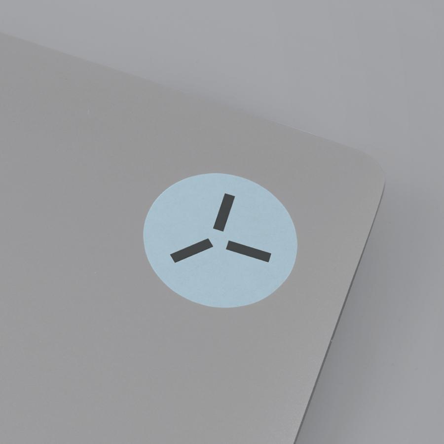
The new brand identity design starts with a metaphor. Verze calls it "standing on your toes". This idea represents visibility. It shows confidence. It hints at the moment of transformation. The logo symbol captures this feeling. It is bold. It is geometric. Yet, it feels light. This shape acts as the DNA for the whole project. It is the foundation for every other visual element.
The standout feature is the illustration system. Verze created over 20 bespoke characters. Each character comes from the logo shape. They are not just decorations. They tell stories. They show interaction. They show conflict. They show collaboration. These are abstract concepts in leadership. Usually, they are hard to visualize. Verze makes them human. He makes them accessible. The characters add a layer of warmth. They make the brand feel like a partner, not a vendor.
Color choice was vital for this shift. Verze avoided the usual corporate palette. He picked orange as the lead color. Orange means action. It means creativity. It brings energy to the screen. He balanced this with soft neutrals. He used subtle pastels. These colors create a sense of calm. They provide a safe space for dialogue. The palette is fresh. It stands out in the Swedish market. It looks like a brand that understands emotions.
Typography provides the final balance. The chosen typeface is refined. It adds a layer of trust. It ensures the brand remains professional. It keeps the playful illustrations grounded. The system works everywhere. It looks good on a website. It works on social media. It scales for course materials. This flexibility is key. It allows Gry to grow without losing its heart.
Michele Verze shows us that leadership can be visual. It can be playful. It does not have to be boring. By using character-led design, he created a brand that speaks to the human experience. It is a lesson in how to build a visual language with personality. The result is a system that feels alive. It is a bold step away from tradition.
Credits:Michele Verze
