by abduzeedo
Explore the YWCA BC rebrand. A dynamic design system using a "Y" motif to amplify gender equity and community strength through bold visual storytelling.
Visual identity often struggles to balance heritage with modern advocacy. The YWCA BC rebrand solves this by grounding its aesthetic in a singular, geometric truth. The project focuses on advancing gender equity through a design system that feels both architectural and human. It moves away from the passive imagery often associated with non-profits. Instead, it embraces a visual language that is active, loud, and intentional. This is not just a logo change. It is a structural shift in how the organization communicates its role in housing, child care, and employment services.
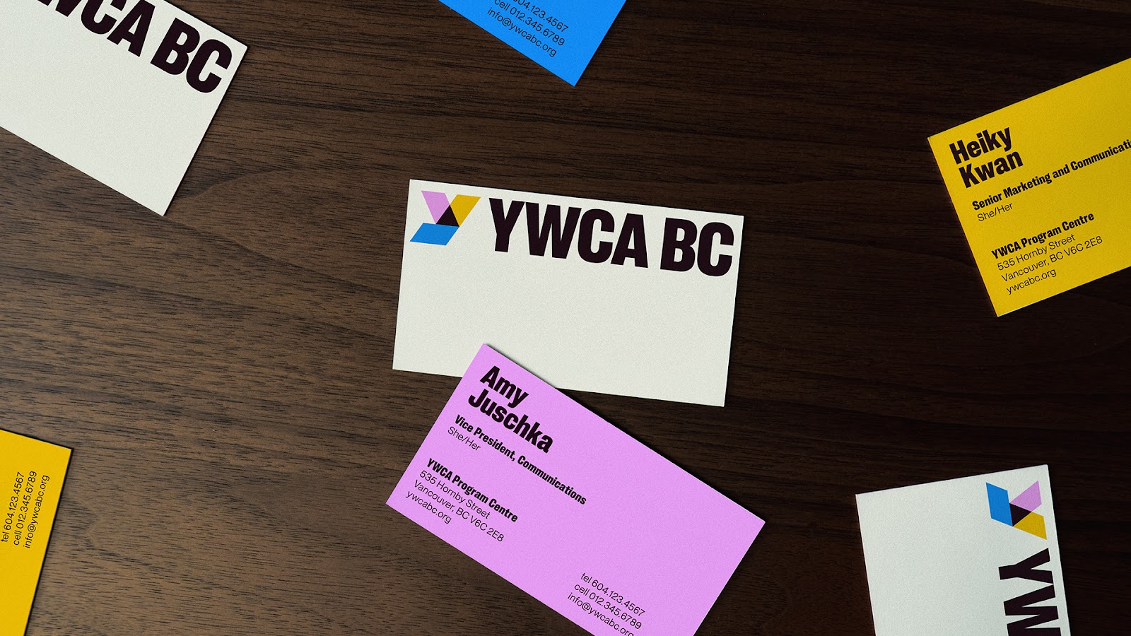
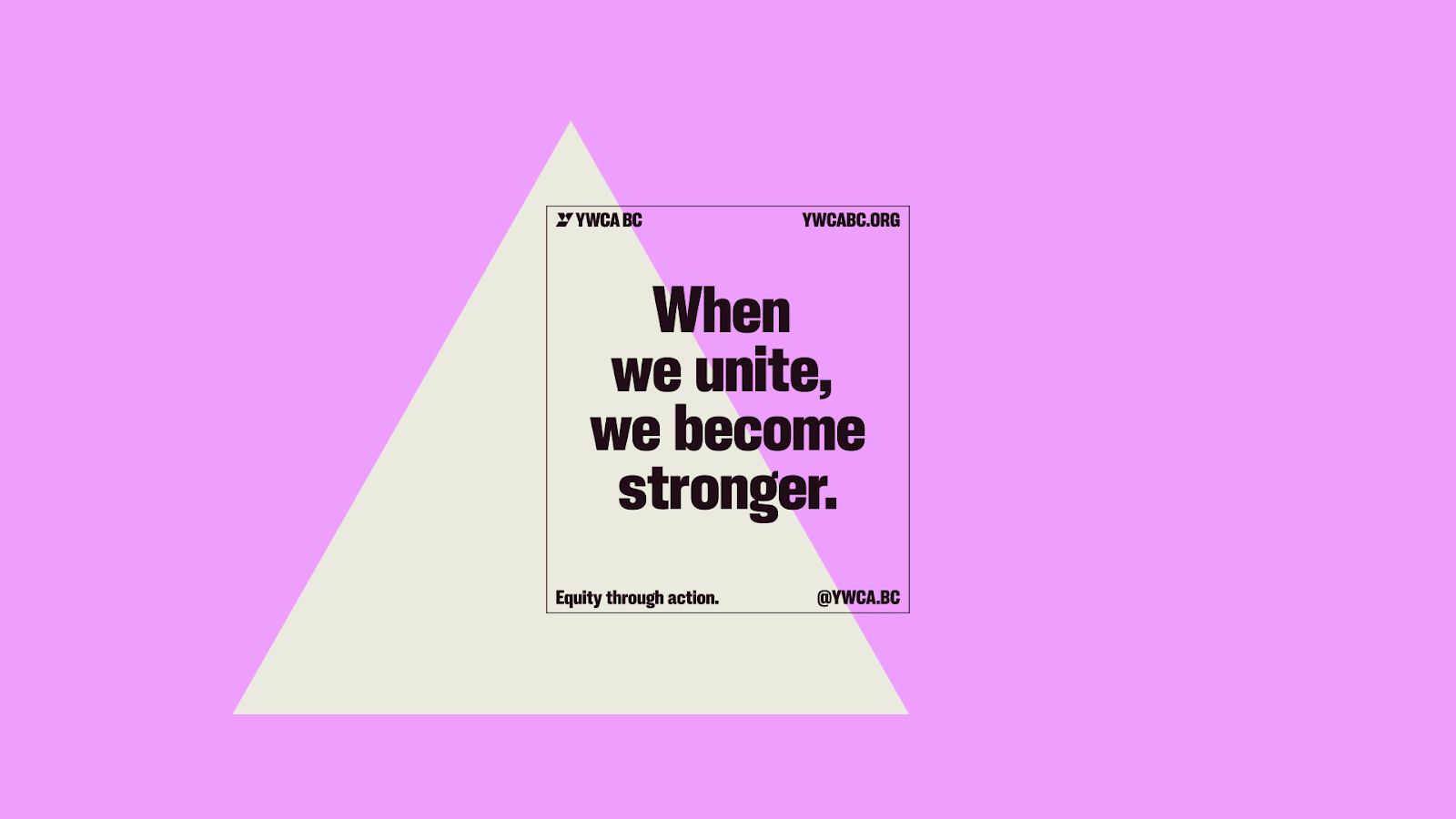
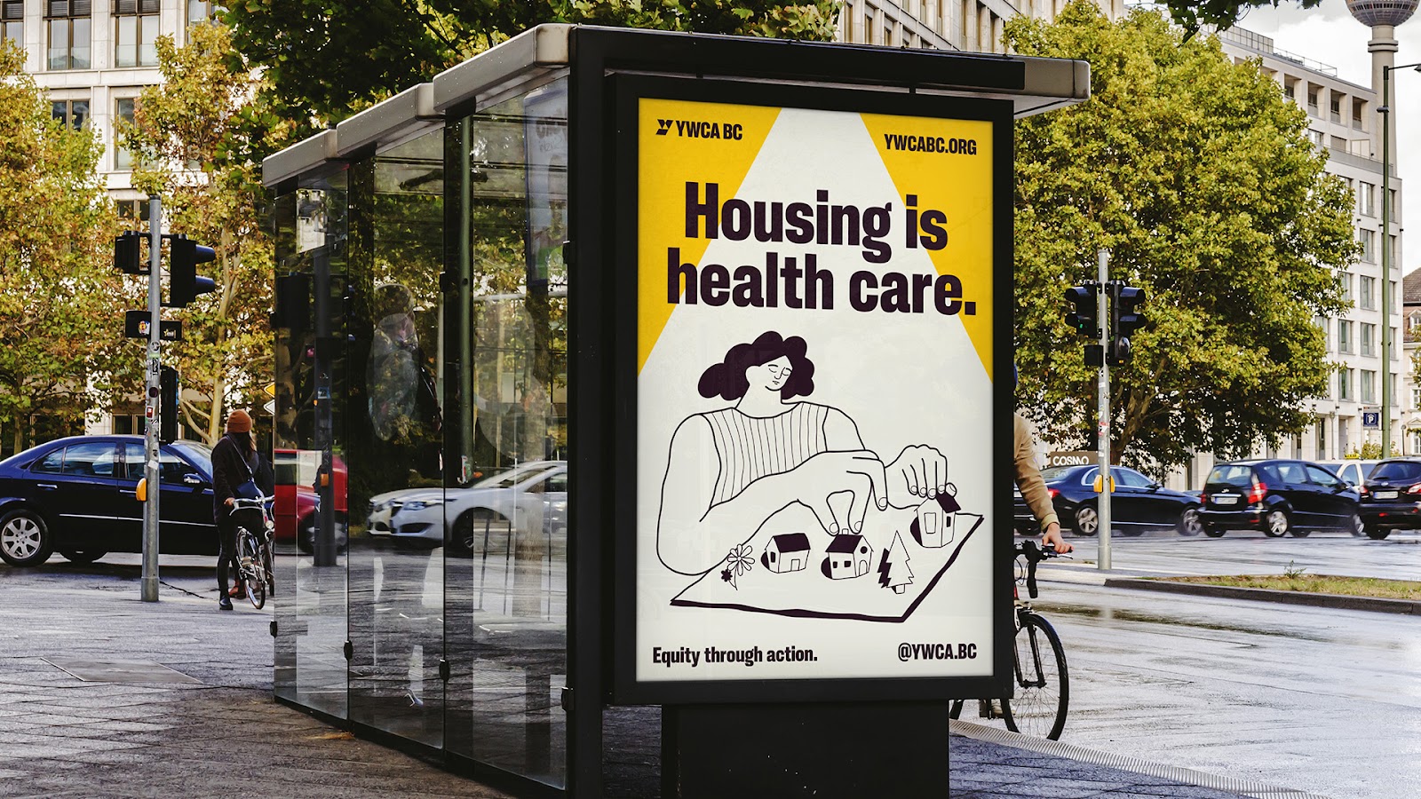
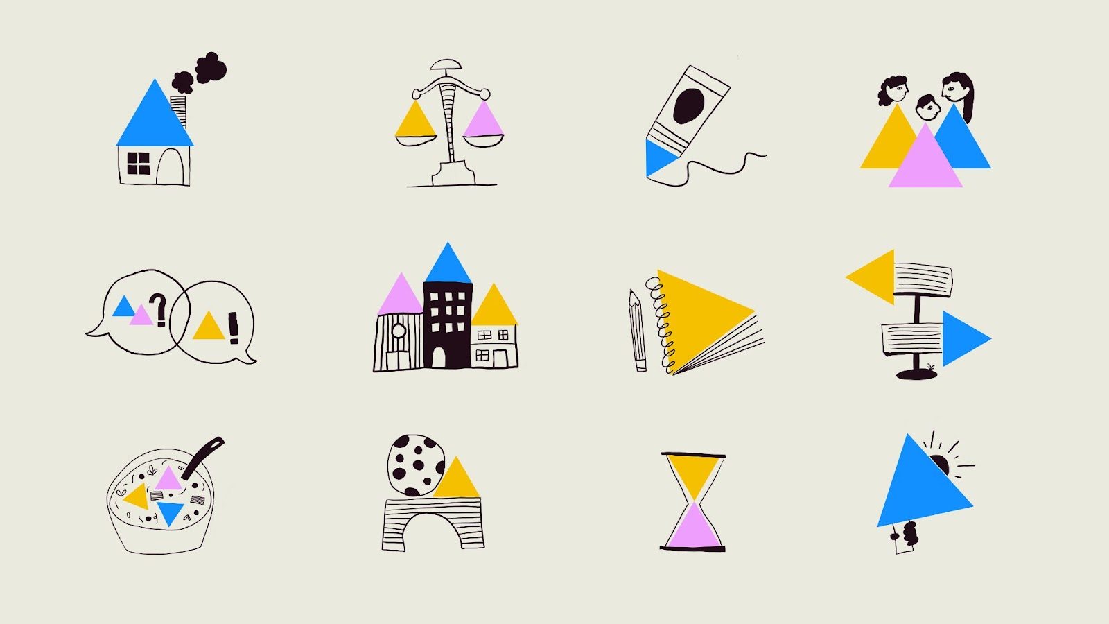
The core of the work lies in the "Y" logo. The designers created a mark where three distinct shapes converge into a dynamic triangle. This triangle is the soul of the project. It represents the meeting point of programs, advocacy, and people. In the materials provided by the studio, we see how this motif functions beyond a mere stamp. It scales. It expands into a spotlight for messaging and acts as a frame for custom illustrations. This flexibility allows the brand to maintain a high level of recognition across various scales, from digital platforms to large-scale environmental graphics.
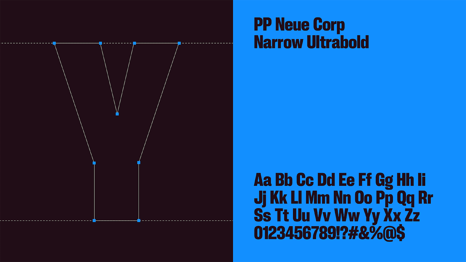
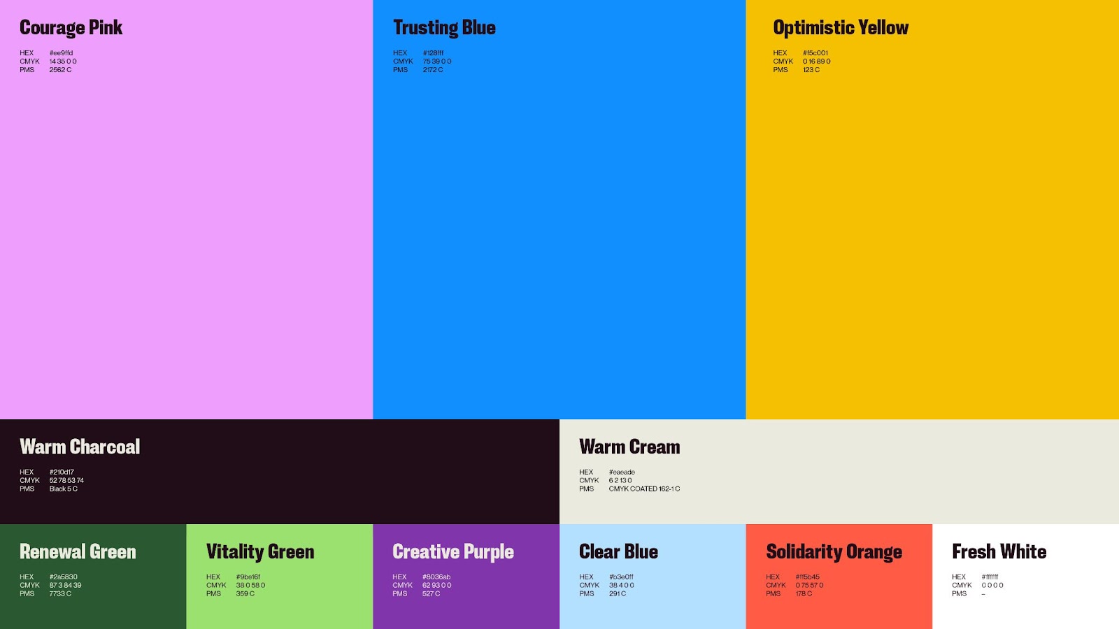
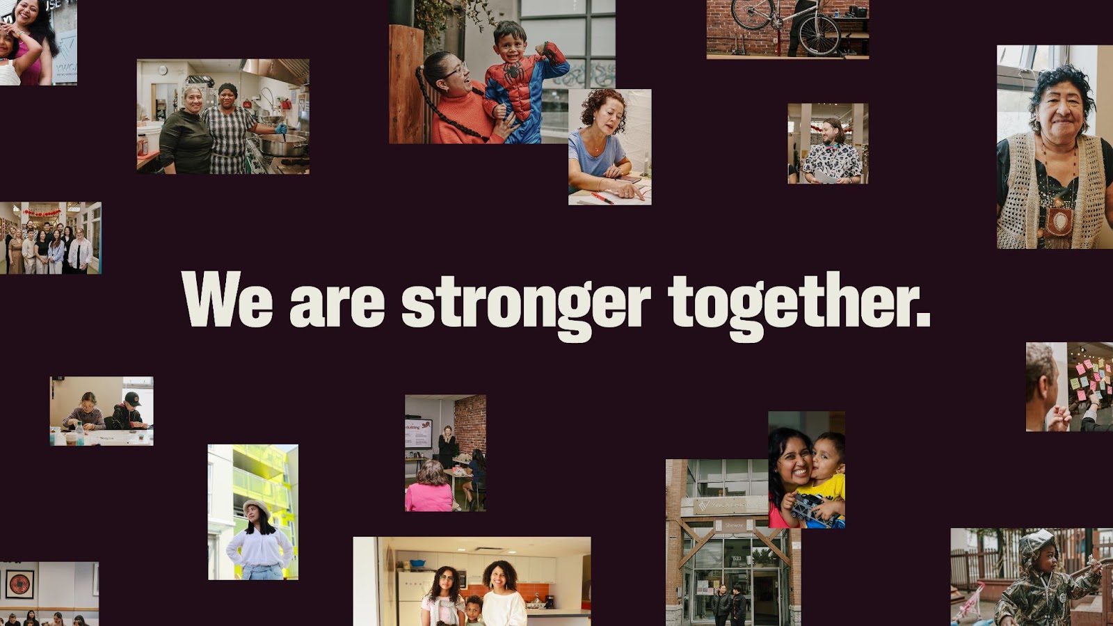
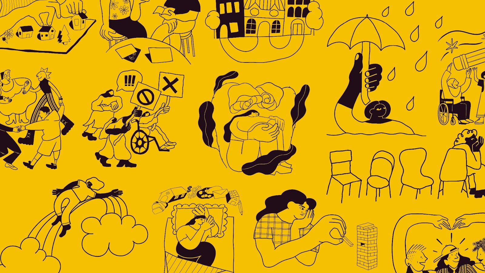
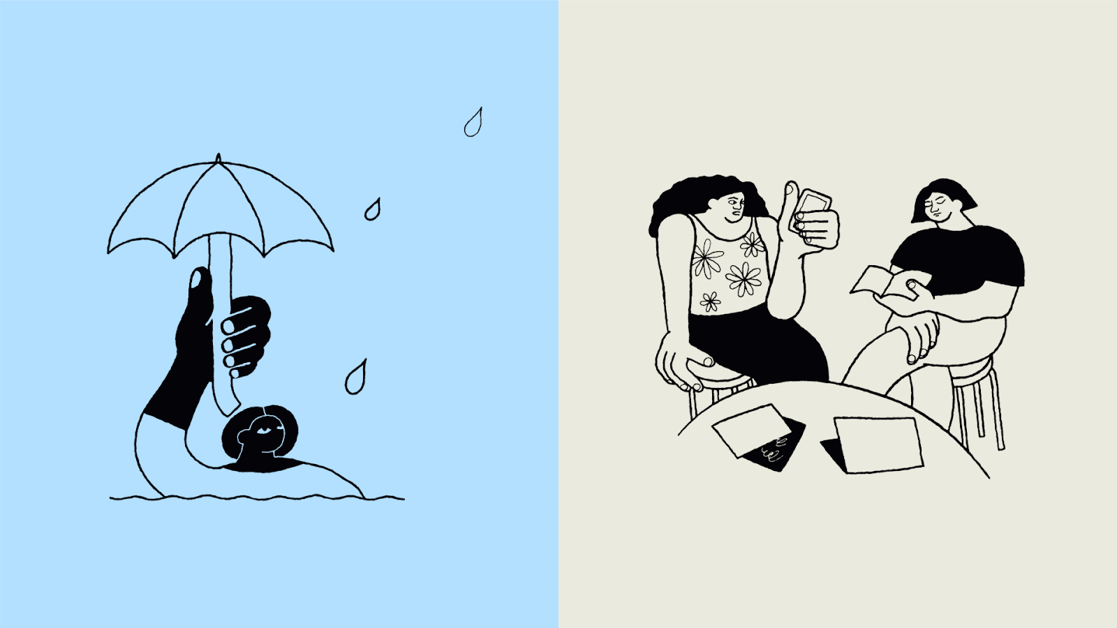
Typography and color play a secondary but vital role in this ecosystem. The palette is bold, moving away from soft tones to signal confidence. The typography is clean and legible, ensuring that the advocacy work remains the priority. Most importantly, the brand system places real people at the center. The new photography style showcases the actual women of the YWCA. By using the geometric "Y" frame to highlight these individuals, the design creates a literal and figurative spotlight on the community. It humanizes the data and the services, making the brand feel like a lived experience rather than a corporate entity.
This rebrand proves that minimalism does not have to be cold. By using simple shapes to build a complex narrative, the YWCA BC identity achieves a rare level of clarity. It avoids the fluff of traditional marketing speak. The work speaks for itself through sharp lines and high-contrast layouts. It is a "built for women, by women" identity that understands the power of the collective. The result is a cohesive design system that provides the organization with the tools to speak loudly and clearly for years to come. Every touchpoint reinforces the idea that strength is found in convergence.
Credits: YWCA BC
YWCA BC rebrand