Vessilux: Luxury Real Estate Branding Built on Permanence
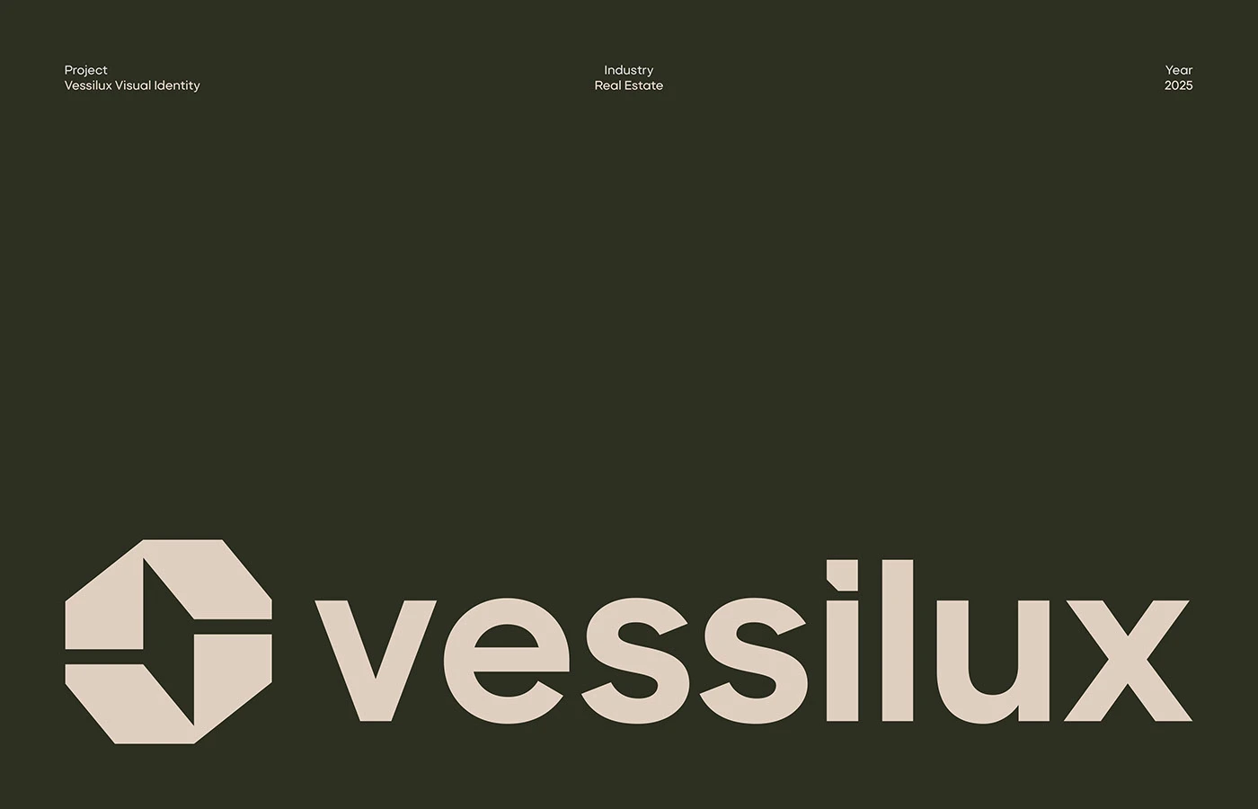
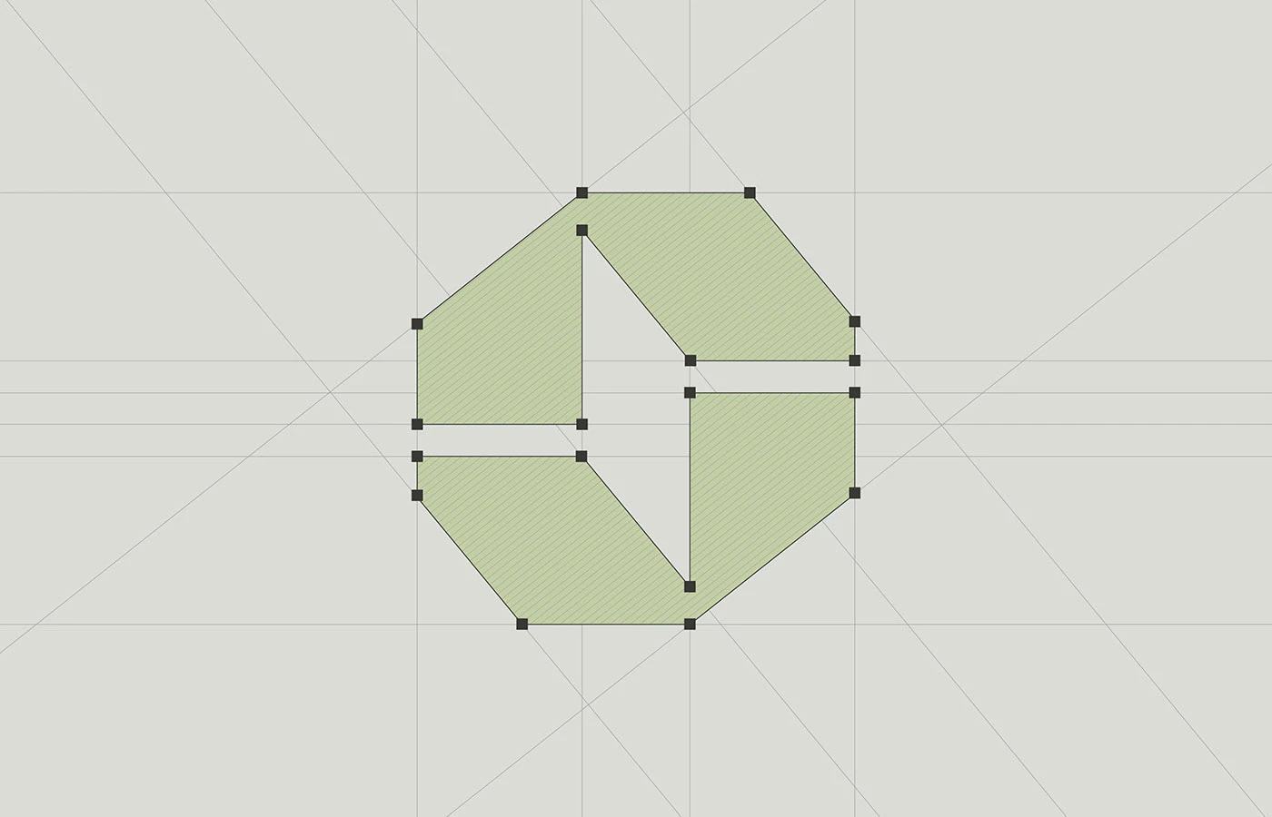
Irfan Khatri crafts Vessilux luxury real estate branding with deep khaki, geometric marks, and restrained typography that signals permanence over excess. The logo—a split square that reads as a hexagonal vessel—sits at the heart of a system designed to feel permanent, not transactional. Khaki and cream don't shout. They ground the luxury real estate branding in a material world: aged stone, warm plaster, the color of earth beneath construction sites. The typography locks down to one sans-serif in two sizes. Small spacing work does the heavy lifting—the kind of typographic restraint that signals confidence.
Luxury Real Estate Branding Across Touchpoints
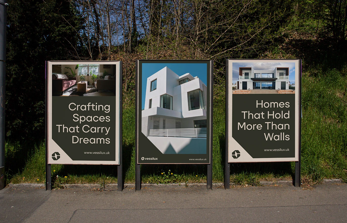
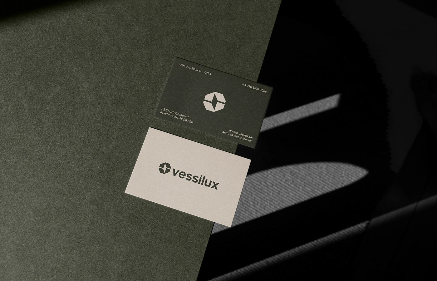
Signage photographs show the mark on billboards in overgrown green, the brand appearing almost archaeological against landscape. Stationery carries the vessel form through business cards and envelopes. Web mockups demonstrate how the system extends to digital listings, where the same precision applies: plenty of white space, photograph-heavy layouts, and the geometric mark as structural anchor. Irfan Khatri's real estate branding system doesn't chase luxury through excess. It earns it through craft and the confidence to leave space alone.

Via: Irfan Khatri
