Million: A Condensed Display Typeface in 18 Variable Styles
Rajesh Rajput's Million is a condensed display typeface variable font design 2026. 18 styles, 9 weights, inktraps — specimen layouts at full-frame scale.
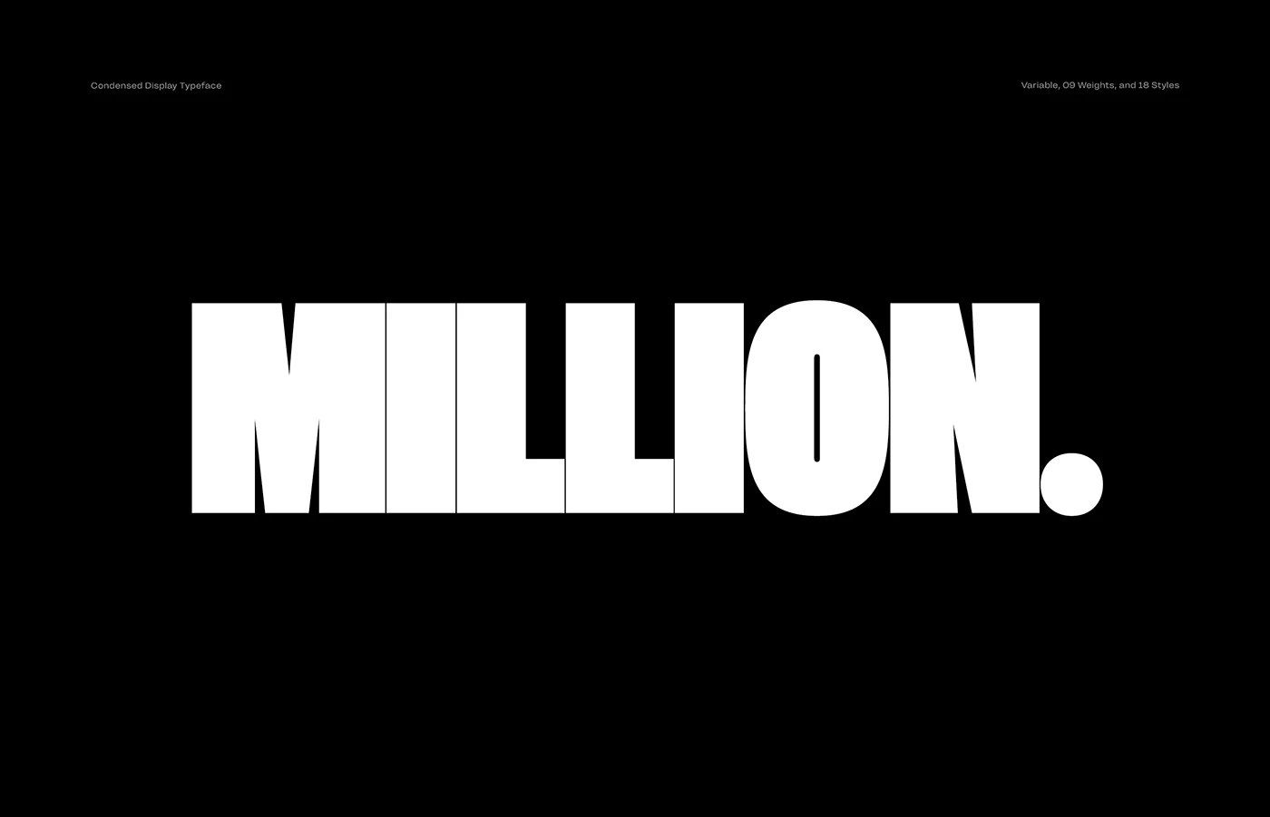
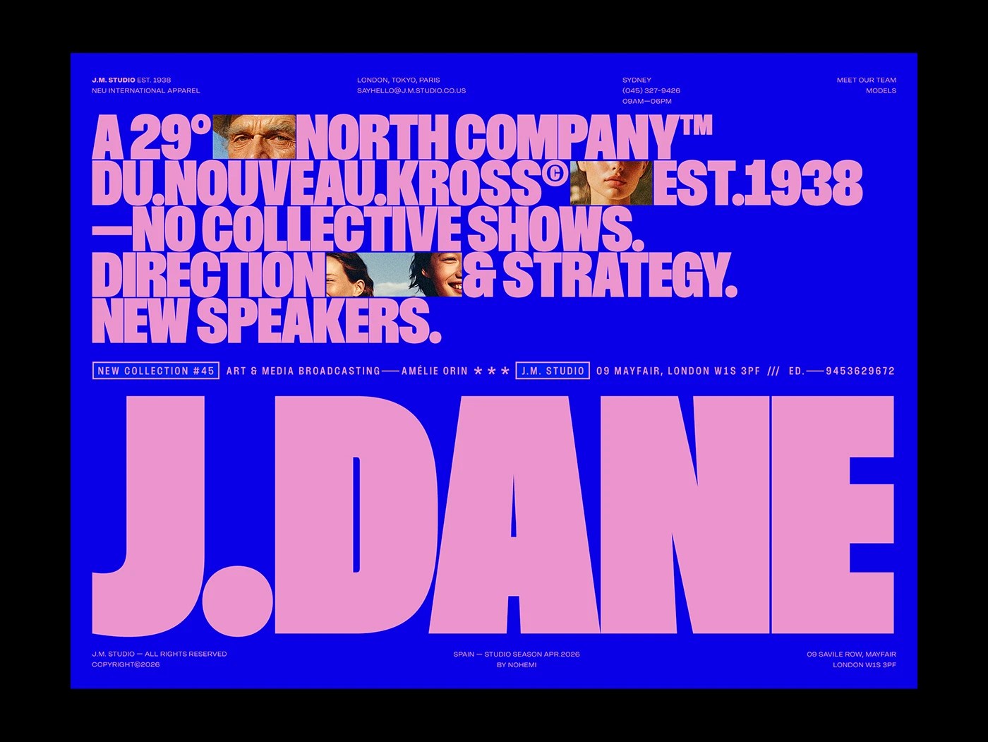
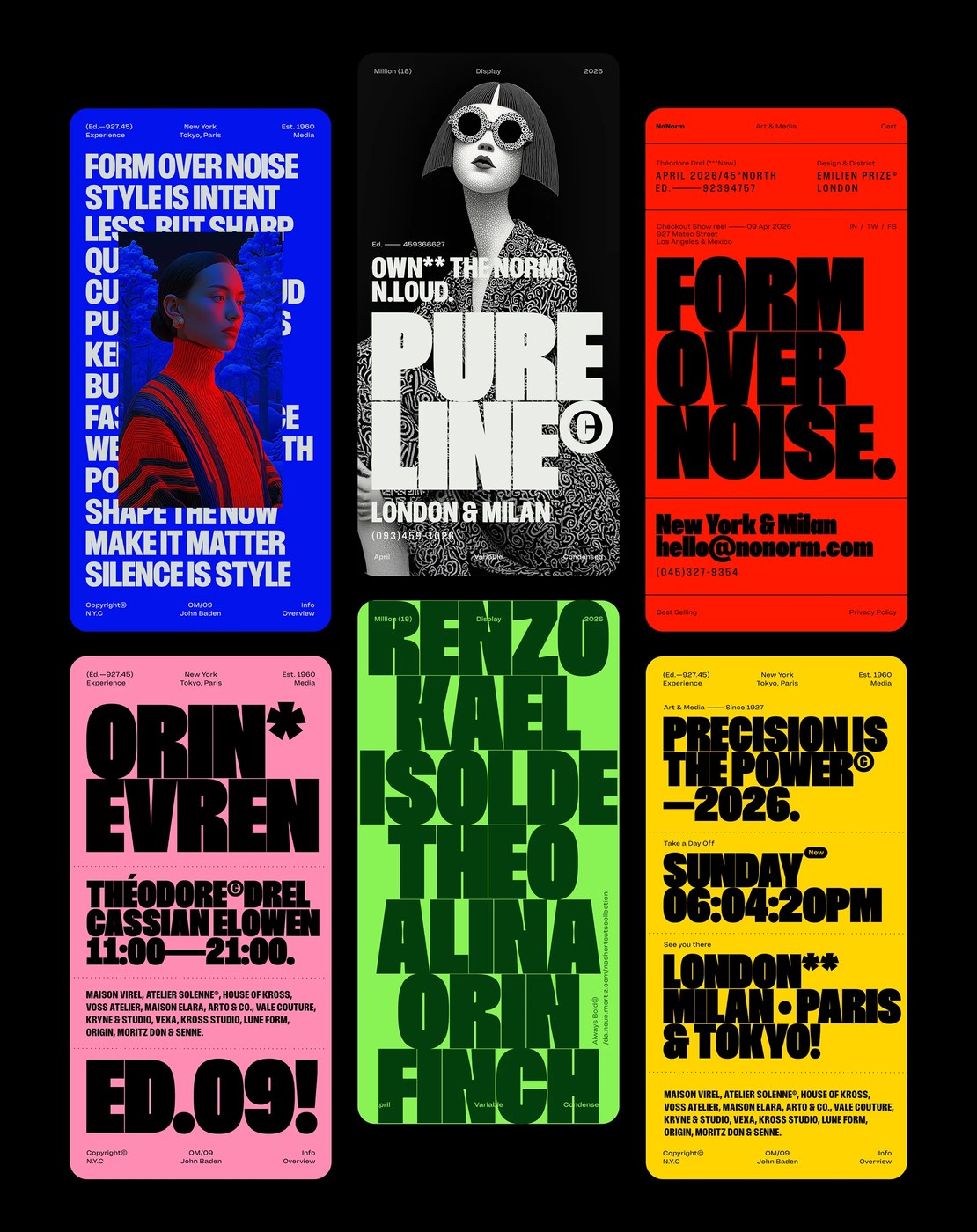
Rajesh Rajput built Million around a single premise: the letterform should occupy the frame, not sit inside it. The opening specimen sets the argument immediately — 'MILLION.' in condensed black, white on pure black, the word filling roughly 70% of the frame width, the period landing as a final beat of mass at the right edge. The weight comparison specimen extends this: 'MILLION HAS EIGHTEEN STYLES NINE WEIGHTS!' mixes thin, regular, and black in a single phrase, and the contrast between stroke widths in the same word does all the visual work. An electric blue poster stacks condensed pink type across five lines over embedded portrait thumbnails, every edge bled — the typeface becomes the grid.
Million: Condensed Display Typeface and Variable Font Design 2026
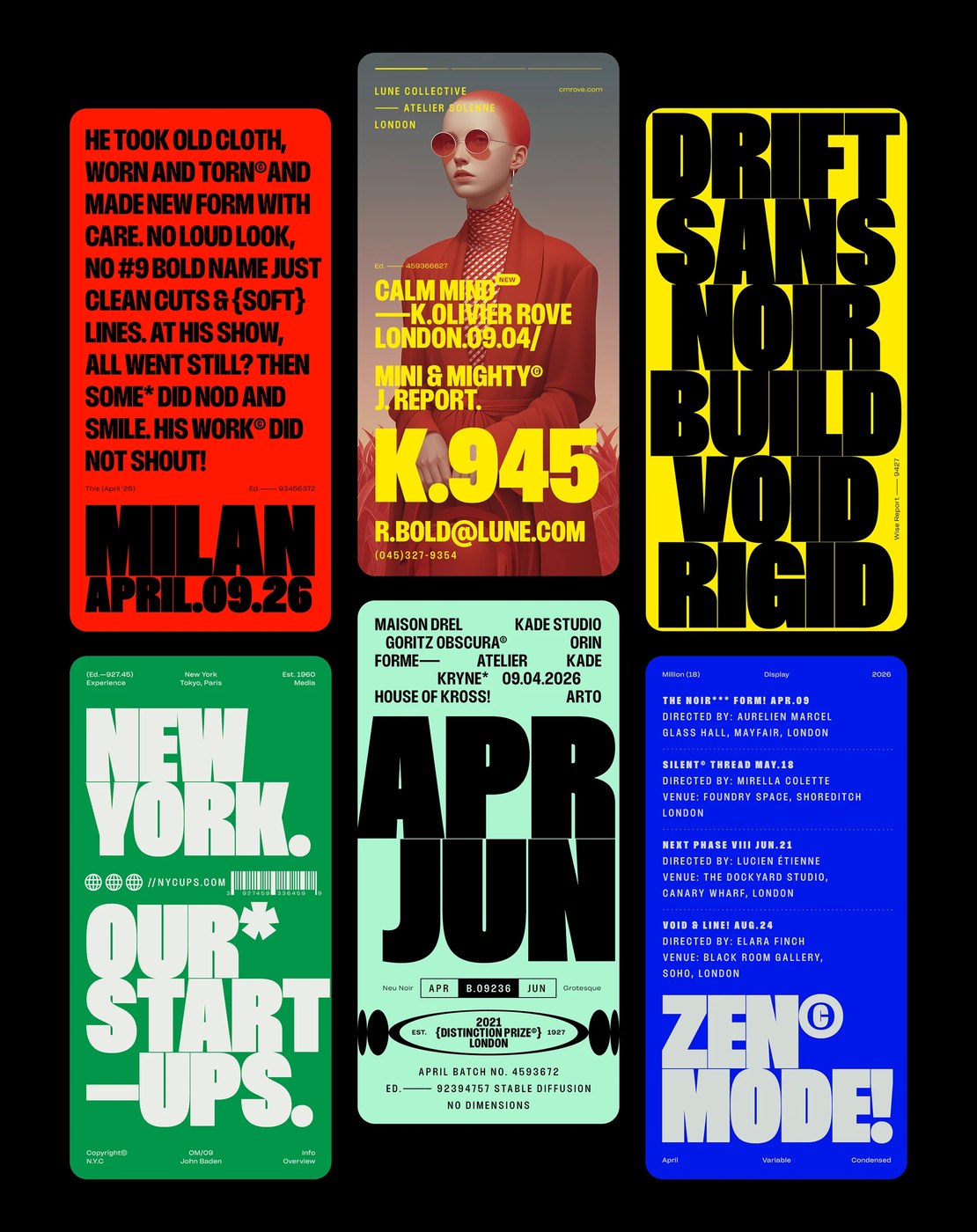
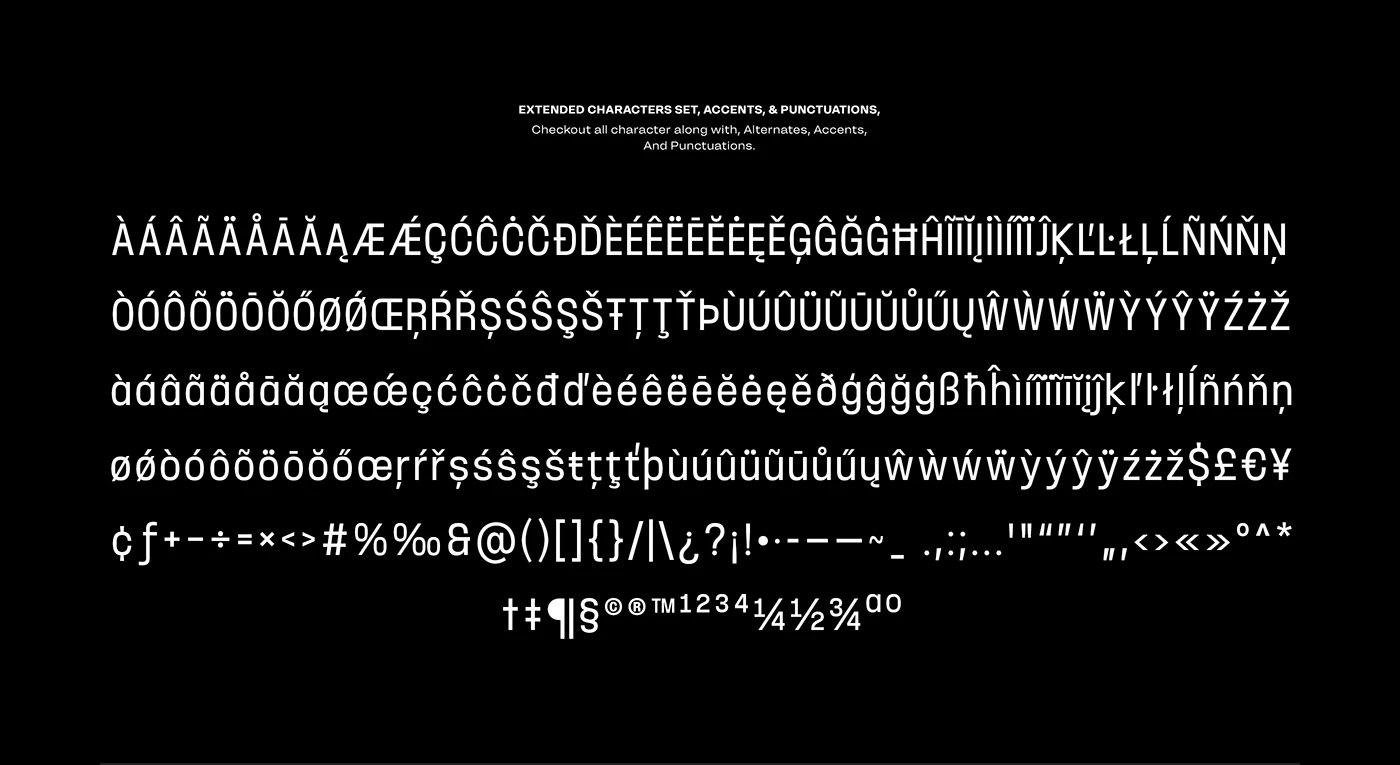
The 18 styles span nine weights from Thin to Black, with a variable font axis and an inktraps optical variant for smaller sizes where ink fill in tight corners would compromise legibility. The red-yellow editorial triptych runs three color fields end to end — orange-red, black, yellow — each panel a different weight and register, consistent enough in proportion to read as a system across extreme tonal shifts. The specimen is the argument for the condensed display typeface: whether the work ends up in advertising, editorial, or motion, this variable font design handles it.
See the full project by Rajesh Rajput on Behance.