by sofia
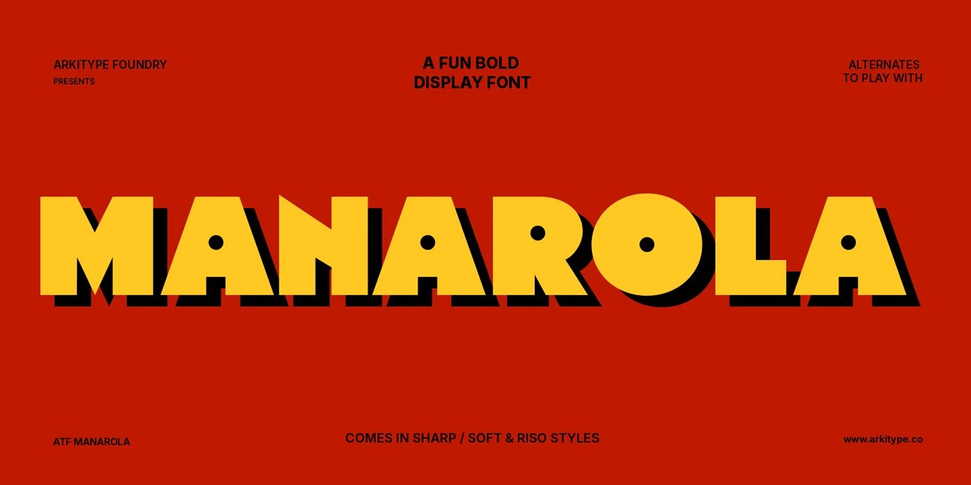
ATF Manarola font is a bold display typeface by Arkitype Foundry, built in vintage Italian signage tradition with three styles and Mediterranean palette.
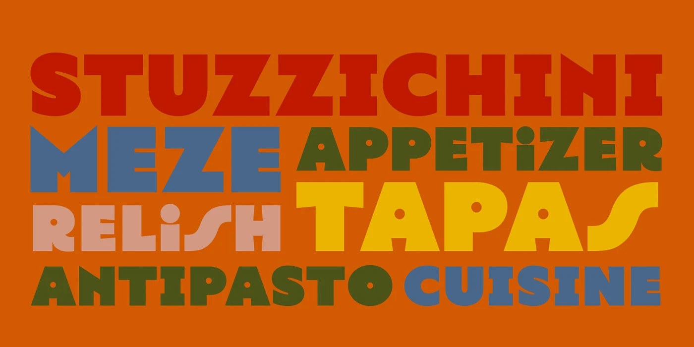
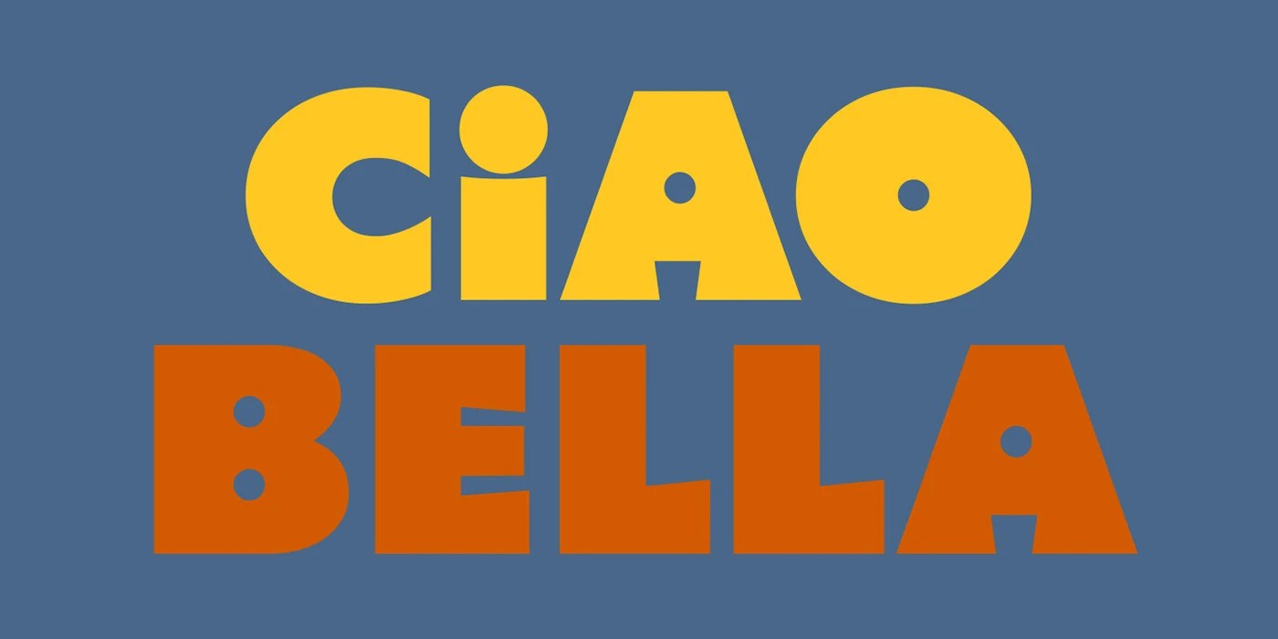
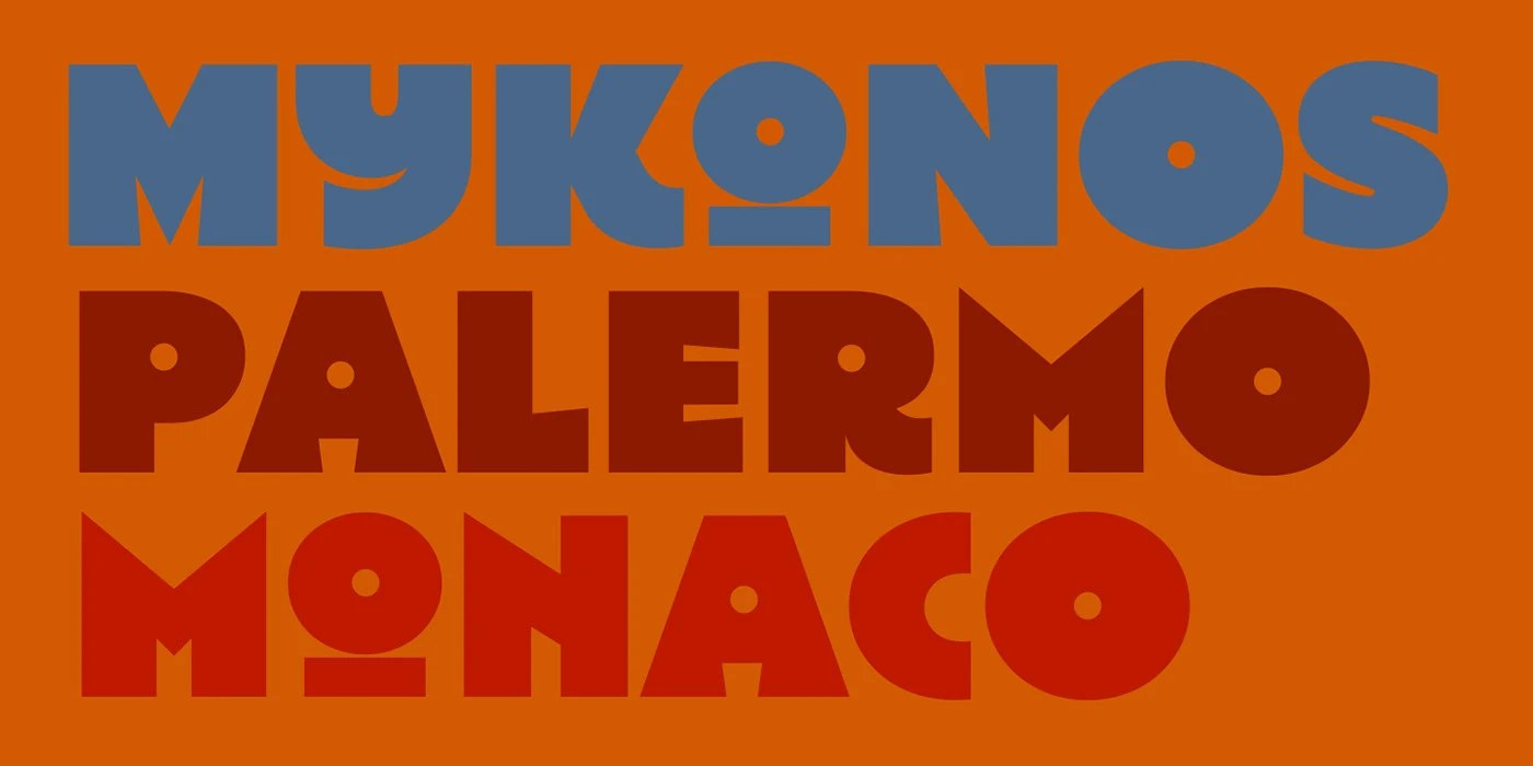
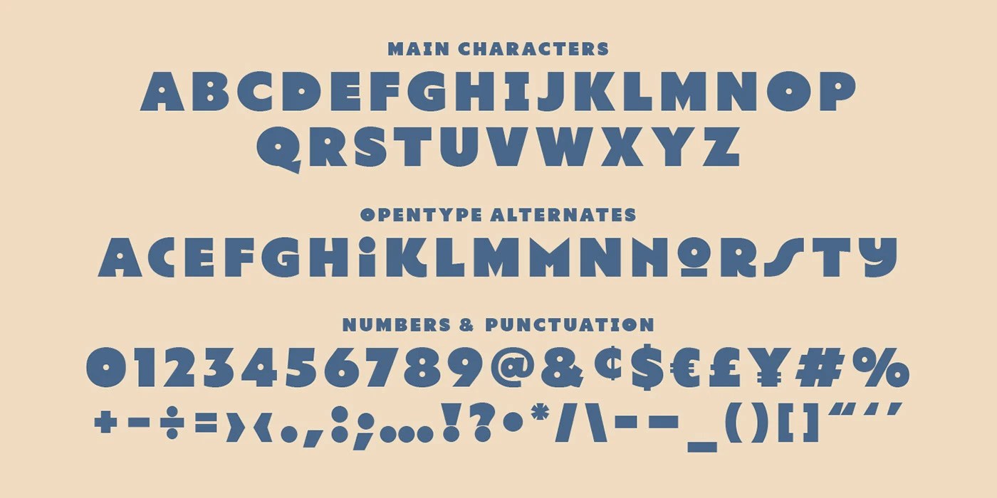
Arkitype Foundry built the ATF Manarola font around a handful of very deliberate decisions. The Regular style carries a flat-angled extrusion shadow — about 15 to 20 percent of cap height, dropping downward-right — that reads as physical depth rather than decoration. Circular counters run through the family: the dot of the lowercase i, the O, every round aperture becomes a perfect disc instead of open space. That one choice gives the font a toy-like solidity that holds at any size. The Soft Riso style layers a fine scatter of flecks across every stroke, simulating Risograph ink-bleed without muddying the forms. Color in the specimen works in saturated two-tone pairs — deep red with yellow, burnt orange with blue, olive with orange — a palette that reads as found rather than assembled.
ATF Manarola Font: Display Type for Food and Hospitality Branding
The ATF Manarola font ships in three cuts: Regular, Soft, and Soft Riso. Soft rounds every terminal to a consistent radius, turning the A crossbar from a bar into a rounded arch. The family targets headings, packaging, and food and hospitality branding — contexts where Mediterranean street-lettering warmth does real commercial work. For type with this kind of cultural specificity, the ATF Manarola font lands as a rare find. See the full project by Arkitype Studio / Andrew Footit on Behance.