ORO Coffee Packaging Design by 3rd Floor
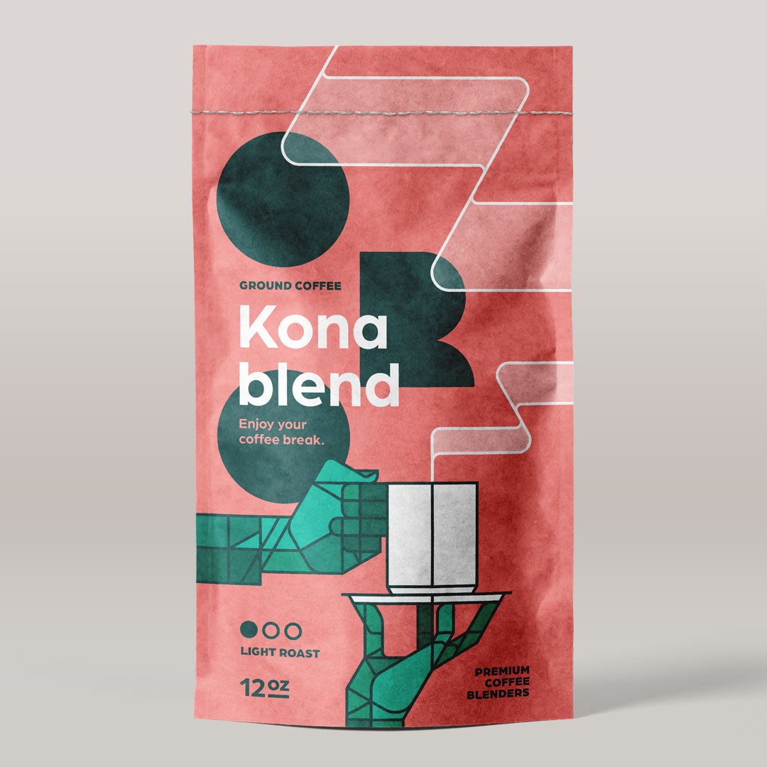
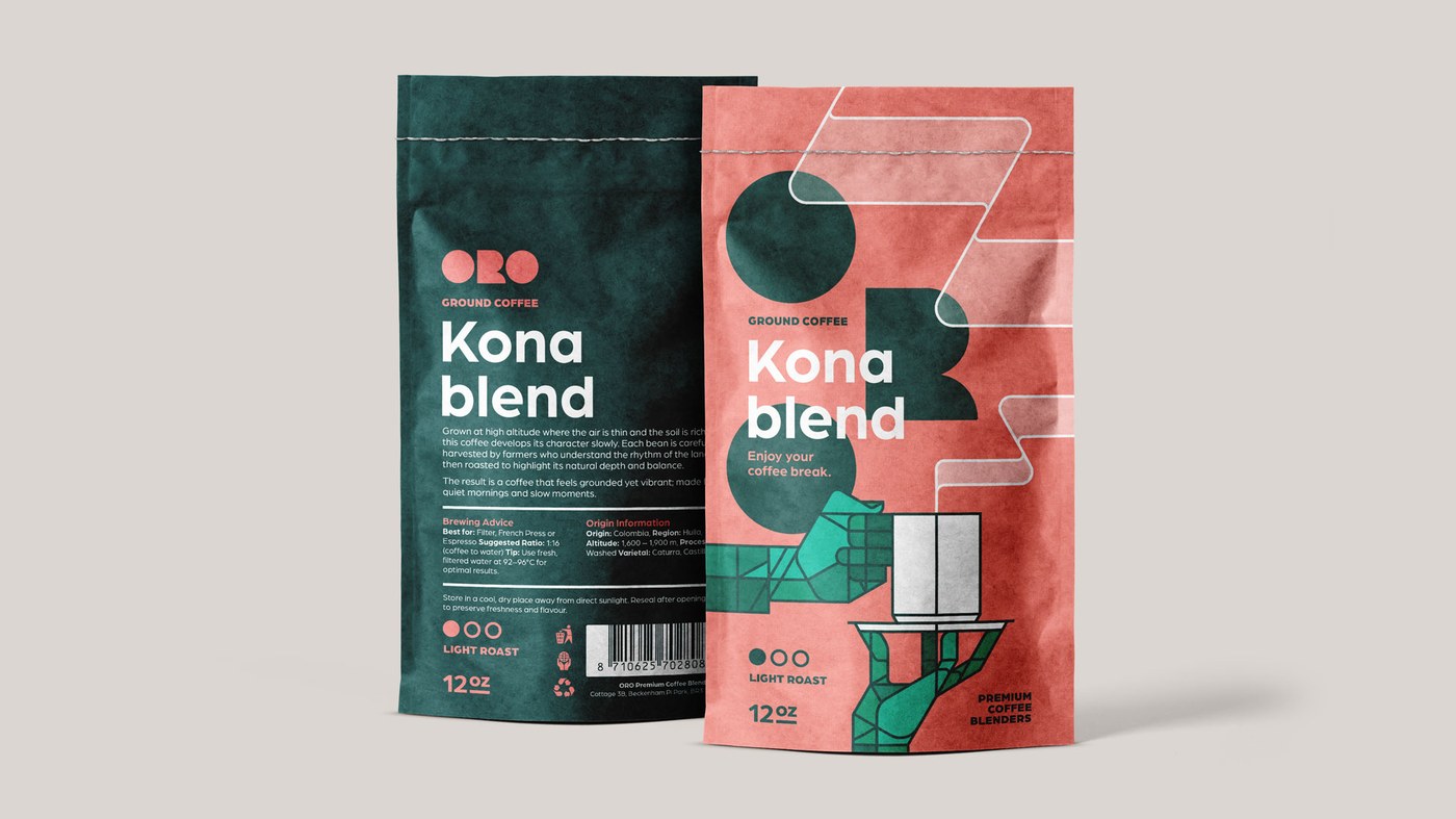
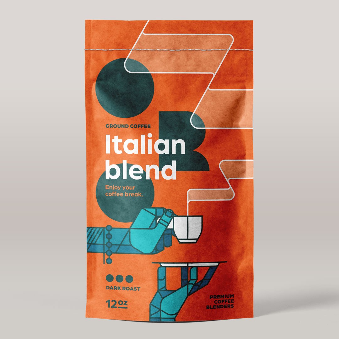
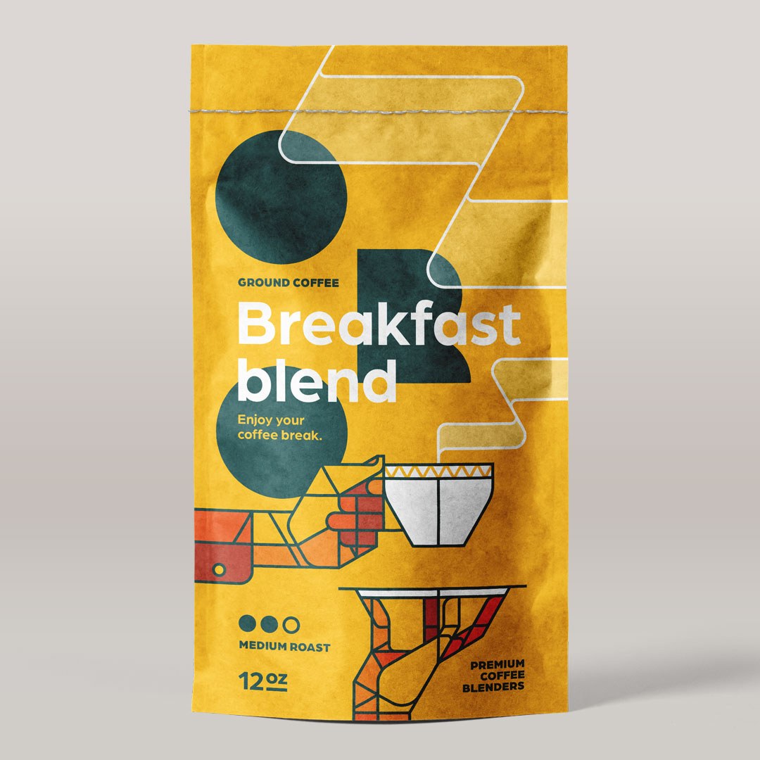
ORO coffee packaging design by 3rd Floor: coral, burnt orange, and golden yellow, a stained-glass facet illustration, and a three-dot roast-level system.
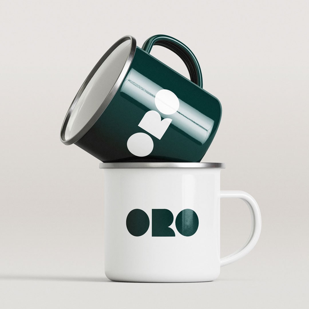
3rd Floor’s ORO is a fictional premium coffee packaging design built around a simple constraint: color does the sorting. Coral pink, burnt orange, golden yellow — each bag is a single saturated field with nothing competing for attention. What anchors the system is an R-letterform fragment from the ORO wordmark, blown up to roughly four times the size of the set type and bled off the right edge of each bag. It creates scale contrast without adding a second graphic element. The wordmark itself uses custom rounded letterforms — the two O characters are near-perfect circles — and the roast level is handled by a row of three dots at the bottom left: one filled for light, three for dark. No text required, reads clearly at thumbnail scale.
A scalable coffee packaging design system held together by three rules
The stained-glass illustration — hands, cup, saucer, and pour-over dripper rendered in flat teal, aqua, orange-red, and off-white facets with fine black outlines — carries the same vocabulary across enamel mugs and tote bags. This is what good coffee packaging design looks like at a system level: one field color, one illustration, one letterform shape. Change the color, keep everything else. ORO is a coffee packaging design concept worth studying for the clarity of its constraints. See the full project by 3rd Floor.