PLOP #02 — Polish Graphic Design Revue by Slanted
PLOP #02 is a 32-page graphic design revue from Slanted Publishers examining the Polish poster—its history as protest, export product, and national myth.
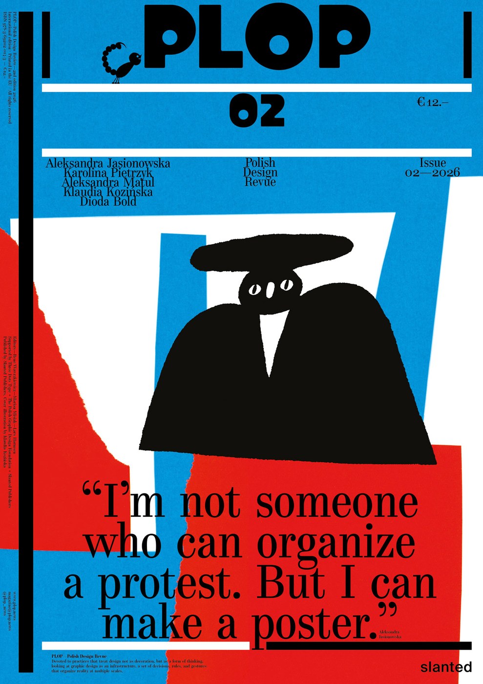
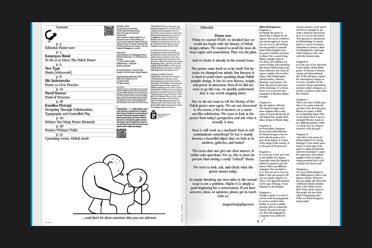
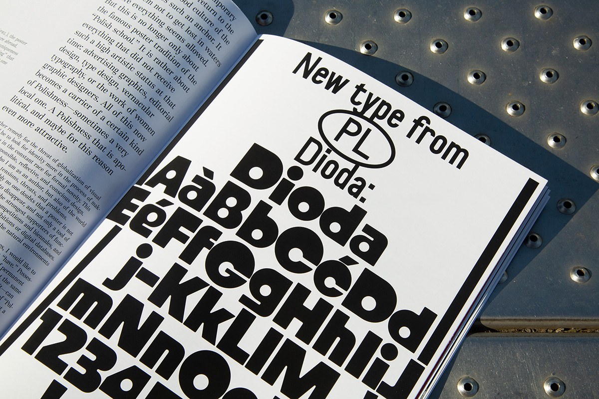
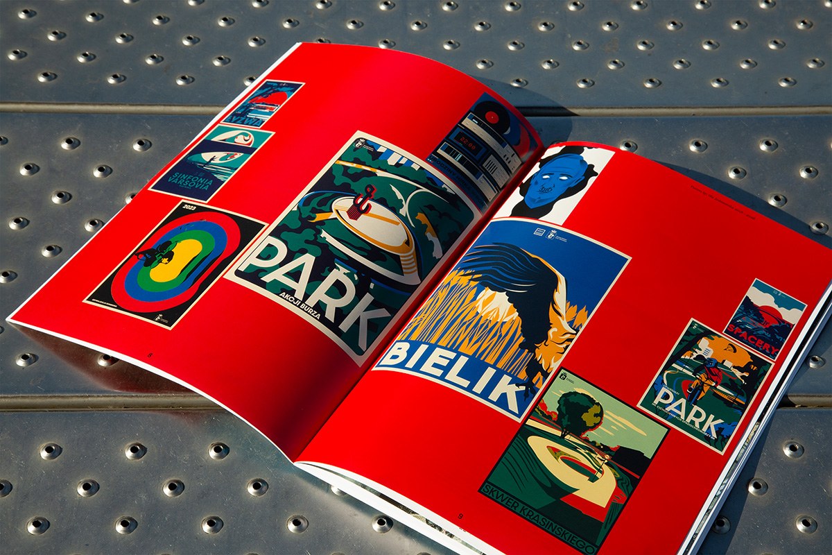
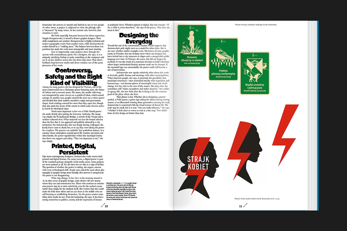
The second issue arrives in A4 saddle-stitched format, 21 × 29.7 cm, printed full color offset—proportions that echo the poster format it scrutinizes. The design by Marian Misiak and Lars Harmsen uses the Dioda typeface by Jan Estrada-Osmycki, made in collaboration with Three Dots Type Foundry. Inside, essays by Katarzyna Matul trace the Polish poster as a communist-era export commodity, while Karolina Pietrzyk and Paweł Starzec address what happens when graphic design moves from street walls to gallery frames.
Polish Poster Graphic Design Reconsidered
PLOP #02 refuses to treat the Polish graphic design tradition as fixed canon. Contributors probe biennials, festivals, civic practice, and AI tools with equal skepticism, asking whether the poster communicates, decorates, or simply ritualizes its own legacy. The revue sits at a useful intersection—graphic design criticism in a format small enough to read on a train, cheap enough to share.
See the full publication at Slanted Publishers.