by abduzeedo
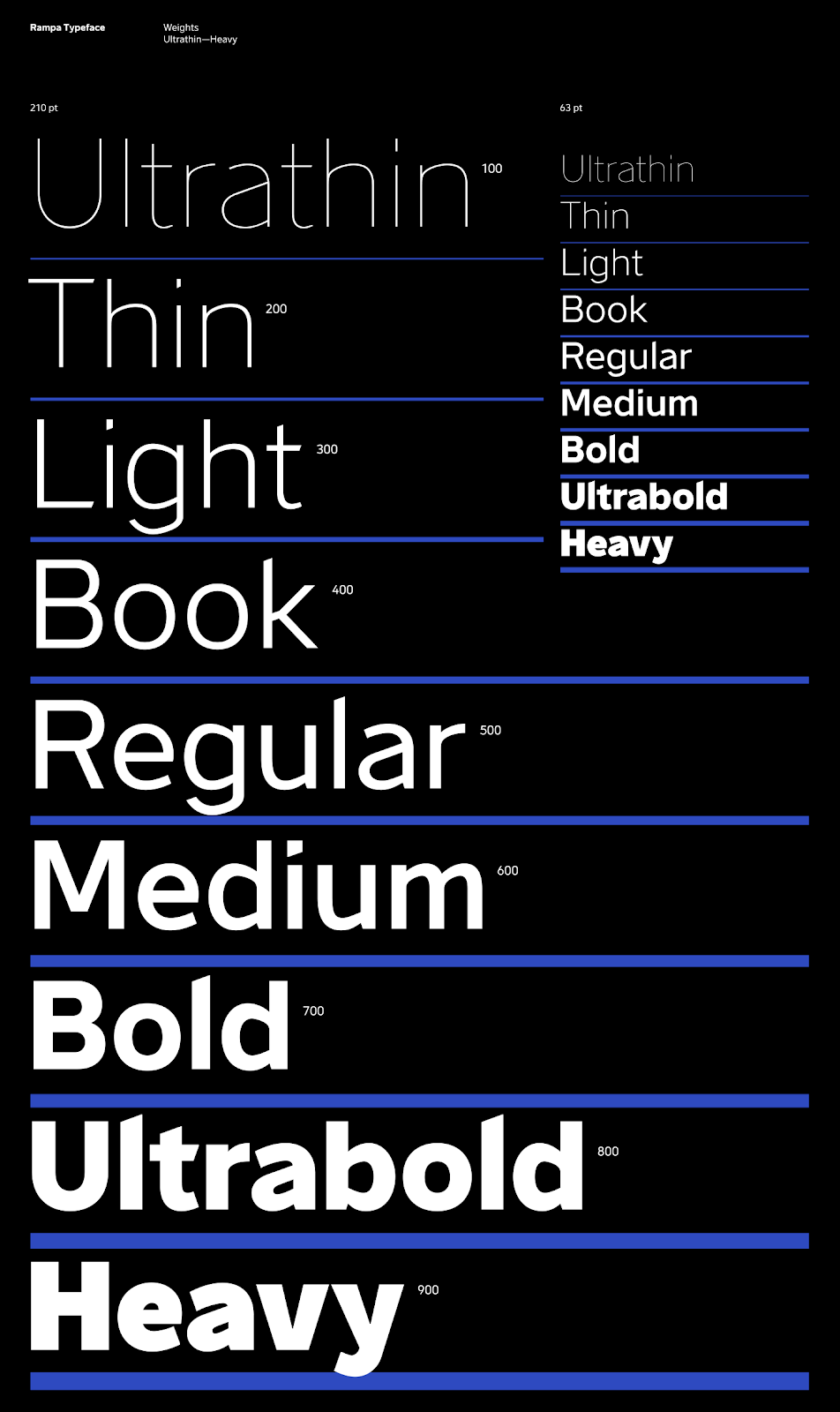
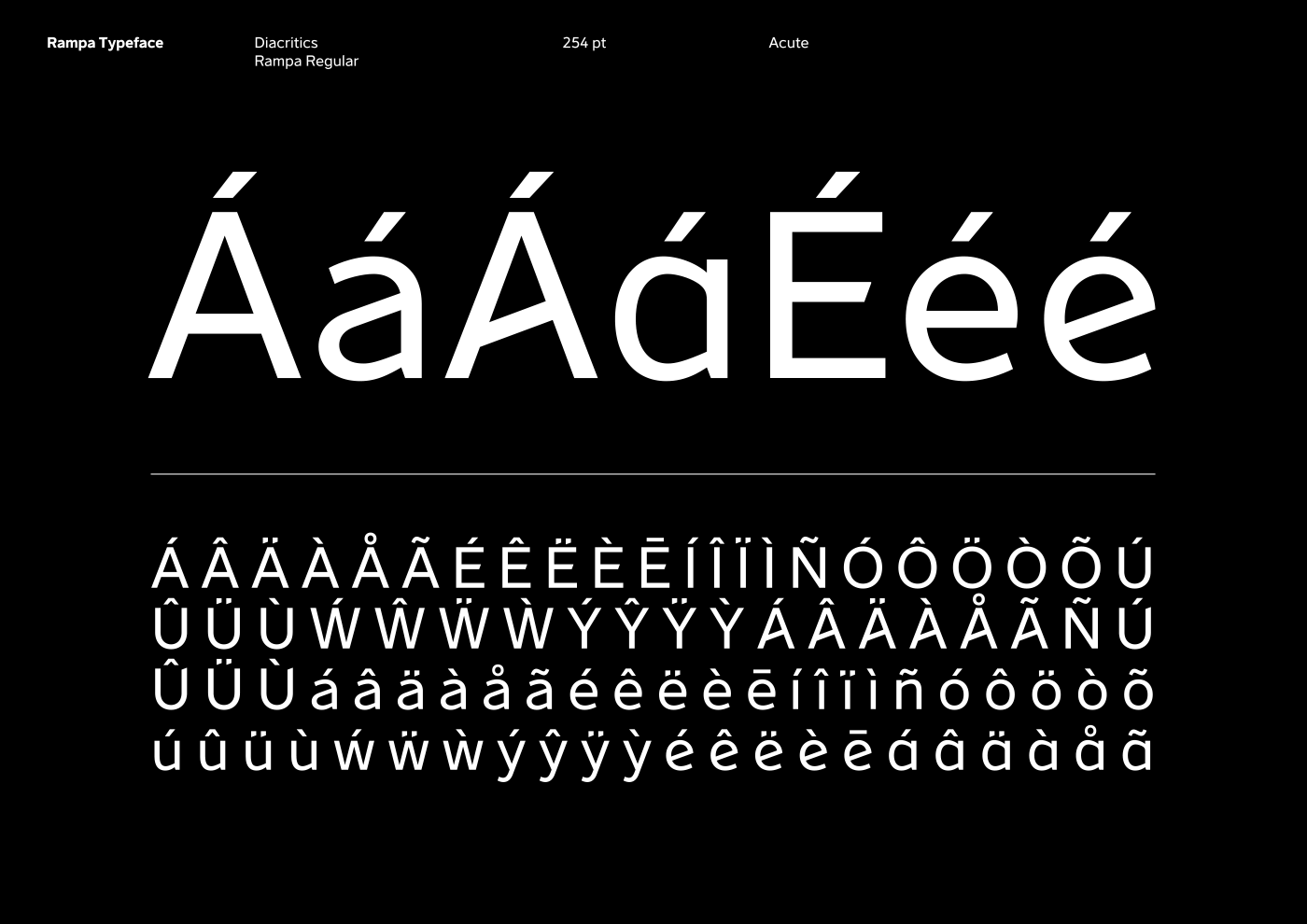
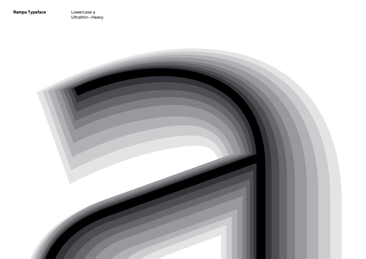
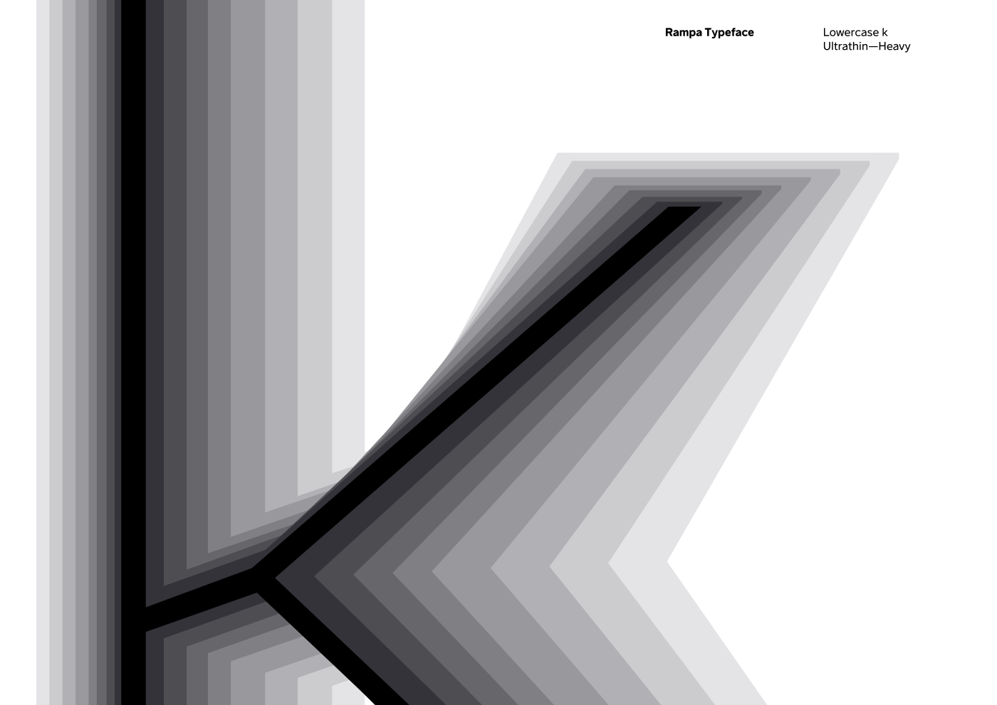
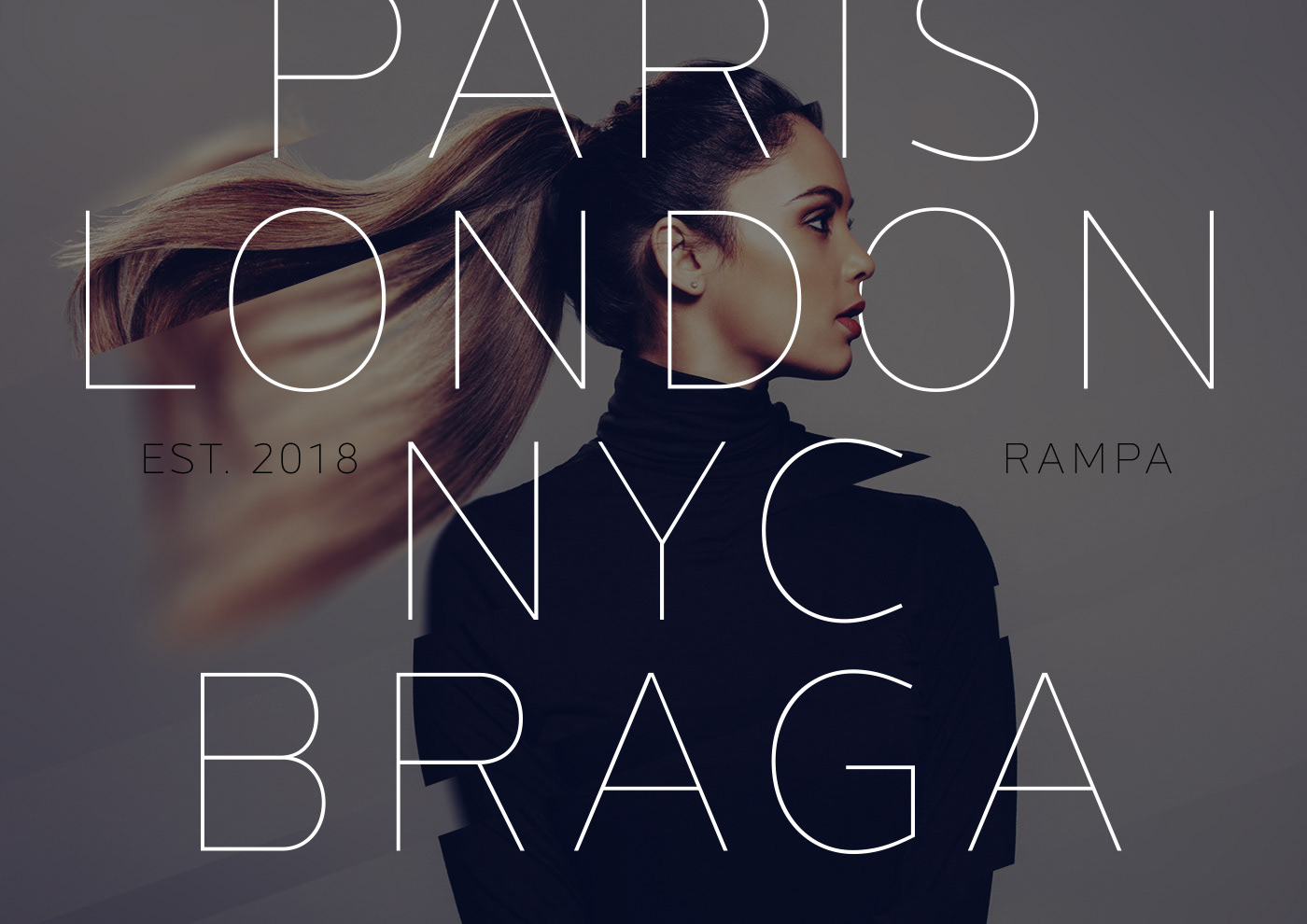
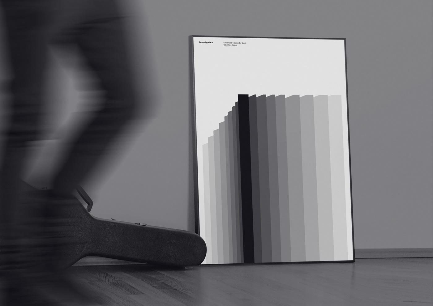
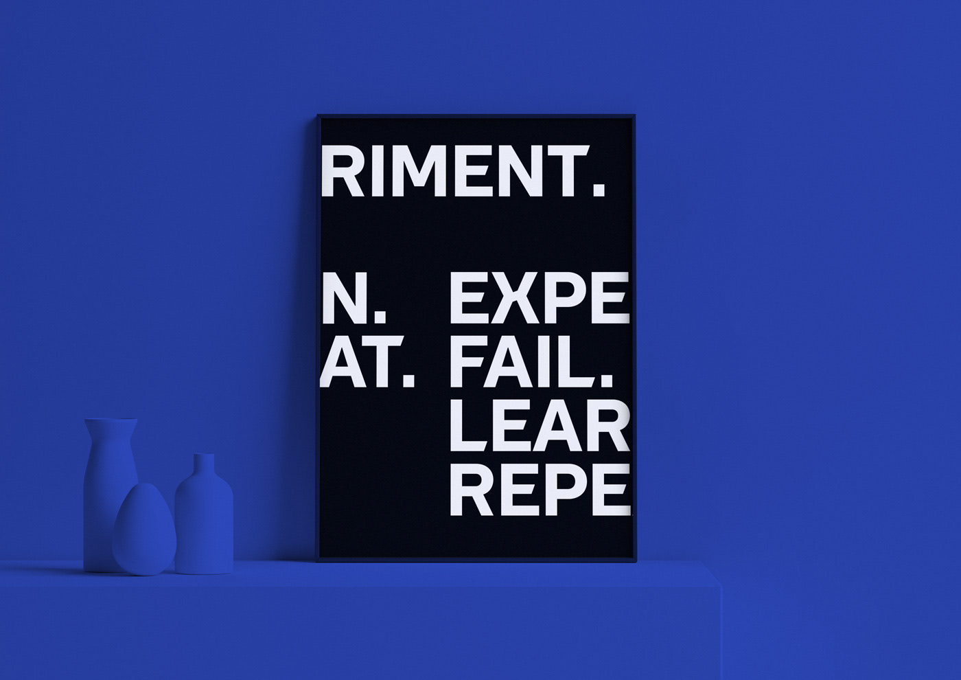
Pedro Matos shared a beautiful typography project on his Behance profile titled RAMPA. Built from scratch, for v10. Rampa is a bespoke typeface developed for Primavera BSS, born with the release of Primavera v10. Neither a grotesque nor a humanist font, Rampa is a contemporary yet friendly looking sans serif typeface—with moderate contrast and modern proportions—that plays on both sides of these styles. The key concept behind v10 branding and communication is a 20 degree acute angle, symbolizing growth and evolution.
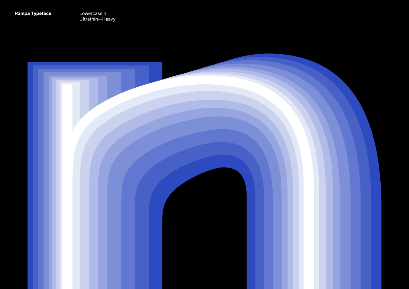
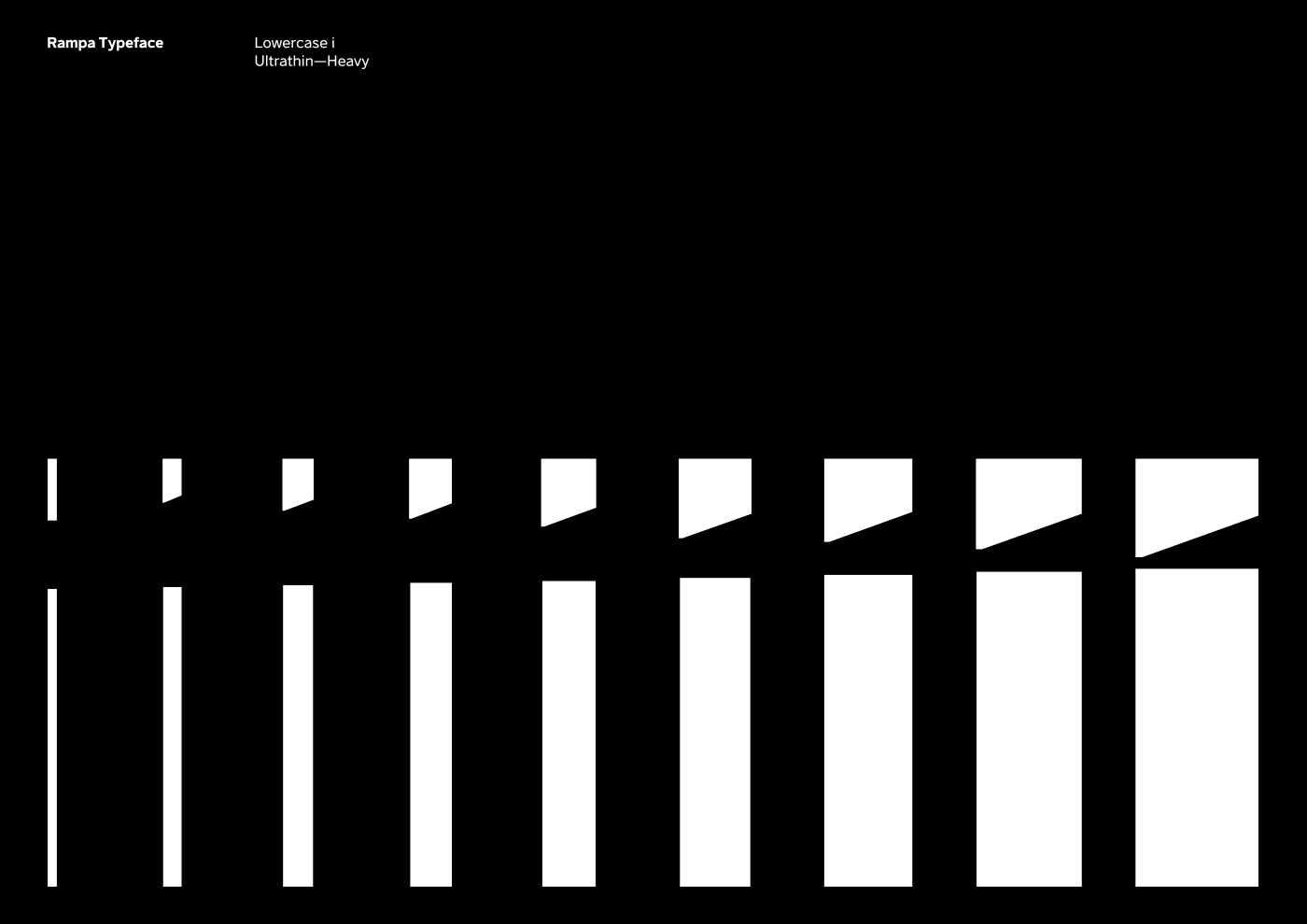
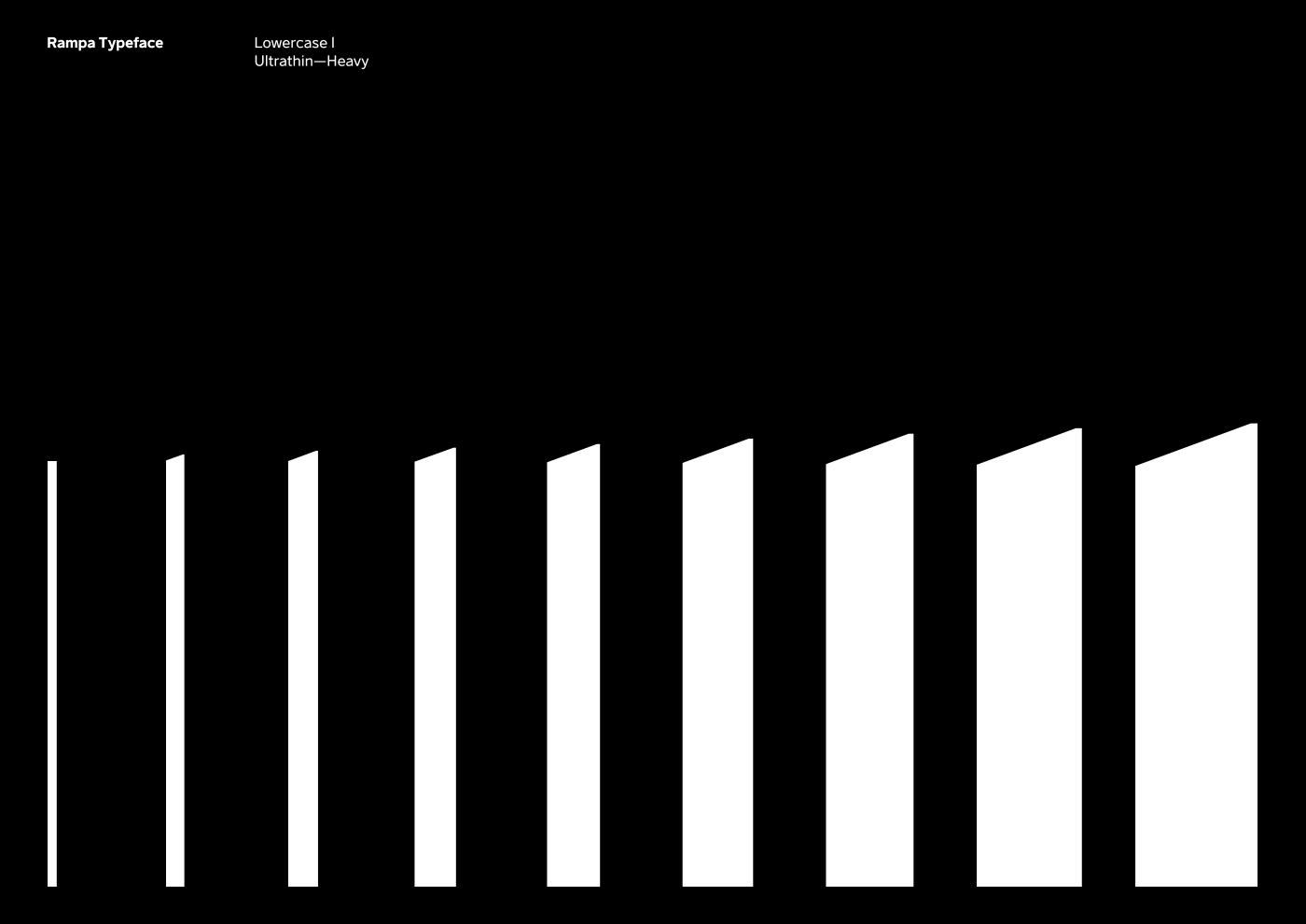
Rampa was crafted to include this 20º angle throughout almost every glyph geometry, present sometimes on a shoulder, on an apex, a leg or even a terminal, to bring out a higher sense of relationship between all parts.
Typaface


Credits
- Client: Primavera BSS
- Studio: Pi Creative Studio
- Creative direction and design: Pedro Matos


