Sans Serif Typeface: Solare and the Integration of Grotesque Form and Serif Grace
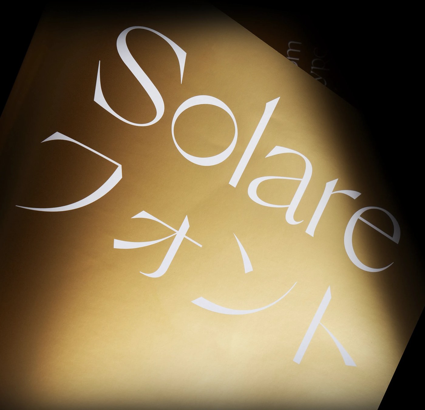
Solare is a versatile sans serif typeface designed by Nikolas Wrobel of Nikolas Type. Five years in development, the project merges traditional details with digital utility. The family offers sixteen distinct styles ranging from fine to black. It also includes matching italics and unique alternates. These glyphs introduce warm emotions into a clean typographic structure. The result is a highly functional tool for contemporary graphic layouts.
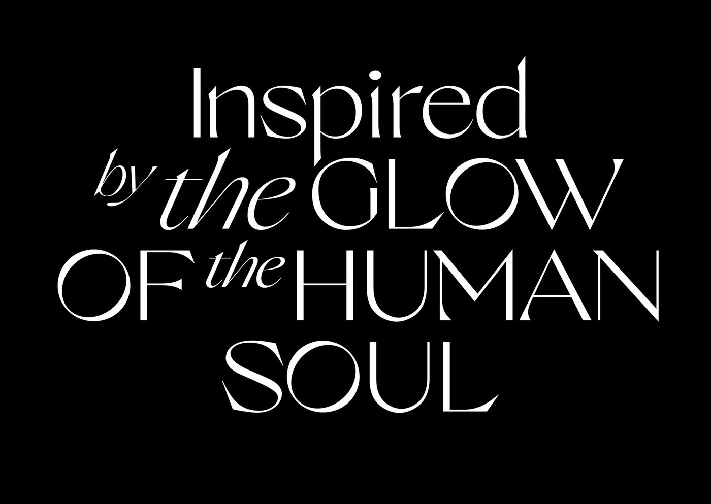
The design balances rigid grotesque geometry with delicate serif details. The letterforms display high-contrast terminals and sharp angles. This structure generates strong compositional tension. In use, the characters maintain a balanced visual rhythm. The modular grid dictates the layout. It allows ample negative space to shape the pages. Every stroke shows careful baseline alignment. The geometric restraint of the system provides clarity. It is perfect for both large headlines and dense text.
Harnessing the Adaptability of a Sans Serif Typeface
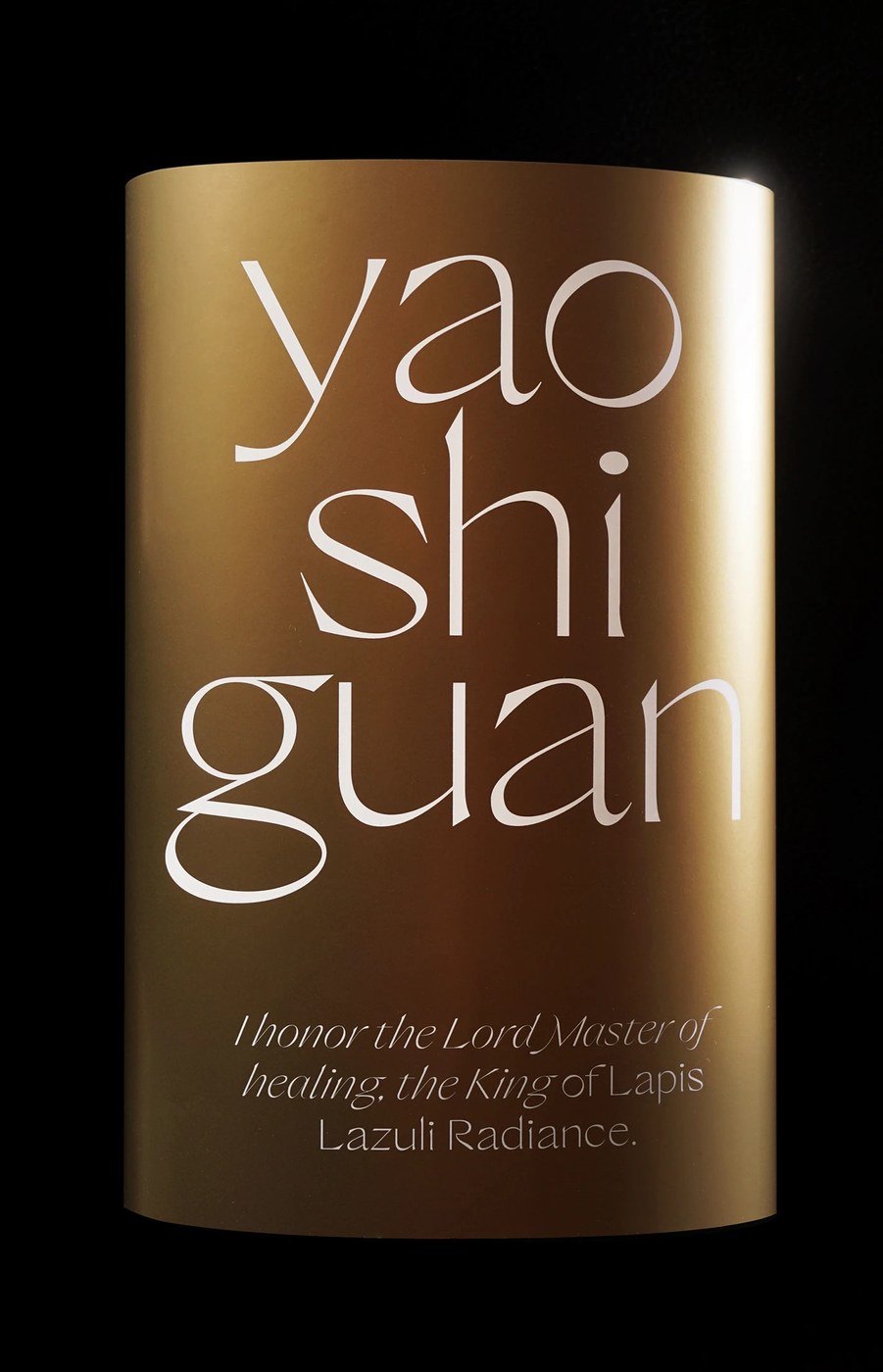
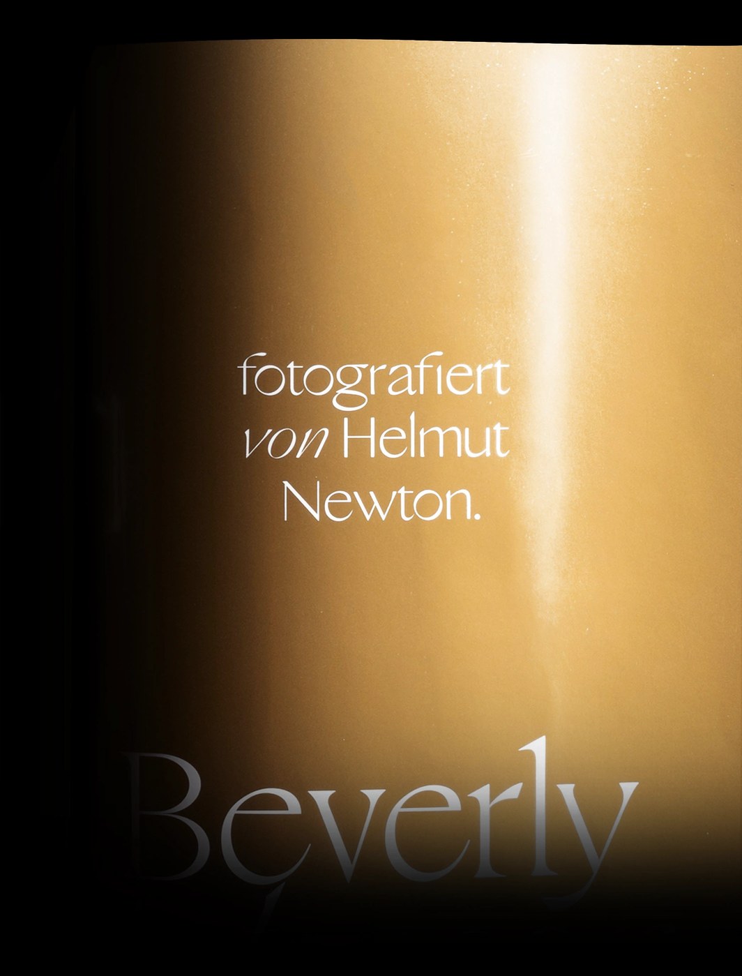
The variable font axis makes this sans serif typeface highly adaptable across weights. This typographic scaling ensures precise rendering on digital screens. In physical specimens, the letters cover cylindrical gold objects. A warm spotlight highlights the tactile contrast of the white ink. The gold paper offers a fine grain. Furthermore, glass letters and sculptures by Jon Vio introduce three-dimensional reflections. These sculptures translate digital curves into physical glass forms. The material interaction creates a rich visual experience.
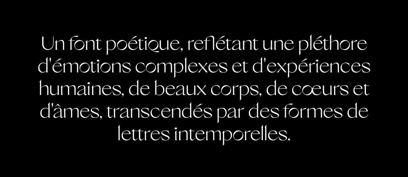
Nikolas Type has developed a distinct position in contemporary type design. The foundry merges classical printing traditions with modern software capabilities. This sans serif typeface demonstrates that utility and emotional expression can coexist. The resulting character set supports multiple languages. It includes comprehensive Japanese support. This makes the family versatile for global branding. It serves as a great tool for editorial designers. The project shows how type can feel warm yet disciplined.
Typographic systems today must perform across diverse media. Solare meets this demand with grace. The family offers both technical control and emotional resonance. Designers can experiment with the variable axis to create custom weights. This flexibility helps studios establish unique identities. The project represents a disciplined study in letterform design. It sets a high standard for modern independent type foundries.
Discover more details on the Nikolas Wrobel Behance page.