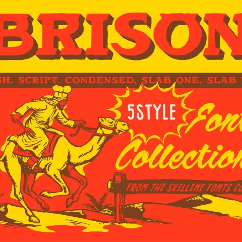
SFC Brison — Bold Retro Western Typeface Bundle
SFC Brison is a bold retro western typeface from Skilline Fonts Co. — 5 styles built for BBQ branding, hot sauce labels, and Americana packaging designs.
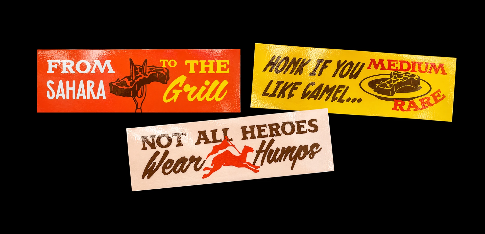
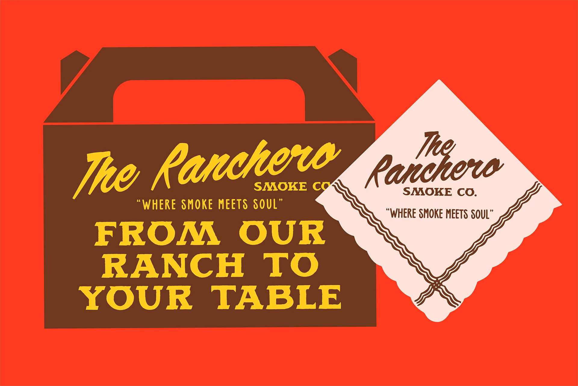
Most retro western typeface releases stop at one weight and call it done. Skilline Fonts Co. went further with Brison, building five condensed styles that share a consistent x-height and ascender line across the whole family. The letterforms carry exaggerated serifs that read as dimensional mass at display scale — the kind of stroke treatment that recalls old smokehouse signs and ranch-gate lettering, where the type had to hold up from forty feet away. Warm charcoal and sepia undertones run through the rendering, giving every weight a desert-weathered feel that looks earned rather than applied. Character pairs were tested against real commercial contexts: BBQ branding, hot sauce label copy, cantina menus, western apparel tags. A retro western typeface only works when it survives the label, not just the poster.
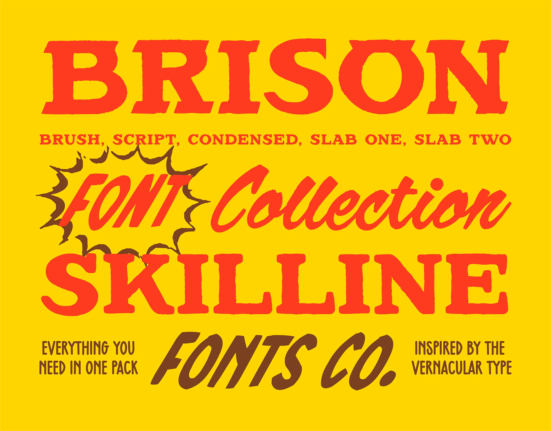
SFC Brison Retro Western Typeface — Five Styles, One Consistent Voice
The design problem here was range without drift. A family that reads as western at Regular needs to hold that identity through Bold — the silhouette has to stay legible even as the weight changes. Brison solves it by keeping the condensed proportions locked while letting the serif mass grow. The heavier weights push toward the dimensional look of carved wood; the lighter ones sit closer to vintage Americana packaging where ink economy mattered. That range is what makes this retro western typeface genuinely commercial — it can headline a menu board and label a bottle on the same job.
Skilline Fonts Co. built Brison for designers who work in food and beverage, apparel, and regional branding — categories where Americana shorthand is currency. The five-style structure means the family scales without switching fonts, keeping the identity tight across a whole brand system.