by sofia
Sous Forme brand identity captures a Zürich architecture studio’s ethos of human logic, shelter, and endurance through minimal, structural visual design.
Architecture studio Sous Forme was founded in Zürich by Elena and Marc Velden. The studio builds spaces that carry human logic as a founding principle. Their structures are designed to hold, shelter, and outlast the moment of their making. The practice takes a long view. Buildings are not backdrops; they are reasoning made physical.
Brand designer Gideon Phillip developed the Sous Forme brand identity to mirror that architectural conviction. The result is a system of restrained precision. Every element earns its place on the page. Nothing performs. Everything means.

Sous Forme Brand Identity: Structure Made Visible
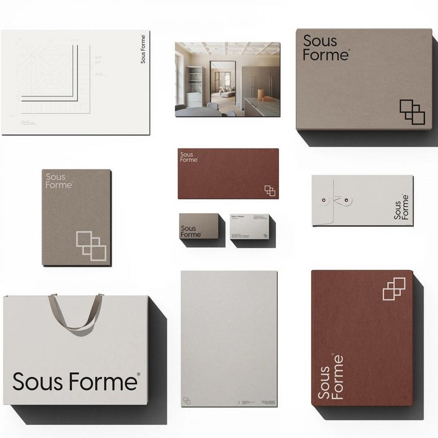
The Sous Forme brand identity opens with a geometric logomark built from four interlocking squares. The form is tight, balanced, and deliberately architectural. It reads as a plan view. It reads as a grid. Alongside the mark, the wordmark uses a clean geometric sans-serif with subtle humanist curves. Guide lines are visible in one presentation slide, exposing the typographic construction beneath the surface. The letterforms have been drawn with the same care given to a section cut.

The color palette runs from charcoal black through dusty terracotta to warm greige and cream. These are material tones. They recall raw concrete, pale stone, and aged timber. A printed collateral suite reinforces the palette across matte book covers, branded boxes, string-tied envelopes, and business cards in both dark and light variants. Shopping bags carry the wordmark in black on warm grey. Each piece shares the same quiet register.


Editorial layouts carry an italic serif tagline alongside precise sans-serif body text. The manifesto reads: “Form is the skin. Beneath it is the reason. We work beneath.” That sentence governs the entire system. The Sous Forme brand identity does not decorate. It reasons. Gideon Phillip translated an architectural philosophy into visual form without ornament or excess, delivering a brand that holds weight the way a well-built wall does.