by abduzeedo
In the vast sea of music platforms, there's a tune that stands out, a rhythm that captivates. Enter StreamFi, a branding and visual identity creation elegantly sculpted by Alan Cheetham.
StreamFi isn't just another music platform; it's a revolution. It dreams of a harmonious world where artists and their fans are in sync. Here, music NFTs are more than just digital assets; they're tools empowering artists, giving them 95% more from their creations, all thanks to the platform's ingenious features.
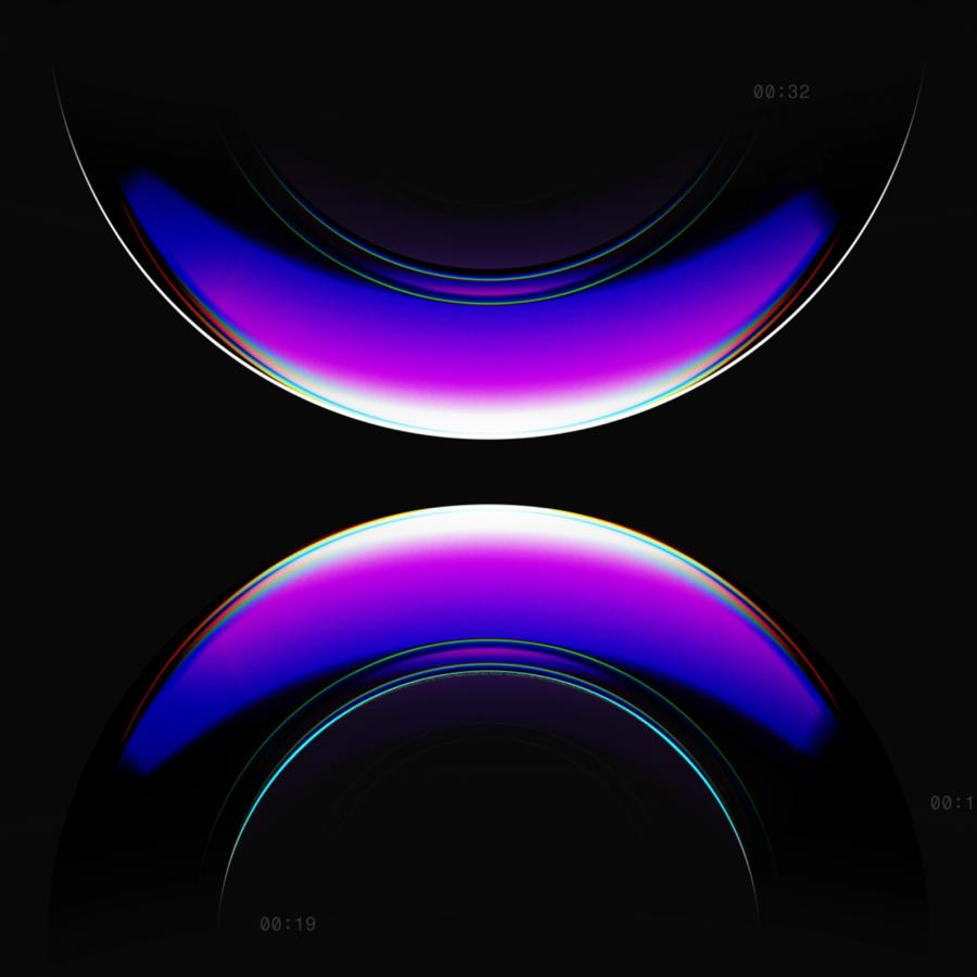
The logo is an ode to music itself. Gently undulating wave forms represent the melodies we cherish, while the paired quarter circles signify the continuous dance of audio, traveling seamlessly from remote servers to our devices. And, in a delightful twist, tilt the logo, and a subtle 'S' for StreamFi emerges, as if by magic.
The brand mark draws inspiration from a wave form connected by two interceptive quarter circle shapes either end, these represent the continuous transmission of audio that occurs in the streaming process via sending and receiving data between a remote server and device.
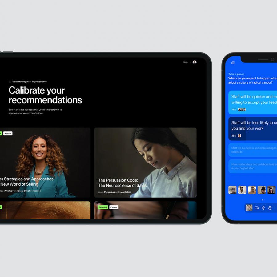
Alan’s design expertise is evident in every curve and color. The challenge was monumental: to not just rebrand StreamFi, but to breathe new life into its identity. The aspiration? A youthful, dynamic design that seamlessly waltzes across every brand interaction. Verdict? Alan struck the right chord.
For those with an eye for design frequenting abduzeedo.com, the branding of StreamFi stands as an epitome of elegance and innovation. Amidst cacophonies, it's the melody that stays with you.
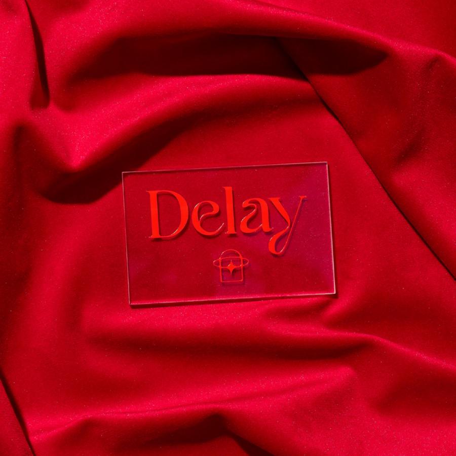
Branding and visual identity artifacts
For more information make sure to check out Alan Cheetham Behance profile or follow them on Instagram and LinkedIn
