by abduzeedo
Perfectly boring studio crafts a playful branding and visual identity for Second Brain, an HR service provider. Mixing playful iconography with warm colors and bold typography
The challenge of branding an HR service provider like Second Brain lies in striking the right balance between professionalism and approachability. Perfectly boring studio achieves this balance with a warm color palette and playful iconography, creating an identity that is both credible and engaging.
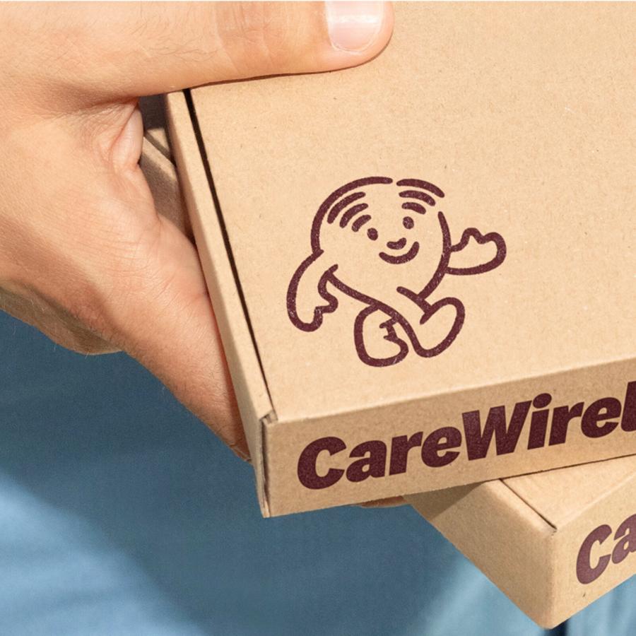
The studio's approach is evident in the brand icon, a dynamic figure rendered in a bold, graphic style. This playful twist on the classic silhouette injects a sense of irony and fun, reflecting the studio's commitment to "making boring things unboring."
The color palette is another key element of the brand identity. Warm hues create a sense of approachability and empathy, qualities that are essential for an HR service provider.
Perfectly boring studio's approach to branding is not just about aesthetics; it's about creating an identity that reflects the client's values and mission. In the case of Second Brain, the identity conveys the company's dedication to helping companies elevate their organizations to new heights.
The studio's use of classic office objects as shapes for the main brand elements is a clever way to infuse the design with reminders about office life. This attention to detail creates a cohesive and memorable brand experience.
The result is an identity that is:
- Warm and friendly: The color palette and playful iconography create an approachable and inviting feel.
- Empathetic: The design conveys a sense of understanding and compassion, reflecting Second Brain's commitment to helping companies navigate the complexities of change.
- Professional: The bold typography and clean lines maintain a sense of credibility and expertise.
Perfectly boring studio's work on the Second Brain brand identity is a testament to the power of thoughtful and creative branding. By understanding the client's needs and values, the studio has created an identity that is both effective and engaging.
See more of perfectly boring studio's work on their website.
Branding and visual identity artifacts
The essence of this design is rooted in the understanding that it’s created for those who create comfort for others. Every element in the design, from the bold and chunky typography to the soft-shaped letters in the brand’s logo unite to convey a sense of humanity. This not only enhances the aesthetics but also reinforces the brand’s commitment to connecting with people on a more personal level. Seeing such compassion and the desire to change we could only mirror it in our design, completing the brand’s appearance.
Credits
- Client: Second Brain
- Designed by perfectly boring studio: Olya Dyatlova, Anastasiia Shcherban
- Art Direction: Anastasiia Shcherban
- Creative Direction: Son of Rand
