YARI CLUB Restaurant Brand Identity by Studio NinetyOne
London-based design practice Studio NinetyOne created a cohesive restaurant brand identity for YARI CLUB, a modern Japanese yakitori establishment. By combining clean typography with sharp graphic lines, the project presents a confident approach to hospitality design.
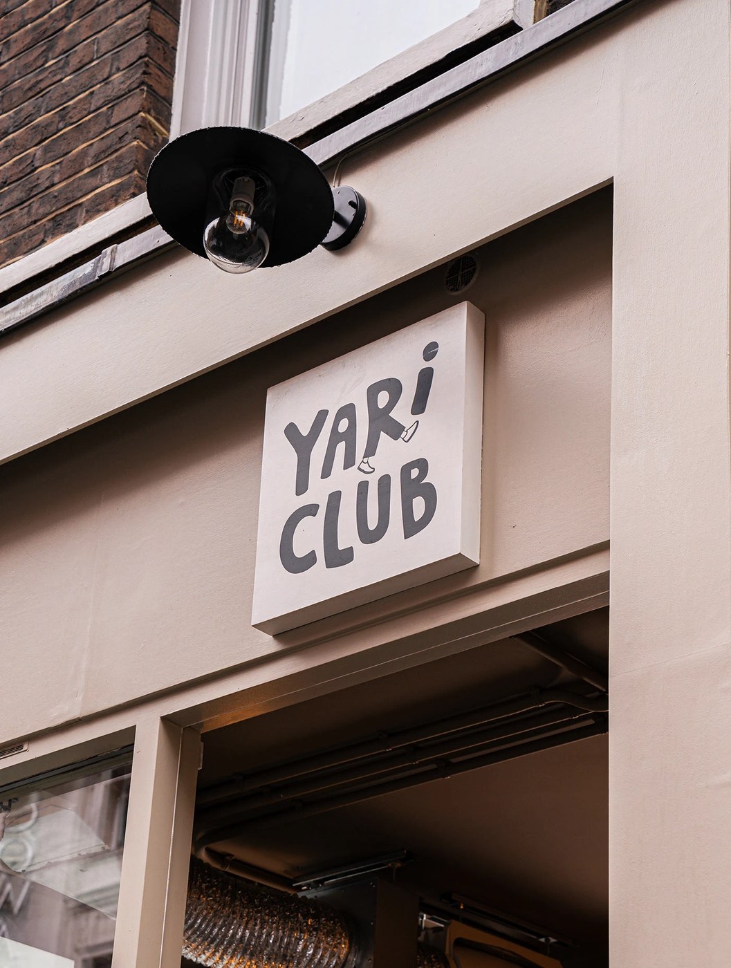
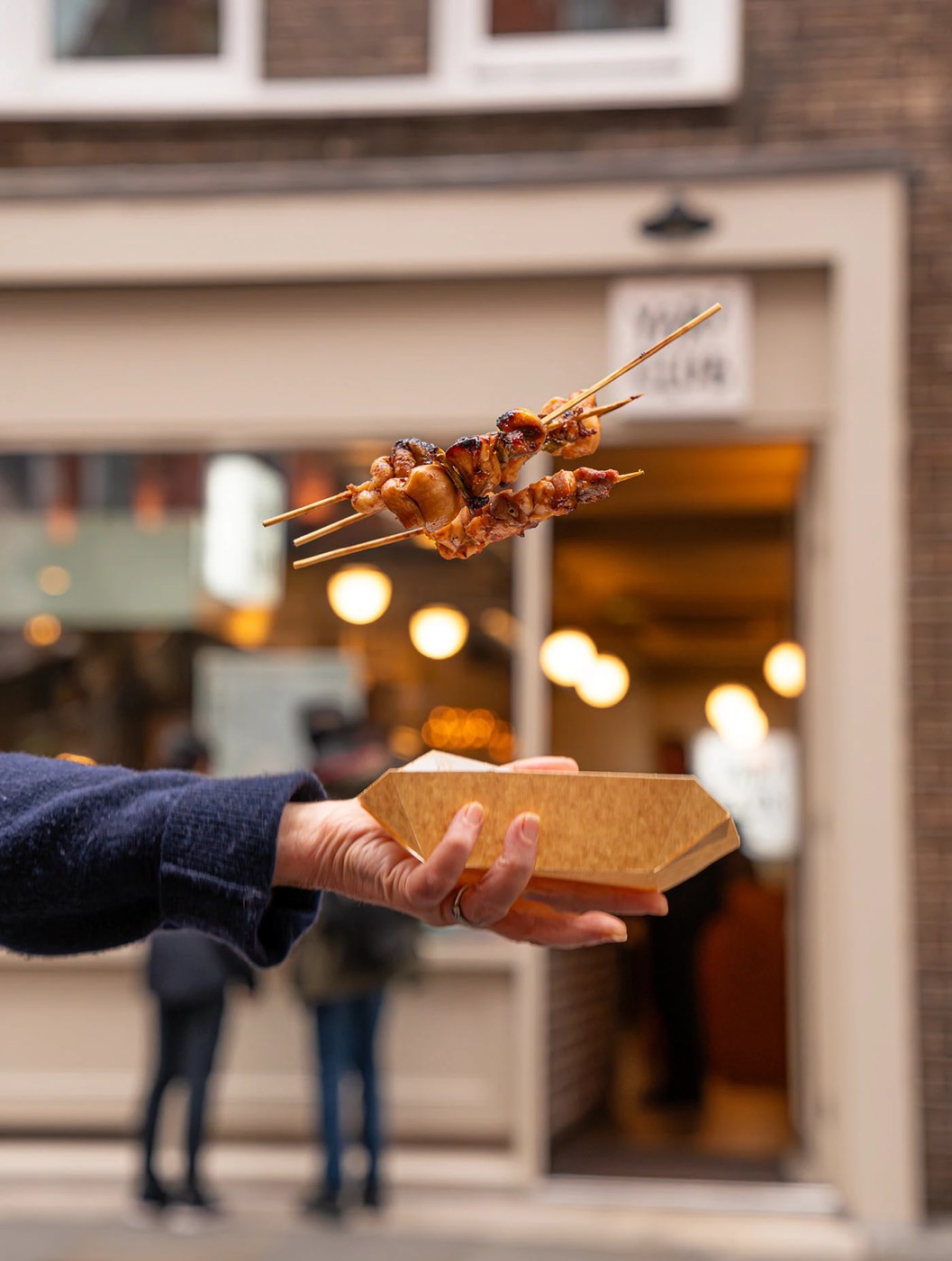
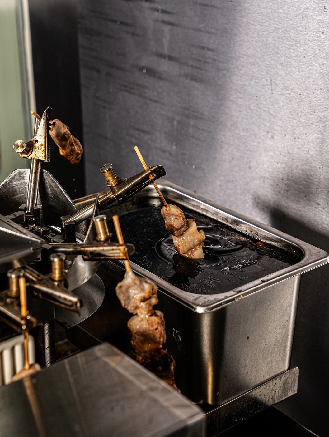
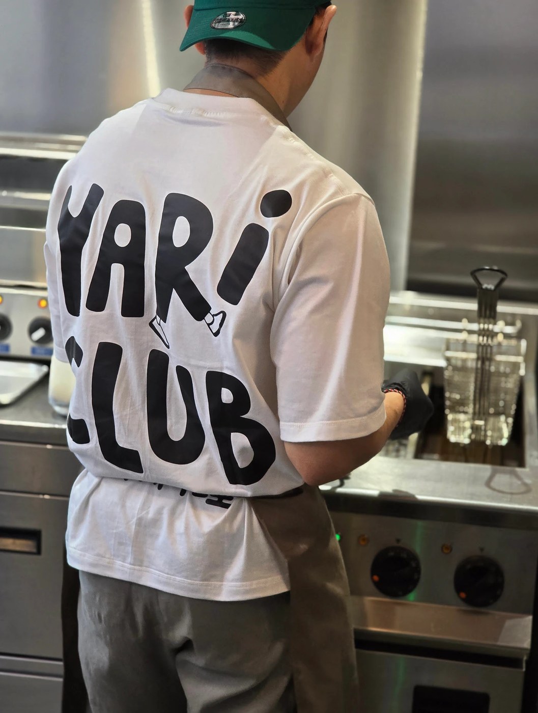
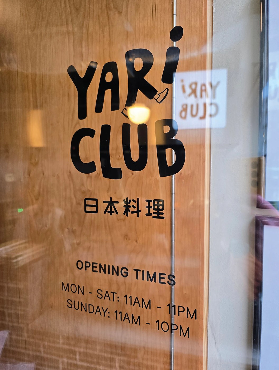
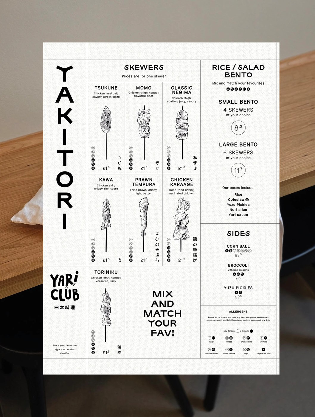
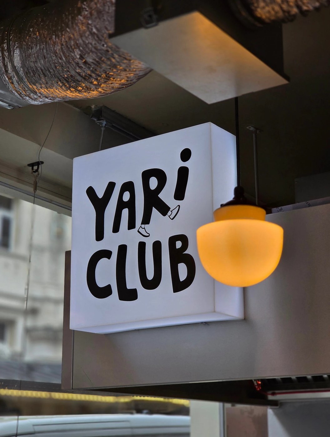
The visual system centers on a custom wordmark that draws inspiration from Japanese architecture and vertical grid layouts. Bold geometric strokes define the custom lettering, balancing physical mass with quiet space. To create visual tension, the designers pair these primary logos with highly detailed, fine-line technical illustrations. The color palette relies on off-white, deep charcoal, and a single accent of warm vermillion red. This specific choice of red echoes classic lacquerware traditions while retaining a modern feel. The restaurant brand identity extends gracefully from paper menus to spatial applications, using material textures like rough wood and concrete to anchor the identity.
Crafting a Modern Restaurant Brand Identity
Beyond the physical assets, the design defines the atmospheric voice of YARI CLUB. By avoiding predictable cultural cliches, the studio focuses on craftsmanship and graphic restraint to convey a contemporary dining experience. This restaurant brand identity demonstrates how historical references can be translated into a clean, modern design language.
The complete restaurant brand identity is fully documented on Behance, where you can explore more design work by Studio NinetyOne.