by abduzeedo
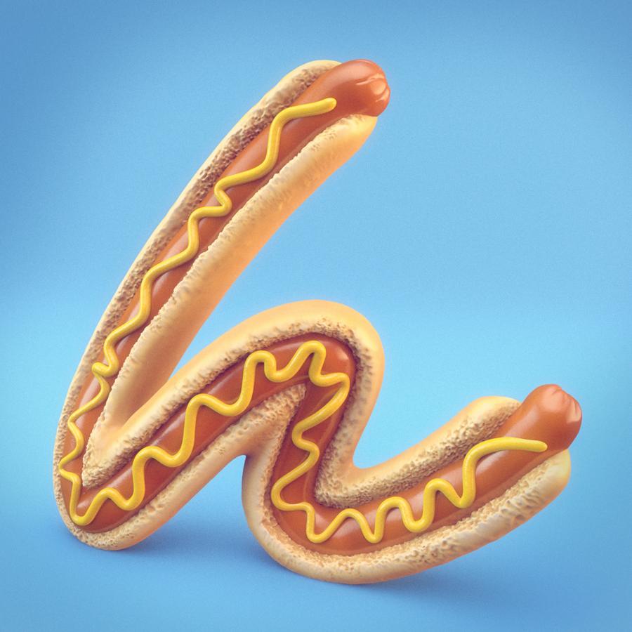
As personal experimental projects, when starting with the alphabet "A" for the typography animation, J2Motion(Jin Jeon) just came up with the conflicting words in some way such as "Alignment" to "Air" which is the title of this project. With that in mind, the animation presents more precise and elaborate moments for the first word. On the other hand, this ends up with a rather flexible and loose vibe to manifest the last letter.
Inspiration
Many designers are recently working on 36 days/weeks/months of type projects to broaden their perspective and improve skills. Those creatives give much inspiration all the time, and J2Motion's also been diving into this. While designers out there usually create it with either static images or just quite short sequences, He’d rather like to make one-of-a-kind animations which could stand for more meaningful moments beyond just the beauty of design. On top of that, as for the intro part it's inspired by great artists, Vincent Schwenk and Vitaly Grossmann.
Credits
- Director, Designer, Animator, and Compositor: J2Motion(Jin Jeon)
- Sound: J2Motion(Jin Jeon), Motion Array
For more information make sure to follow J2 Motion on Instagram at @j2motion
