by abduzeedo
Discover the innovative branding and visual identity of Banco Itaú, Brazil's largest bank, redesigned by Pentagram for its 100th anniversary.
Brazil's banking giant, Banco Itaú, has unveiled its branding and visual identity redesign, marking a significant milestone as the bank approaches its 100th anniversary in 2024. Designed by the esteemed New York-based design firm Pentagram, this project is not just a transformation of a logo but a reimagining of a brand that resonates deeply with its Brazilian roots.
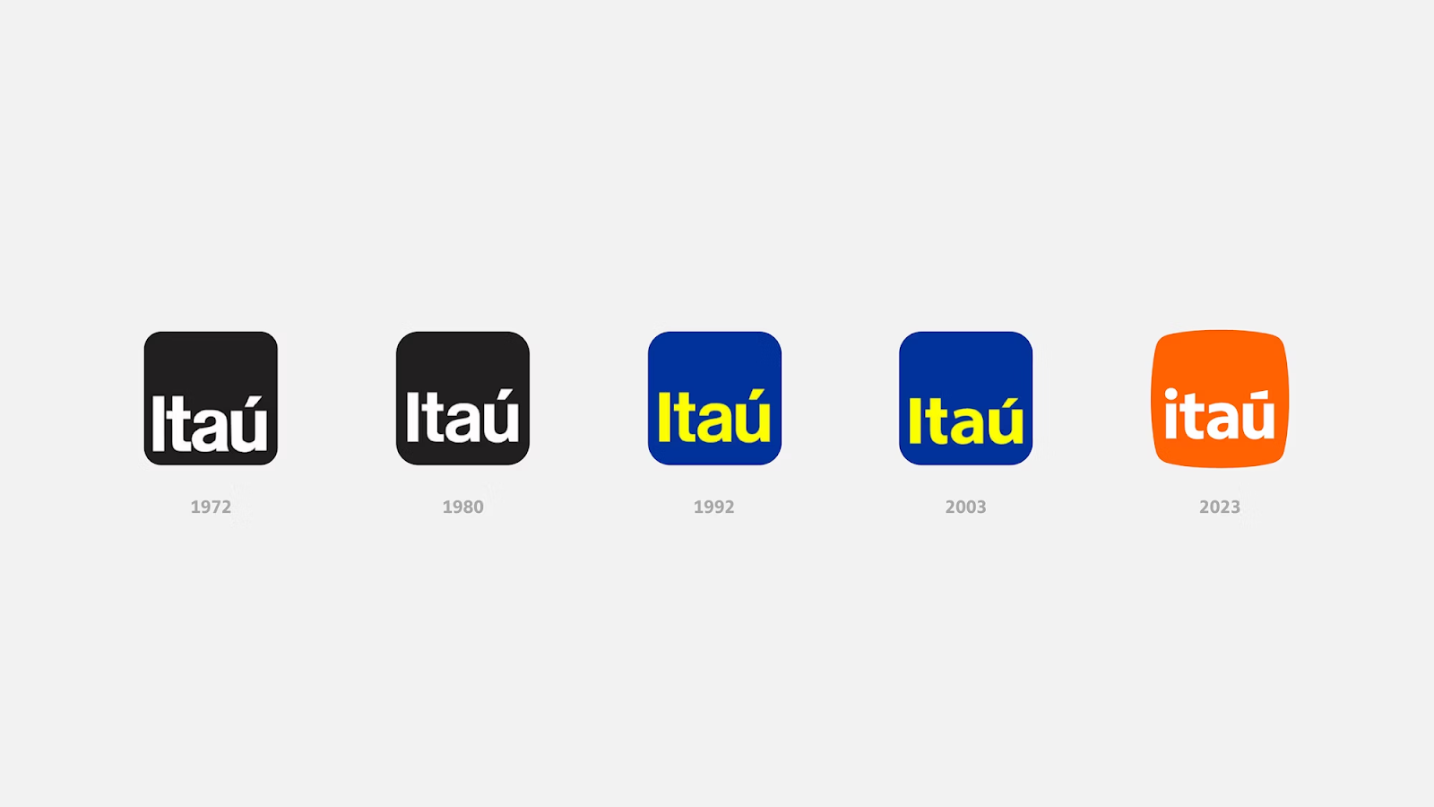
Banco Itaú, a household name in Brazil and a titan in Latin American finance, has evolved its iconic logo to reflect both its rich heritage and its vision for the future. The redesign journey is led by Pentagram's partner Michael Bierut, along with a talented project team comprising Jonny Sikov, Lauren Rush, and Camila Pérez.
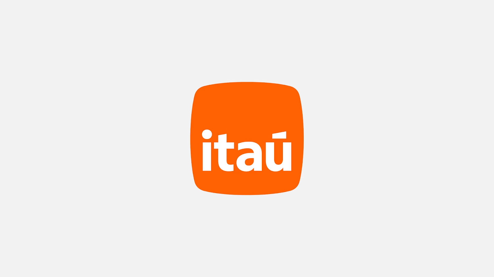
The new logo draws inspiration from 'pedra' (stone in Portuguese and Spanish), symbolizing endurance and reliability. This concept is deeply rooted in Itaú's name itself, which means 'black stone' in the indigenous Tupi-Guarani language. Pentagram and Itaú's in-house design team innovatively evolved the traditional square logo, famous since the 1970s, into an organic shape reminiscent of river stones smoothed over time. This shape, both dynamic and tactile, aptly represents Itaú's approach to banking – personal and enduring.
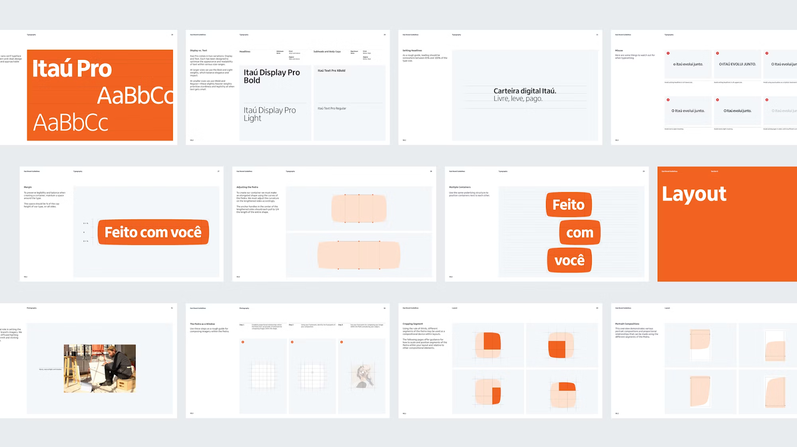
Typography plays a crucial role in this redesign. The collaboration with Dalton Maag, Fabio Haag Type, and Commercial Type has led to a logotype with a fuller geometry. The logo now features a lowercase 'i' with a round tittle and a balanced acute accent over the 'u', enhancing its approachability and distinctiveness.
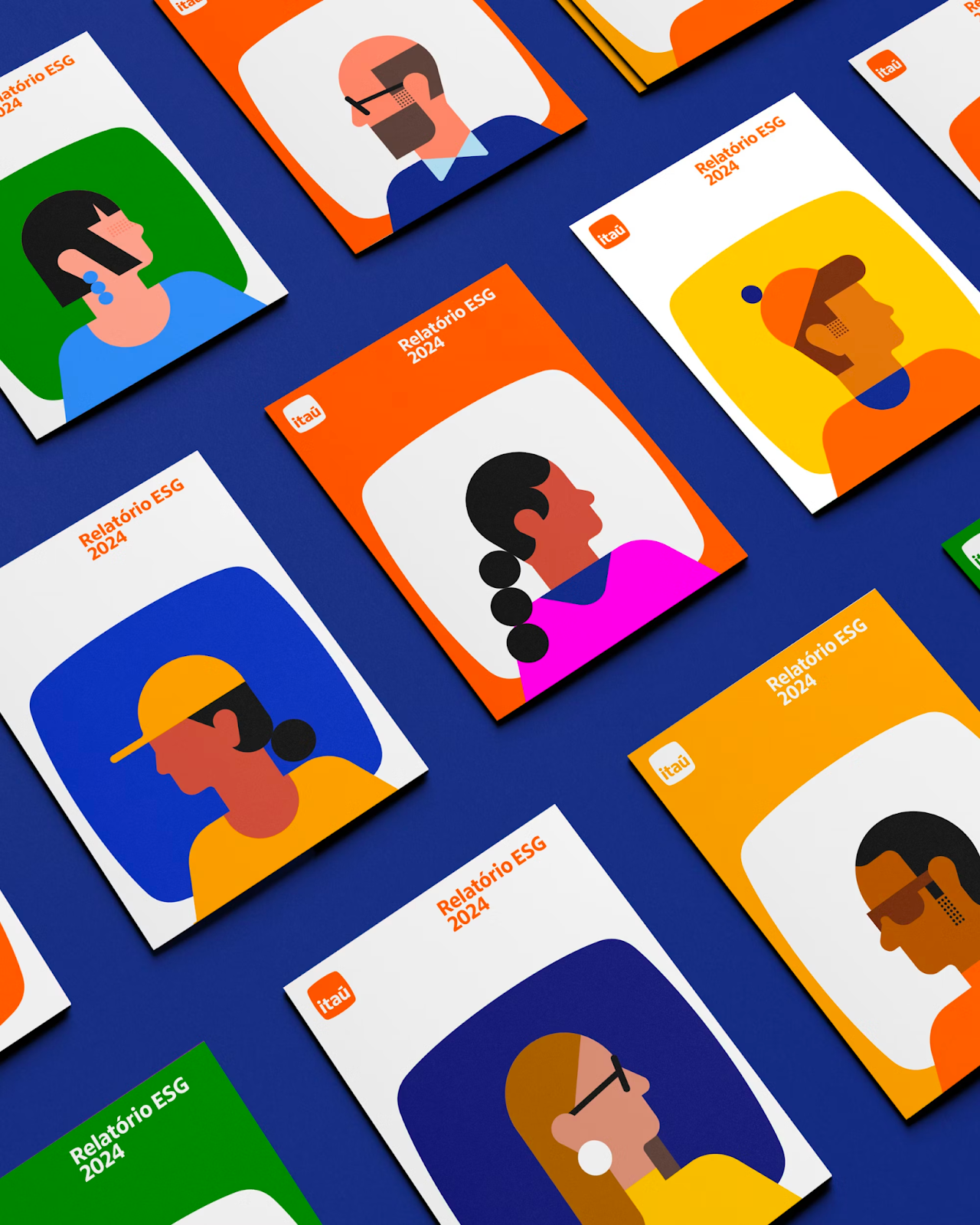
A significant shift in the color palette is also part of the new identity. The earlier blue and yellow scheme now gives way to a warm, radiant orange as the primary brand color. This is complemented by a broader secondary palette incorporating quintessential Brazilian colors – yellow, blue, green, and pink.
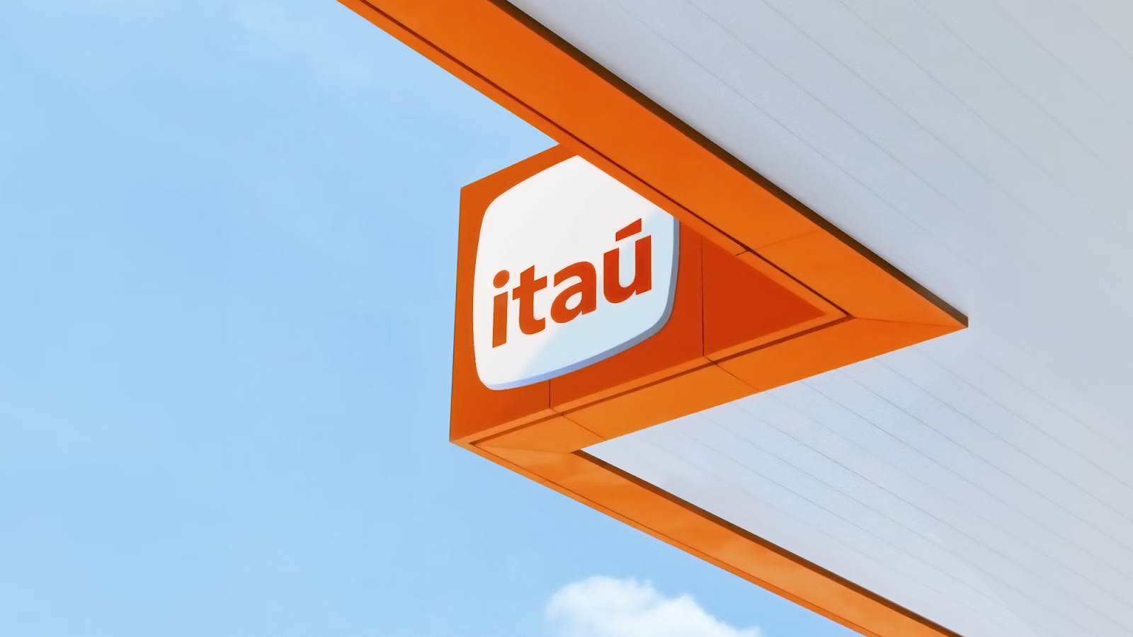
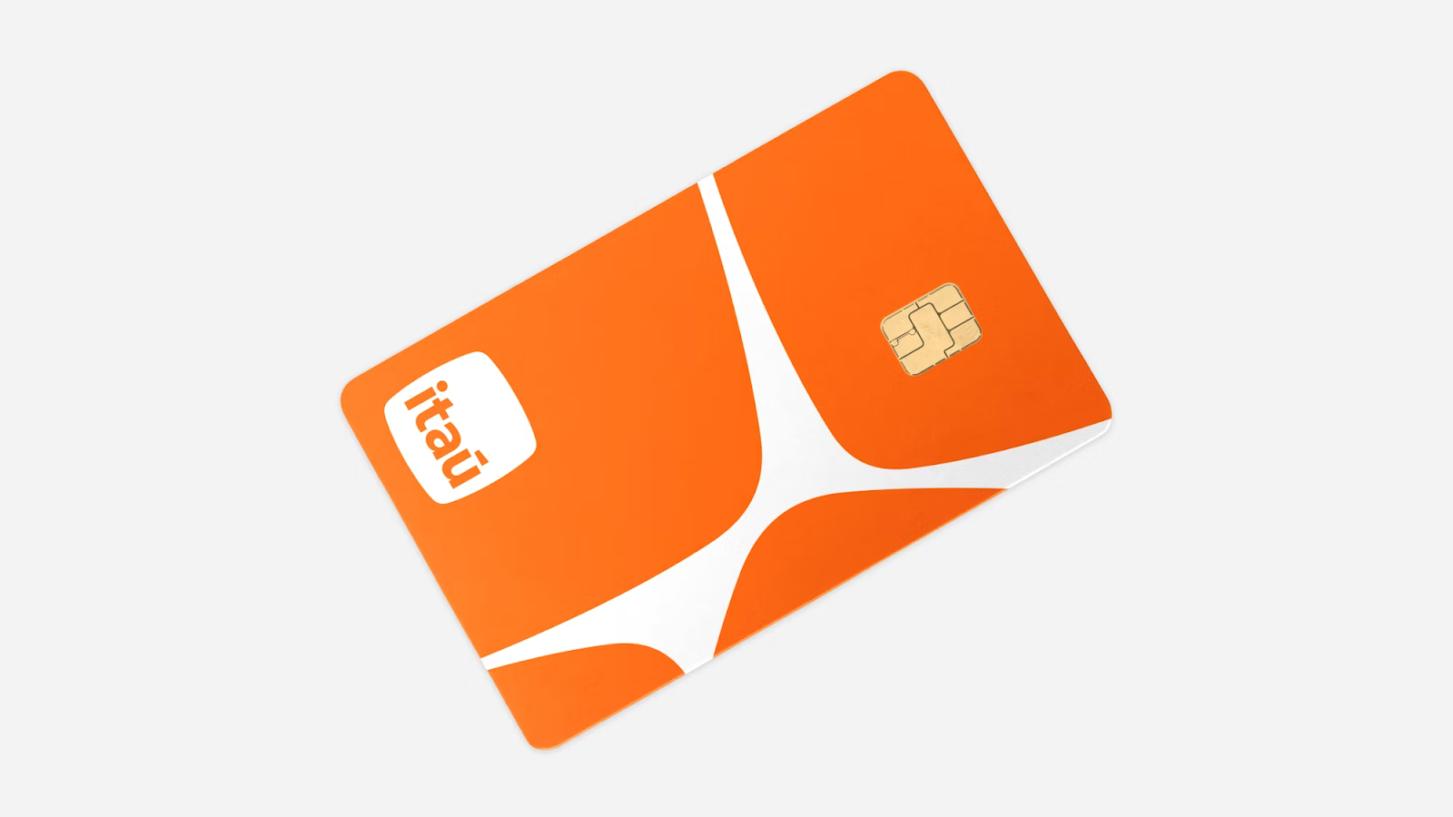
The 'pedra' forms the cornerstone of a comprehensive graphic language for Banco Itaú. It serves various purposes – from being a container for images or type to an integral part of patterns and motifs. This versatility ensures that the brand identity is not just seen but experienced in a multitude of ways.
As Brazil's largest bank embarks on its next century, this redesign by Pentagram is more than a visual update; it's a reaffirmation of Itaú's commitment to innovation, customer-centricity, and a deep connection with its Brazilian heritage.
Branding and visual identity artifacts
All rights reserved to Pentagram
Credits
- Client: Banco Itaú
- Sector: Banking & Finance
- Discipline: Brand Identity
- Office: New York
- Partner: Michael Bierut
- Project team: Jonny Sikov, Lauren Rush, Camila Pérez
More information make sure to check out Pentagram website.


