by abduzeedo
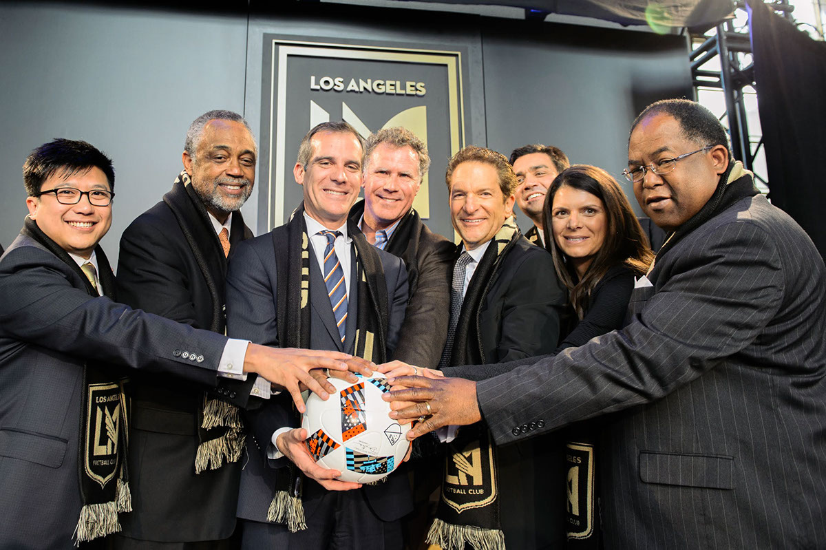
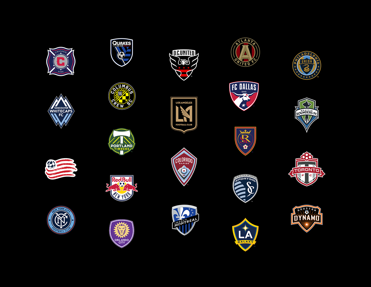
Los Angeles Football Club (LAFC) is a brand new franchise that will begin play in Major League Soccer in 2018. Backed by a star-studded ownership group that includes Magic Johnson, Will Ferrell, Mia Hamm, and Nomar Garciaparra, LAFC promises to be a major force in the global game. Plans for 22,000-seat stadium are underway, with groundbreaking scheduled in 2016.
The club reached out to me, through a group called Spark Int’l, to design the crest and identity for the franchise. We had a blank canvas in front of us, and our goal was to create a mark that the people of Los Angeles would wear with pride. A look that they would identify with and rally behind. A crest that would stand the test of time.
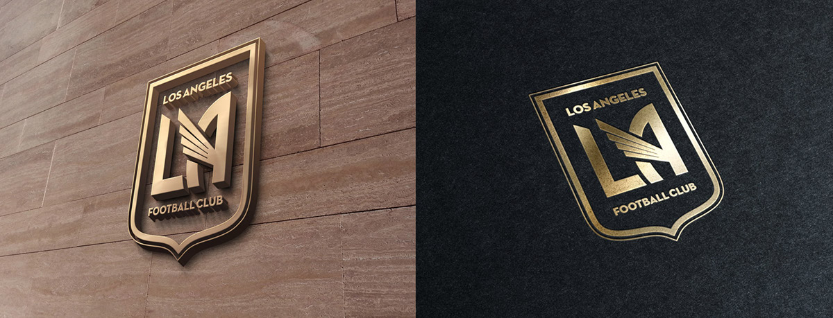
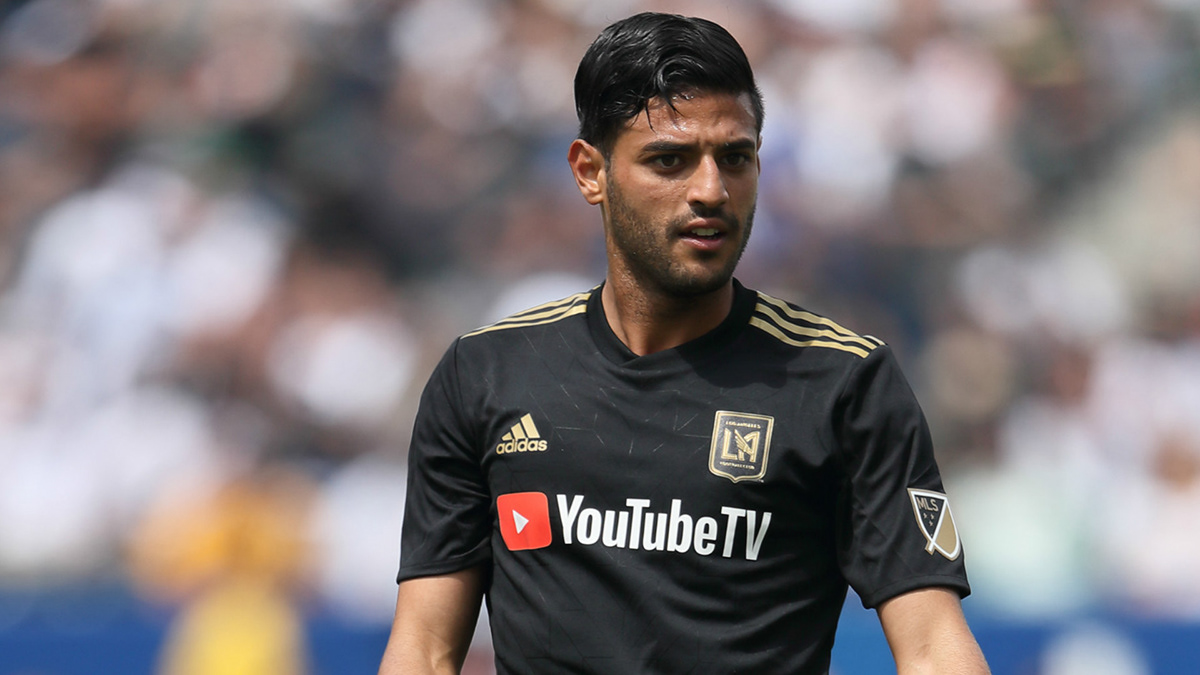
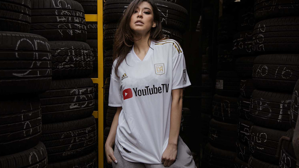
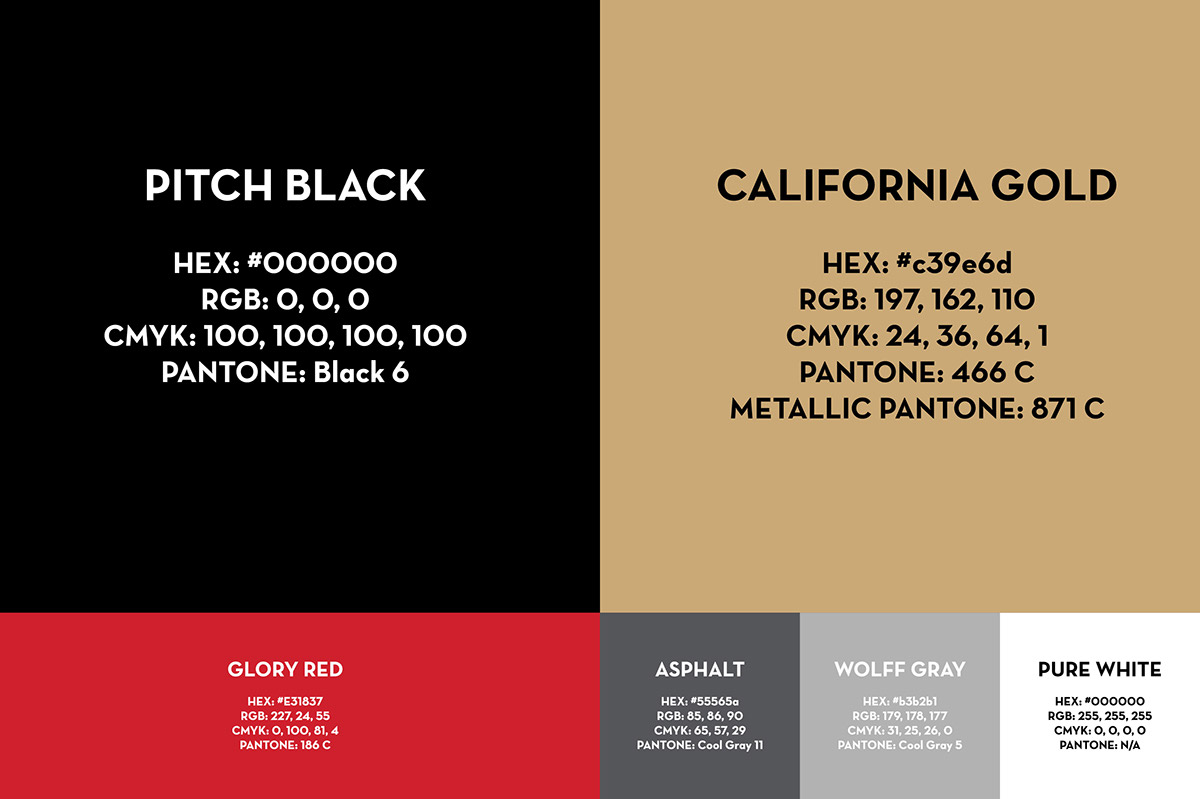
Each element of the crest has strong ties to Los Angeles from its shape to the color palette to the unique typeface. The shape of the shield is derived from the Seal of the City of Los Angeles. The black and gold color scheme embodies the success, urban texture, and glamour of Los Angeles. The wordmark is set in Neutraface – an elegant and versatile Art Deco-inspired typeface based on the signage of architect Richard Neutra. This typeface is a nod to Downtown Los Angeles’ rich collection of Art Deco buildings, dating back to city expansion in the 1920’s. At the heart of the crest is a wing, paying homage to the City of Angels and the city’s Aztec and Mexican heritage.
Branding
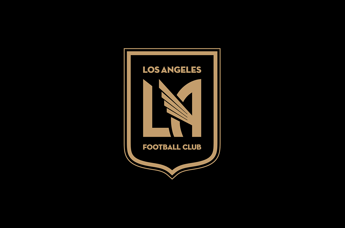

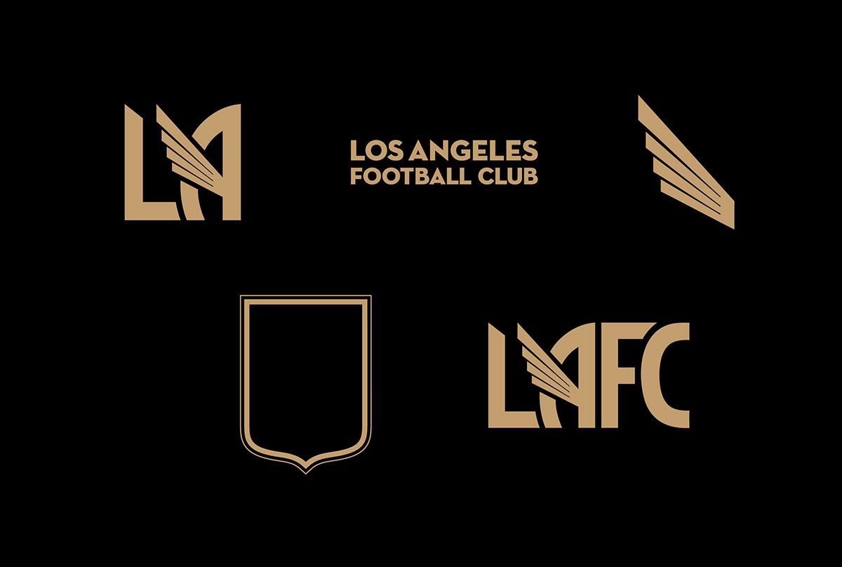
We chose a single wing to be the centerpiece of the crest. It is the perfect symbol to represent the City of Angels, and is grounded in historical and multicultural significance. A universal symbol of speed, power, and mobility, the wing is a legendary icon which appears consistently throughout history and across cultures.
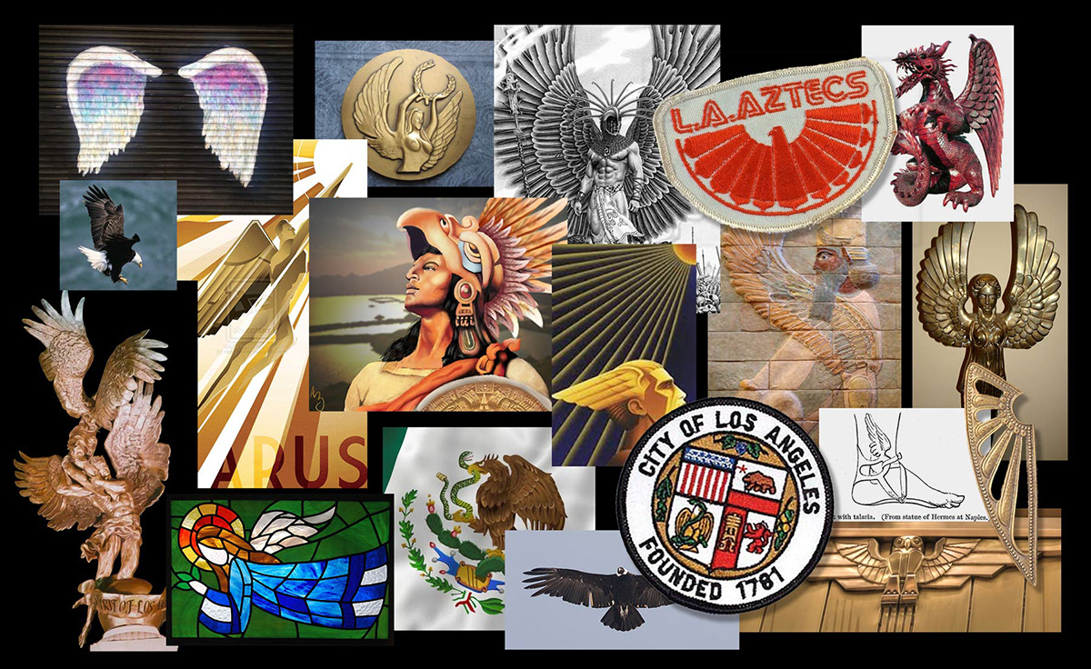
"Strong, Powerful, Achievement, Triumph. Black and Gold embody the success, urban texture, and glamour of Los Angeles. A flash of red represents our home in the heart of the city." - Official LAFC club statement