by abduzeedo
Saul &Co shared a branding and visual identity project for Nuphase© a public image consultancy located at the heart of Querétaro, México, founded in 2020 by Carla Margut and Karla Calderón. Carla Margut's taste for sobriety and Karla Calderón's colorful personality result in a versatile consulting firm capable of adapting to the user's needs.
“At Nuphase we design a fresh image profile tailored to your needs. Our brand, more than offering you a service we seek to establish a bond of trust with you, always having a human approach." - Carla & Karla
Case Study - Saul & Co words
- We designed a flexible identity which could be capable of transmitting professionalism, style, youth and confidence.
- Our logotype has been designed using as a starting point the ToY typeface (inspired by another typeface used in a cycling magazine called "LE VIE D’TALIA" from 1917).
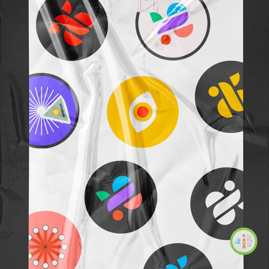
- The sleek composition of our logo is due to the proper study of the image and the use of the repetition of nature as a model, in other words: fractals.
- We got inspired by comparing and adapting the anatomy of our logotype to a macro photograph of human skin. With this we seek to reinforce the approach that Nuphase has towards a human brand.
3d Artwork
As part of the development of the brand, Saul &Co team created a 3D artwork that embraces the essence of the brand and reinterprets the concept of beauty through organic elements with an institutional approach.
Credits
- Project: Naming, Brand Identity
- Client: Carla Margut, Karla Calderón
- Location: Querétaro, México
- Strategy, Art Direction, Naming, Graphic Design, Photography, Printing, Motion & 3d Artwork: @Saul Osuna
- Strategy, Naming & Sound Design: @René Mariaca
- Logo Typeface (Modified): Toy By Philipp Herrmann Out Of The Dark
- Display Typeface: Neutrif Pro By Degarism Studio
- Portrait Photographs: Unsplash (thanks a lot to every photographer, this project wouldn't be the same without your work.)
For more information make sure to check out Saul &Co on
