Best of the Week: Code Rhythms and Temporal Systems
INFO
BLOG
Our roundup of the best of the week explores how brand identities and tactile surfaces balance generative code, interactive packaging, and physical mass.
We analyze how editorial constraints and dynamic typographic systems define contemporary design across physical and digital mediums:
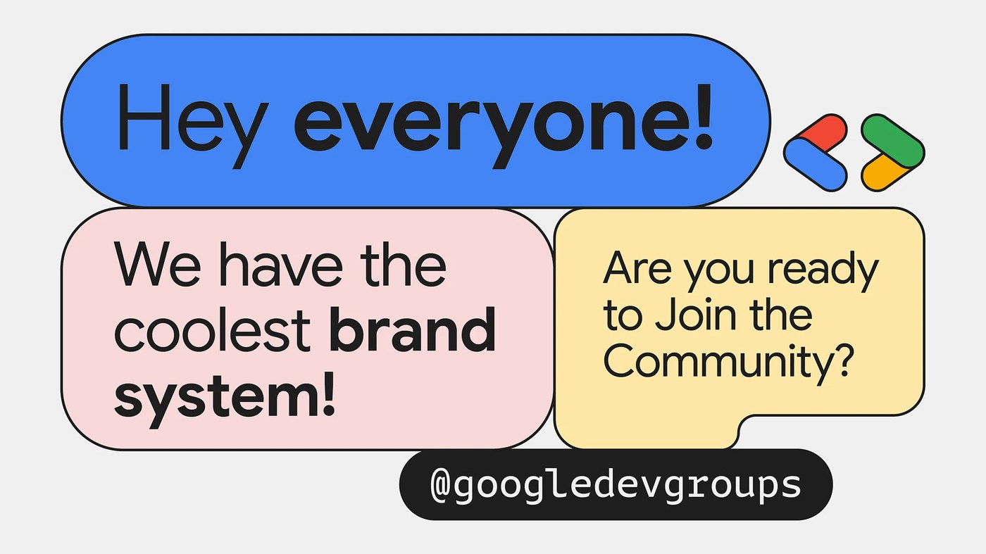
- Google GDG Branding by NotReal: Generative motion identity taking code structure as its literal visual rhythm.
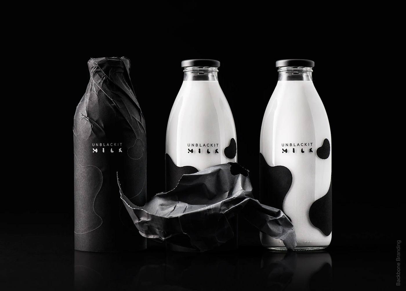
- UNBLACKIT by Backbone Branding: Interactive dairy packaging using a perforated black sleeve to reveal cow pattern spots.
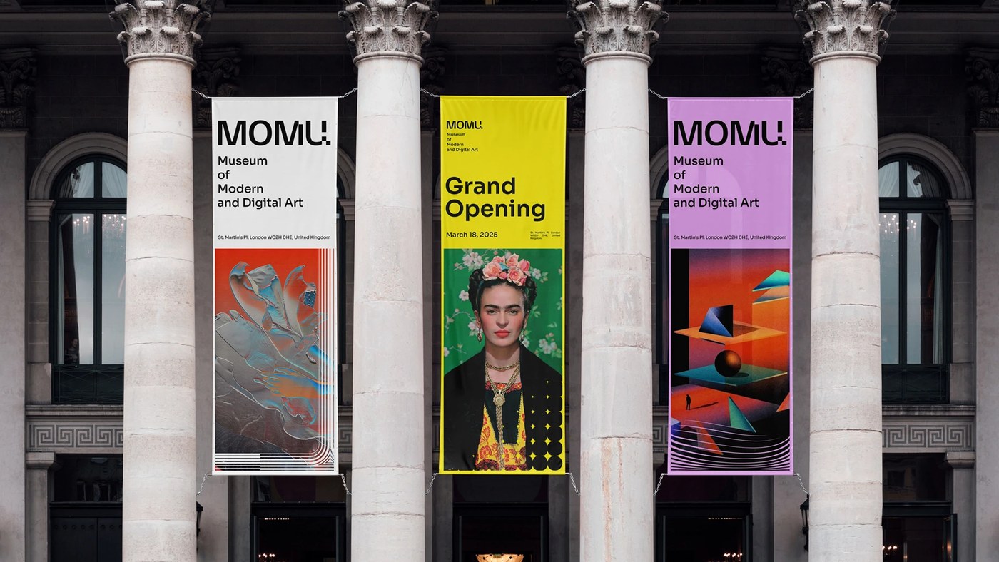
- MOMU Visual Identity by WOBL Creative: Museum branding inspired by wave resonance physics and fluid typography.
- OVERZERO Condensed Type by Pixel Surplus: A sharp, condensed display typeface designed to command attention at large scales.
- The Daily Form Identity by Florencia Souto & Nano Armanini: A temporal brand identity utilizing rotating color palettes to mirror shifting inventories.
- NUON Brand Identity by Gong Yuhan: AI chip branding that leverages negative space to communicate depth and foundational compute.
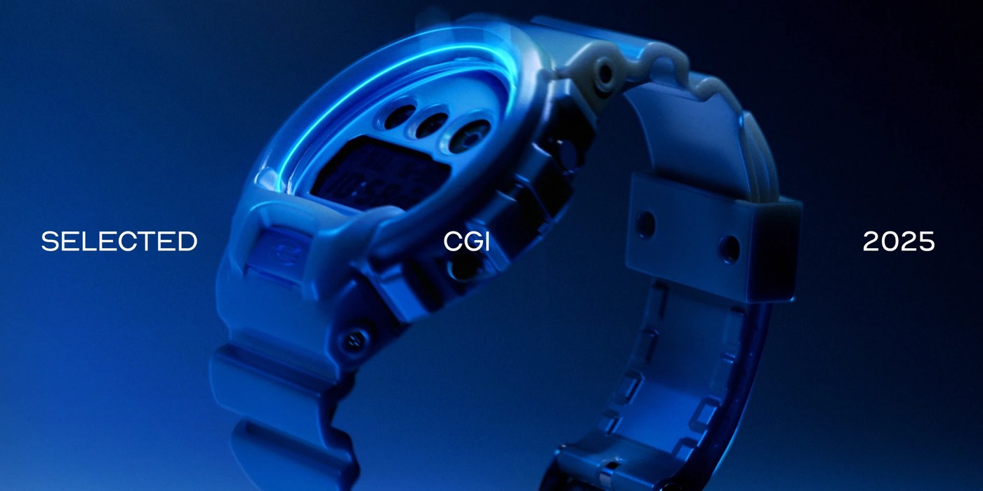
- CGI Product Visuals by Matt Oxley: Product renders that use Cinema 4D and Redshift to prioritize tactile material quality.
- Yes! Apples Branding by Blurr Bureau: A bold identity converting a commodity orchard fruit into a modern consumer brand.
- OFFF Barcelona 'Cultured' by Uncommon Creative Studio: A campaign and bespoke typeface grown biologically from creative community traces.
- Imperial College Rebrand by The Click: Bespoke department visual identities centered around custom academic 'I' motifs.
Next week, we examine how minimalist packaging designs utilize tactile finishes to define physical consumer products.
For more inspiration check out our curated selections on Abduzeedo.
ADS
