by abduzeedo
Explore how CIGA crafted BIEL's branding and visual identity, seamlessly blending health food and beach vibes.
Designers often face a challenge. They must create one brand that speaks to many audiences. It means finding the core essence. Then, they translate it across different touchpoints. The work by CIGA - Image Agency for BIEL is a great example. It shows how to achieve this balance. CIGA developed the full graphic identity for BIEL. This brand has two main parts: "Brunch & Health Food" and "Beach & Sunset" (CIGA - Image Agency, "BIEL - Brunch & Health Food / Beach & Sunset").
The Core Idea: Balance and Well-being
CIGA's team focused on BIEL's core. This included balance, well-being, flavor, and a light, relaxed energy. This base helped them build a visual world. It feels connected, no matter the specific BIEL experience. This approach is vital for complex branding and visual identity projects. The goal is a single, clear message. It should not be broken or confusing.
Two Environments, One Identity
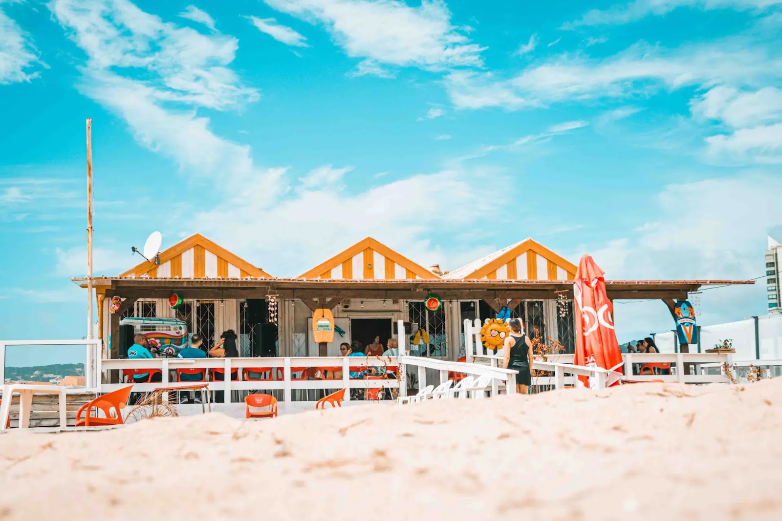
BIEL - Brunch & Health Food is a cozy place in Figueira da Foz, Portugal. Its organic design makes you feel calm. The menu uses organic ingredients. It offers brunches, smoothies, and natural juices. It's a good spot for families. It promotes healthy eating.
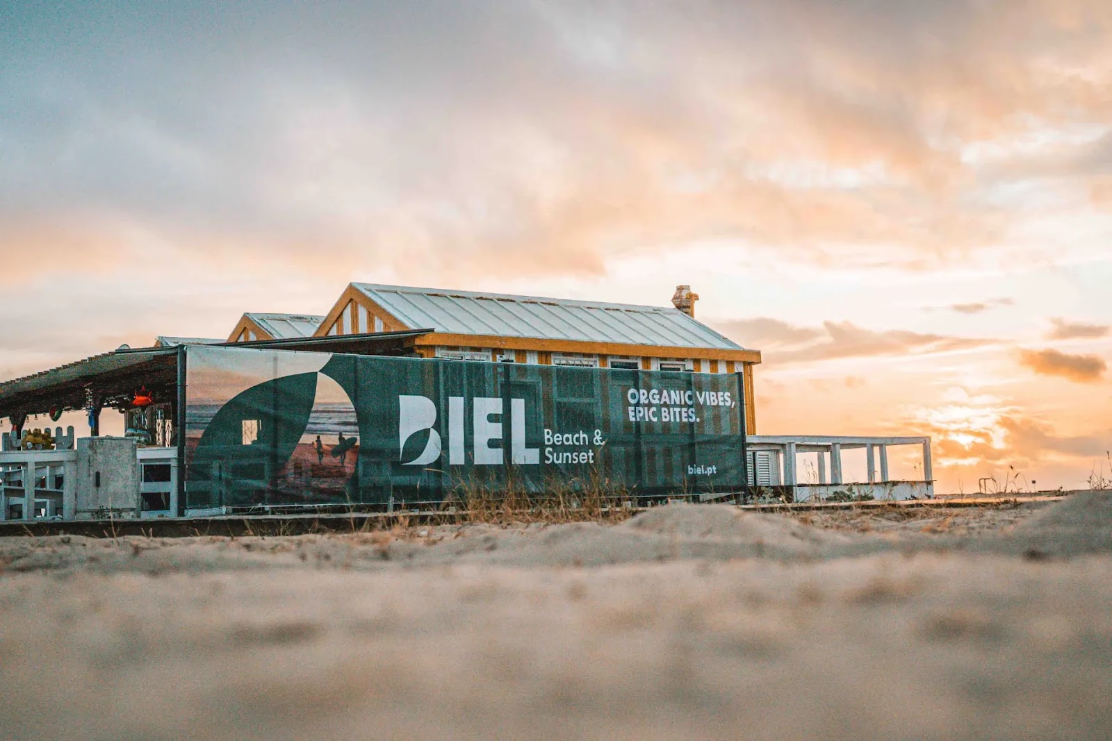
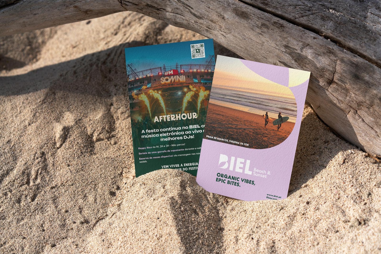
Then there is BIEL - Beach & Sunset. This location is right on Buarcos beach. It shares the same philosophy. It adds light meals and snacks. These are perfect for sharing. Live music and DJ sets play at sunset. This creates a lively mood. Good food blends with the sea's rhythm.
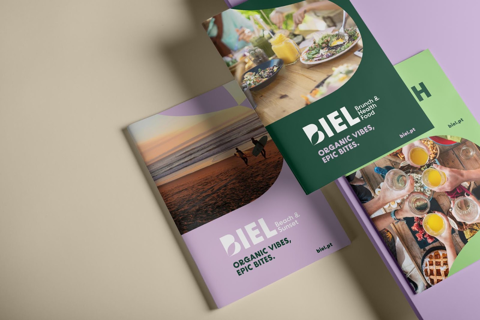
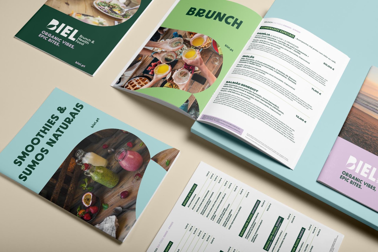
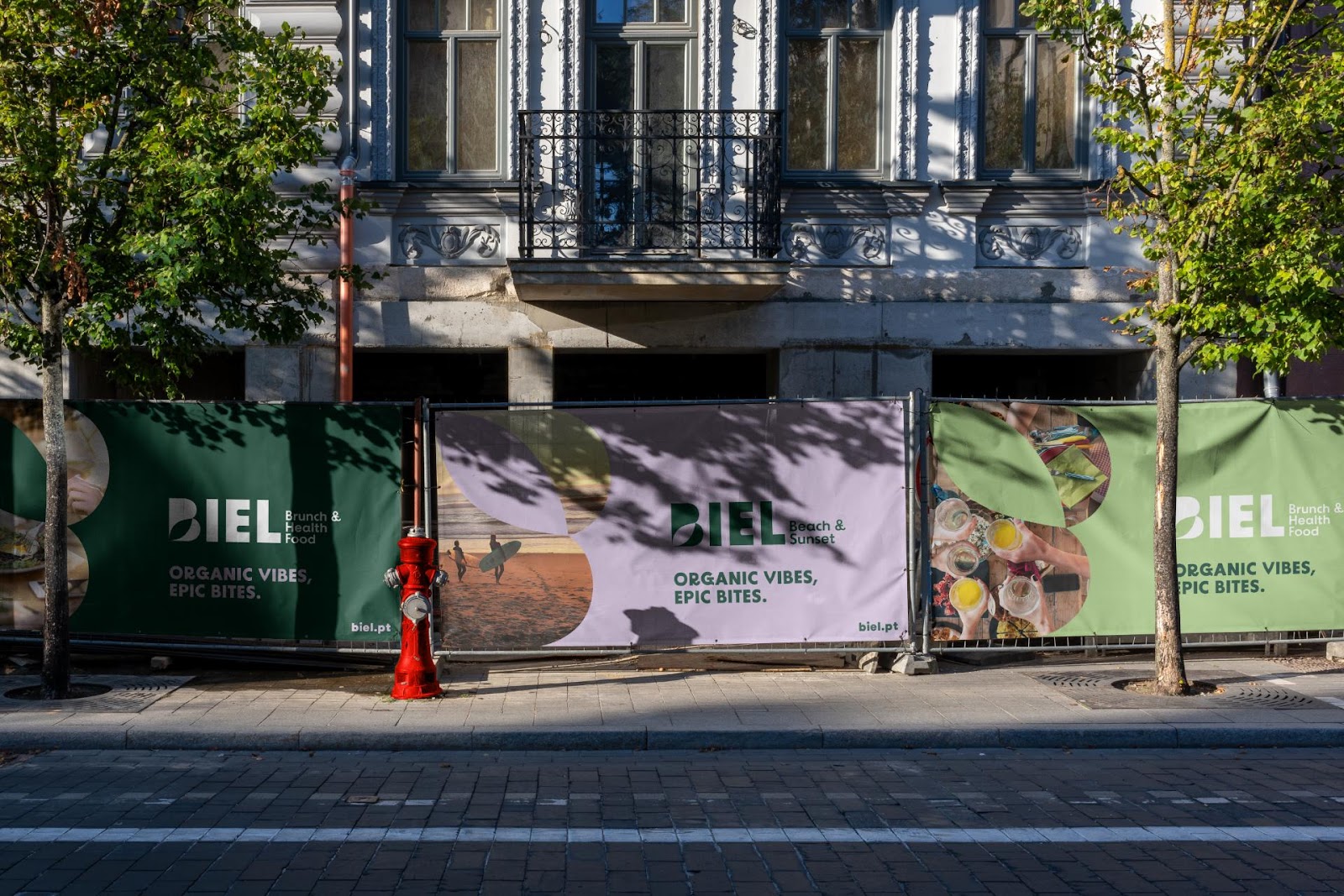
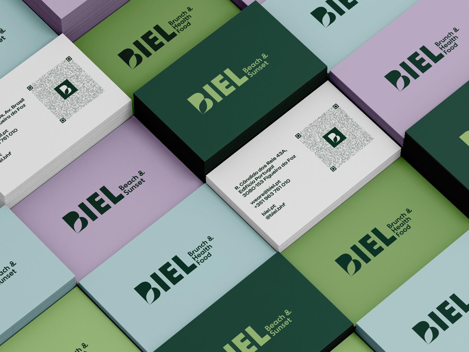
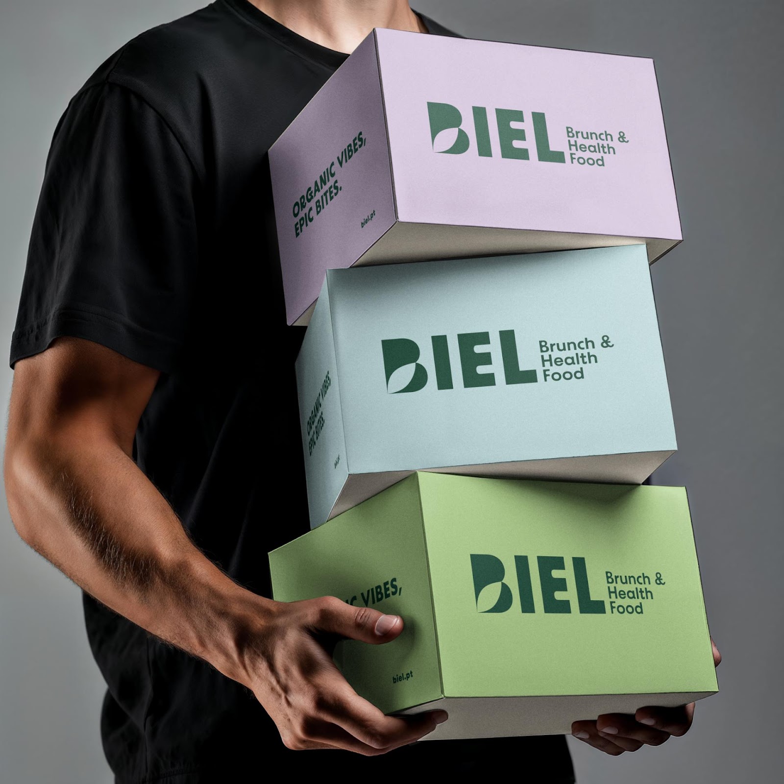
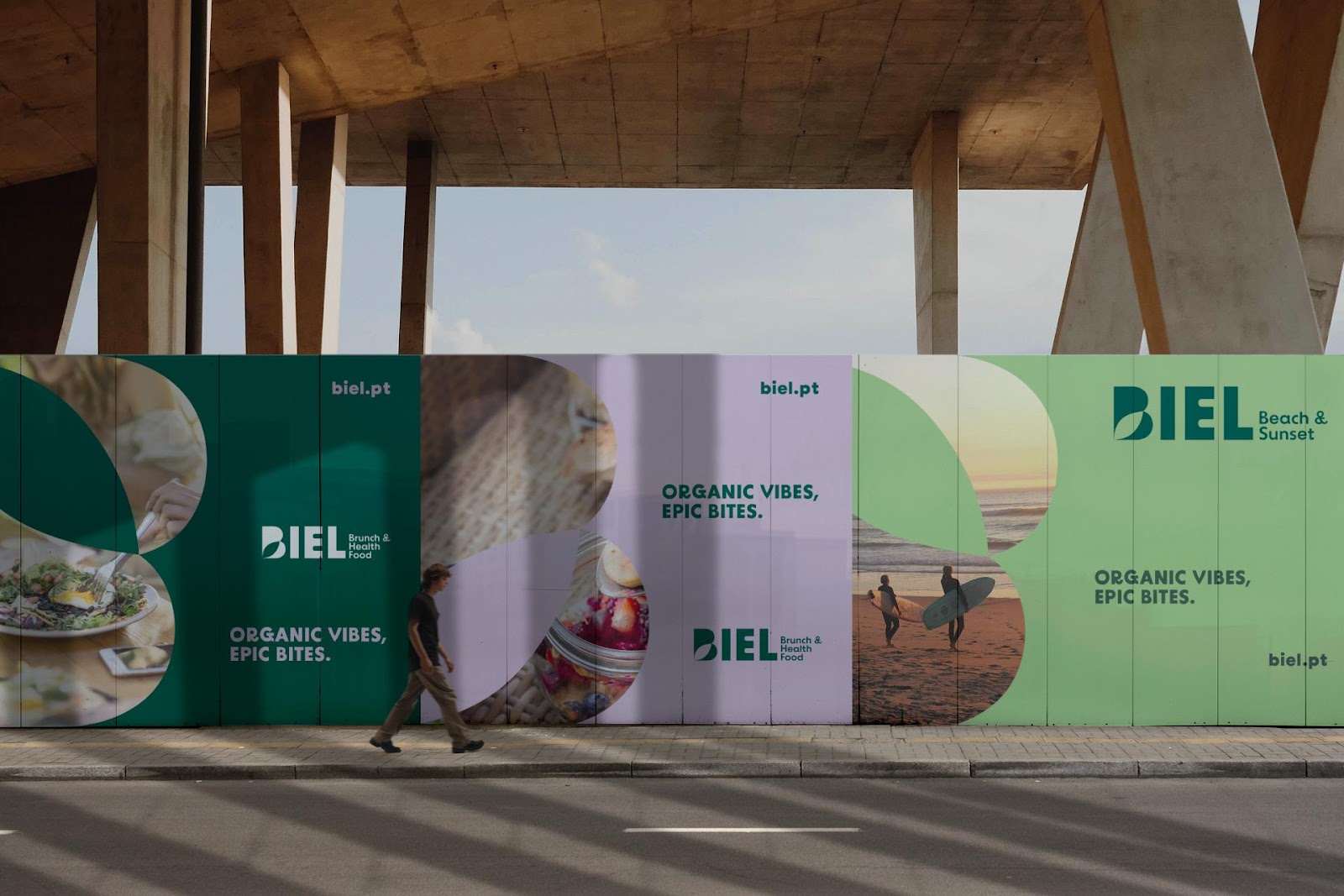
CIGA needed to make both places feel like one brand. They used consistent visual elements. Look at the branding items: the logo, the slogan "ORGANIC VIBES, EPIC BITES," and the colors. These appear on menus, flyers, billboards, and the mobile website (CIGA - Image Agency, "BIEL - Brunch & Health Food / Beach & Sunset," page 4). This consistency strengthens the brand's identity.
Visual Harmony in Practice
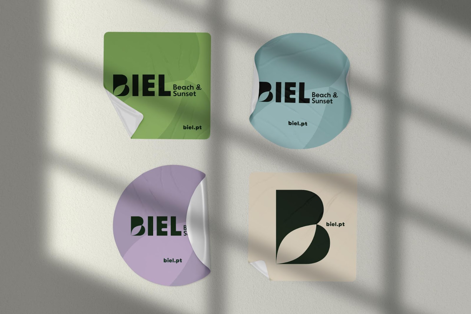
The design agency made a logo that works in both settings. It remains easy to recognize. A clean, modern font was used. A small leaf design in some places links to the "health food" side. Its simple look fits the "beach" vibe. The color palette includes earthy greens, soft purples, and blues. These colors reflect fresh organic food and calm beach sunsets (CIGA - Image Agency, "BIEL - Brunch & Health Food / Beach & Sunset," page 7-8).
Outdoor ads, like the billboards, also show this visual flow (CIGA - Image Agency, "BIEL - Brunch & Health Food / Beach & Sunset," page 5). The message, "ORGANIC VIBES, EPIC BITES," is always there. It reinforces the brand's promise across different media. This careful use of branding and visual identity gives customers a smooth experience.
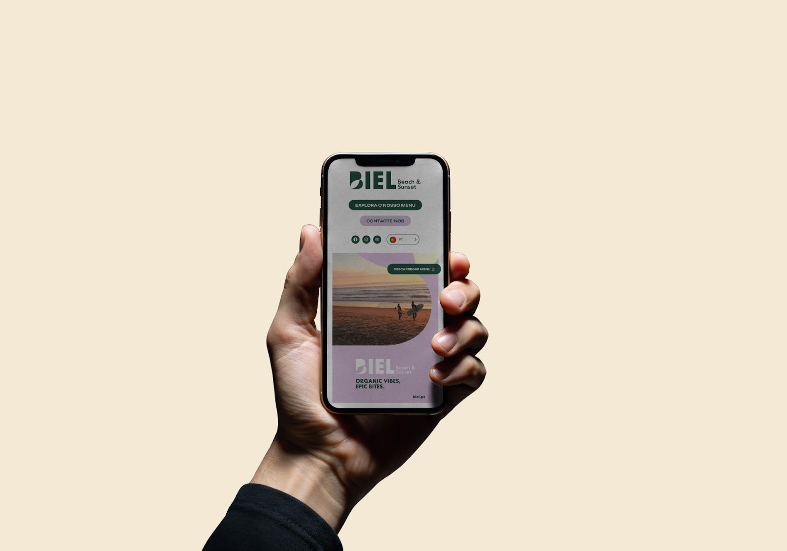
Mobile-First and Engaging
The mobile-first website further proves this integrated approach (CIGA - Image Agency, "BIEL - Brunch & Health Food / Beach & Sunset," page 9-10). It shows how the brand's visuals work well on digital platforms. The layout is clean and easy to use. It looks good and reflects the brand's light, relaxed energy. This focus on UI/UX ensures a consistent brand experience everywhere.
A Lesson in Brand Cohesion
The BIEL project by CIGA - Image Agency is a strong example. It shows how good branding and visual identity can connect different offerings. They come together under one strong brand. It proves that clear brand values let designers create visuals that work in many situations.
Explore more of CIGA - Image Agency's inspiring work at https://ciga-online.com/en/projeto/biel/.