Branding and Packaging Design to Elevate Non-Alcoholic Drinks
Explore how Skinn Agency's branding and packaging design elevates The Mocktail Club, shifting perceptions in the booming non-alcoholic market.
The non-alcoholic beverage scene is booming, right? More folks are opting for booze-free sips. That's great. But for brands like The Mocktail Club, it means a crowded shelf. Plus, mocktails sometimes get a bad rap: too sweet, too safe, or just like fancy lemonade. Skinn Agency stepped in to sharpen their story, giving them a clear step forward in branding and packaging design.
Redefining the Mocktail Experience
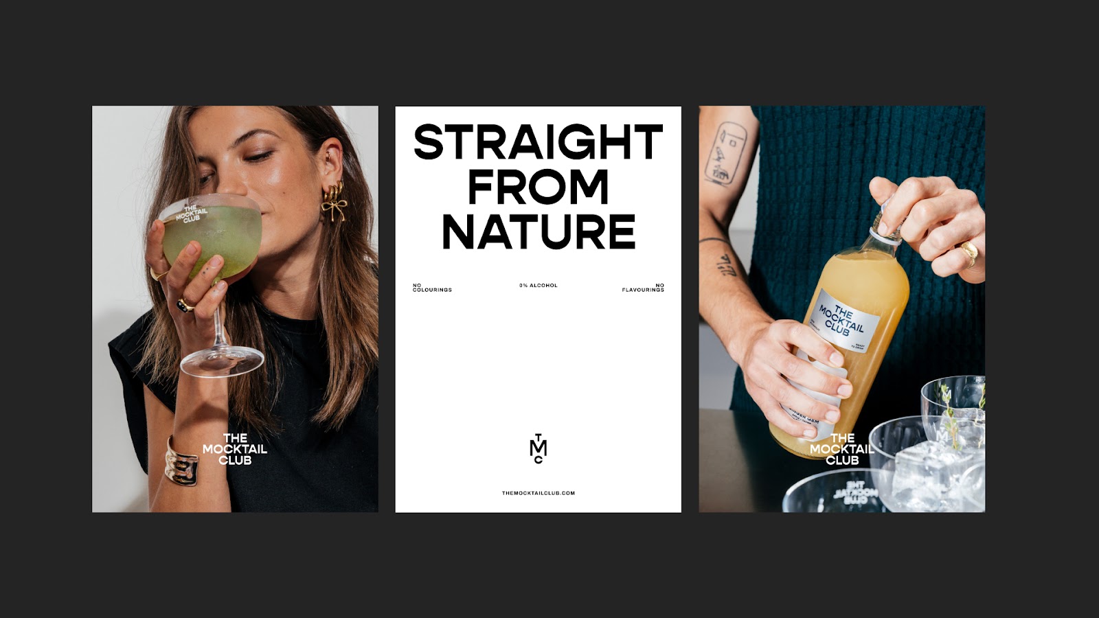
The Mocktail Club isn't about wild parties. It’s about those quiet, real-life moments: dinner with friends, sunny afternoons, small wins worth celebrating. Skinn Agency repositioned the brand around at-home celebrations. Think ready-to-serve, flavor-forward drinks. They don't try to mimic cocktails. Instead, they offer something unique to the table. This shift in focus was key.
A Sophisticated Look, Bottled
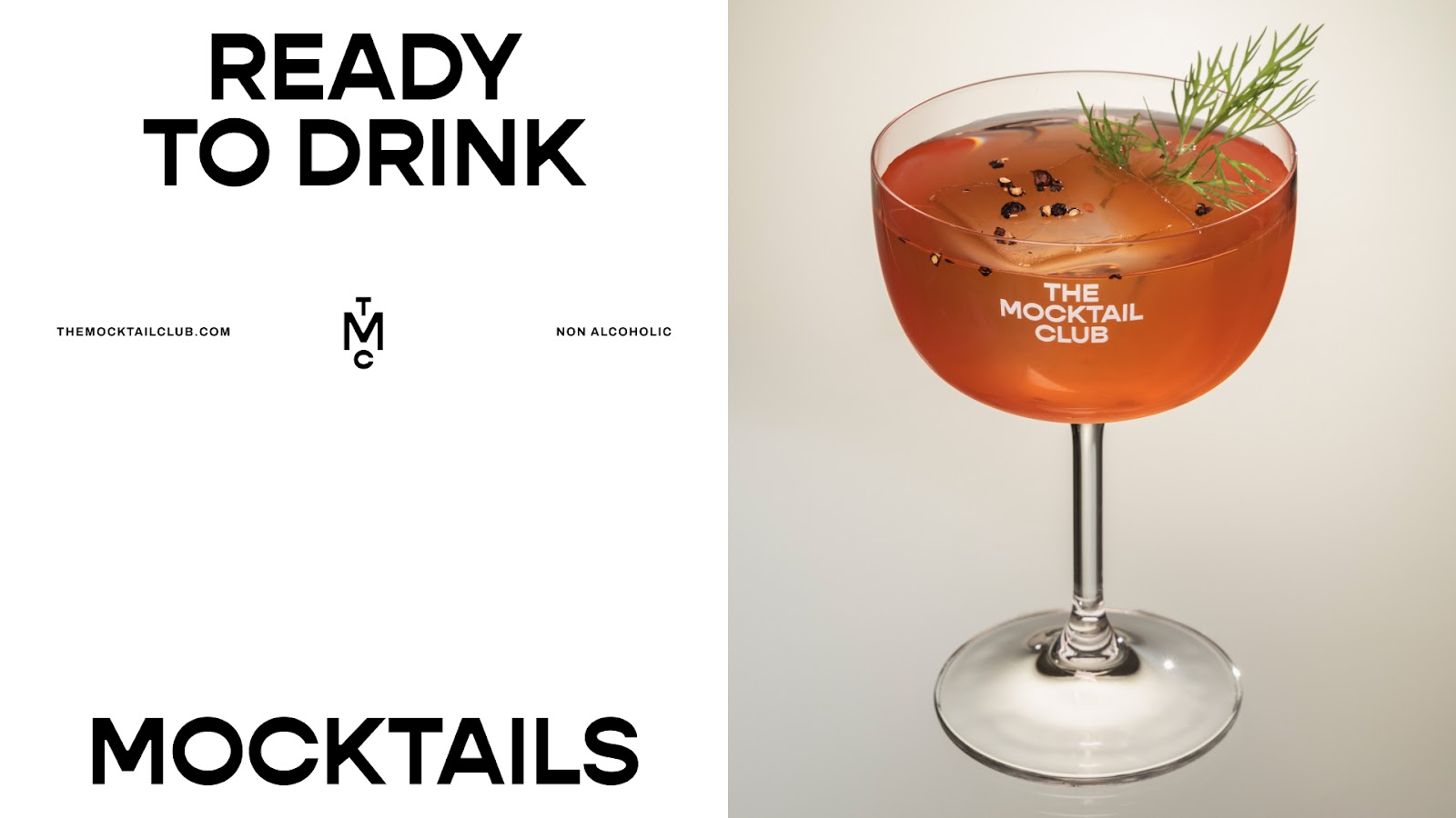
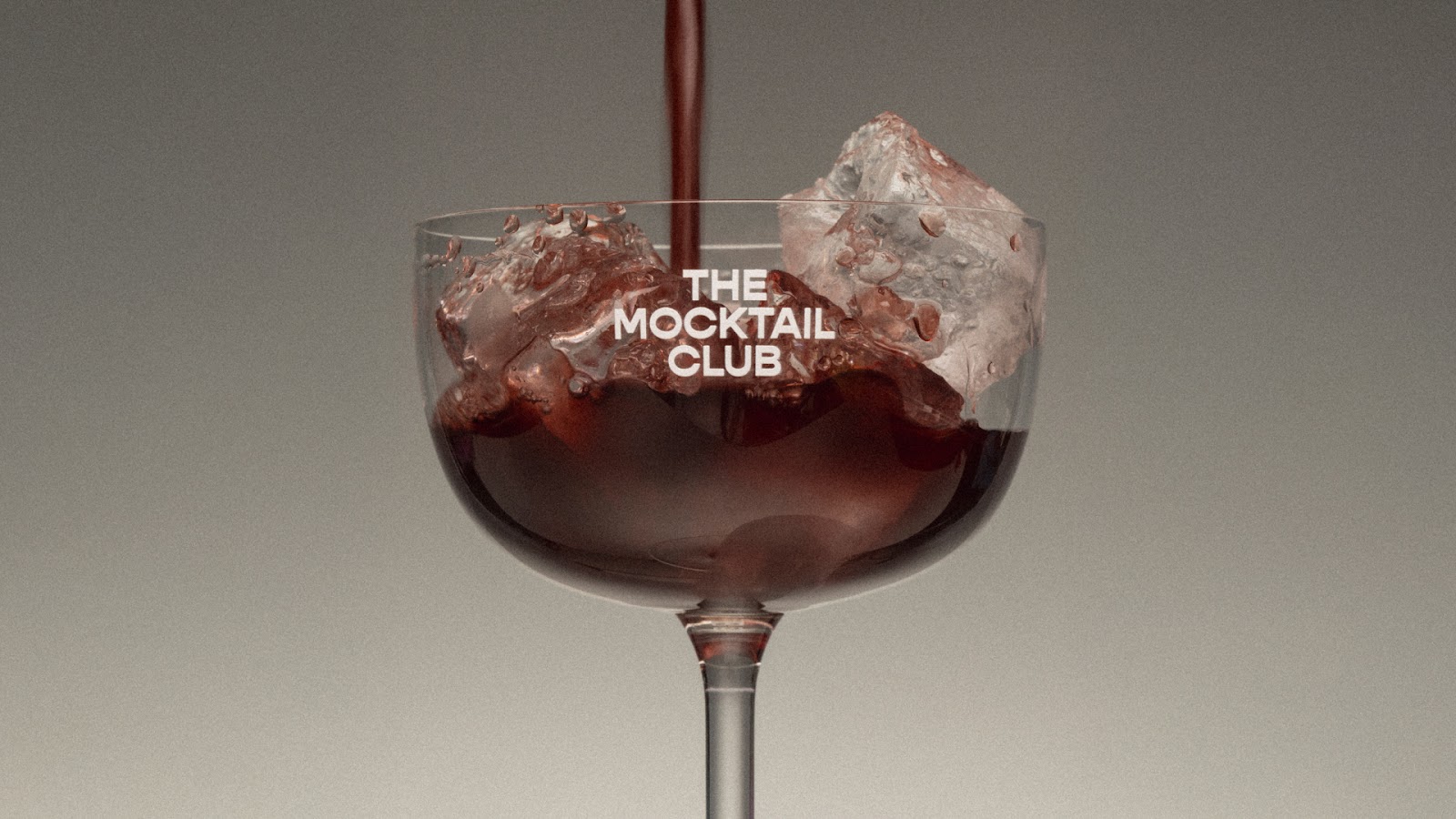
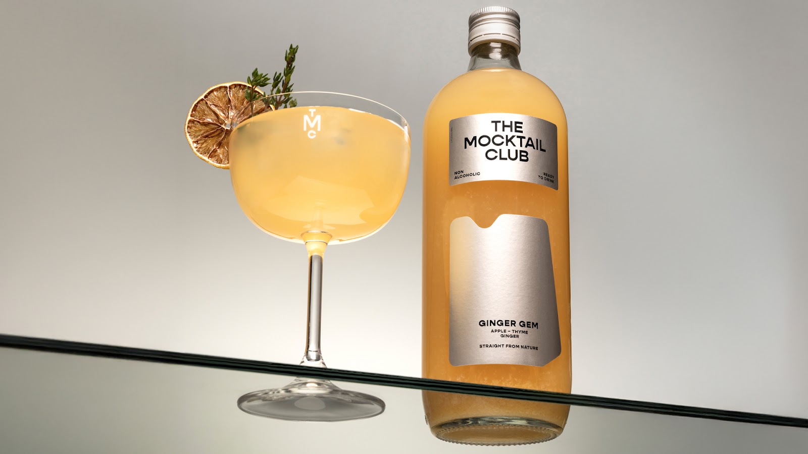
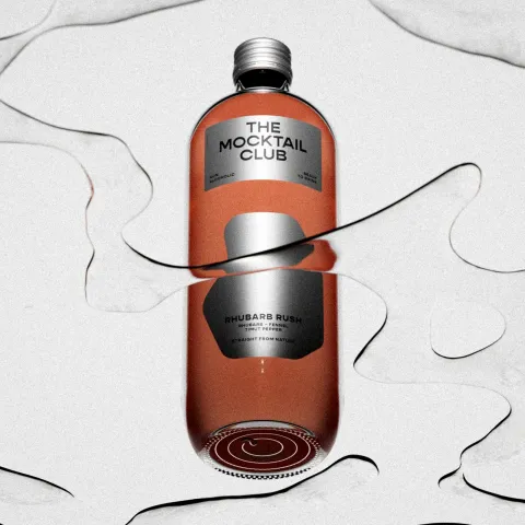
The new visual identity for The Mocktail Club speaks volumes. It’s curated and confident, with a hint of urban playfulness. You won't find typical "healthy juice" greens or "apothecary" browns here. It’s a clean, sophisticated vibe. It captures festive moments in a mature, understated way.
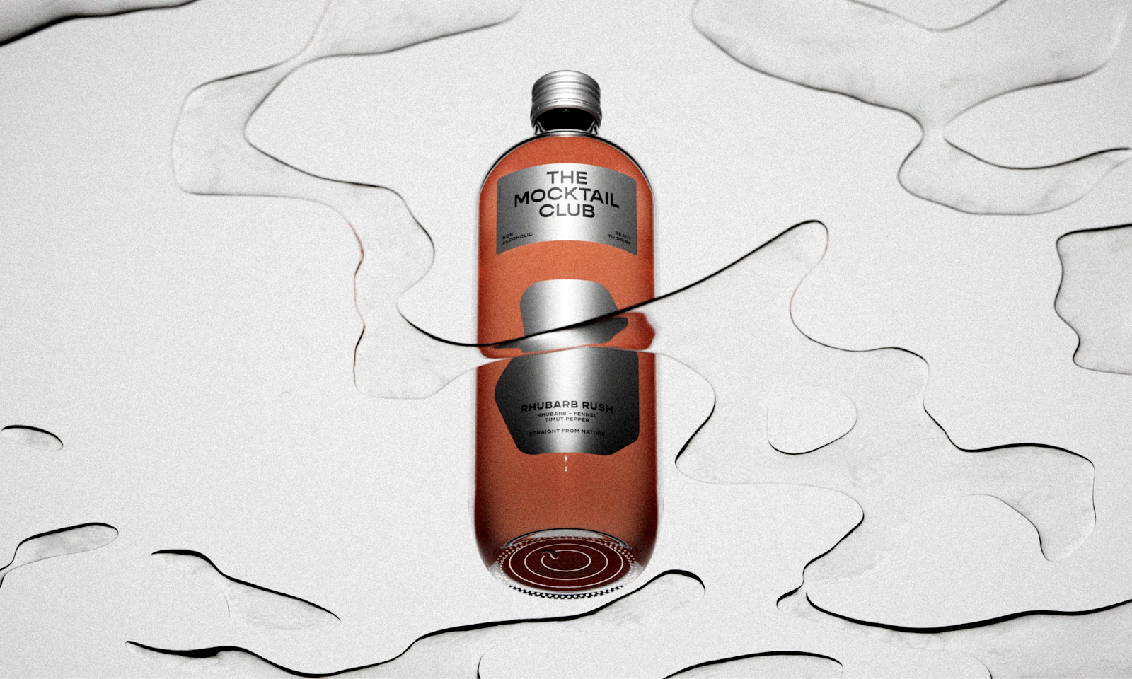
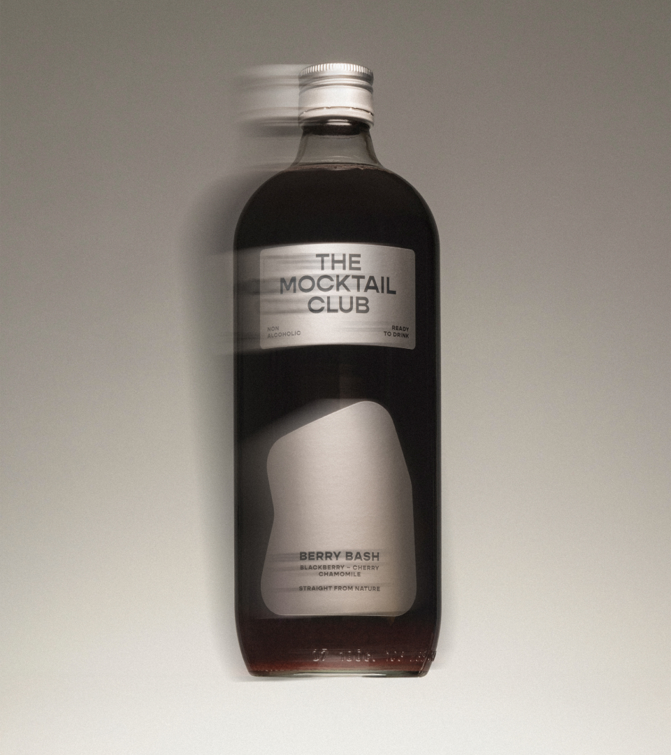
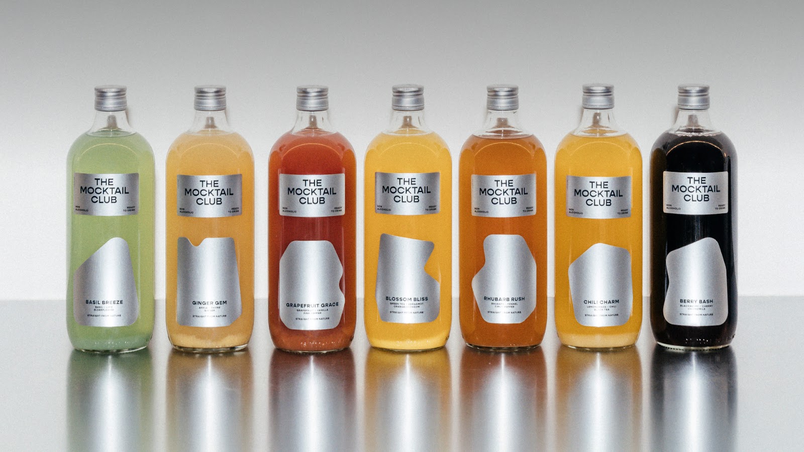
The color palette reinforces this premium feel. Silver, white, and black form a pared-back base. Then, softer greens, pinks, yellows, and reds add a feminine, celebratory touch. Each mocktail gets its own distinct color, creating a unique personality while maintaining family cohesion.
Crafting the Packaging System
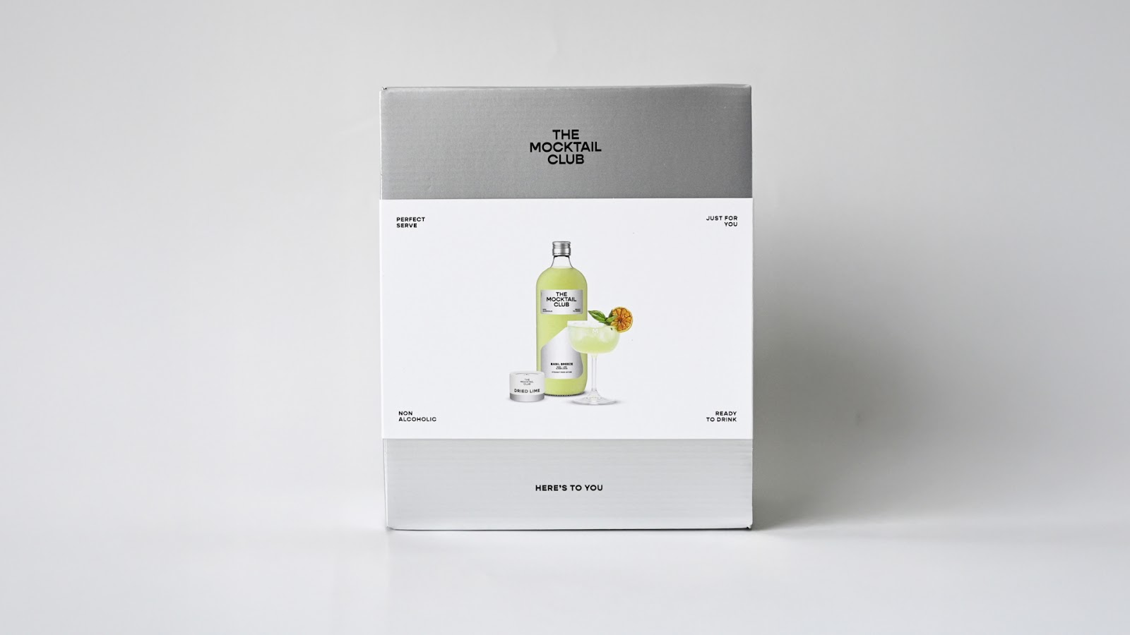
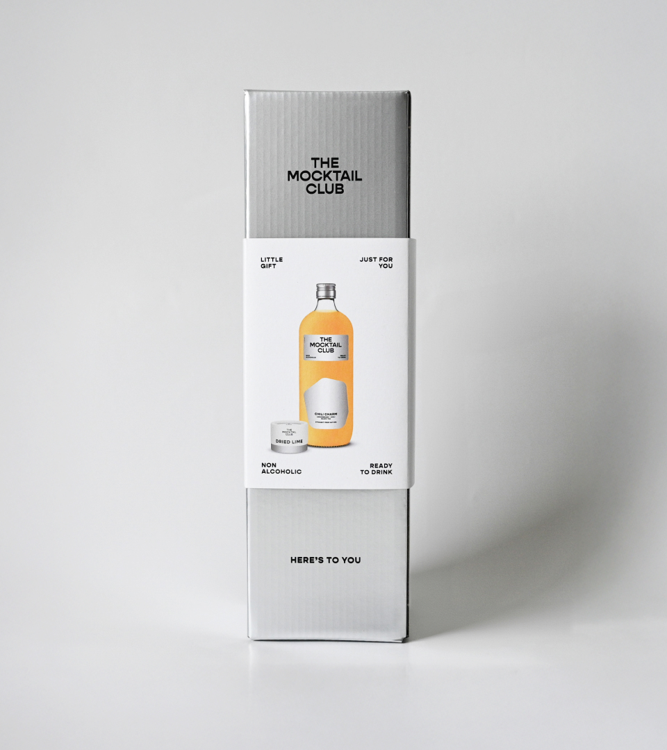
Skinn Agency designed the full line-up. This includes the bottles, gift boxes, shipping boxes, and even matching botanicals. Every mocktail has its own label shape and color. Yet, they all feel part of the same family. This balance was crucial. It ensures a cohesive look on the shelf. It also allows flexibility as the range grows.
Considering how the bottles would look on the shelf was a major design driver. Especially with a large production order looming. Skinn Agency created detailed 3D visualizations of the bottles. This allowed the team to see the final product before committing to production. It ensured alignment with the brand identity.
Practicality was also a factor. They worked within limits of print, cost, and compliance. They made space for mandatory info without distracting from the experience. The result? A packaging system that feels considered and crafted. It’s a bottle you'd be proud to display.
The Impact of Thoughtful Design
This project by Skinn Agency highlights the power of thoughtful branding and packaging design. It shows how a refined visual identity can elevate a product. It shifts perceptions in a competitive market. The Mocktail Club's new look speaks to sophistication and celebration. It proves that non-alcoholic drinks deserve a prime spot on any table.
Explore more of Skinn Agency's work: https://www.skinn.agency/the-mocktail-club
Branding and packaging design artifacts