by abduzeedo
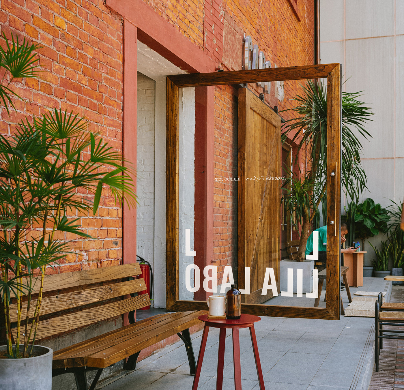
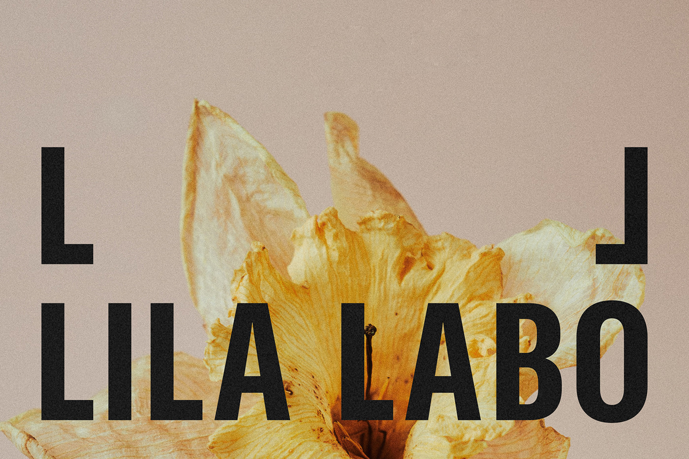
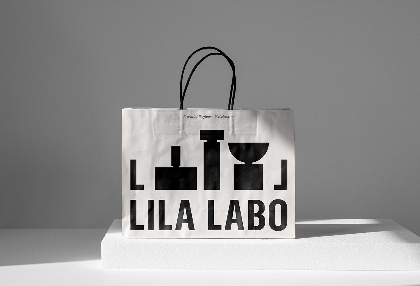
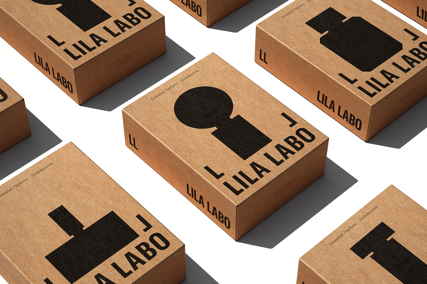
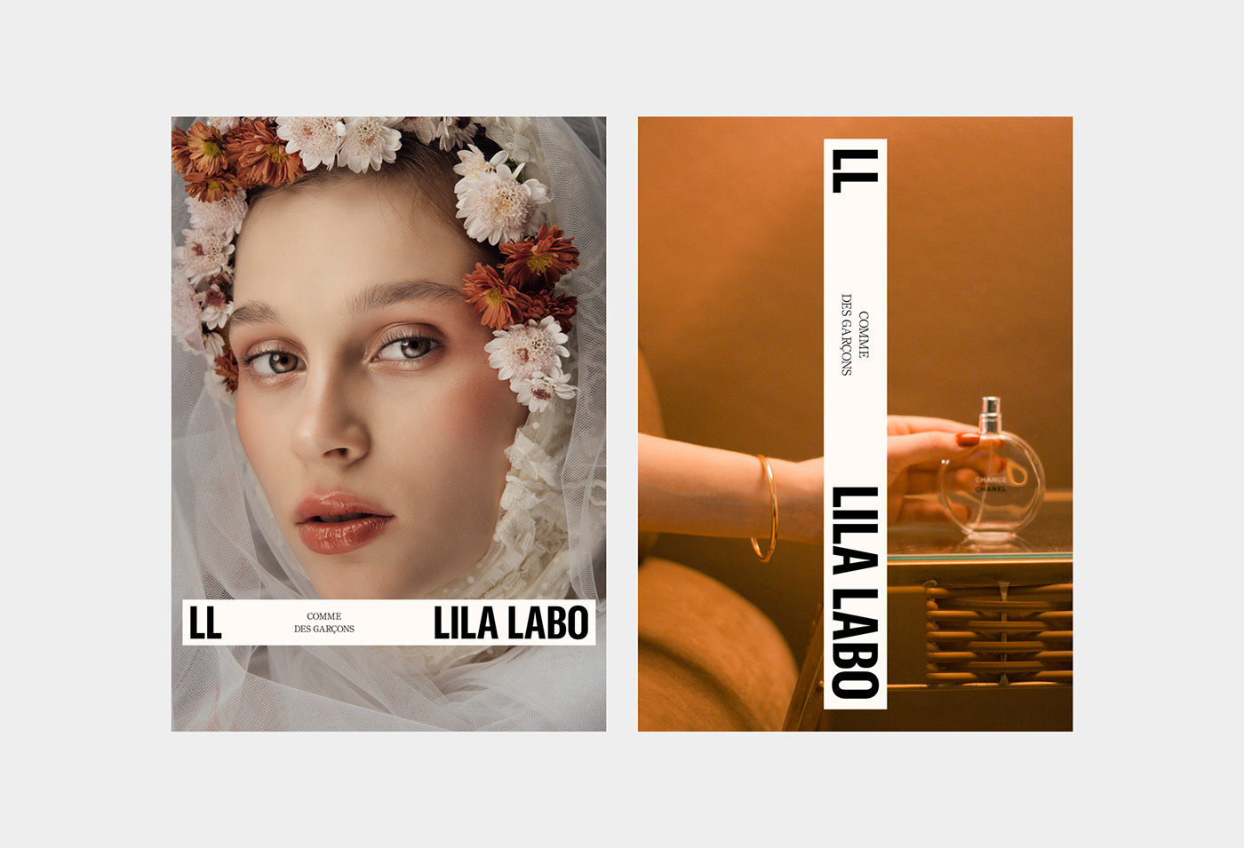
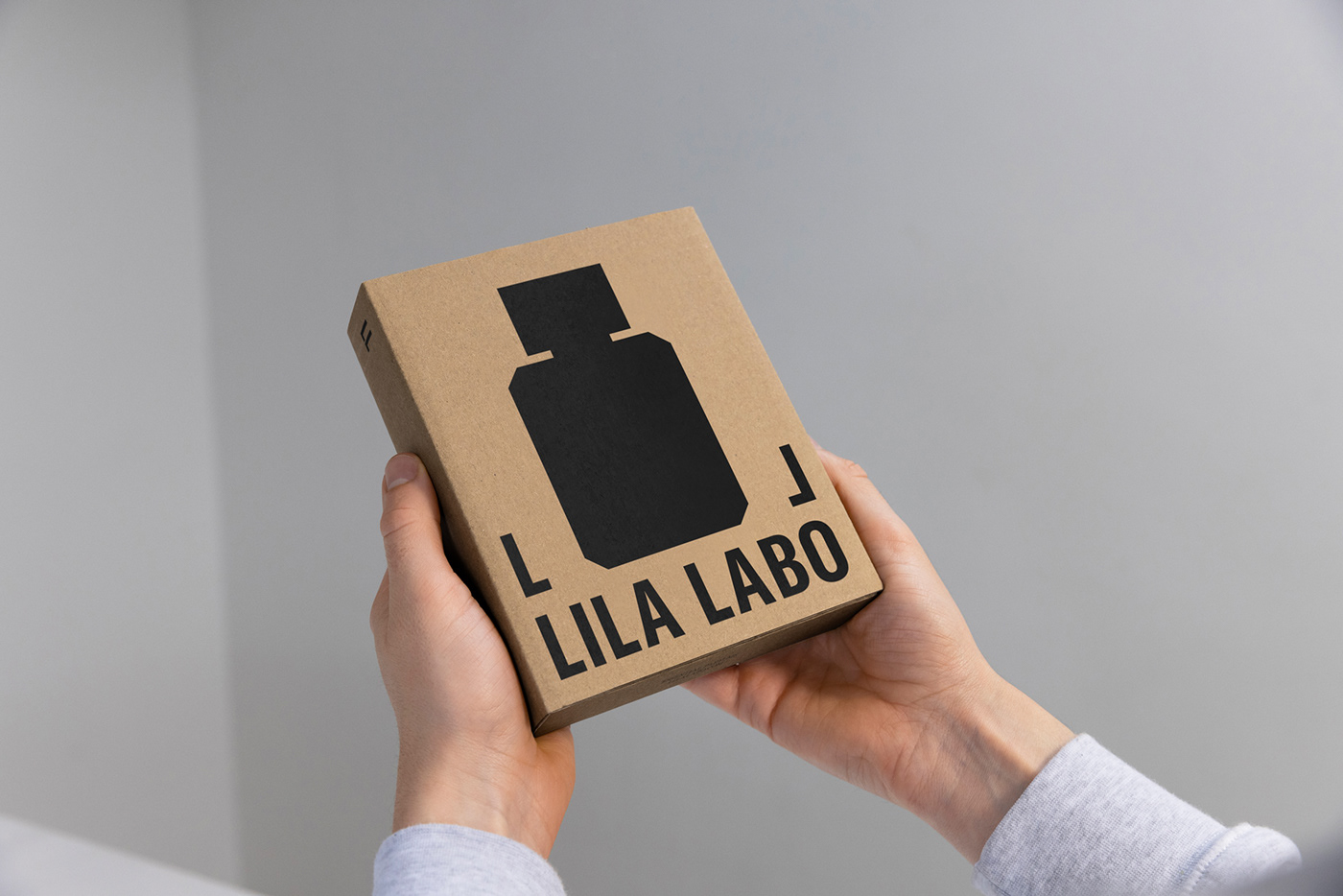
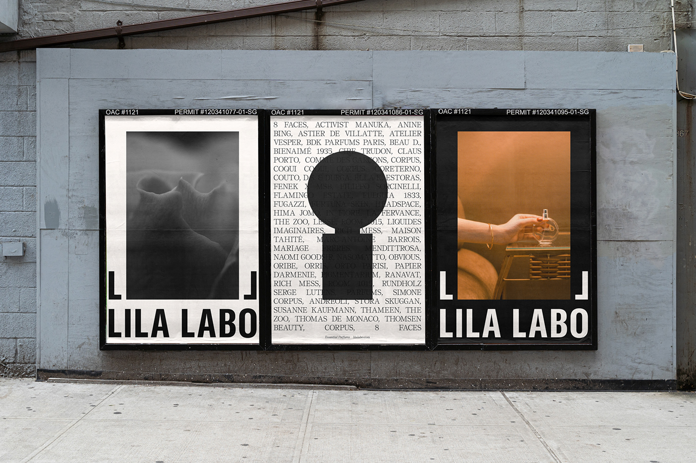
In the dynamic world of design, finding simplicity and elegance can be a challenging task. However, renowned designer Jarosław Dziubek has achieved just that with his breathtaking branding and visual design project for Lila Labo. This project showcases a perfect blend of bold sans-serif typography, a black and white theme, and carefully chosen secondary typefaces, resulting in a design that captivates with its simplicity and sophistication.
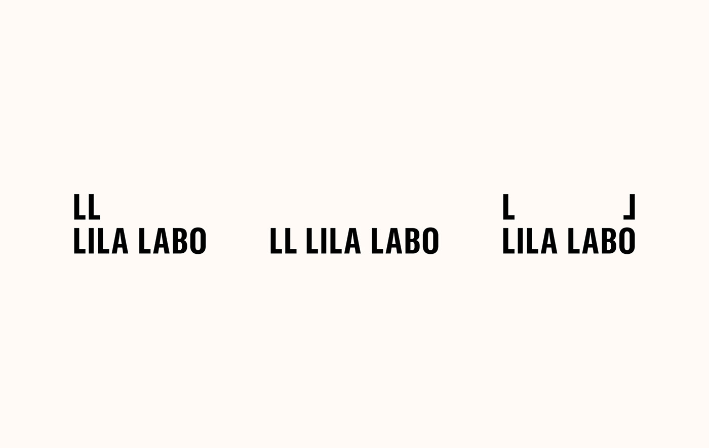
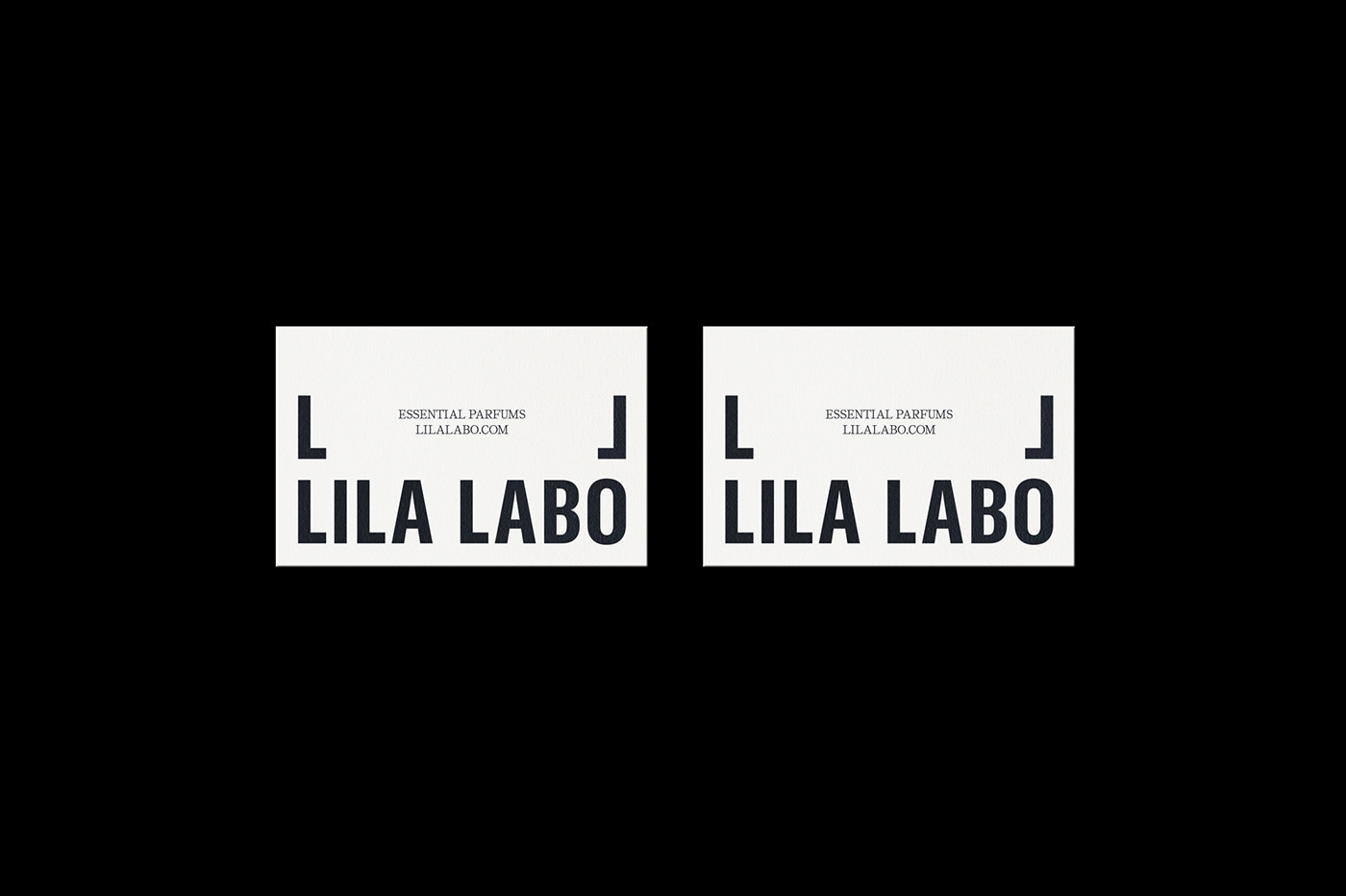
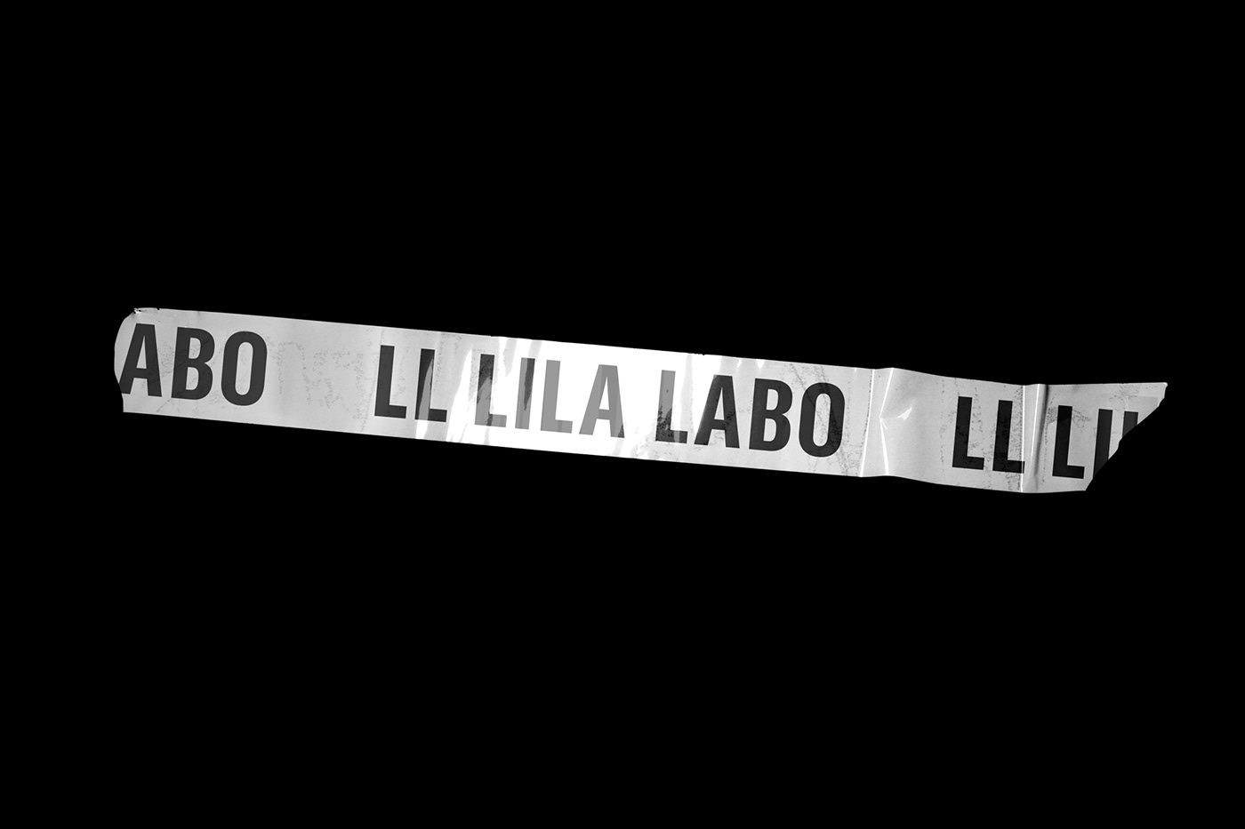
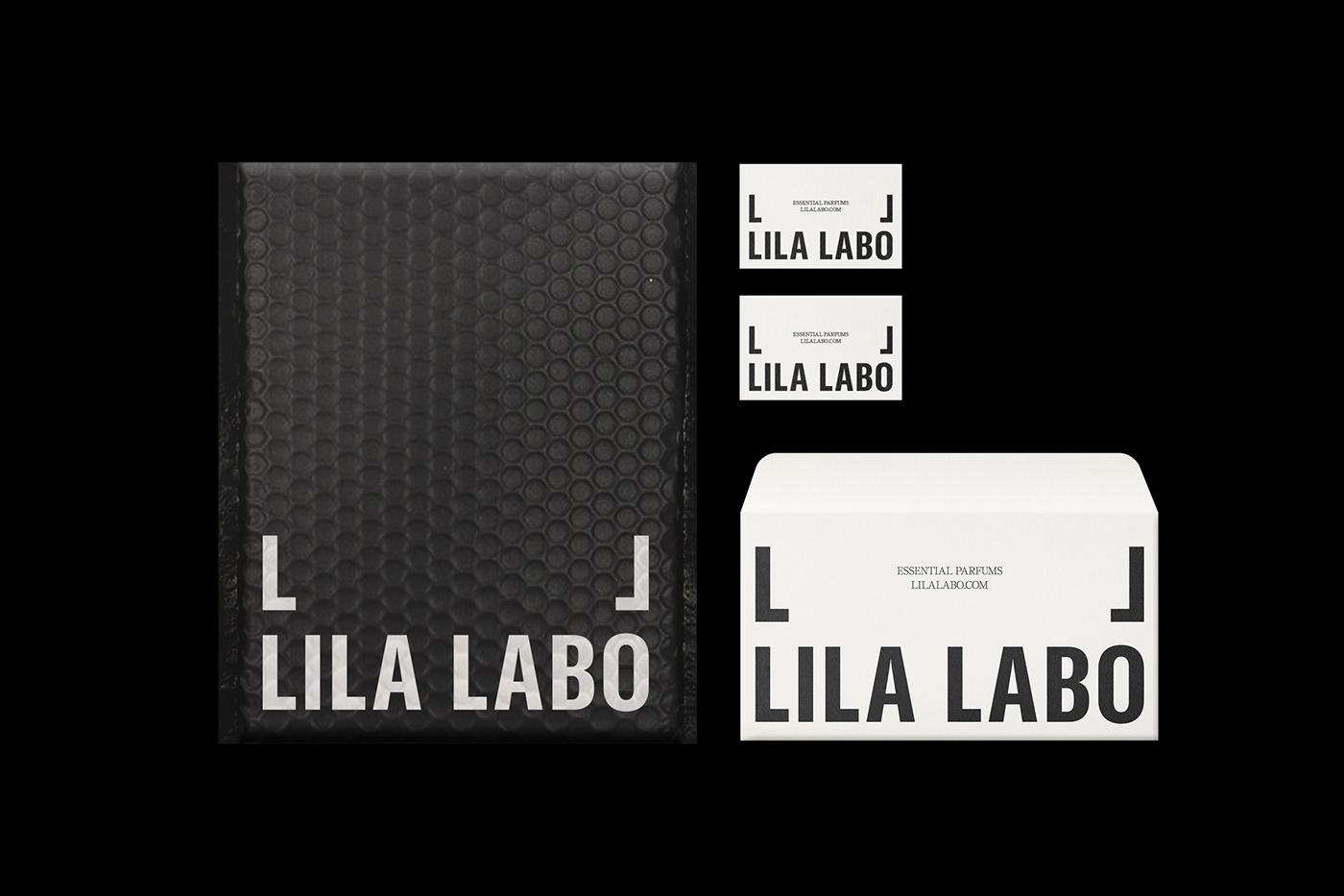
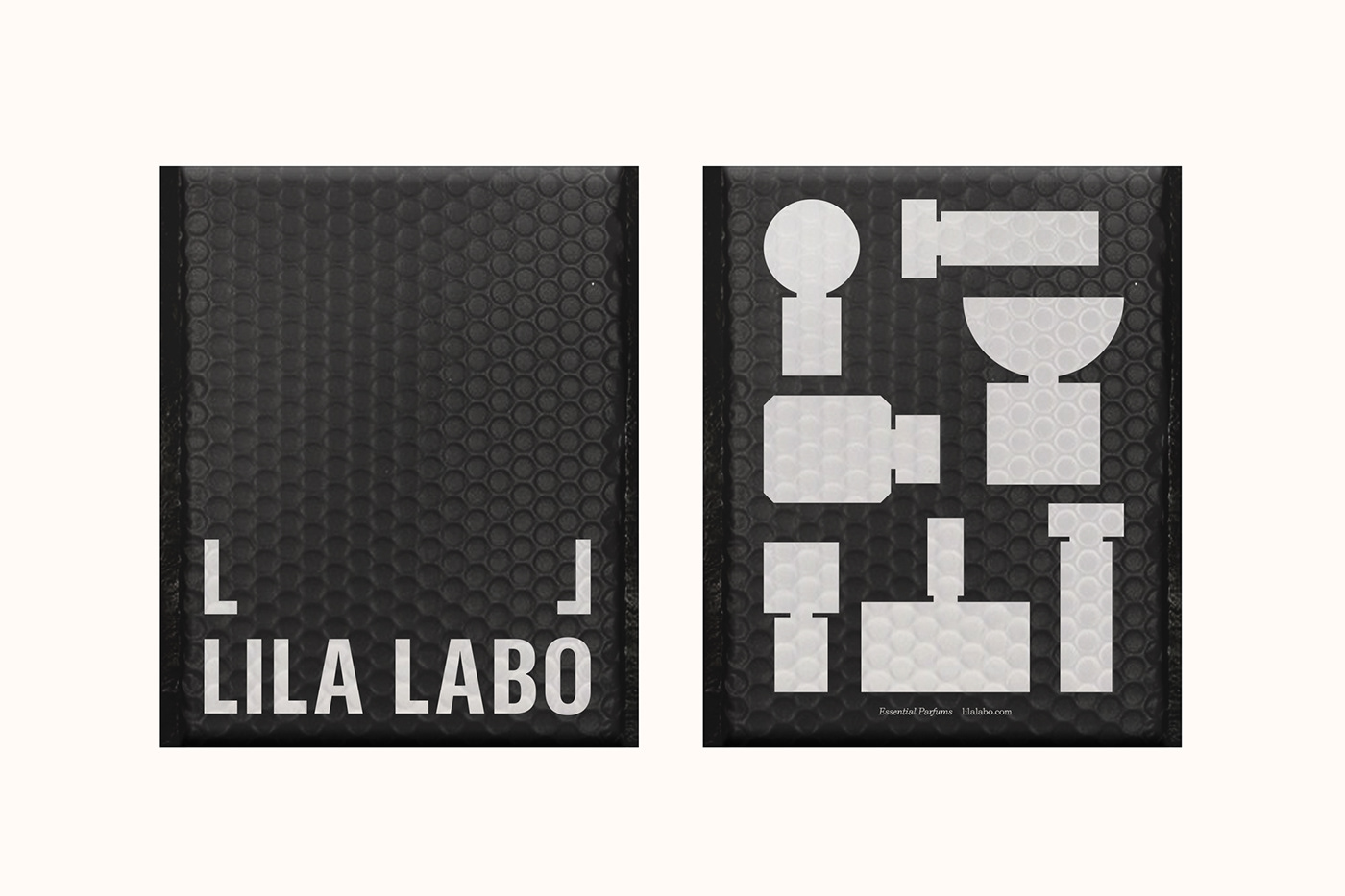
One of the standout features of this project is the remarkable use of typography. Dziubek's choice of a bold sans-serif font for the logo design exudes confidence and modernity. The sharp and clean lines of the typography create a strong visual impact, instantly capturing the viewer's attention. Moreover, the black and white color scheme further accentuates the typography's boldness and ensures a timeless appeal.
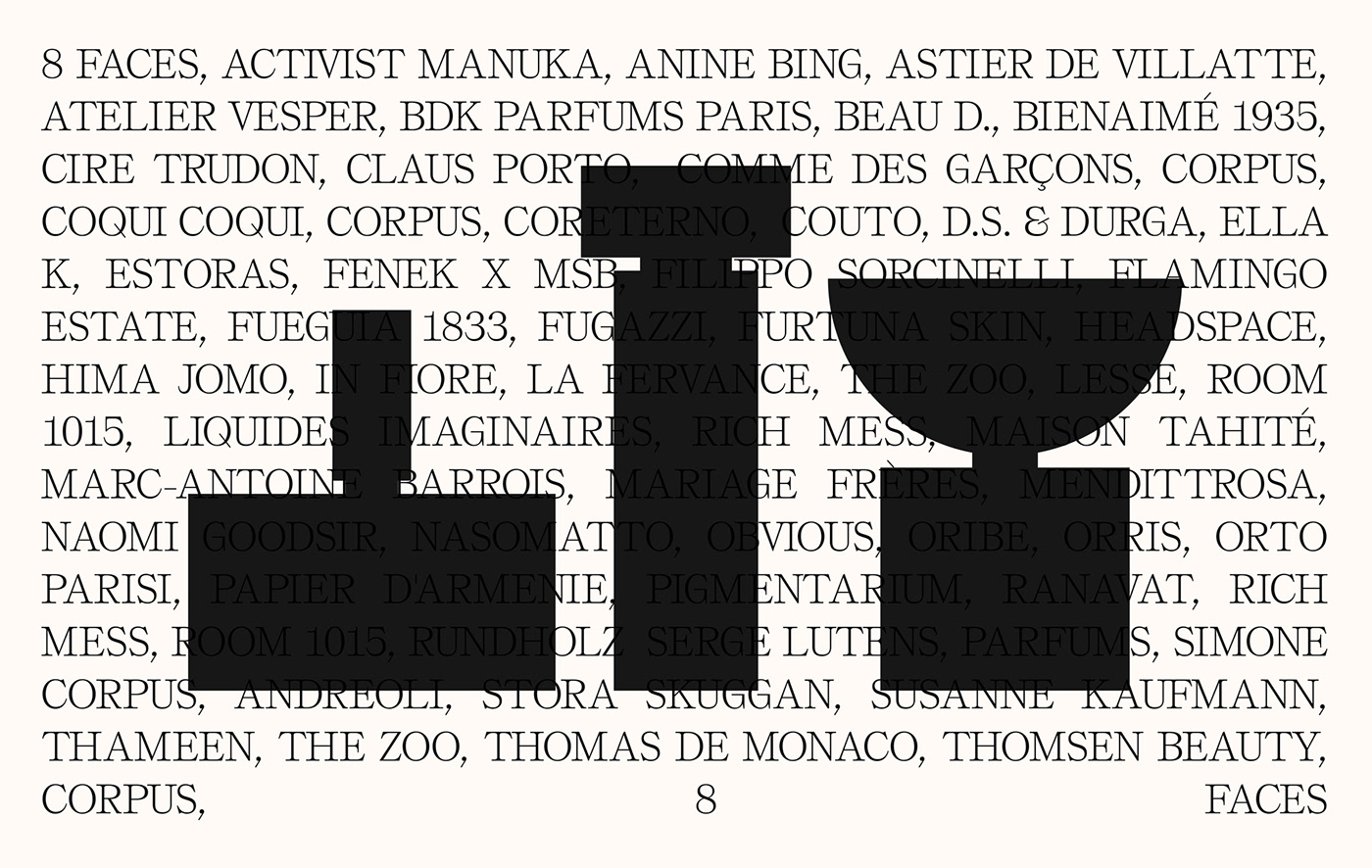
Dziubek's attention to detail shines through in the project's secondary typeface selection. Complementing the dominant sans-serif font, he incorporates a serif typeface, adding a touch of sophistication and refinement. This thoughtful combination brings depth and versatility to the overall design, allowing for a harmonious balance between simplicity and elegance.
The project's black and white theme plays a vital role in its overall success. By embracing this classic color palette, Dziubek has created a design that transcends trends and remains eternally stylish. The simplicity of black and white exudes a sense of purity, while also allowing the typography and other design elements to take center stage. The result is an aesthetic that is both powerful and understated.
Beyond the logo and visual elements, Dziubek's design extends seamlessly to the collateral and packaging materials. The cardboard packaging, perfectly in tune with the project's minimalist approach, adds a tactile and eco-friendly touch. This consistency throughout the various touchpoints enhances the brand's identity and reinforces its commitment to elegance and simplicity.
Jarosław Dziubek's branding and visual design project for Lila Labo stands as a testament to the power of simplicity and elegance in design. With its bold sans-serif typography, skillful use of secondary typefaces, and striking black and white theme, this project captivates viewers and leaves a lasting impression. From the logo design to the packaging, every element exudes sophistication and showcases Dziubek's exceptional talent. It is a masterclass in creating a visual identity that is both refined and impactful.
Branding and visual identity