by abduzeedo
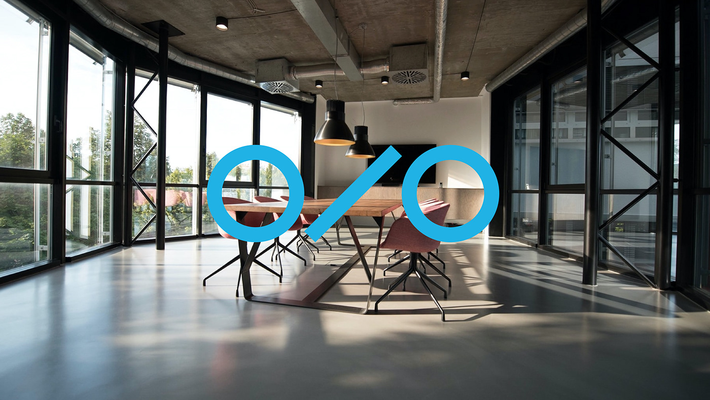
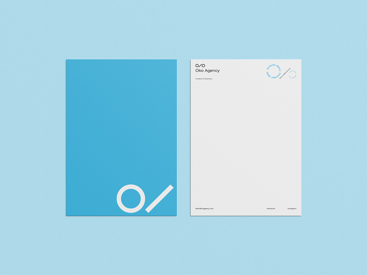
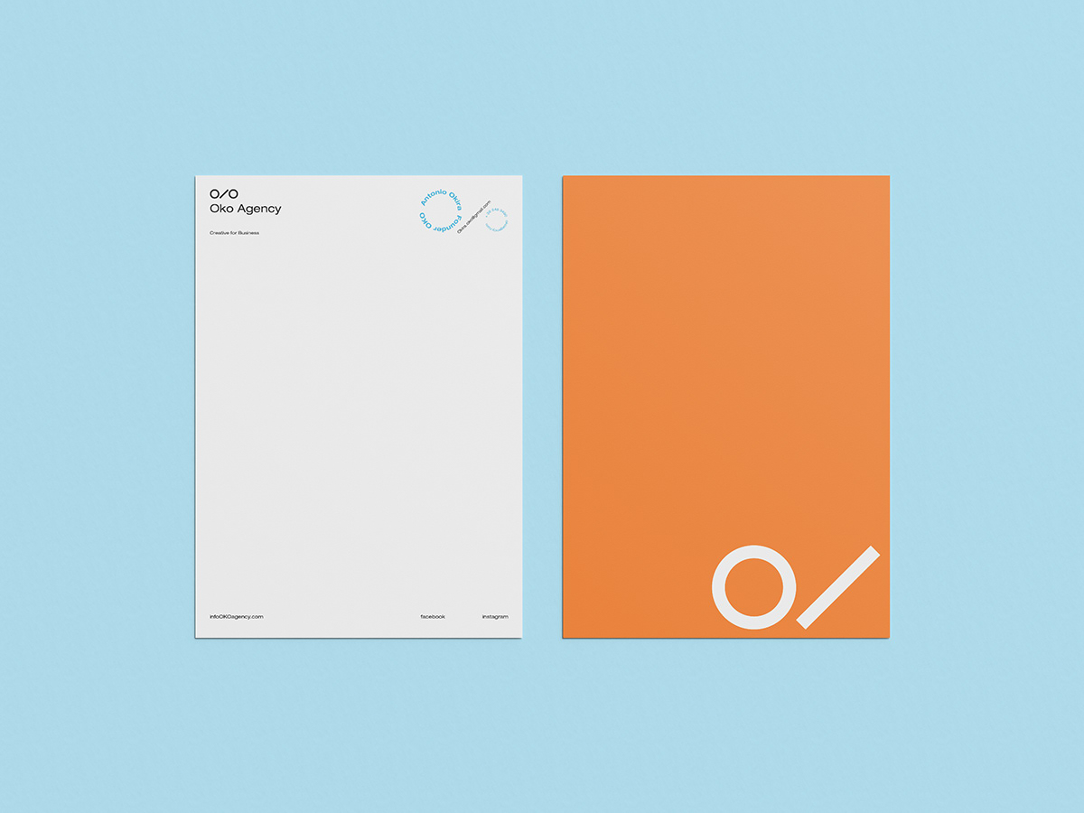
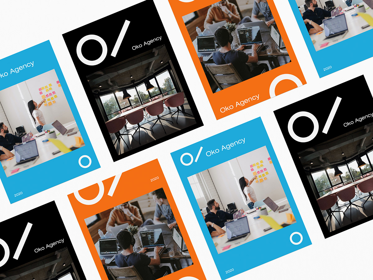
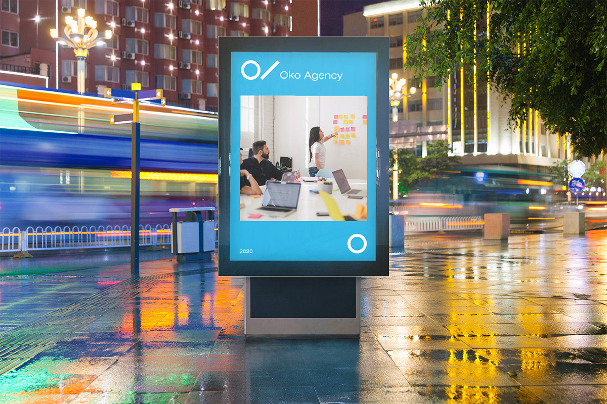
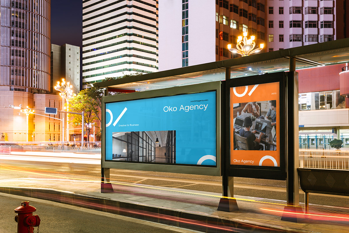
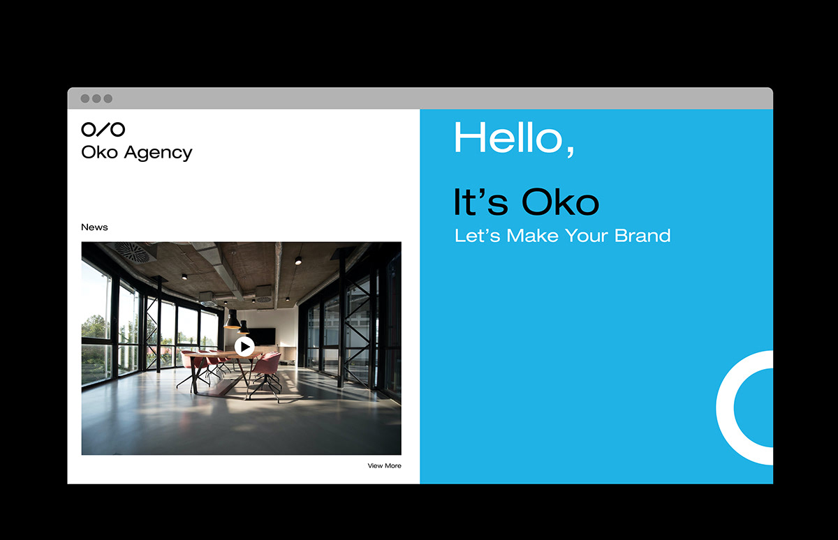
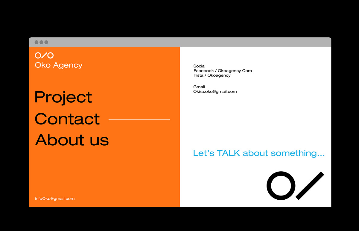
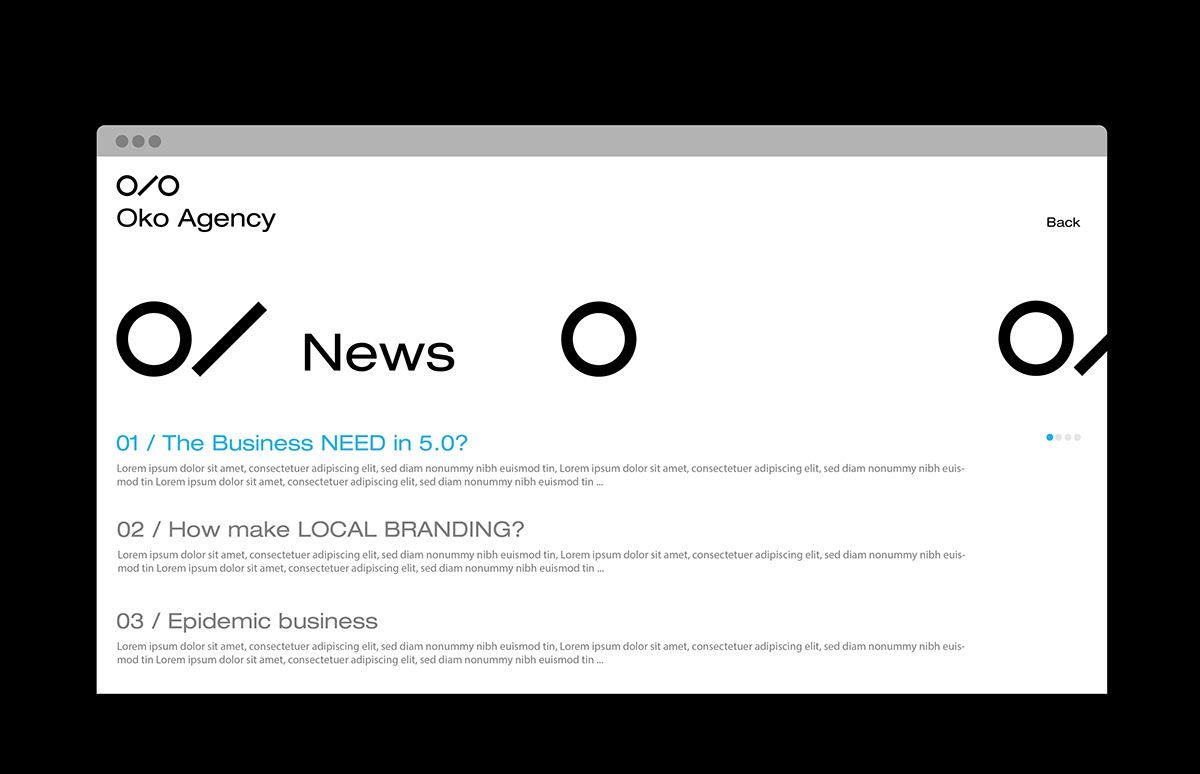
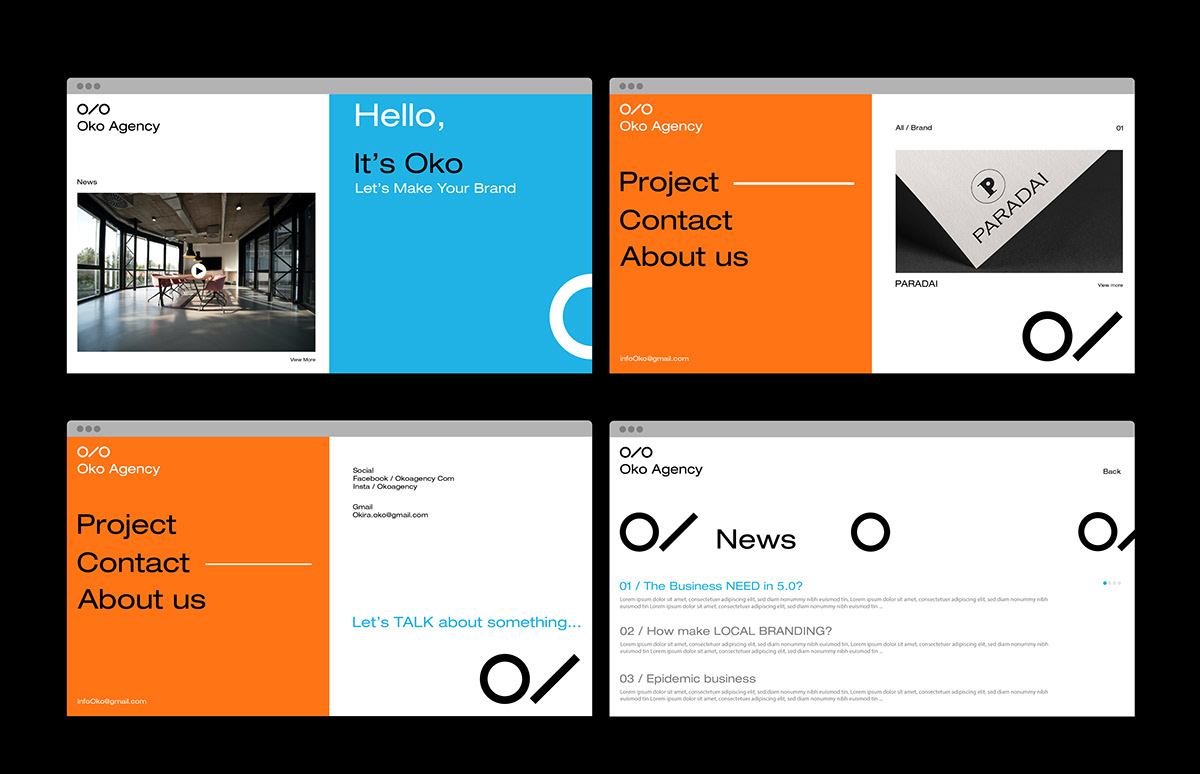
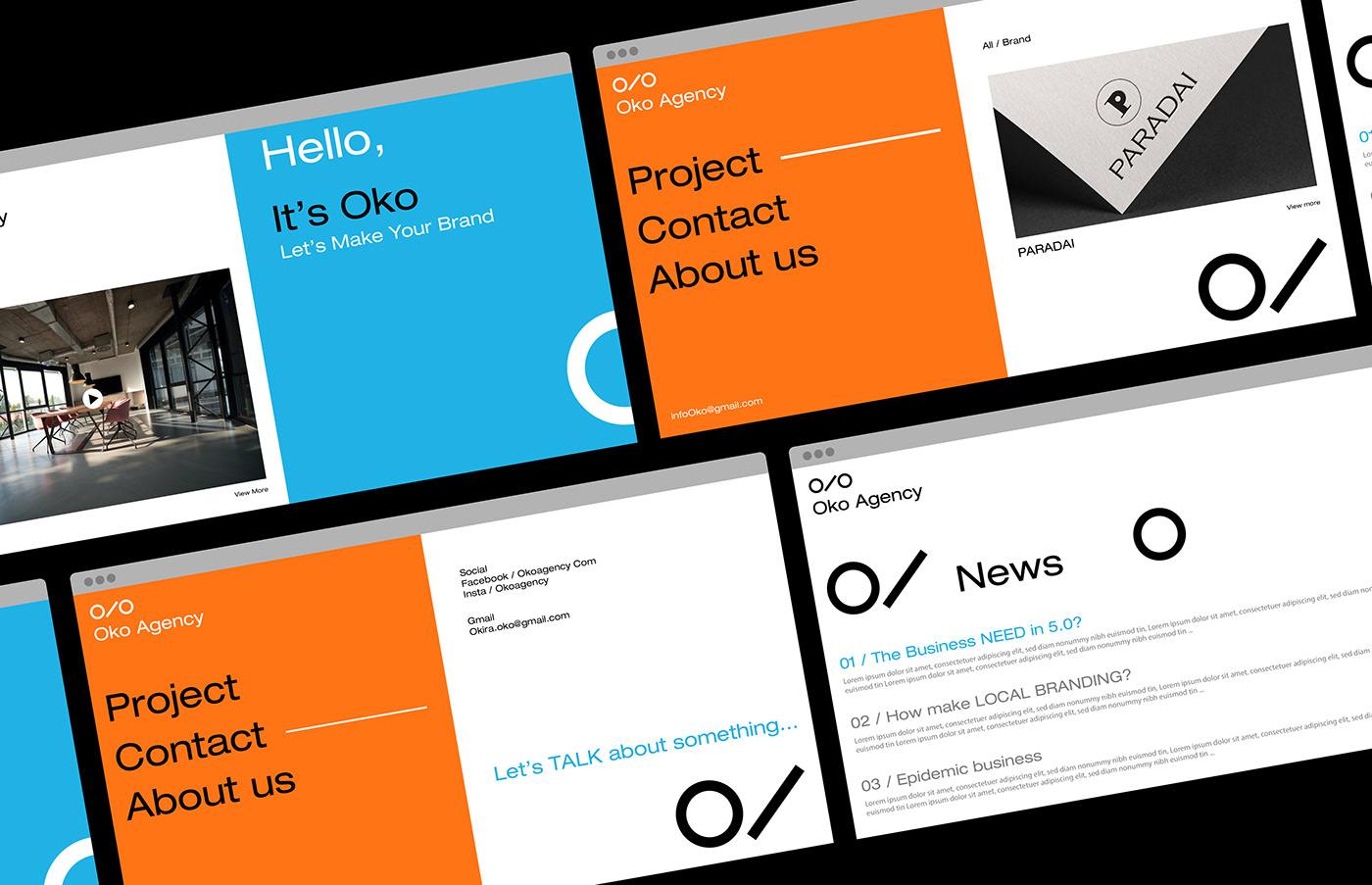
ooo Studio, Linh Tran, Linh CT, Olivia Truong, and DESAI shared a branding and visual identity project for Oko, a newly established agency specializing in brand design and orientation to develop marketing campaigns for customers. Their clients are mostly small and medium-sized start-ups. Oko means eternity and leverage, just as the value they bring to customers is permanent and boosts their brand.
The brand is designed in minimalist style. The logo is based on the stylized name and leverage to create a simple, yet effective brand recognition.