Branding and Visual Identity for Sushi-San PH
Discover how Annoe Studio crafted a branding and visual identity for Sushi-San PH that blends Japanese tradition with modern sophistication.
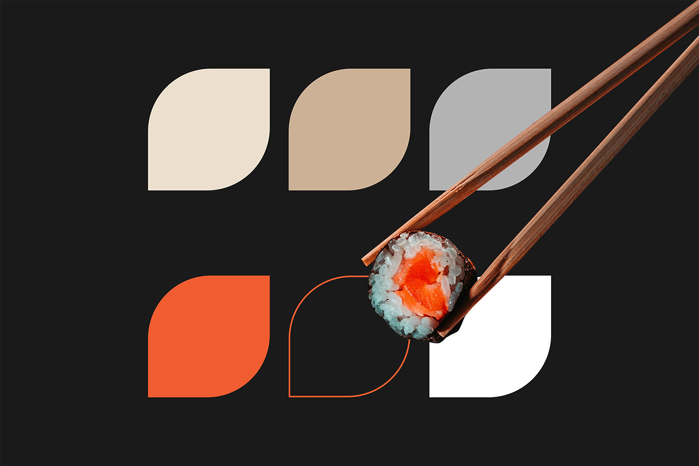
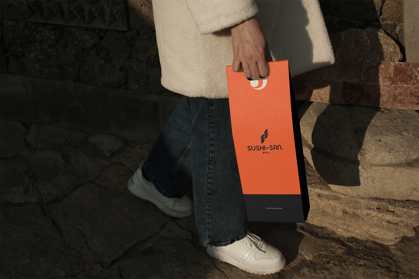
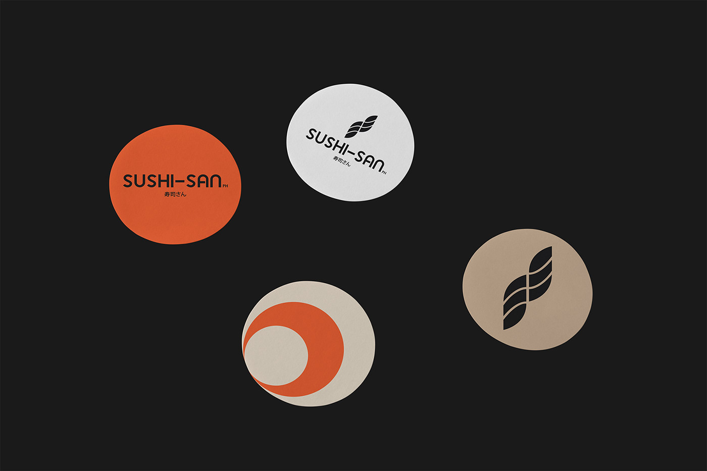
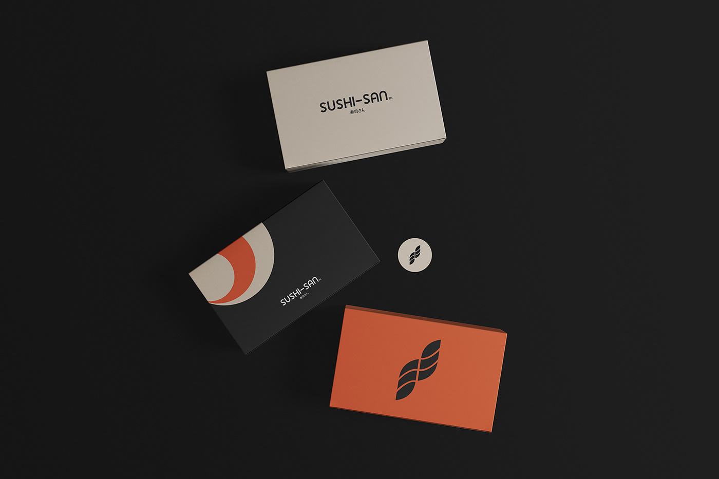
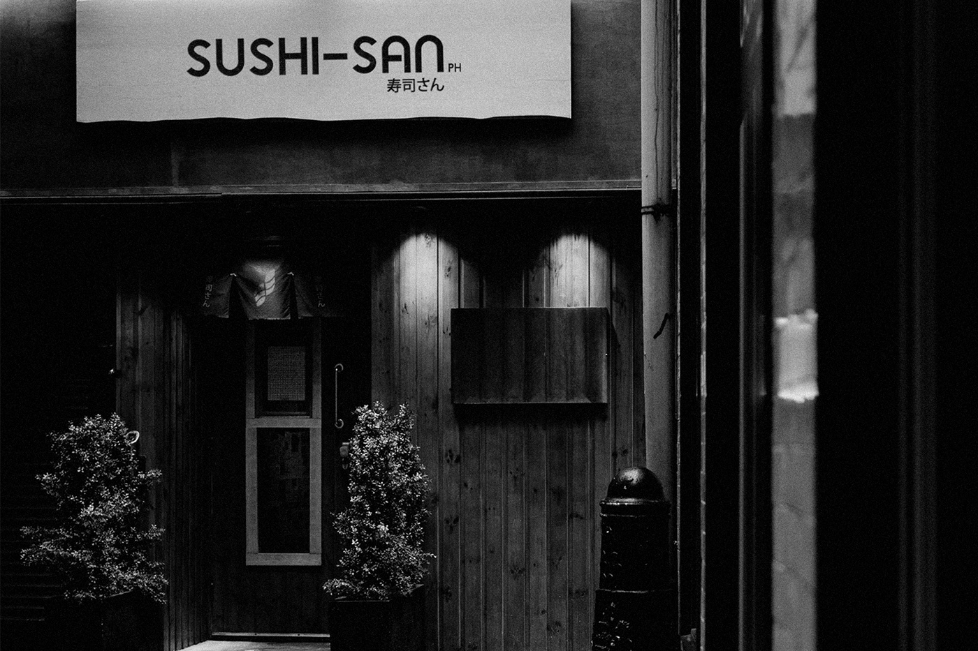
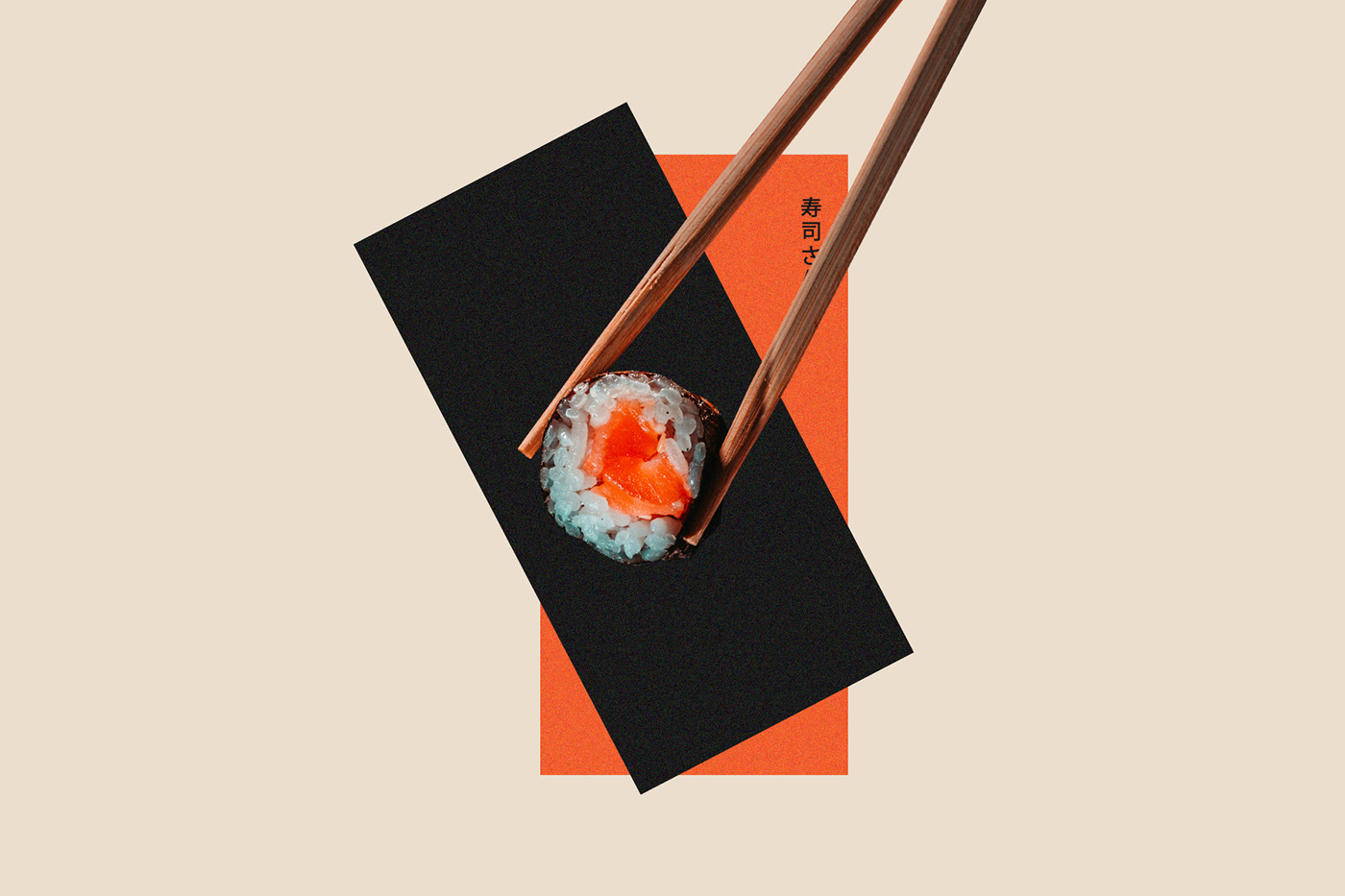
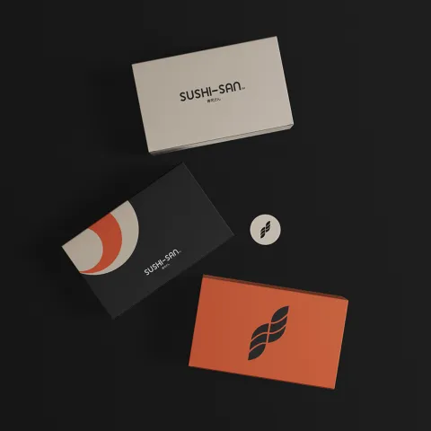
SUSHI-SAN PH's branding is a harmonious blend of contrasts: sophisticated yet inviting, modern yet deeply rooted in tradition. Inspired by Japan's minimalist art and culinary precision, the identity embraces simplicity while maintaining warmth and authenticity. The visual system is built on a carefully curated color palette of nude, gray, orange, and white, striking a balance between refinement and approachability.
Neutral tones like nude and gray evoke elegance and sophistication, while the warmth of orange adds energy and vibrancy, creating a welcoming ambiance. This contrast extends beyond colors—clean, modern typography meets traditional design influences, and the S-mark captures both motion and heritage, symbolizing the artistry of sushi-making. Every design element is intentional, ensuring that SUSHI-SAN PH feels both timeless and fresh, seamlessly connecting tradition with contemporary dining experiences.
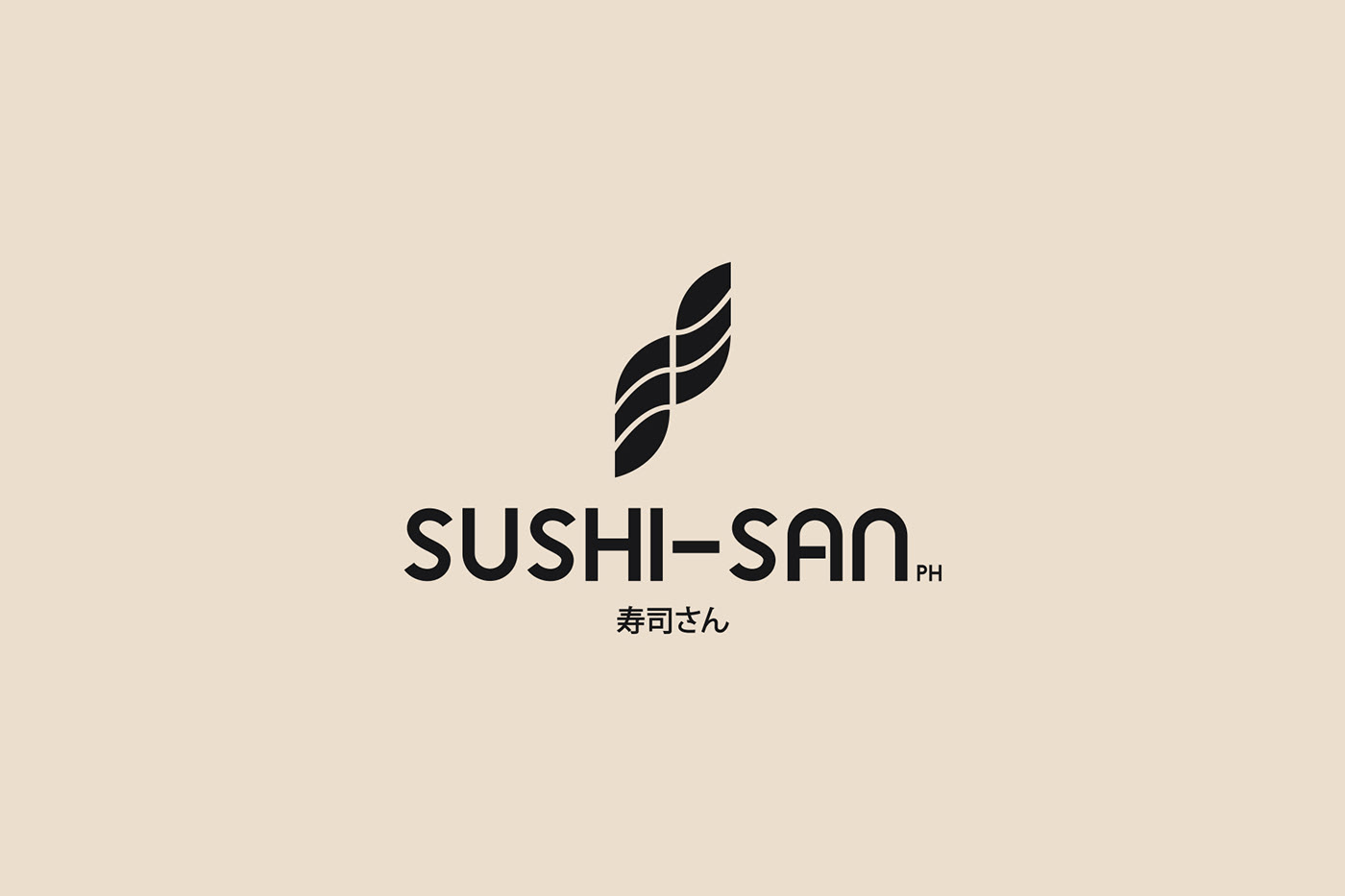
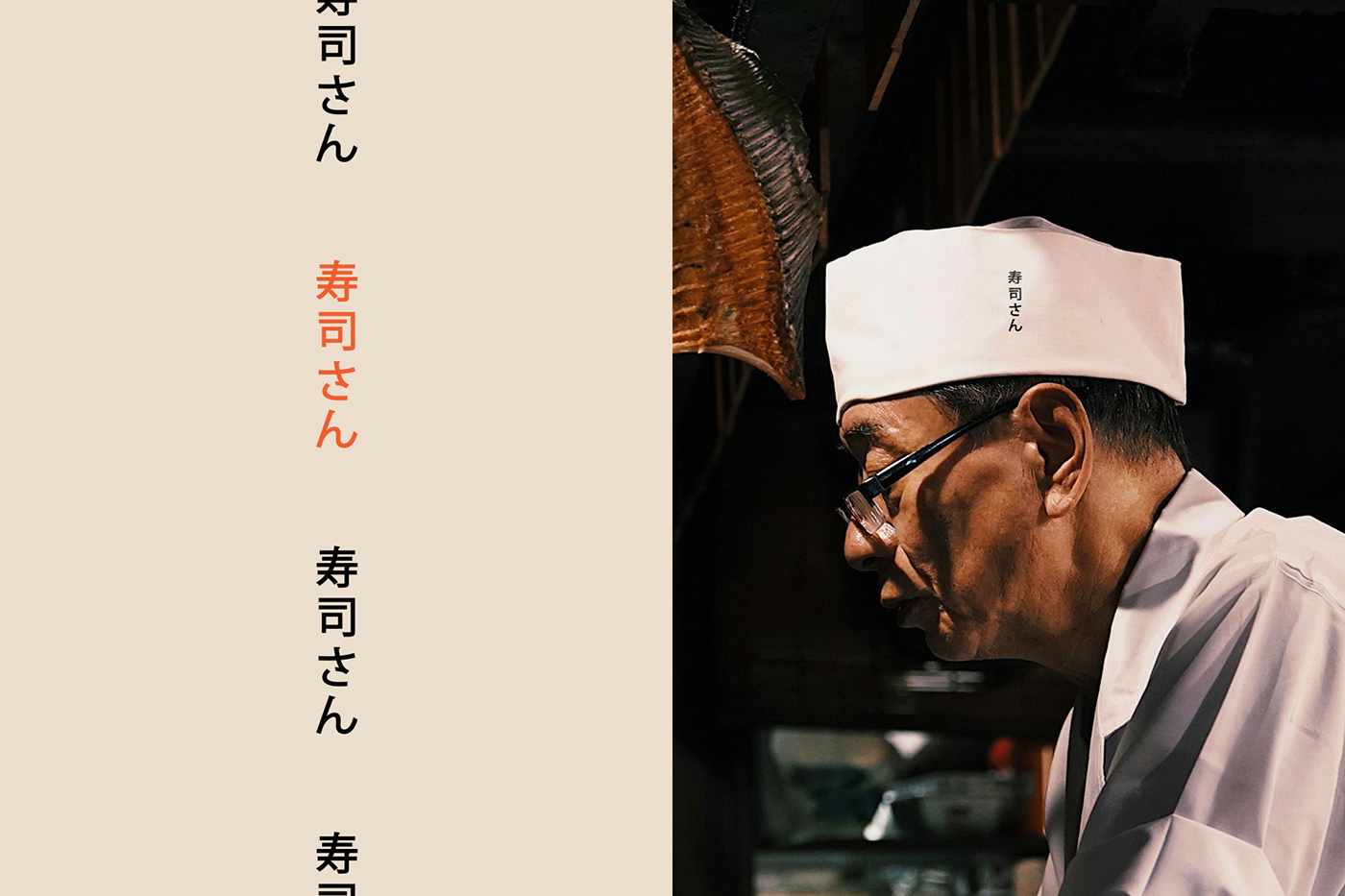
The S-Mark: A Symbol of Motion and Tradition
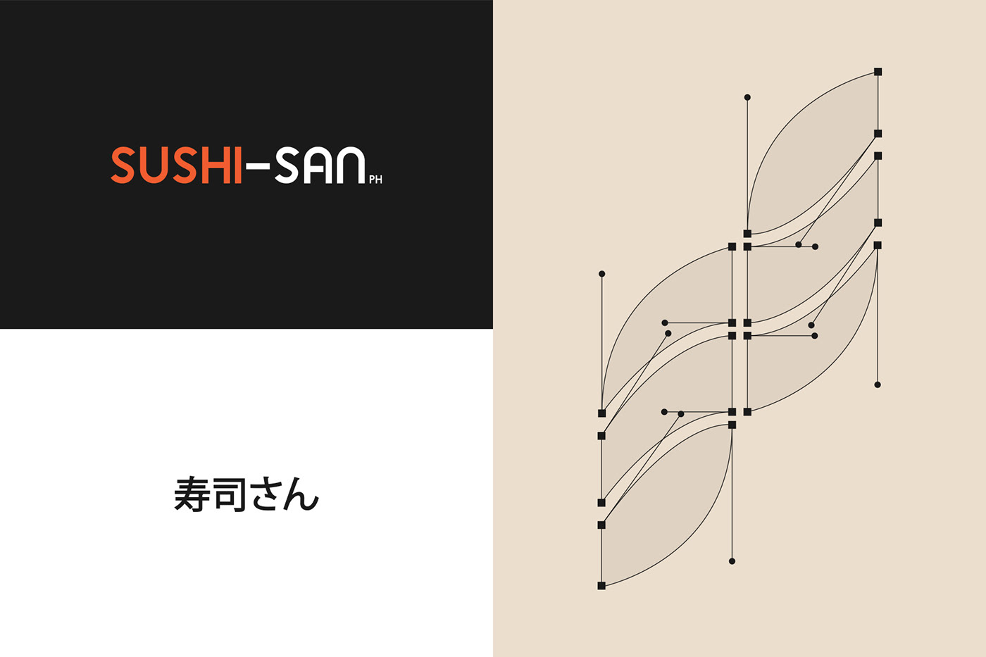
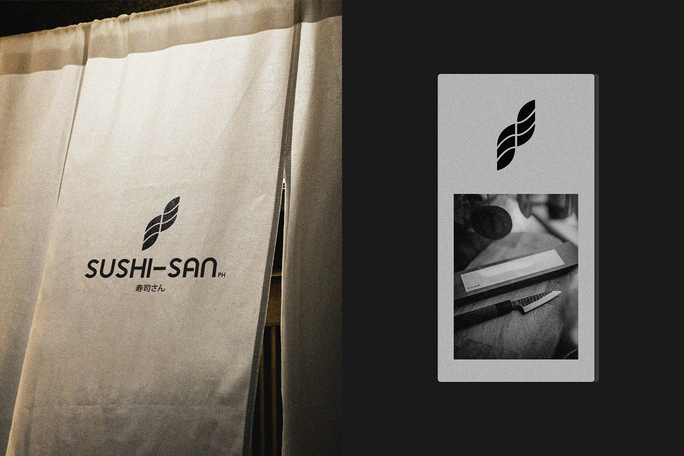
At the core of SUSHI-SAN PH’s identity is the S-shaped mark, which represents movement, adaptability, and heritage. Its fluid lines mirror the graceful artistry of sushi-making, while its wave-like form subtly reflects the rolling motion of sushi. More than just a visual signature, this mark embodies the balance between tradition and innovation, seamlessly connecting the past with the future of Japanese dining.
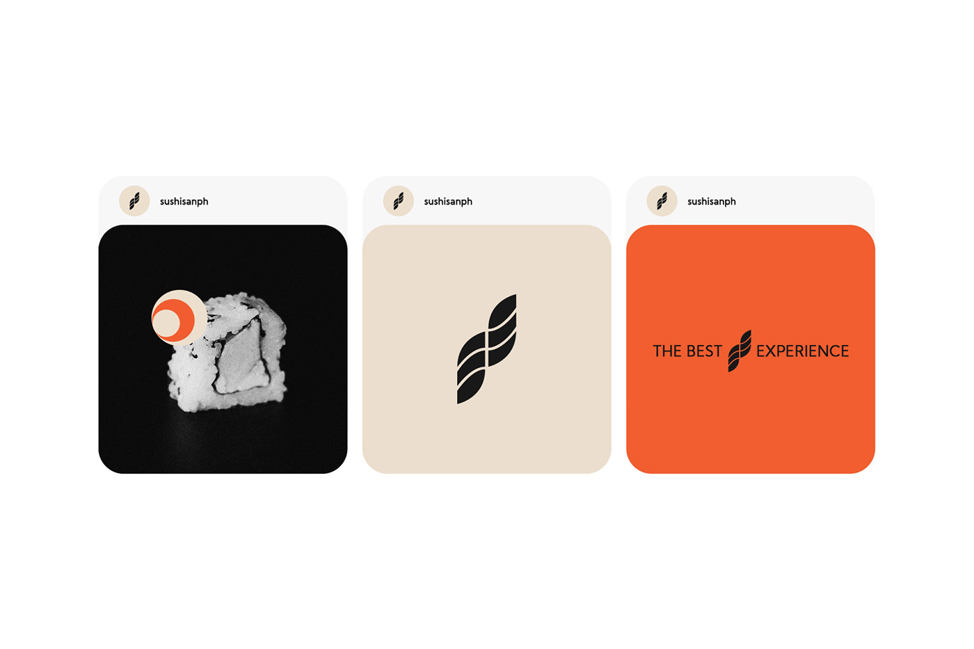
Adding another layer of uniqueness, roll elements are incorporated into the visual identity, mimicking the rolling motion of sushi. These details create a dynamic flow, almost like a pair of eyes following the movement of a sushi roll. This playful yet intentional design choice reinforces the theme of fluidity, precision, and an immersive dining experience.
Typography and Logo Design: A Statement of Modernity
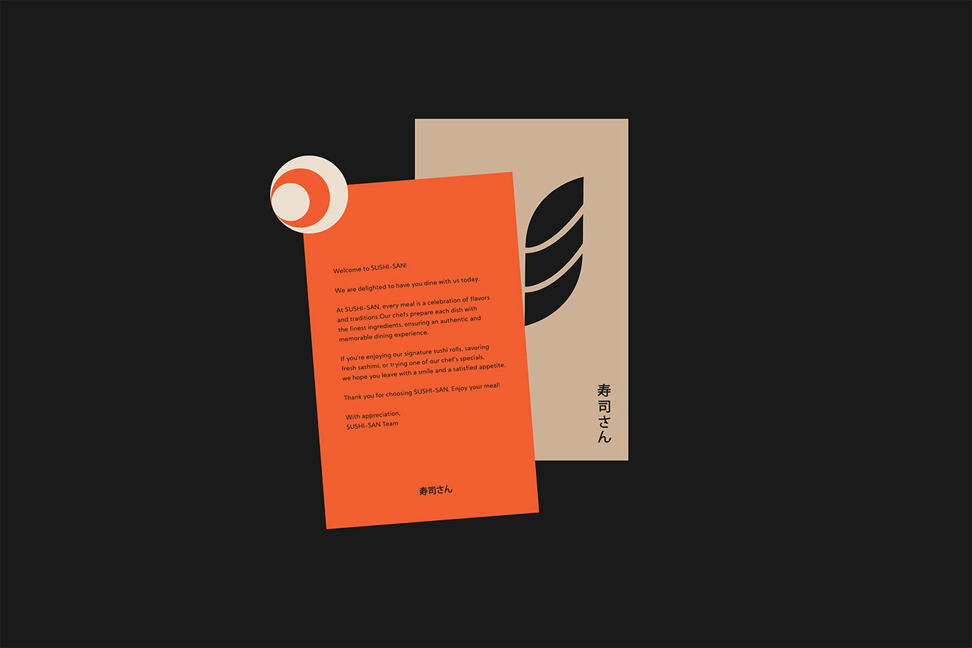
Every detail of the logo lockups was designed to ensure a strong visual impact across different applications. A carefully curated color palette enhances this emotional connection, reinforcing the refined yet inviting atmosphere of the brand. The sans-serif typography further communicates modernity and timelessness, striking a perfect balance between contemporary appeal and respect for tradition.
SUSHI-SAN PH is more than a sushi bar—it's a brand that embodies the artistry, balance, and warmth of Japanese dining culture. With a visual identity that seamlessly blends heritage and modernity, the brand delivers a sushi experience that feels both authentic and refreshingly new.
See more: https://www.behance.net/annoestudio or World Brand Design Society
Branding and visual identity artifacts