Crafting Visual Identity: Acrea's Digital Transformation Journey
Explore Acrea's branding and visual identity by Alphamark. See how design brings a human touch to digital transformation.
Hey, fellow creatives! Let's talk about a recent branding project. It really caught our eye. Design can change a company's image. It makes it more human and approachable. We're looking at Acrea, a Swiss consultancy, and their rebranding with Alphamark.
The Human Touch in Digital Visual Identity
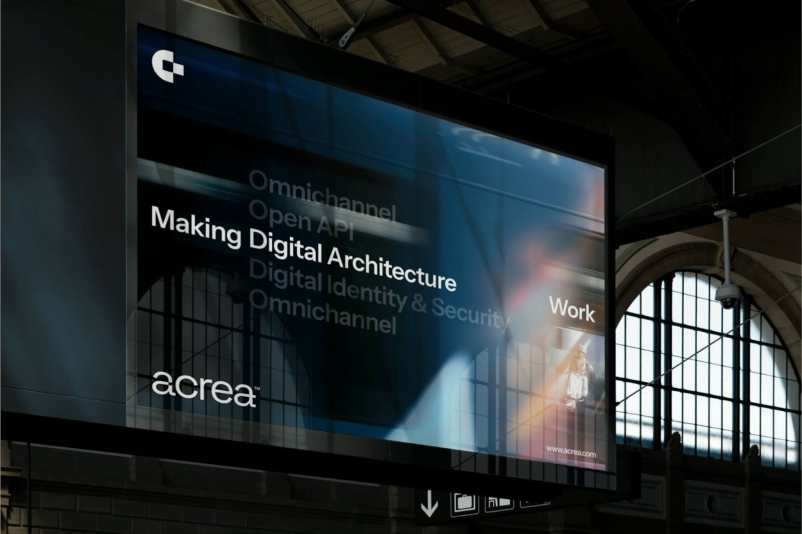
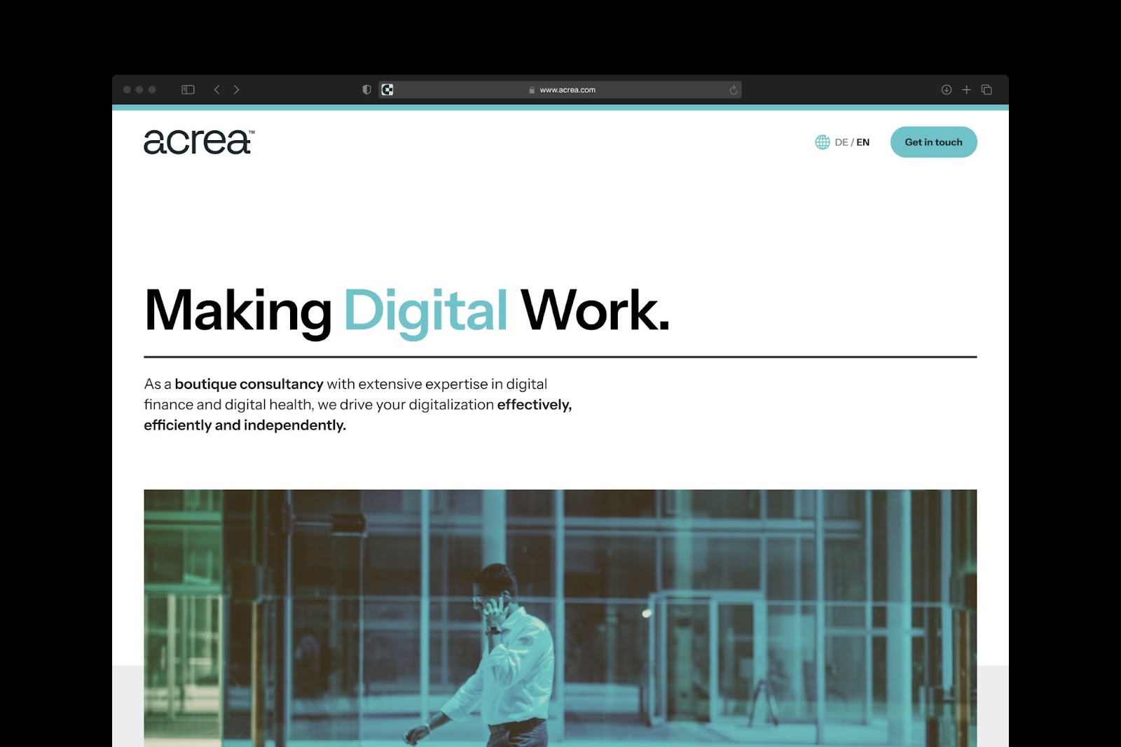
Acrea works in Digital Finance and Digital Health. They faced a challenge: how to show their expertise. They also needed to highlight their personalized approach. At the same time, they wanted to show their strength for big projects. Alphamark helped them. They aligned Acrea's brand identity with their senior, focused, and confident style. Their promise, "Making Digital Work," guided every design choice (Alphamark, "Acrea by Alphamark™," Page 1).
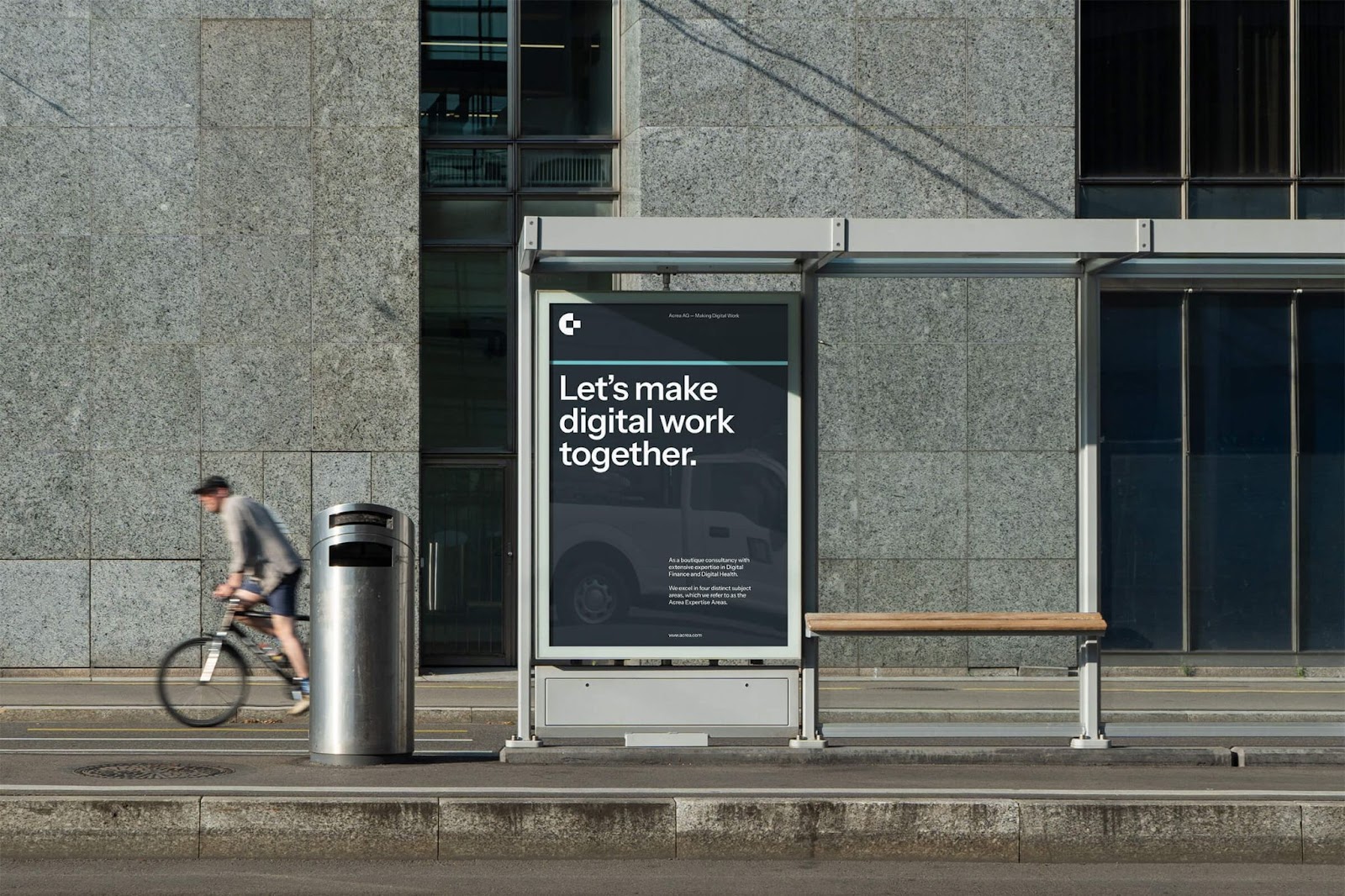
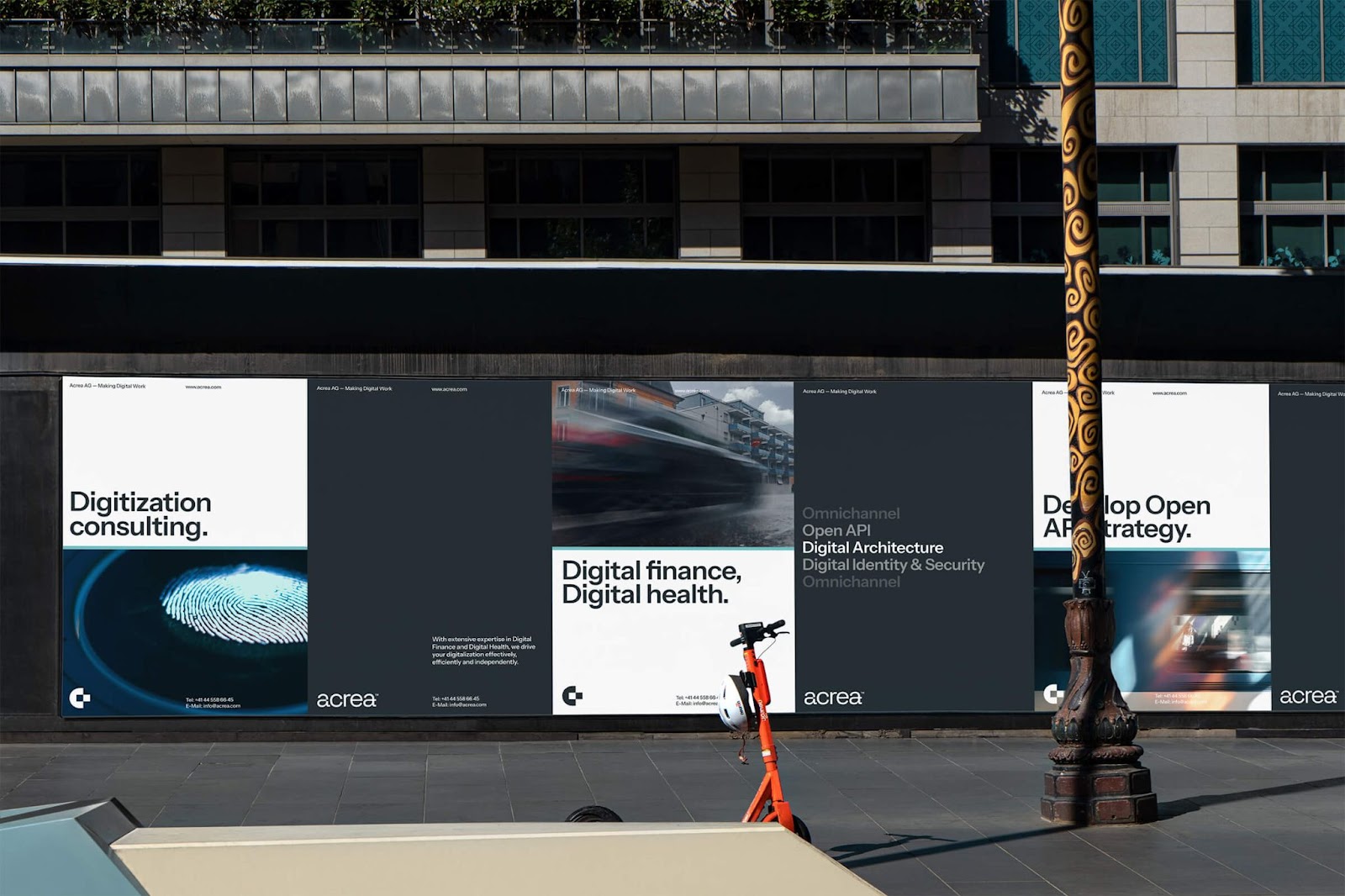
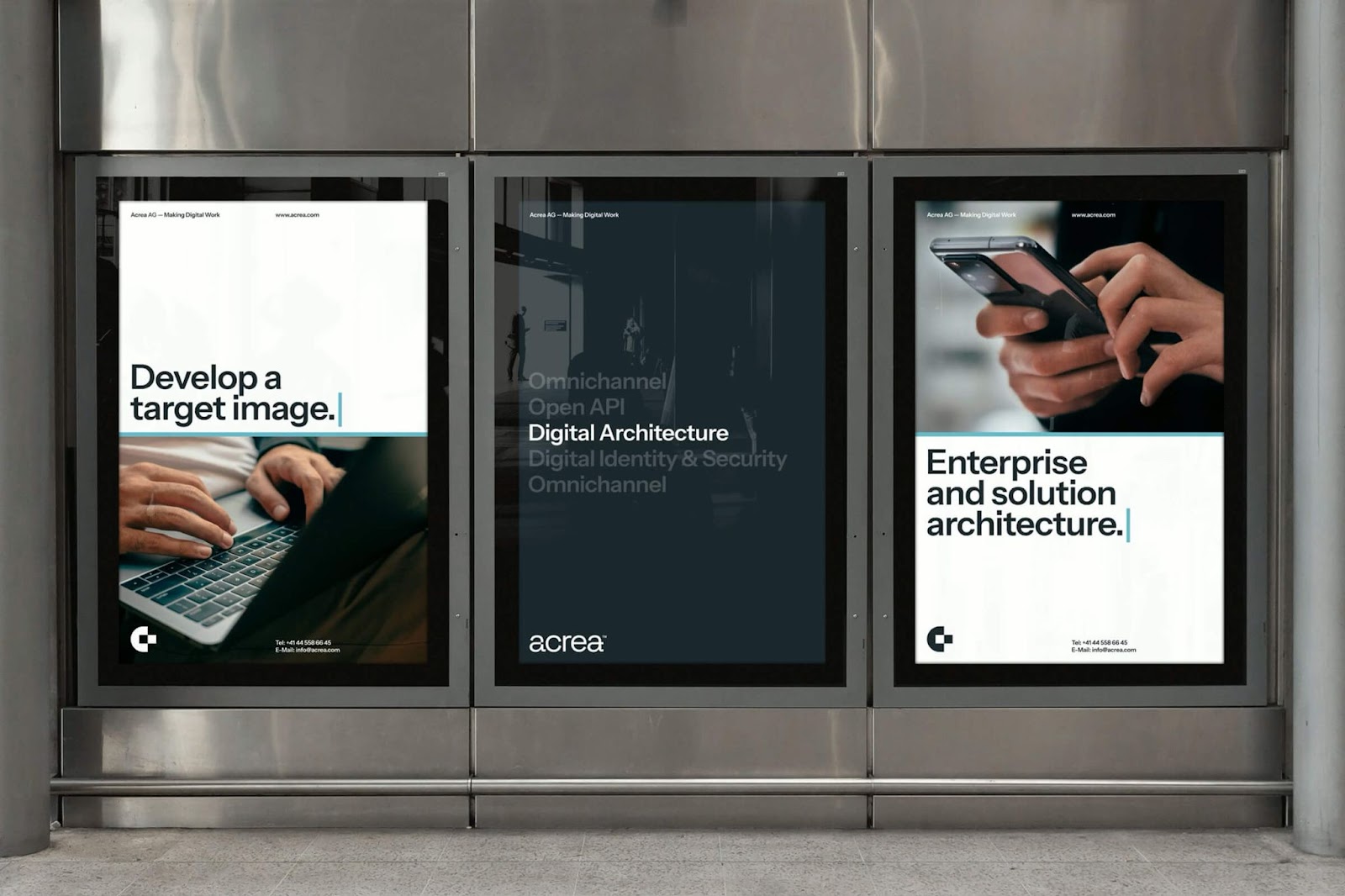
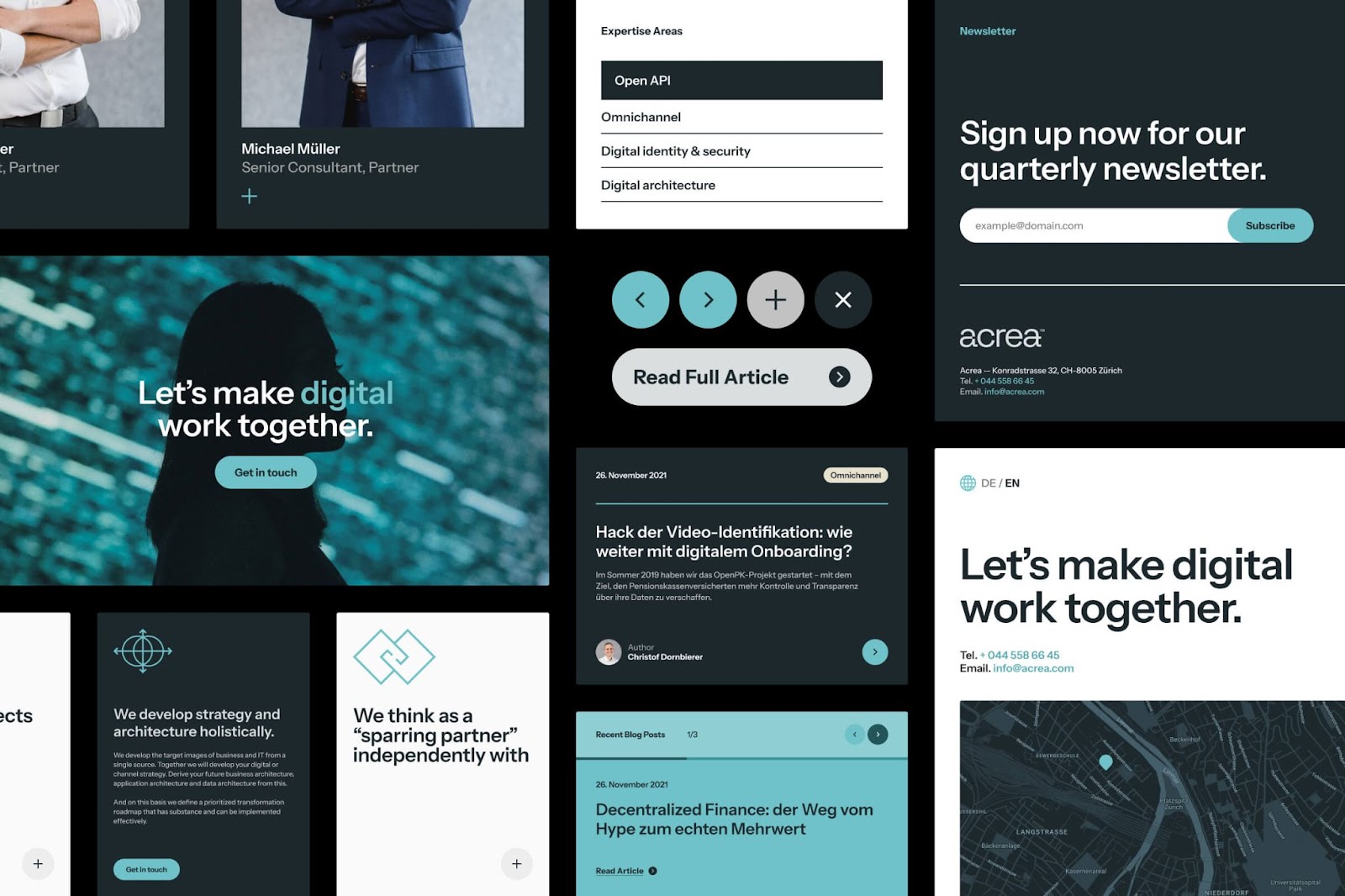
The main idea was simple: keep it approachable. This means no flashy visuals. Instead, they used clean, compact layouts. Photography focused on people. This human touch is key. It's vital in the often-impersonal digital world.
A Logo That Speaks Volumes
The logo has a smart detail. A small "a→a" shows continuous digital transformation (Alphamark, "Acrea by Alphamark™," Page 1). It's a subtle way to show their main business. It's more than just a nice picture. It's a visual idea that perfectly fits their mission.
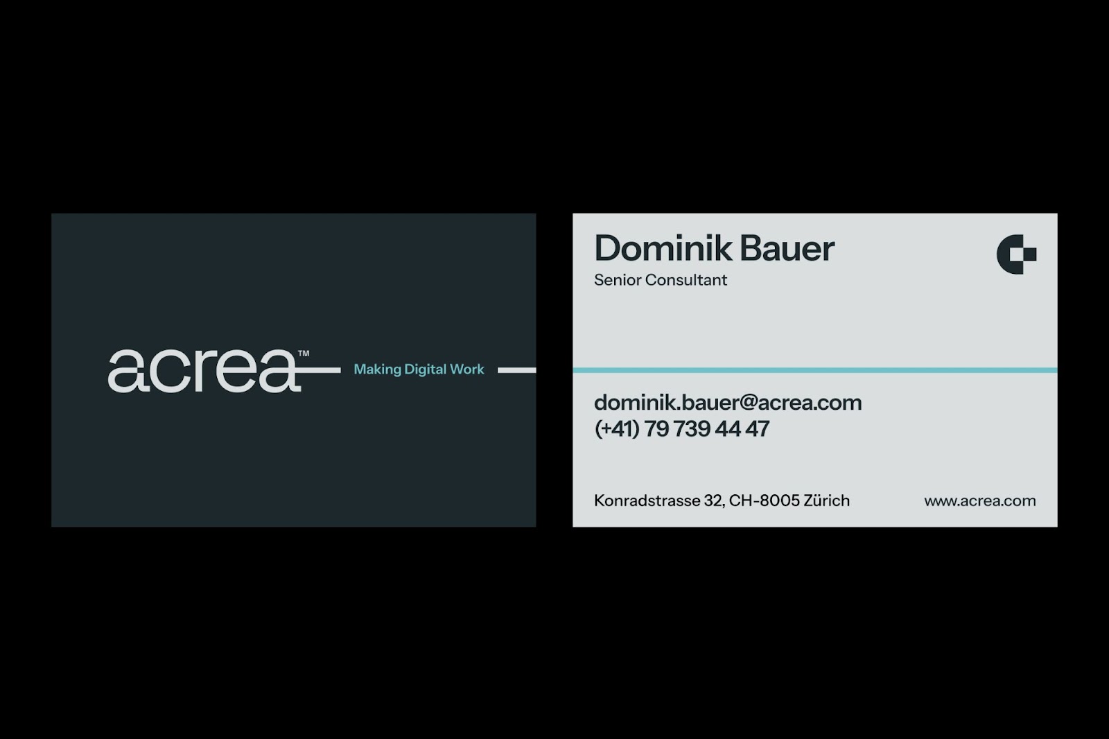
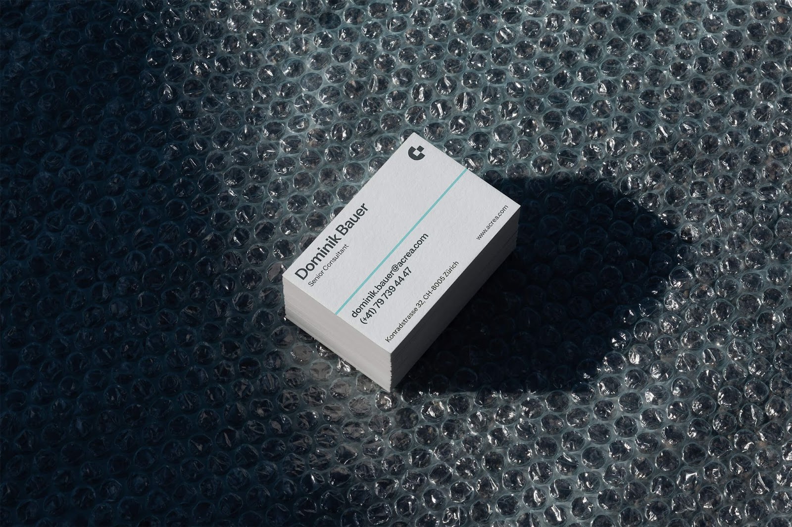
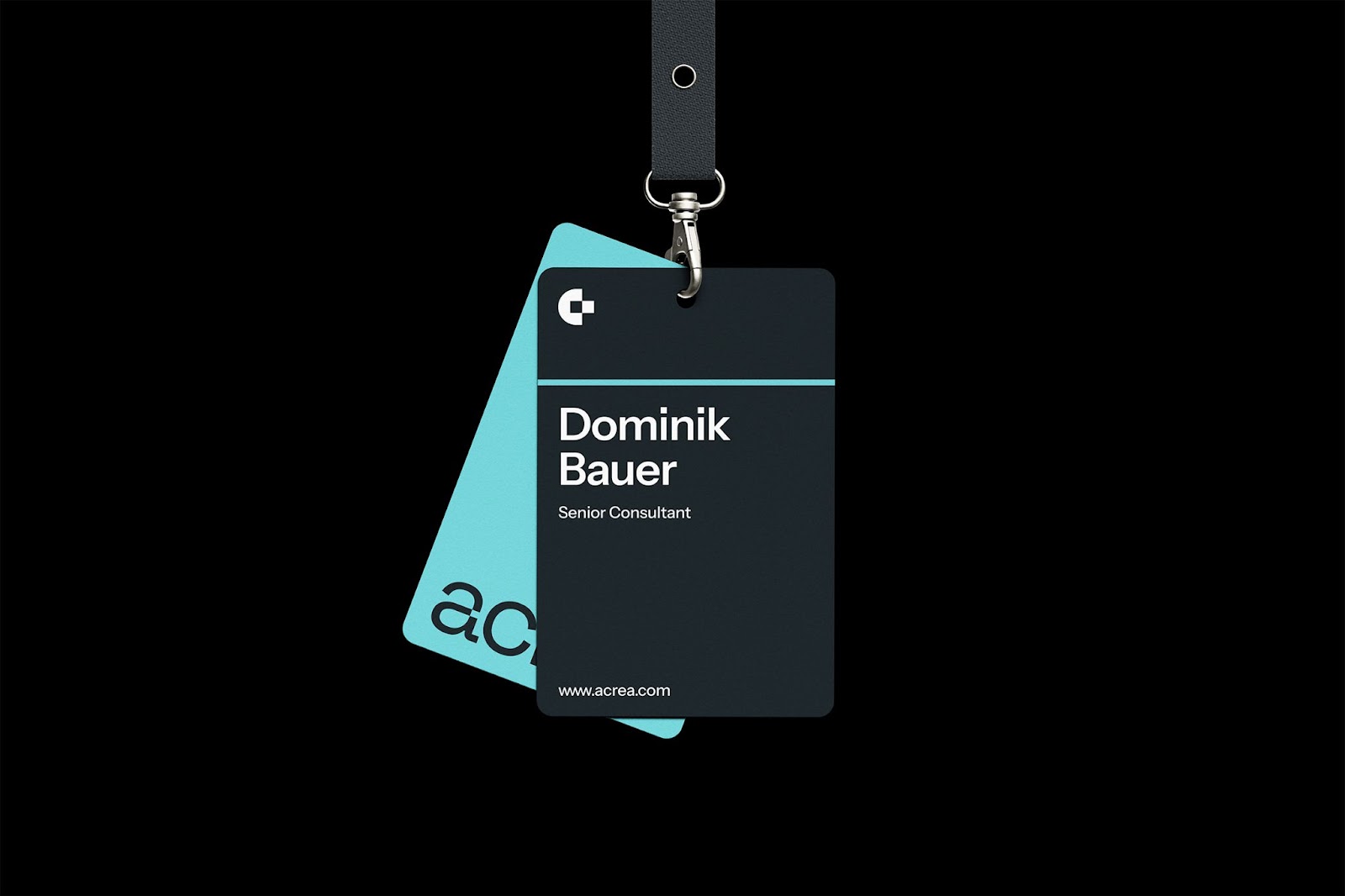
Alphamark also made a flexible brand symbol. This simpler logo balances tech progress with business trust. It adapts well. This keeps the brand consistent. It works on business cards (Alphamark, "Acrea by Alphamark™," Page 9) and big ads (Alphamark, "Acrea by Alphamark™," Page 3).
The Power of Color and Typography
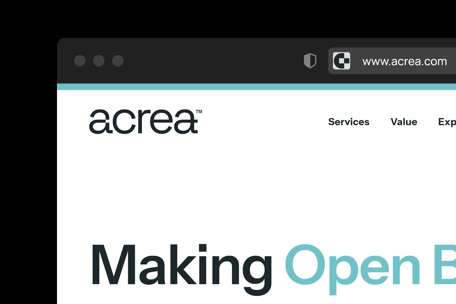
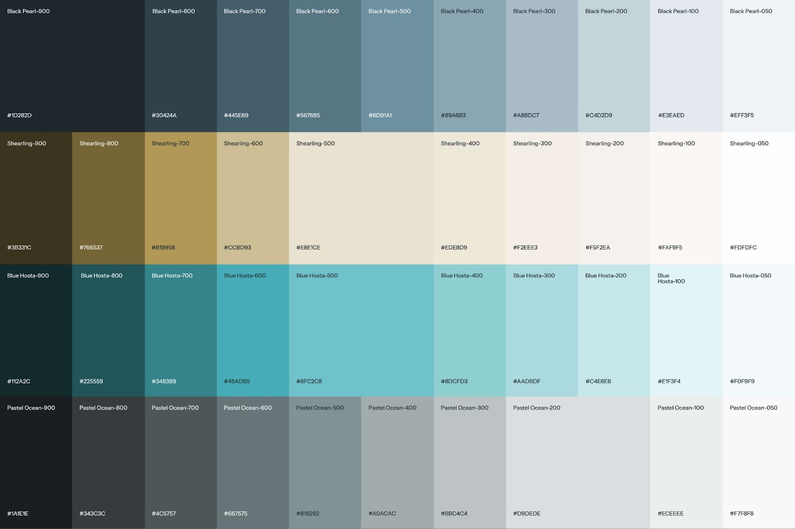
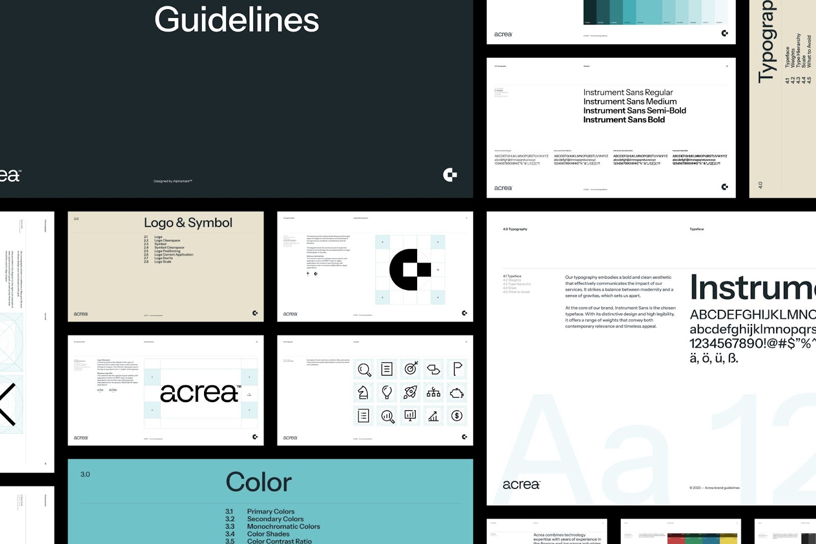
Color is very important for Acrea's new look. Black Pearl and White give clarity and contrast. A light tan adds warmth. This makes the brand feel welcoming. A bright blue is used as a highlight. This blue is not random. It shows digitalization and progress. It adds energy and makes the brand easy to spot (Alphamark, "Acrea by Alphamark™," Page 1).
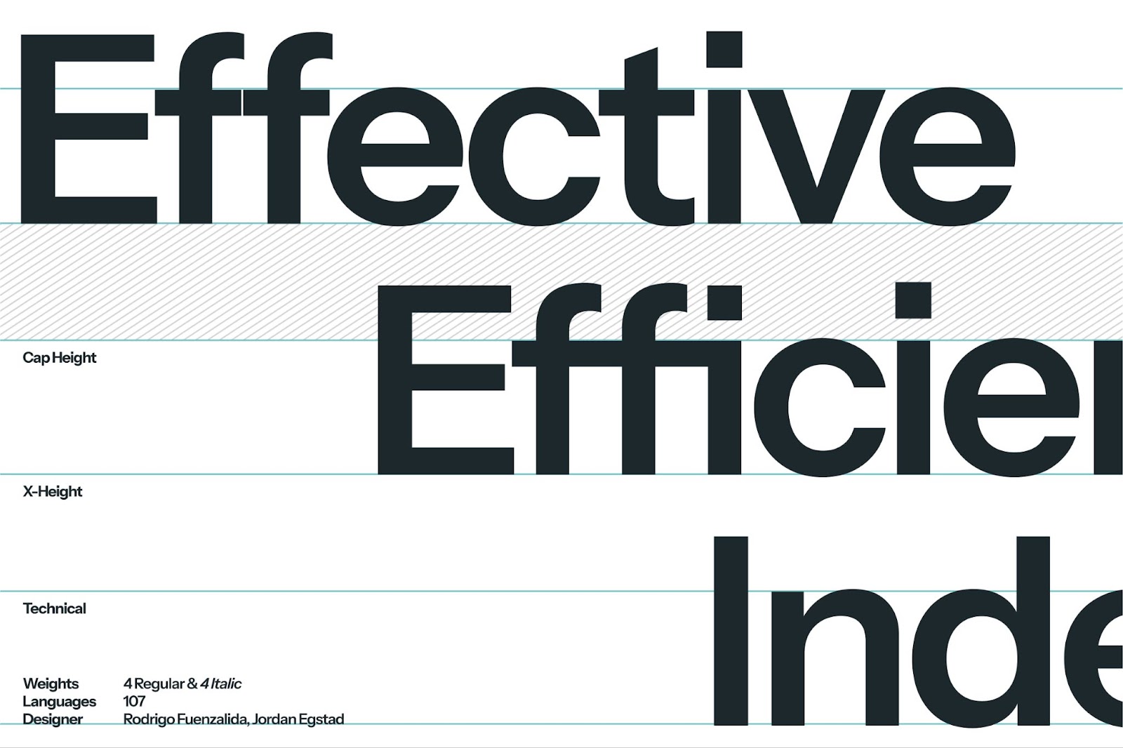
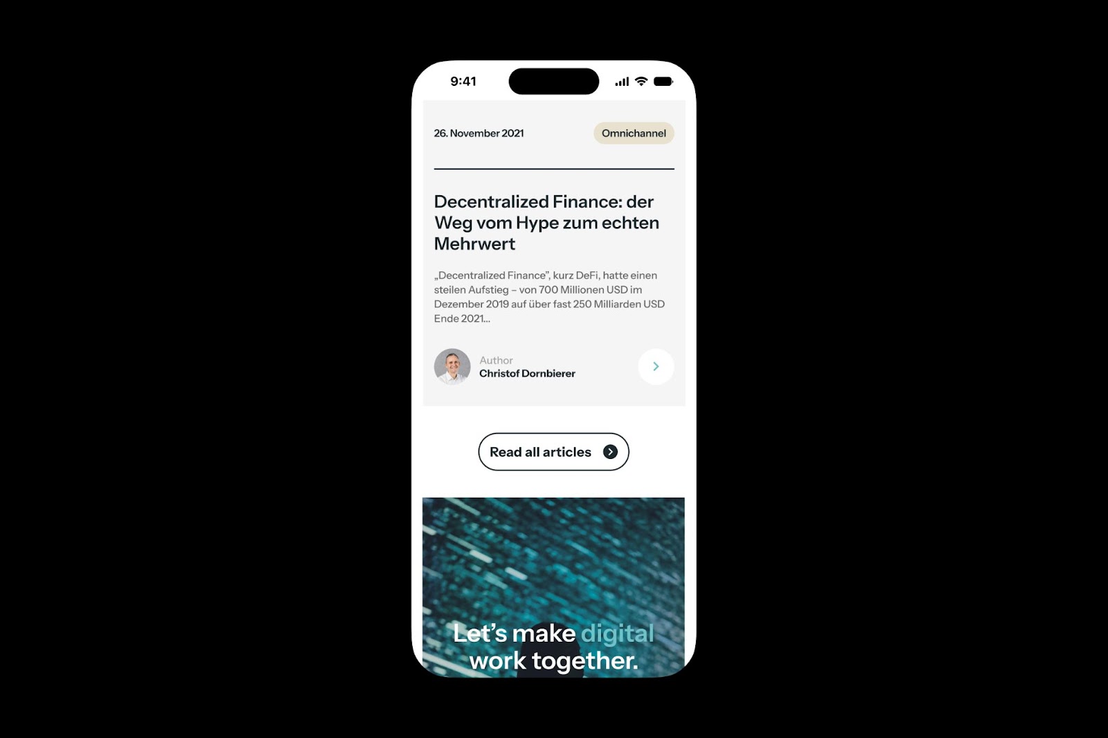
Typography also helps with clear communication. They use Instrument Sans. This font is clean and easy to read. Messages are clear on all platforms, even mobile (Alphamark, "Acrea by Alphamark™," Page 6). This careful font choice shows the brand is professional yet friendly.
Beyond the Visuals: A Holistic Approach
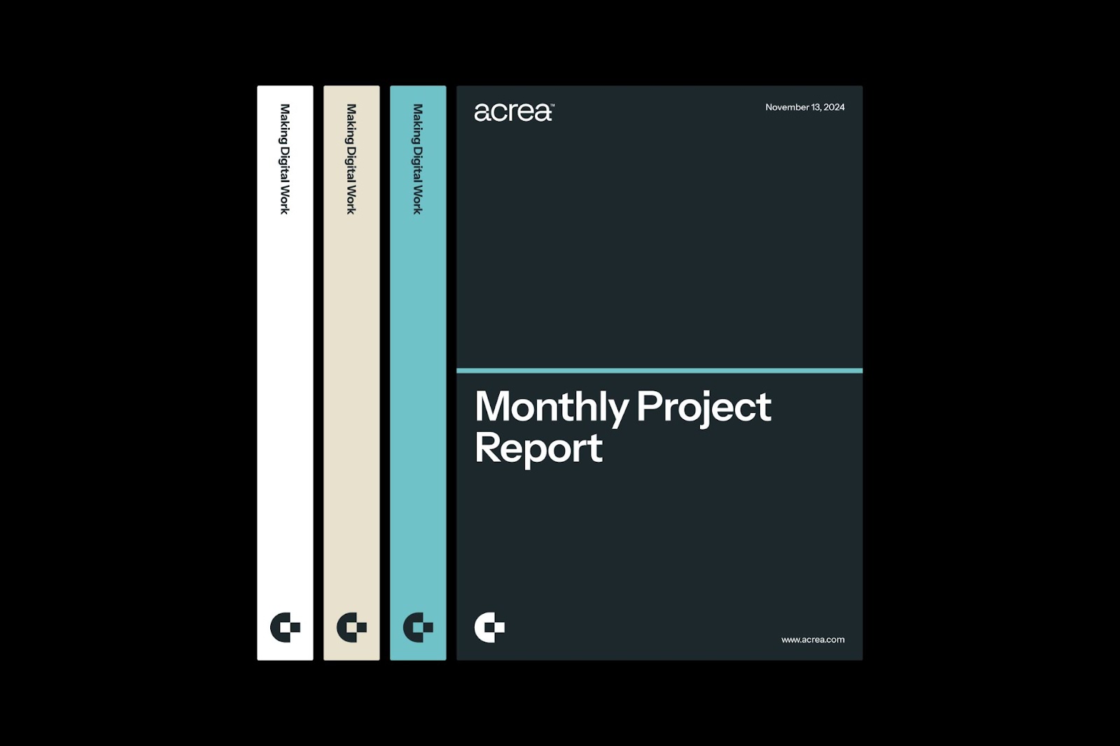
This rebranding stands out because it's complete. It's not just a new logo or colors. It's about making every visual element match the company's values and promise. From monthly reports (Alphamark, "Acrea by Alphamark™," Page 10) to digital newsletters (Alphamark, "Acrea by Alphamark™," Page 11), the new look is consistent and strong. This helps Acrea stand out as a professional, boutique consultancy in the Swiss financial market.
This project shows that good branding goes deep. It's about understanding the client. Then, you turn that into a visual language that connects. It’s about making digital work for the client and their audience.
Want to see more of Alphamark's great work? Visit their portfolio at https://alphamark.design/projects/acrea.
Branding and visual identity artifacts