by abduzeedo
Today we're stepping away from the minimalist monochromes of my world and diving into a vibrant palette of a different kind, as we explore a fascinating branding project by Nelson Balaban.
Now, if you've been following the design world even half as avidly as I do, you've likely heard of Nelson. A fellow Brazilian designer, he's got an eye for detail and an affinity for the unconventional. His latest self-initiated venture is a personal brand project of a fictitious tomato-based product company based in Spain. This is not your typical branding project, and that's precisely why I love it.
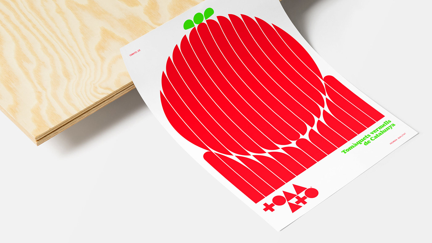
The project is a wonderfully evocative blend of the past and the present, perfectly capturing the 200-year journey of the humble tomato in Spanish cuisine. From the fresh, sun-kissed fruit we adore in our salads to the ubiquitous "tomate frito" that lends a burst of flavor to a plethora of dishes, tomatoes have evolved from an afterthought to a hero in Spanish culinary narratives.
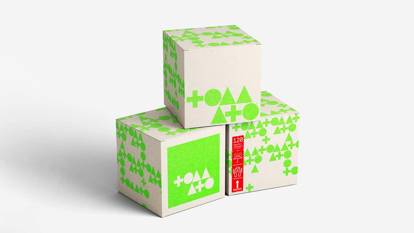
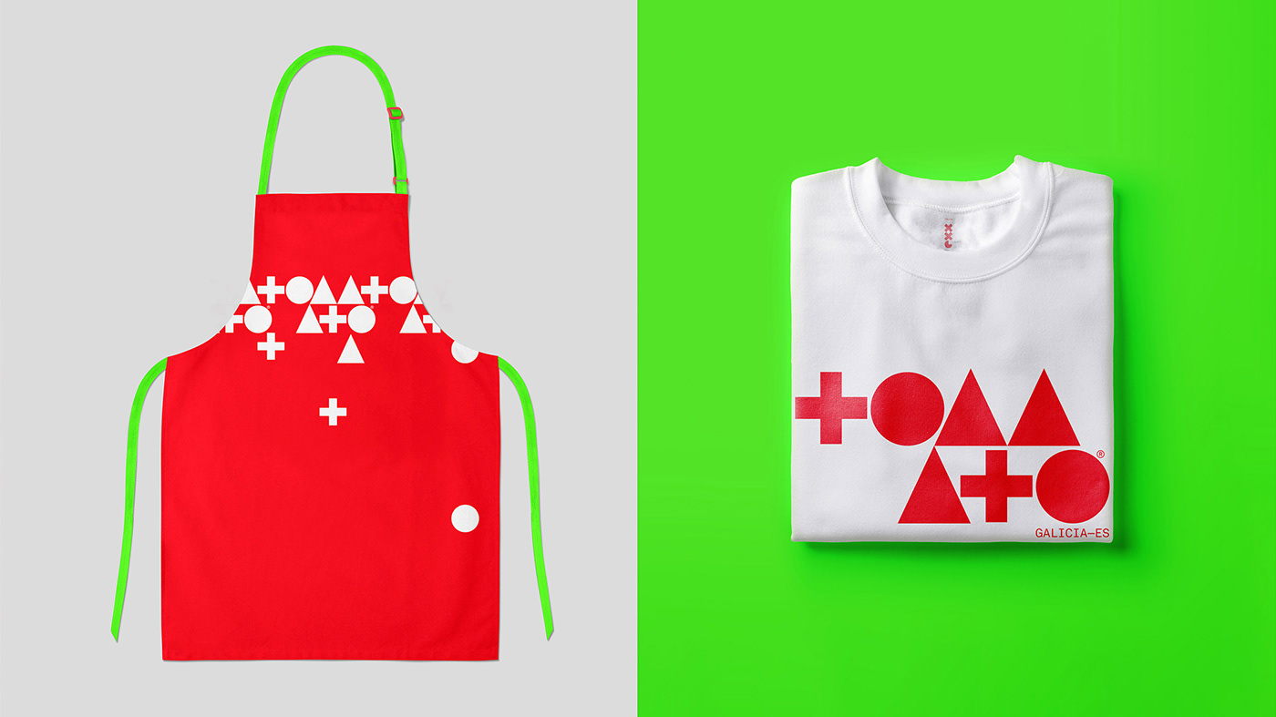
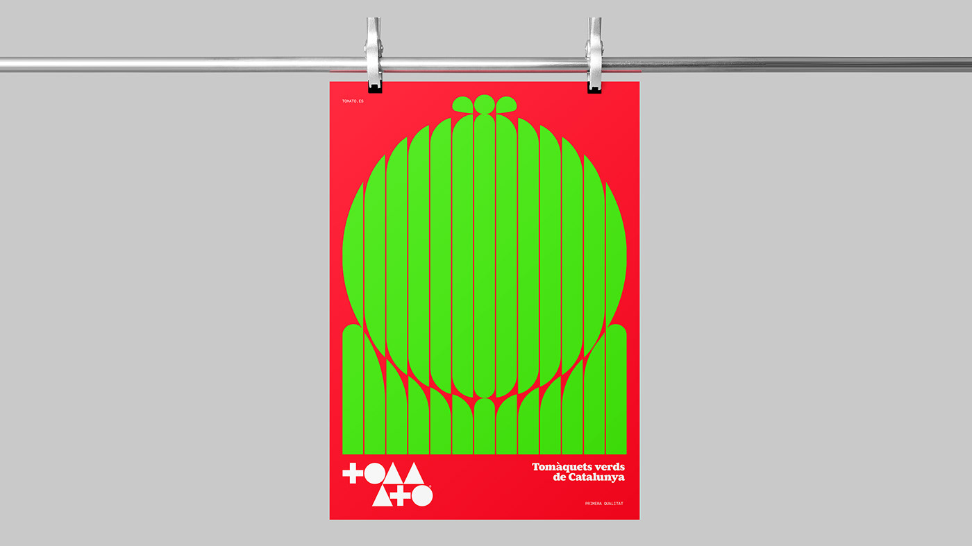
Drawing inspiration from the unruly and vivacious La Tomatina festival held in Buñol, Nelson's branding project has a joyous effervescence about it. Just like the festival where thousands of participants let loose, pelting each other with ripe tomatoes, Nelson's design celebrates the whimsical spirit of the tomato. The carnival-esque chaos of La Tomatina is brilliantly translated into playful brand elements, each carrying a zest for life. There's a lovely sense of motion, a feeling of being in the middle of a joyful, tomato-flinging festival right in the heart of Spain.
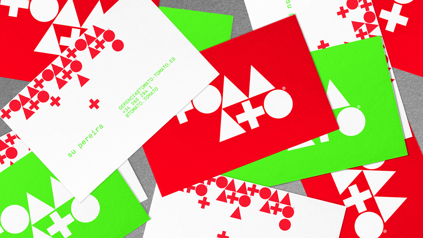
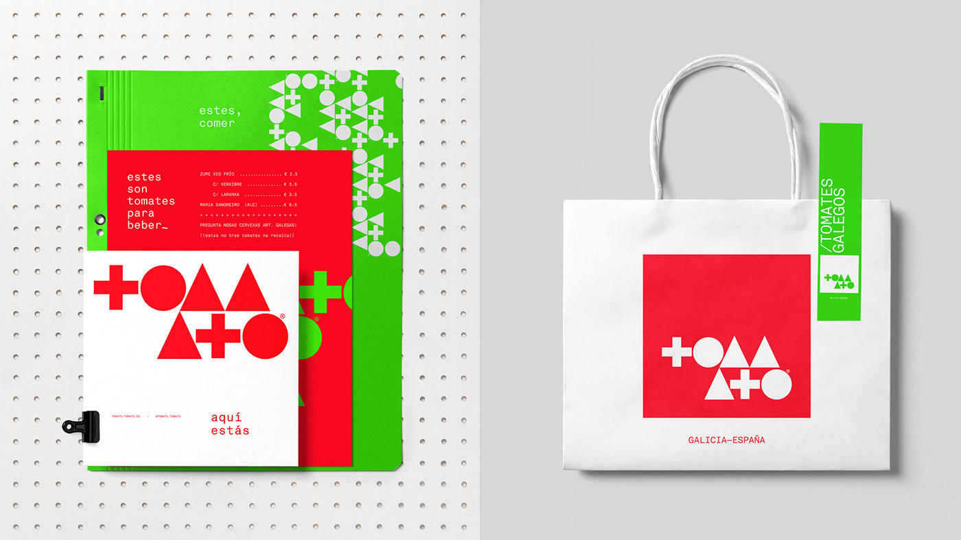
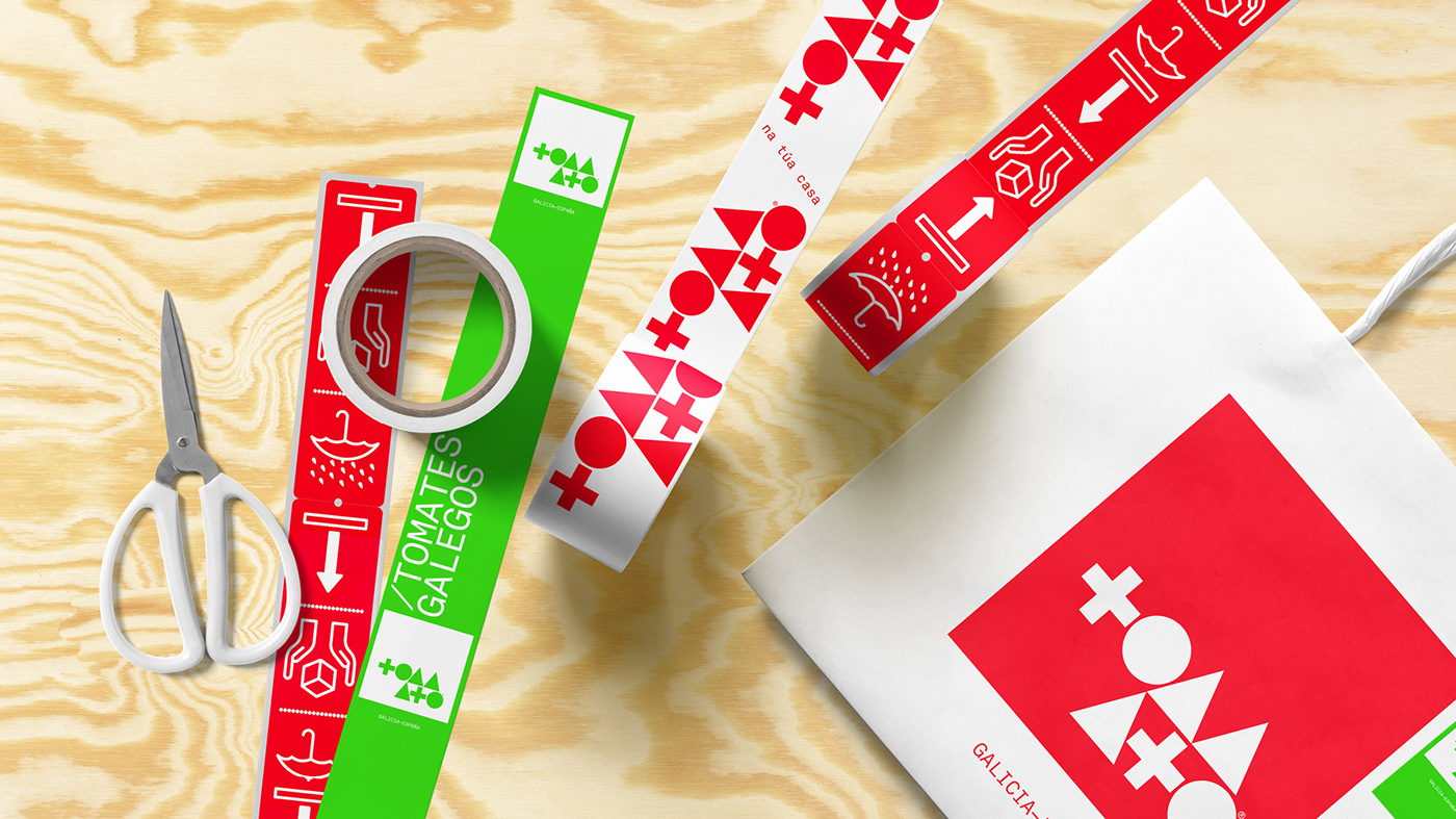
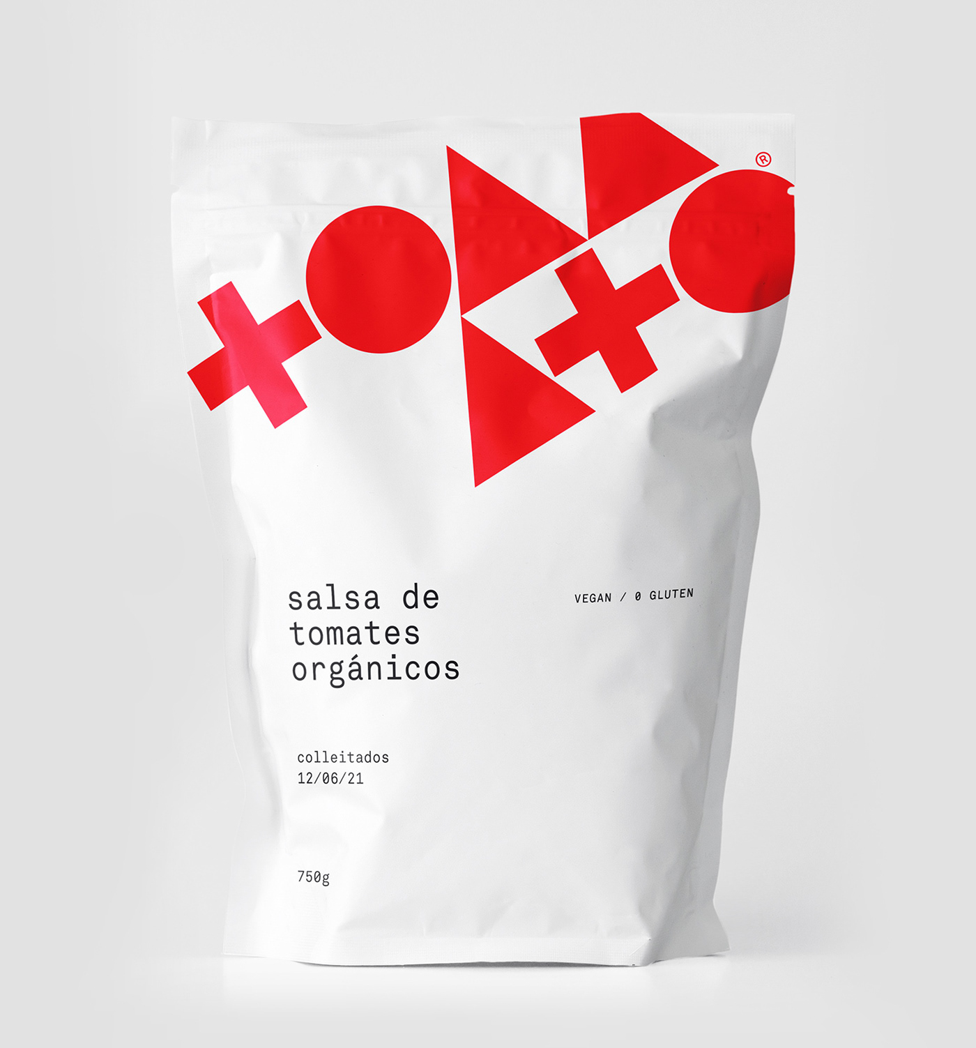
Nelson's design sensibilities are woven throughout the branding project. His careful use of color brings a richness that calls to mind ripening tomatoes under the Spanish sun. The warm reds are balanced with the earthy greens and yellows of a traditional Spanish palette, creating a comforting yet energetic atmosphere. His minimalist approach in font and layout selection contributes to the overall clean and modern look, while the unexpected humor in the design keeps the brand light-hearted and engaging.
What is truly spectacular about this project is the story it tells. It's not just a branding for a tomato-based product company; it's a vivid, engaging chronicle of the tomato's journey in Spanish culture. Every design element, from the typography to the color scheme, tells us a tale of this fiery red fruit that conquered a nation’s culinary landscape over two centuries.
To sum it up, Nelson's branding project is a tomato-flavored fiesta that delights the senses while serving up a hefty dose of Spanish history and culture. He reminds us, in his typically innovative style, that design can be playful, powerful, and can take you on an unexpected journey.
If you’re ever in need of a reminder of how design can be fun, fresh, and full of character, take a leaf out of Nelson's book, or in this case, a tomato. I can't wait to see what he comes up with next, but for now, I'm going to grab a jar of "tomate frito" and get cooking, with this captivating design playing in my mind.
Branding and visual identity artifacts


For more information make sure to check out Nelson Balaban’s website or Behance profile.


