Here & Away Web Design Treats Travel Like Editorial
Here & Away web design by Duo Studio builds an editorial travel platform, where destination photography becomes the navigation interface, not decoration.
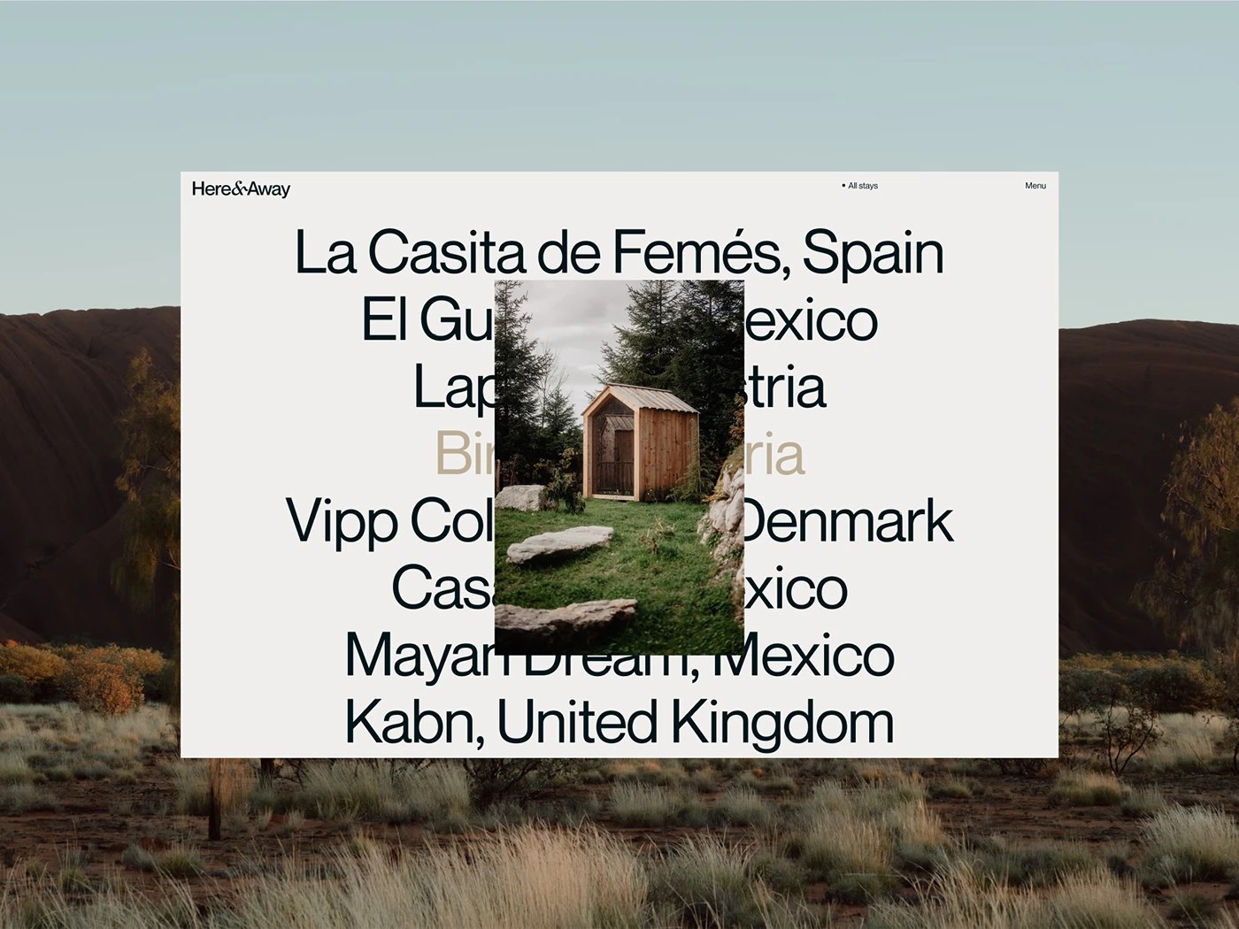
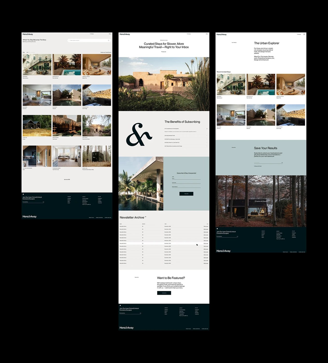
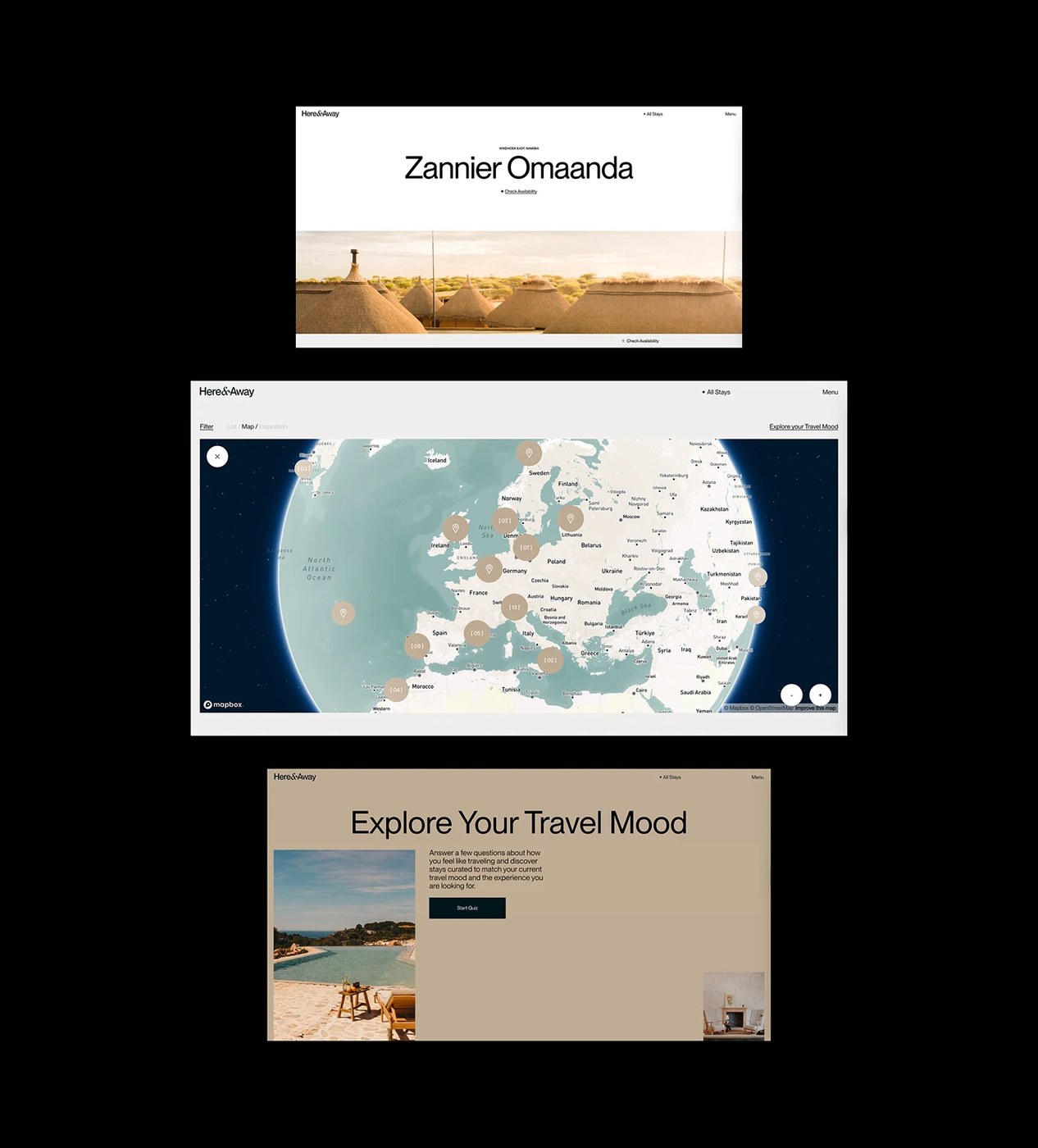
The tension here is familiar: most travel platforms use photography as wallpaper while the real interface sits on top. Here & Away flips that. Duo Studio and Andrea Jelić structured the here away web design so that full-bleed landscape imagery becomes the primary navigational surface — the image is the interface. A large-scale serif at roughly 120pt carries property names while ultra-light caption weights handle the ancillary copy, a contrast ratio borrowed directly from print editorial. The layout toggles between dark-on-light and light-on-dark depending on whether the user is browsing the index or inside a destination spread, and a horizontal scroll pattern — uncommon in web travel — treats each property like a magazine pagination sequence. The color palette holds to warm ochres, deep forest greens, and off-whites that track each destination's landscape rather than imposing a global brand color.
How Here & Away Web Design Closes the Gap Between Magazine and Booking
The editorial design tradition has long known how to make a place feel worth visiting before reading a single sentence about it. Here & Away applies that logic to a functional web design context — the question is not whether to show beautiful photography, but whether the interface architecture respects the image enough to let it carry meaning. The result is a platform where browsing feels more like reading than searching, and the here away web design earns that quality by resisting the impulse to overlay photography with conversion elements.
Work by Duo Studio.