by abduzeedo
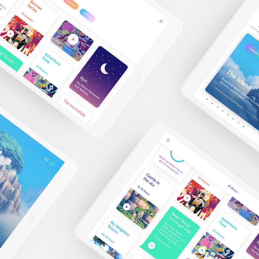
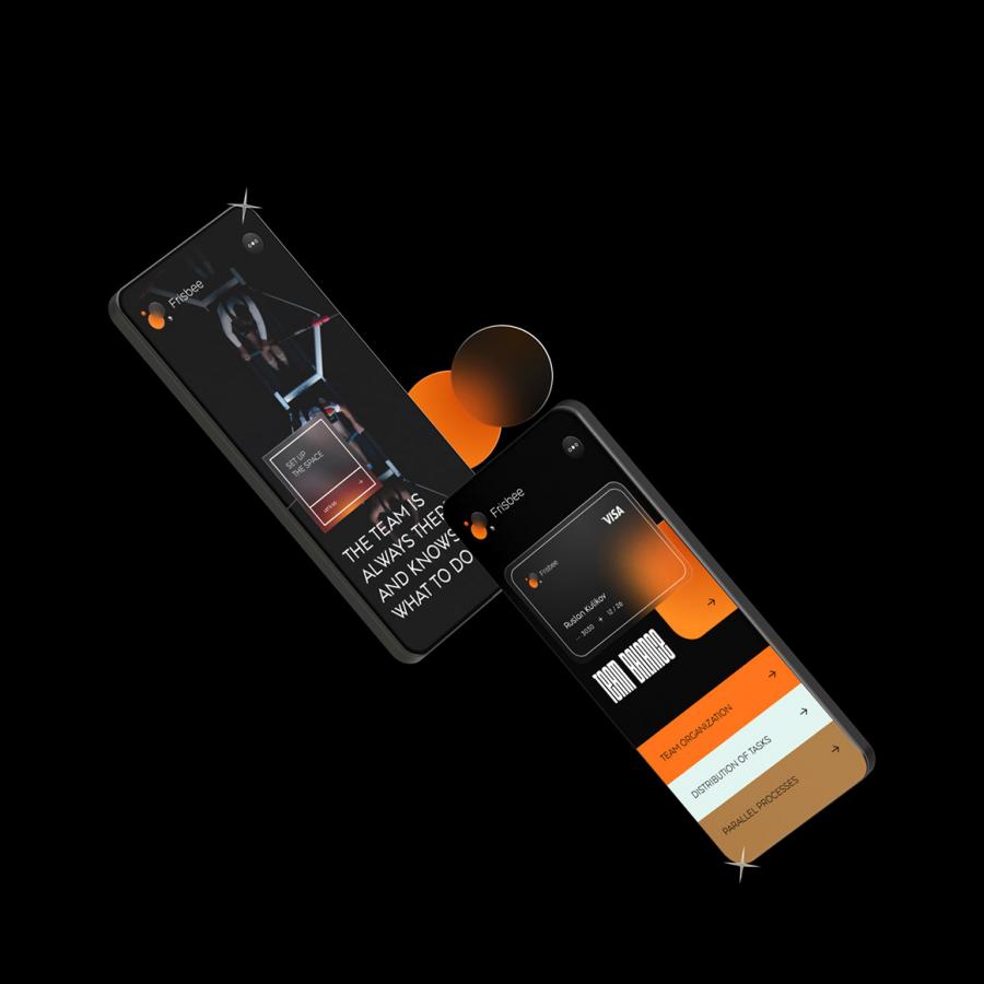
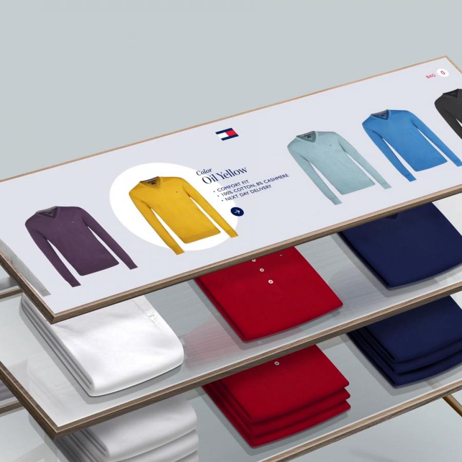
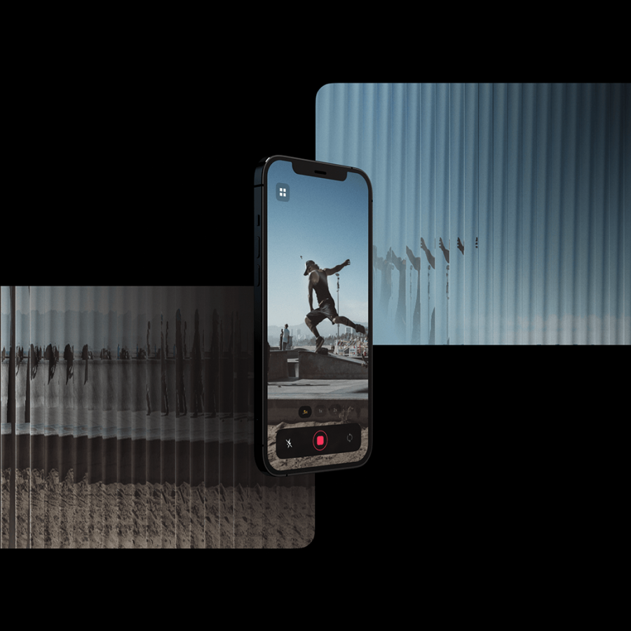
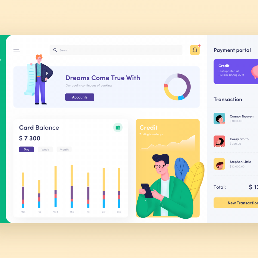
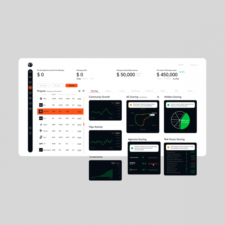
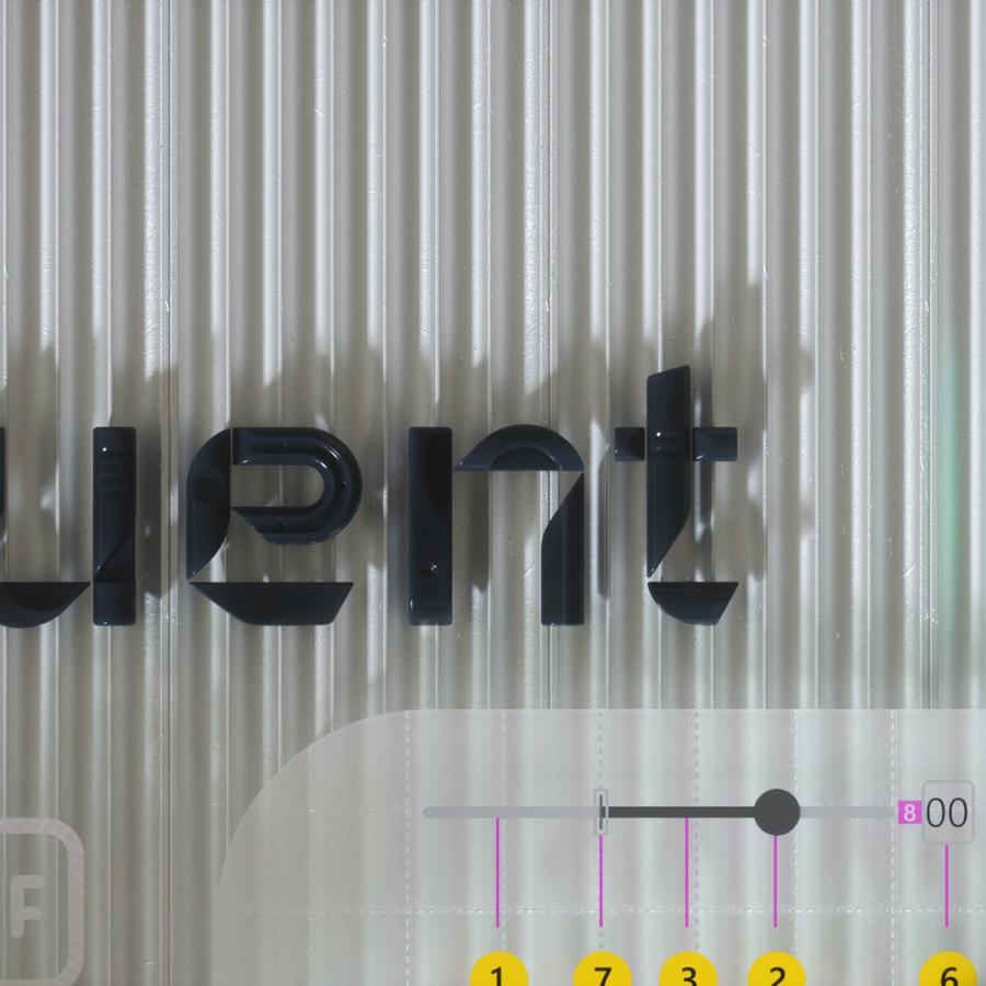
So we have a new UI design trend all over us and it deserves a post here on ABDZ. It’s quite clear to notice it, just spend some time on Dribbble and you will spot it right away. This post is literally from three or for Dribbble pages of beautiful mocks. The interesting thing, and what drove me to write this post was when I saw the new Facebook product called Calibra. It features all the same UI patterns, rounded corners that in some way match the phone and screen rounded corners. My interpretation is that as phones become bezeless the screens now match the hardware form, so the software follows the same direction. Apple and Samsung have been exploring this for quite a bit, but now it seems to be all over the place. Anyways, enough talk and here is a collection of designs with the new super rounded corner widgets.
