by AoiroStudio
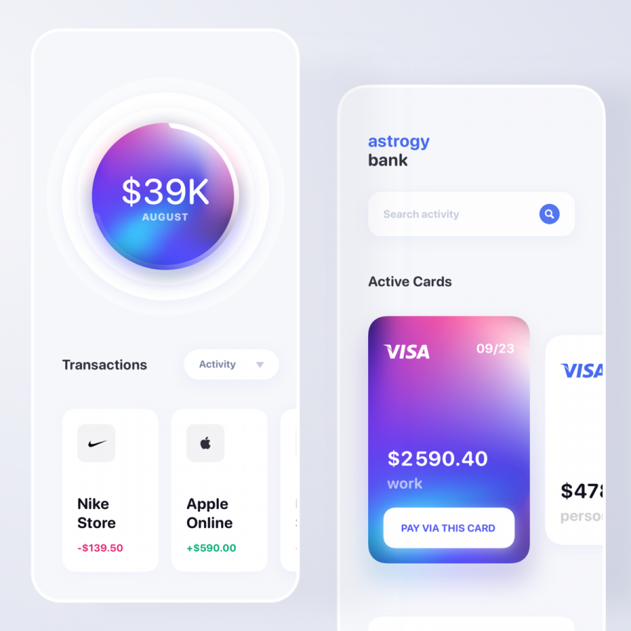
Seeing a slight shift of designers getting into fintech, financial services, and wealth management. It's a complex area to traverse knowing that the reasoning behind the business has been hereabouts for a long-time. There are definitely things to learn and to impose to keep bringing design close to the table. With that said, knowing the target audience is super key in terms of defining the experience, I kind of digging this concept by Artem Badbrother Pravda who is a product designer based in Kyiv, Ukraine. Aside from the monochrome UI with an accent color, I like how he defines the grid with borderless sections with an approach with 'blocks'. It's kind of neat!
Esbram is a new wave brokerage & new tech financial service for wealth management and investment. The platform includes robo-advisor that provides financial advice and offers portfolio management services.
