by abduzeedo
ALIENKIND™ is a juice brand from Bangalore, India, built around one defining idea: that drinking good juice should feel like something from another world entirely. StudioDraft® took that premise seriously. The result is a visual identity that does not whisper — it broadcasts.
The design challenge was direct. The client needed a brand personality capable of standing out in a crowded market, translating across product packaging, apparel, and out-of-home advertising, all while staying rooted in something culturally distinct. StudioDraft® answered with a system anchored in brutalism and science fiction — two reference points that rarely share the same shelf, but make complete sense together once you see the work.
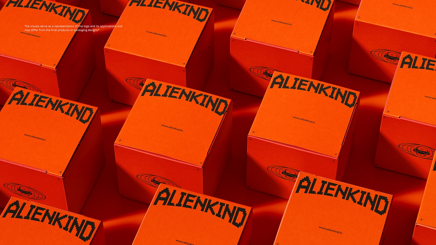
The color story starts with the packaging. ALIENKIND™'s primary identity color is a deep, saturated orange — not the safe, grocery-store kind, but the kind that reads like a warning label or a countdown. Against a black background, it presses hard on the eye. The branded shipping boxes stack together in the hero photograph as a single mass of that orange, with the pixelated ALIENKIND wordmark repeating across every face. The repetition is aggressive. It is also entirely the point.
The wordmark is the backbone of the system. StudioDraft® built a typeface treatment using a chunky, pixel-grid letterform that references early digital display type — the kind found on arcade machines and industrial signage. Each character builds from a modular grid, producing something that reads as simultaneously futuristic and lo-fi. The accompanying tagline "SPACE YOURSELF" appears in a narrow slab beneath the primary mark, grounding the otherworldly visual in something deadpan and deeply confident.
![]()
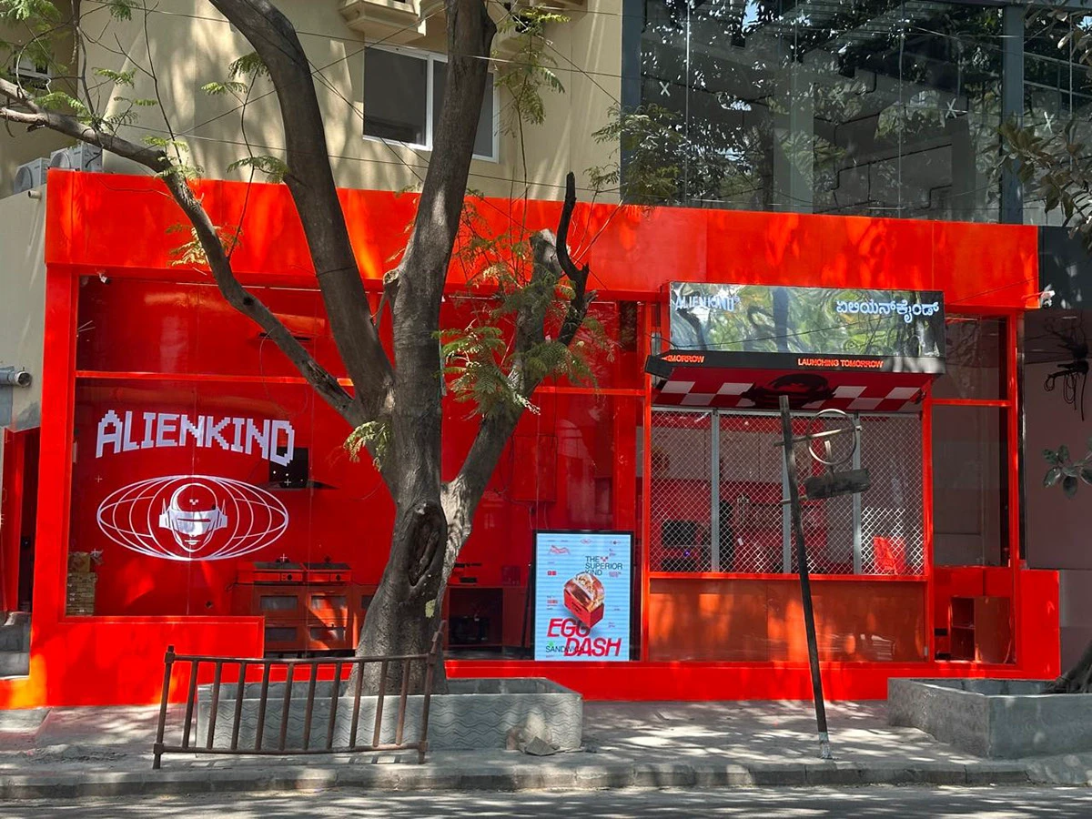
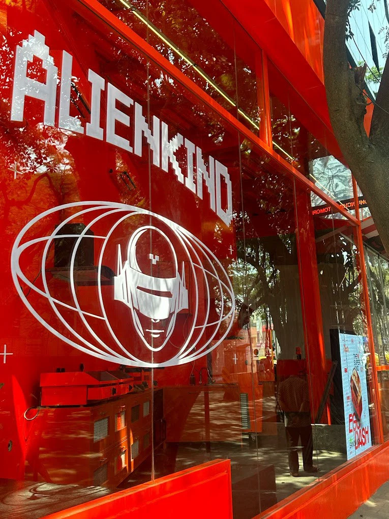
Alongside the wordmark sits a secondary mark: an alien figure, helmeted and stoic, framed inside a set of concentric elliptical orbits that evoke a planet's rings. The figure reads as both space traveler and product mascot. Used alone or nested beneath the wordmark, it carries the brand's attitude without needing any text to support it.
The typography system goes several layers deep. StudioDraft® layered PP Rader and Iscopeur as the primary display faces, with N27 in italic for editorial moments, and Public Sans alongside IBM Plex Sans for supporting copy. Each typeface earns its position in the hierarchy. The contrast between the raw pixel energy of the wordmark and the precision of the body copy system generates real tension — the productive kind that makes a brand feel alive.
On the product label, the ALIENKIND™ system tightens to its essentials. Black labels with orange Iscopeur lettering spell out "ORANGE JUICE" in tall, spaced capitals. The alien orbital mark sits above the text. The word ALIENKIND anchors the bottom edge. Nothing extra. The label works precisely because of what is left out.
The apparel and out-of-home applications confirm the system scales without losing its character. On a t-shirt, the full lockup — wordmark stacked above the orbital alien mark — reads clearly from across the room. On a billboard, the brand cuts through a dramatic monochrome sci-fi landscape with the tagline "You are entering extraterrestrial activity zone," rendered in the same pixel-block type, unapologetic and wide.
StudioDraft® built something that earns its own genre. ALIENKIND™ is not a juice brand trying to look edgy. It is a brand identity confident enough to go fully alien and mean every pixel of it.
For more information make sure to check out Behance.


