by abduzeedo
Discover how Nurgali Sariyev’s Andermatt landing page redesign combines modern web design with Swiss-style typography and editorial aesthetics.
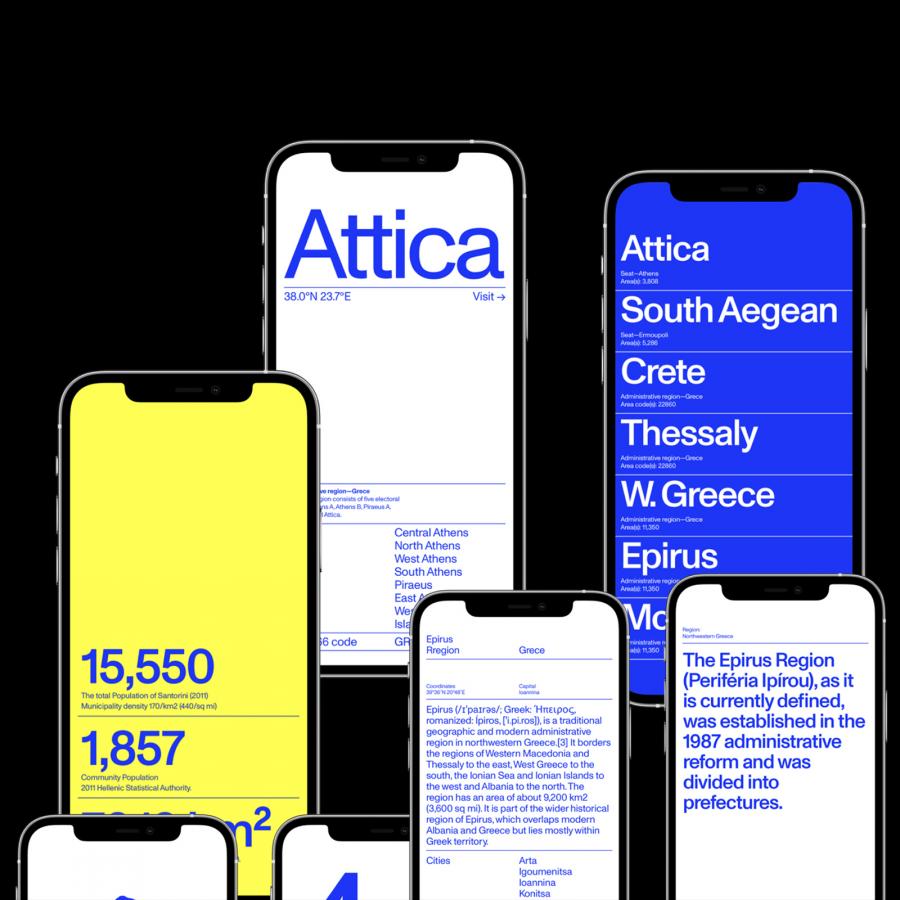
In the competitive world of web design, creating a landing page that stands out requires a blend of creativity and functionality. Nurgali Sariyev’s redesign of the Andermatt landing page is a striking example of this balance. This project showcases how modern web design principles, inspired by Swiss-style typography and grid systems, can transform a website into an engaging digital experience.
Embracing Swiss Style and Modern Aesthetics
Sariyev’s redesign takes inspiration from Swiss style, known for its clarity, readability, and use of a grid-based layout. This approach gives the Andermatt landing page a clean, organized look reminiscent of high-quality editorial design. The site’s aesthetic is akin to a design or art book, presenting information in a visually appealing manner that draws users in and keeps their attention.
Several standout elements define the Andermatt landing page redesign:
- Black and White Format: The choice of a monochrome palette sets the site apart from more colorful counterparts. This non-standard format not only emphasizes simplicity and elegance but also enhances the readability and impact of the content.
- Typography: Excellent use of typography is central to this design. The fonts are modern and clean, enhancing the overall user experience and making the site easy to navigate.
- Grid System: The Swiss-inspired grid layout ensures a balanced and harmonious design. It organizes content efficiently, guiding the user’s eye naturally from one section to the next.
- Tables and Power Lines: The use of tables and architectural elements like power lines directs attention and adds a structured, sophisticated feel to the site.
Enhancing User Interaction
The redesign is not just about aesthetics; it also focuses on improving user interaction. The clear, structured layout and strategic use of tables help users find the information they need quickly and efficiently. This approach is particularly effective for a website about Andermatt, a Swiss village renowned for its year-round sports, luxury real estate, and dining options. The design ensures that potential visitors can easily explore everything Andermatt has to offer.
Andermatt aims to become one of the world’s premier ski resorts, and the website redesign reflects this ambition. The modern, sophisticated design positions Andermatt as a high-end destination, attracting tourists and investors alike. By combining beautiful web design with functional elements, Sariyev’s redesign supports Andermatt’s goal of reclaiming its status on the global stage.
Nurgali Sariyev’s redesign of the Andermatt landing page is a masterclass in modern web design. By leveraging Swiss-style typography and editorial design principles, Sariyev has created a visually stunning and highly functional site. This project exemplifies how thoughtful design can enhance user experience and support ambitious branding goals.
Nurgali Sariyev’s redesign for Andermatt sets a new standard for web design, blending modern aesthetics with Swiss precision to create a compelling and engaging user experience.
Web design artifacts
Explore more of Nurgali Sariyev’s innovative designs on Behance.
