by abduzeedo
Explore the innovative branding and visual identity of zero206, designed by Miltos Bottis, enhancing construction and engineering aesthetics.
Zero206's new branding and visual identity represent a leap in design sophistication within the construction and engineering sector. Crafted by Miltos Bottis from MB Studio, this identity mirrors the brand's commitment to quality and innovation in every project they undertake.
Central to zero206's ethos is the integration of high-grade materials, meticulous engineering processes, and effective collaboration with external partners. This approach ensures custom, durable solutions across various building types and business sectors. Their new visual identity encapsulates this philosophy, blending different elements into a unified, cohesive brand image.
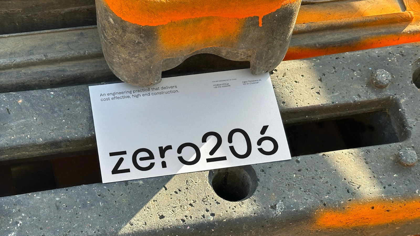
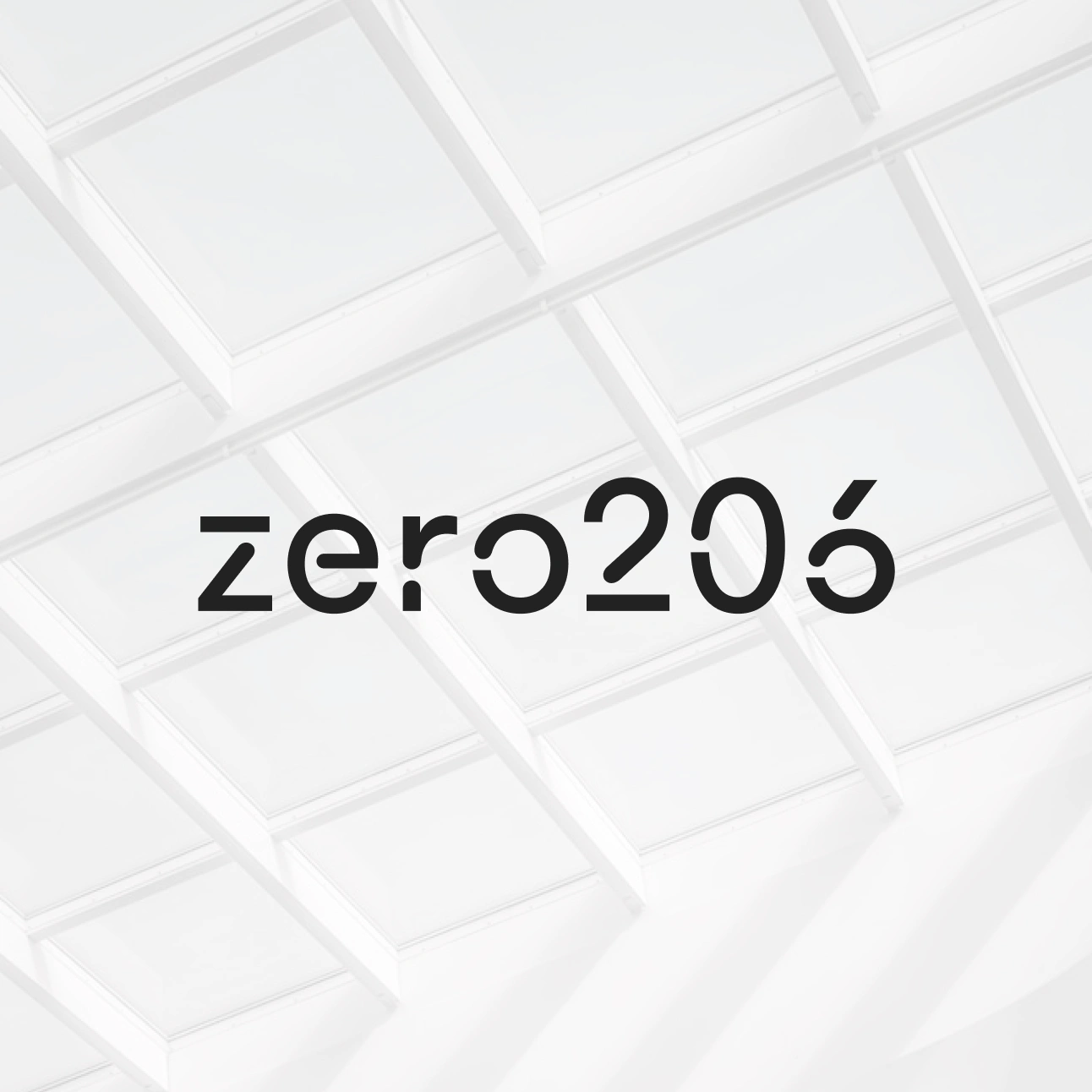
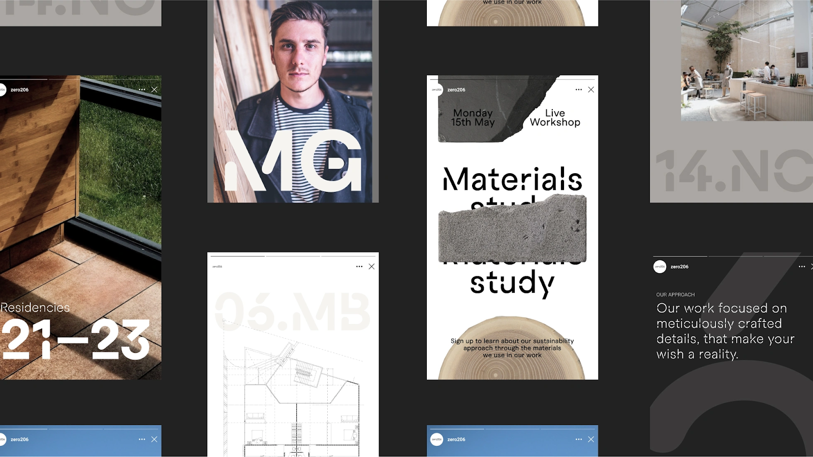
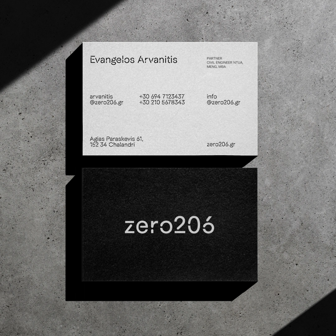
A key feature of this identity is the use of Macan Stencil, a soft stencil typeface. This choice is not arbitrary; it reflects and enhances the constructive nature of zero206's work. The typeface's gentle yet precise character aligns perfectly with the brand's focus on detailed and thoughtful engineering solutions.
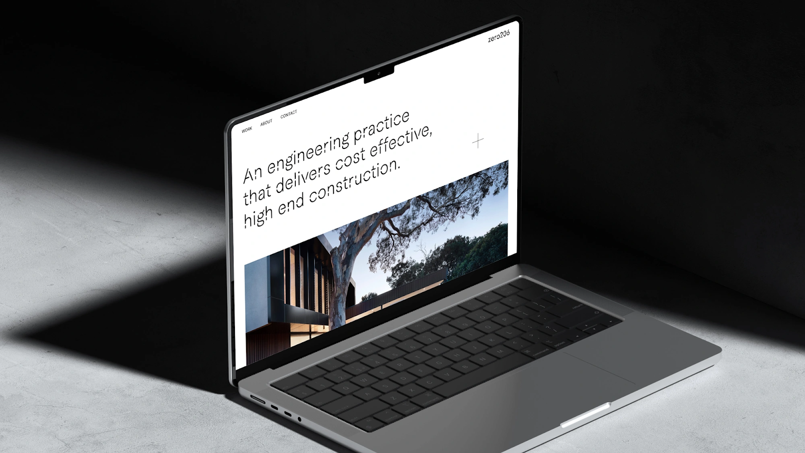
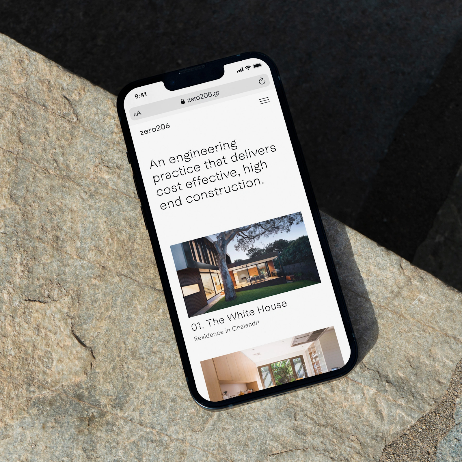
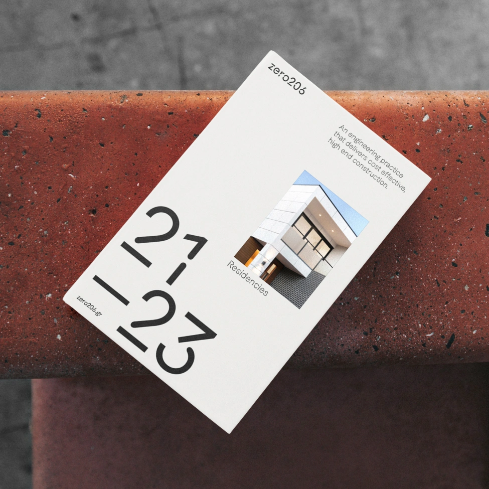
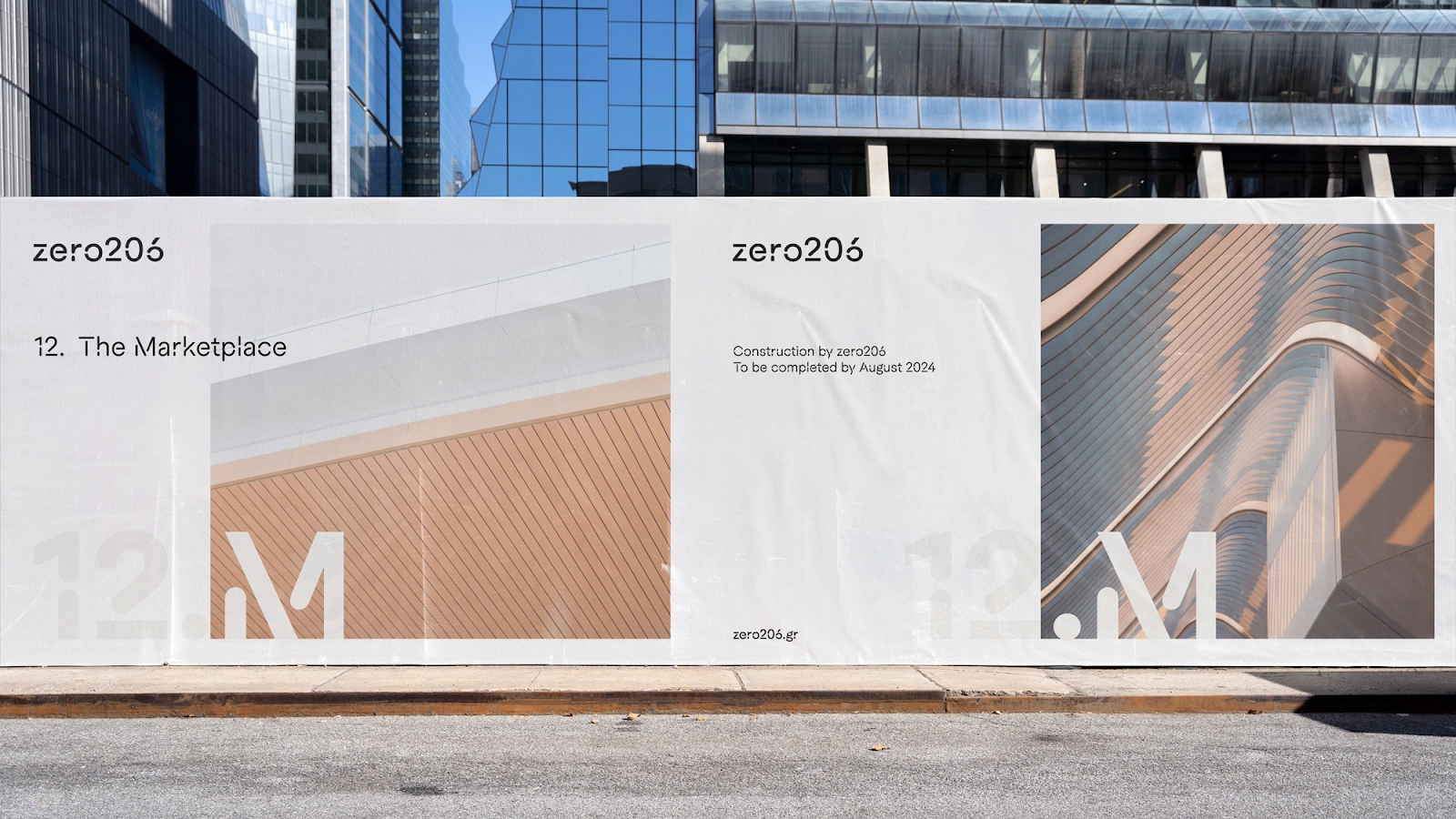
The visual identity extends beyond typography. Zero206's website and print materials showcase intricate details, thoughtful layering, and dynamic motion. These elements come together in a neat, grid-based layout, offering a glimpse into the brand's core activities: planning, construction, and composition. This presentation style not only provides clarity and order but also visually narrates the brand's story, highlighting its strengths and areas of expertise.
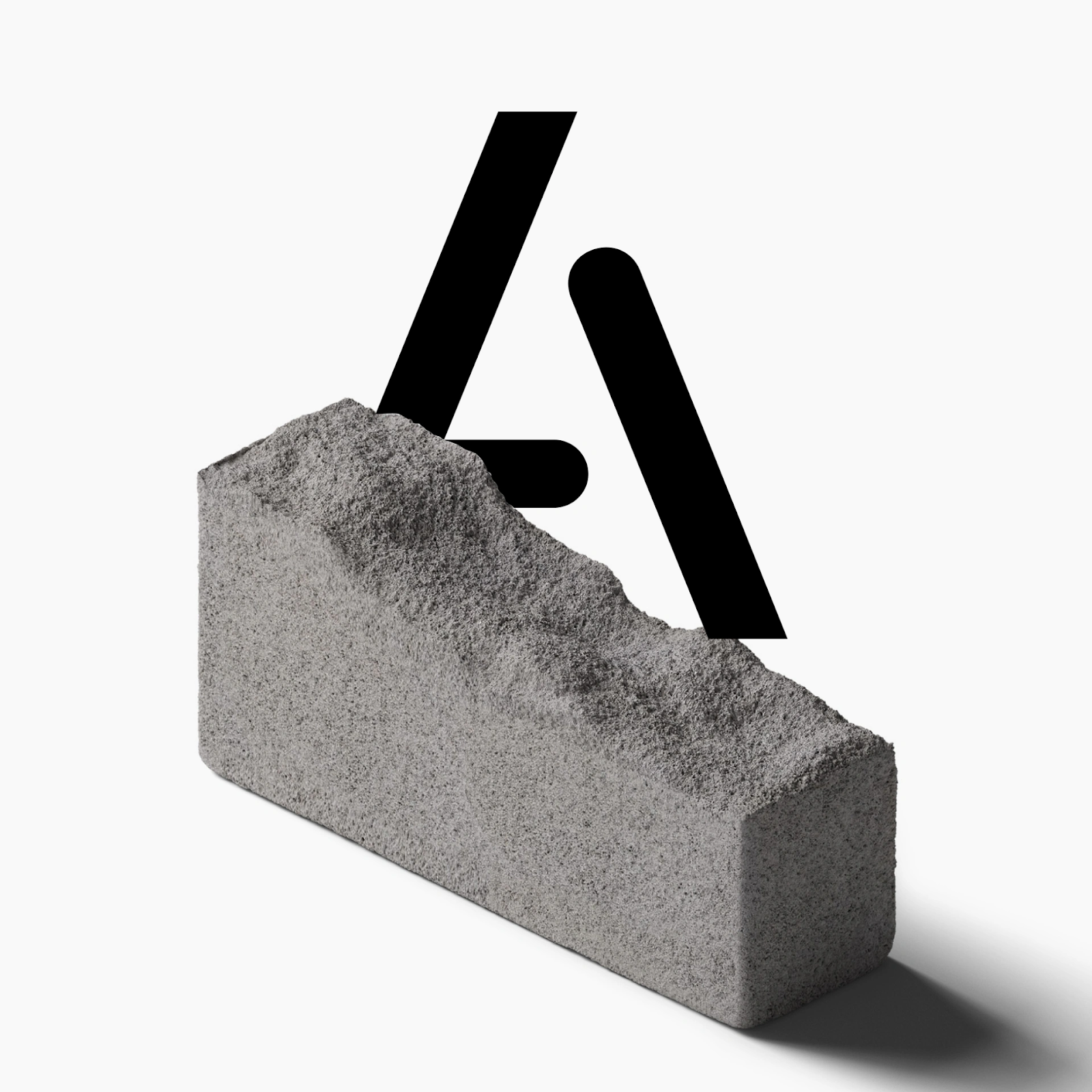
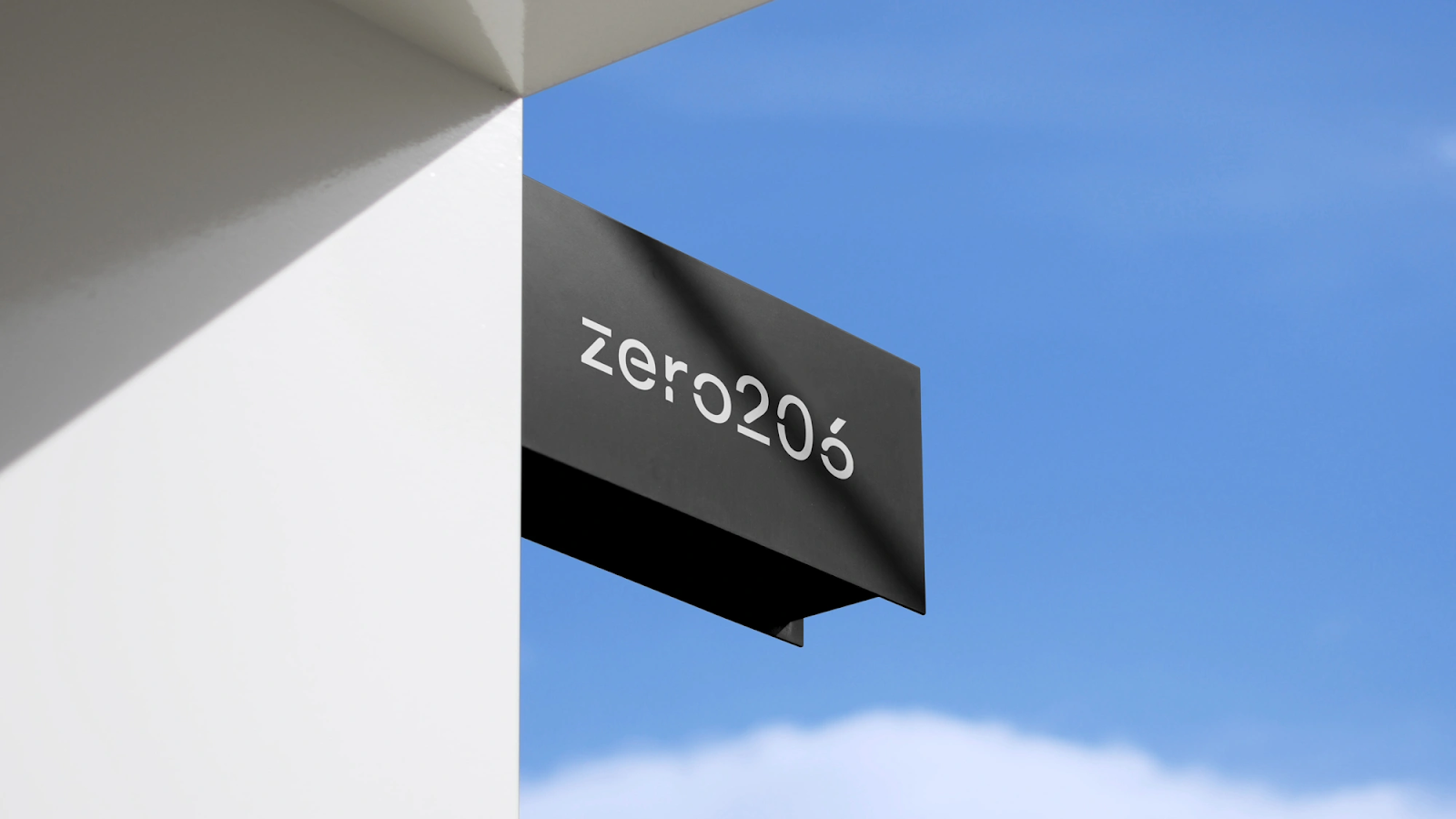
The logo for zero206 is particularly noteworthy. Drawing inspiration from the world of modeling, specifically the plastic sprue board, it symbolizes the process of careful examination, disassembly, and reassembly. This concept is fundamental in modeling, where each part must be meticulously placed to create the final product. The logo captures this essence of intricate assembly and thoughtful construction, mirroring the brand's approach to its projects.
In conclusion, zero206's branding and visual identity, under the creative direction of Miltos Bottis, set a new standard in the construction and engineering sector. It reflects the brand's commitment to quality, precision, and innovative solutions, making it a standout in the industry. This case study is a prime example of how thoughtful design can elevate a brand's identity and communicate its core values effectively.
Branding and visual identity artifacts
Videos
- Client: zero206
- Website: zero206.gr
- Sector: Architecture, Construction, Engineering, Disciplines, Brand Identity, Creative Direction, Motion Design, Signage, Web Design, Design Team, Miltos Bottis
- Client Team: Evangelos Arvanitis, Dimitris Chatzipanagiotou


