by abduzeedo
I am a fan of simplicity in design. Nothing beats the black and white when it comes to brand identity. I feel that if you can make something work well in black and white it can work with any color, or just no color at all. Just keep it as it is. For this post I'd love to share the brand identity of estúdio arco. There's not much to say about it besides it's just awesome, especially for me, due to the fact I am Brazilian and it's a design studio from Brazil :)
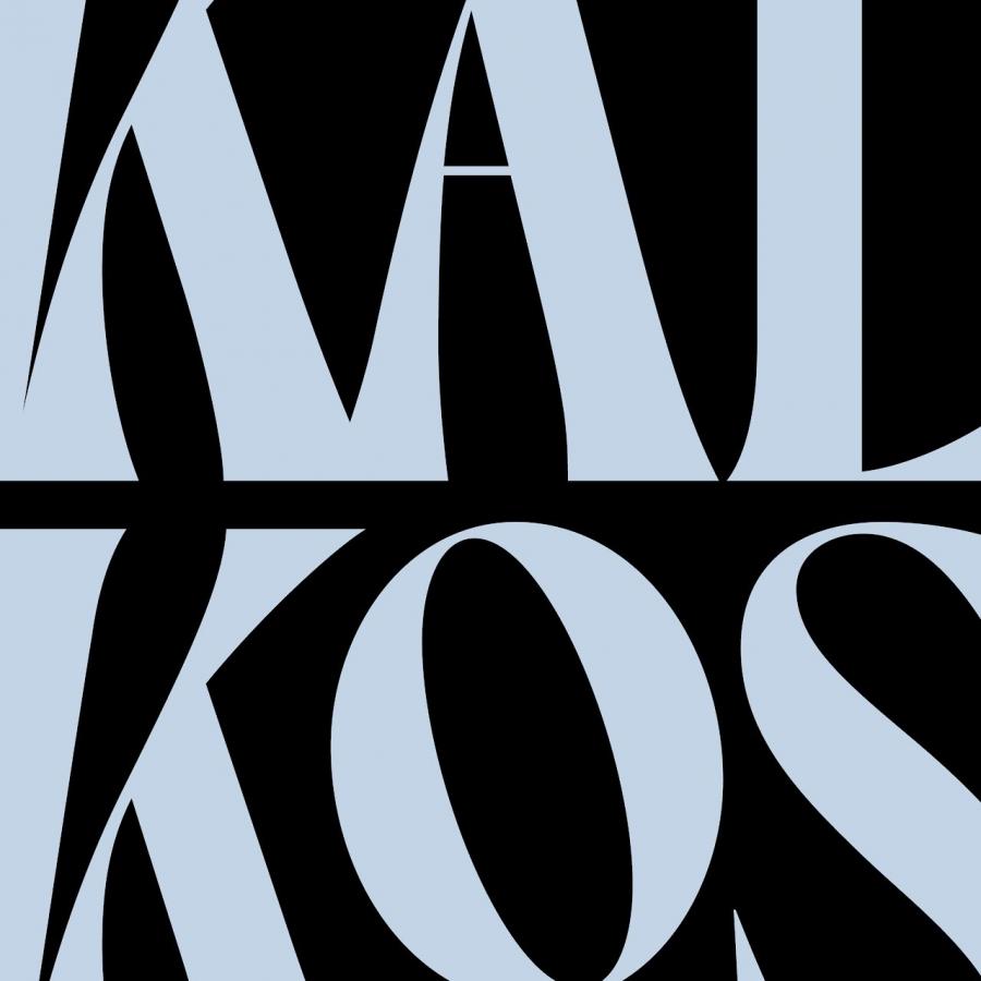
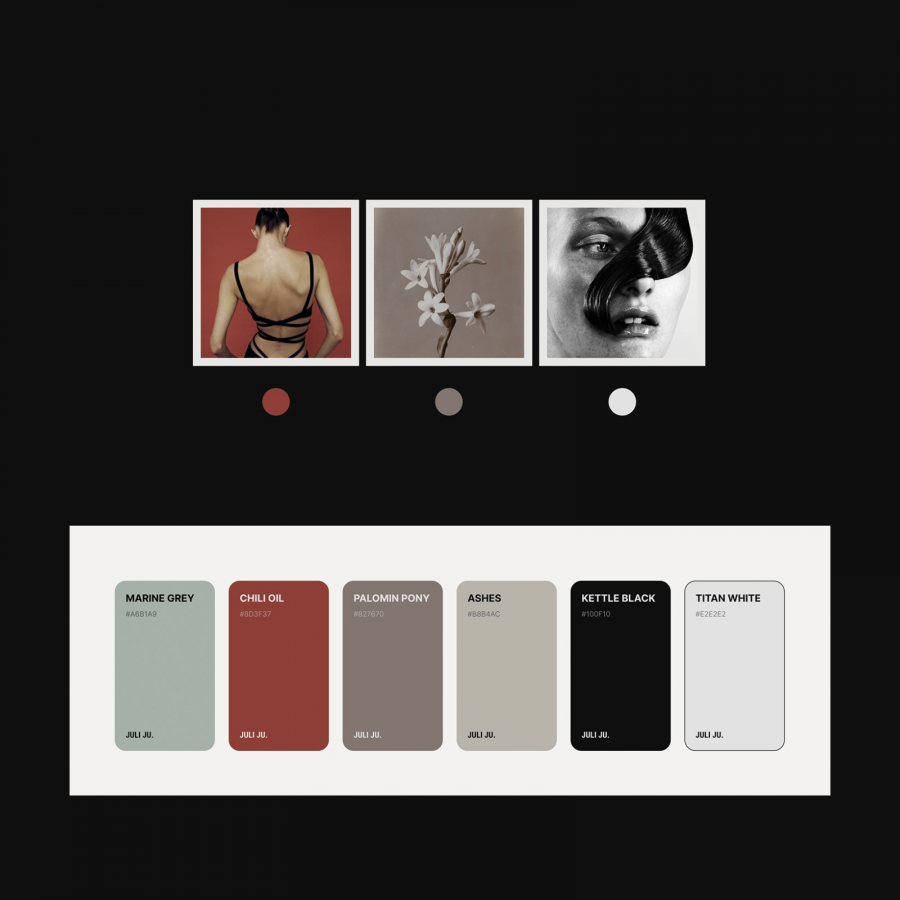
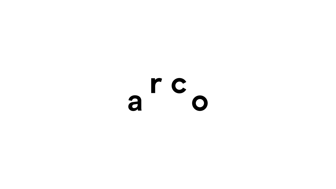
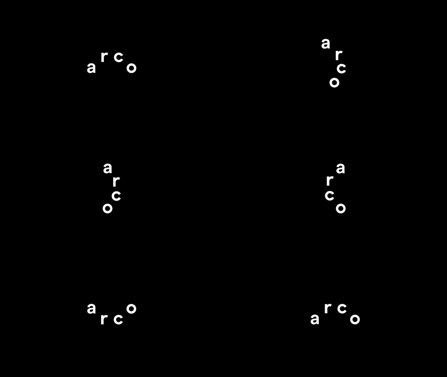
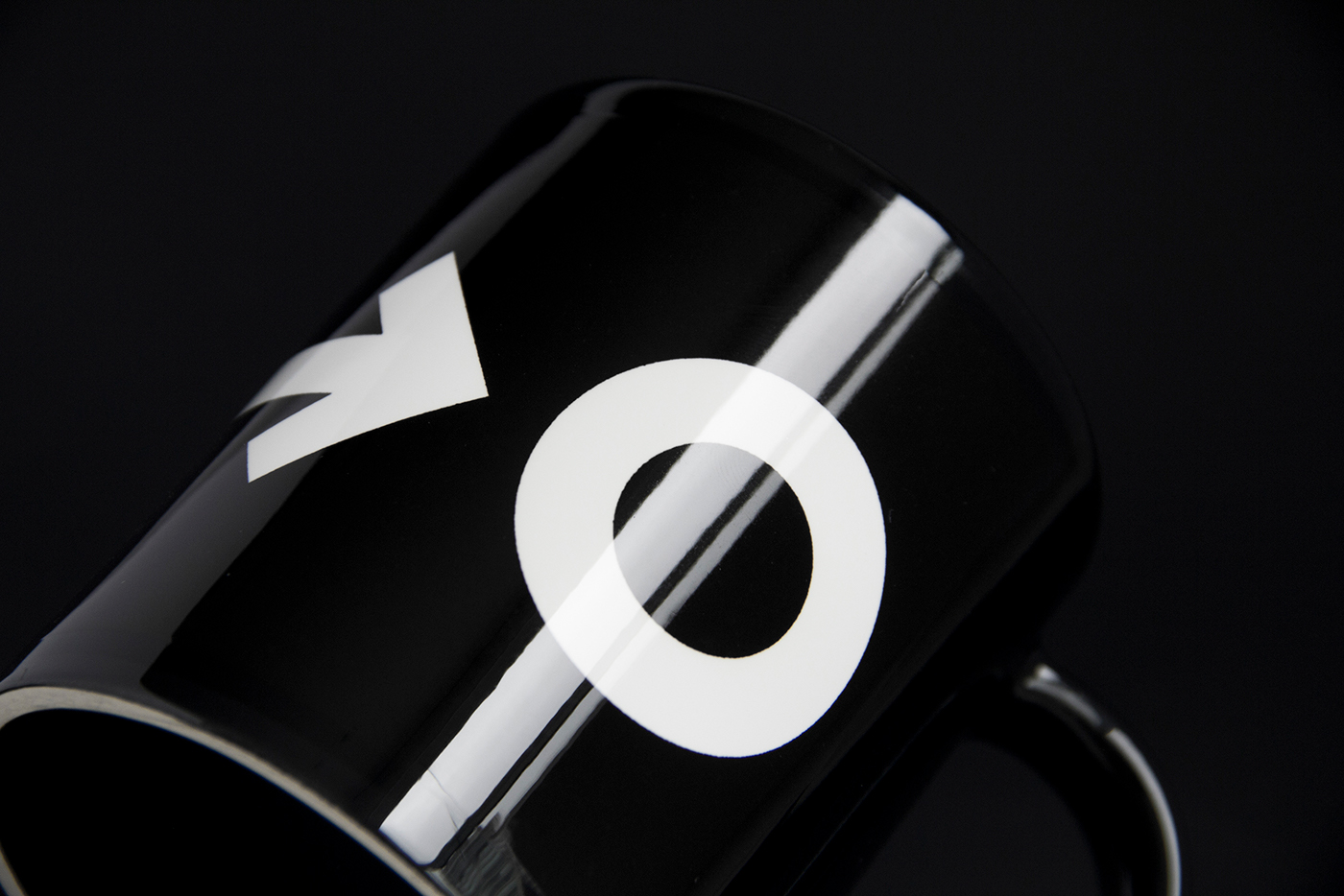
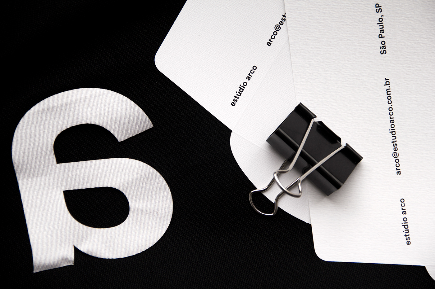
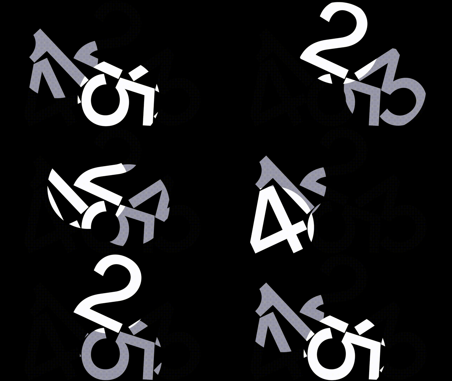
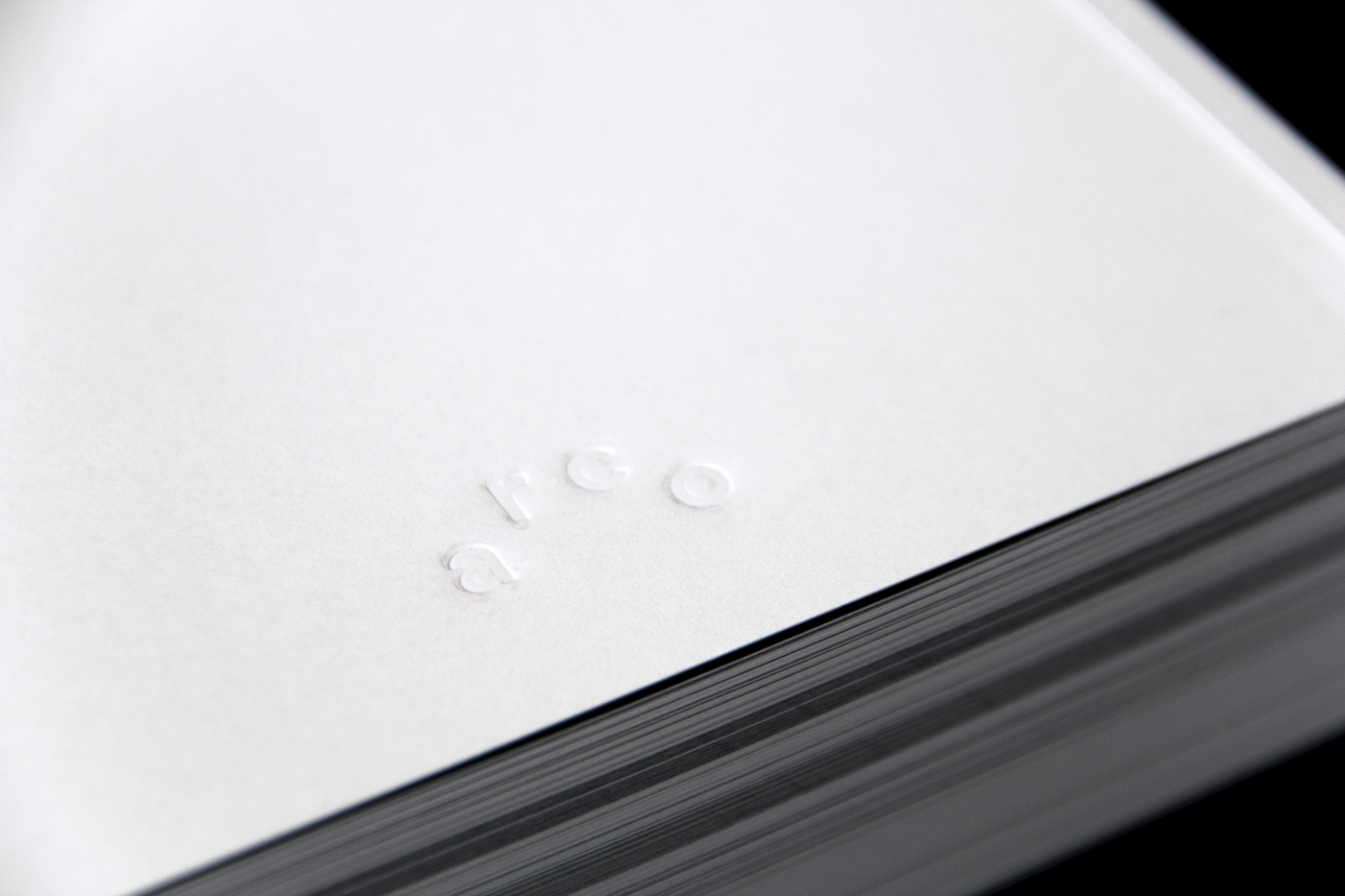
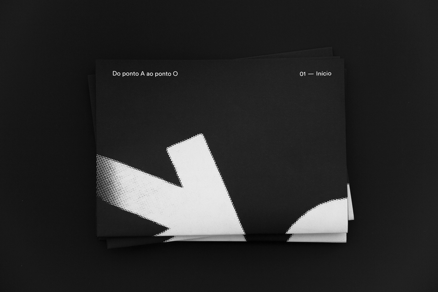
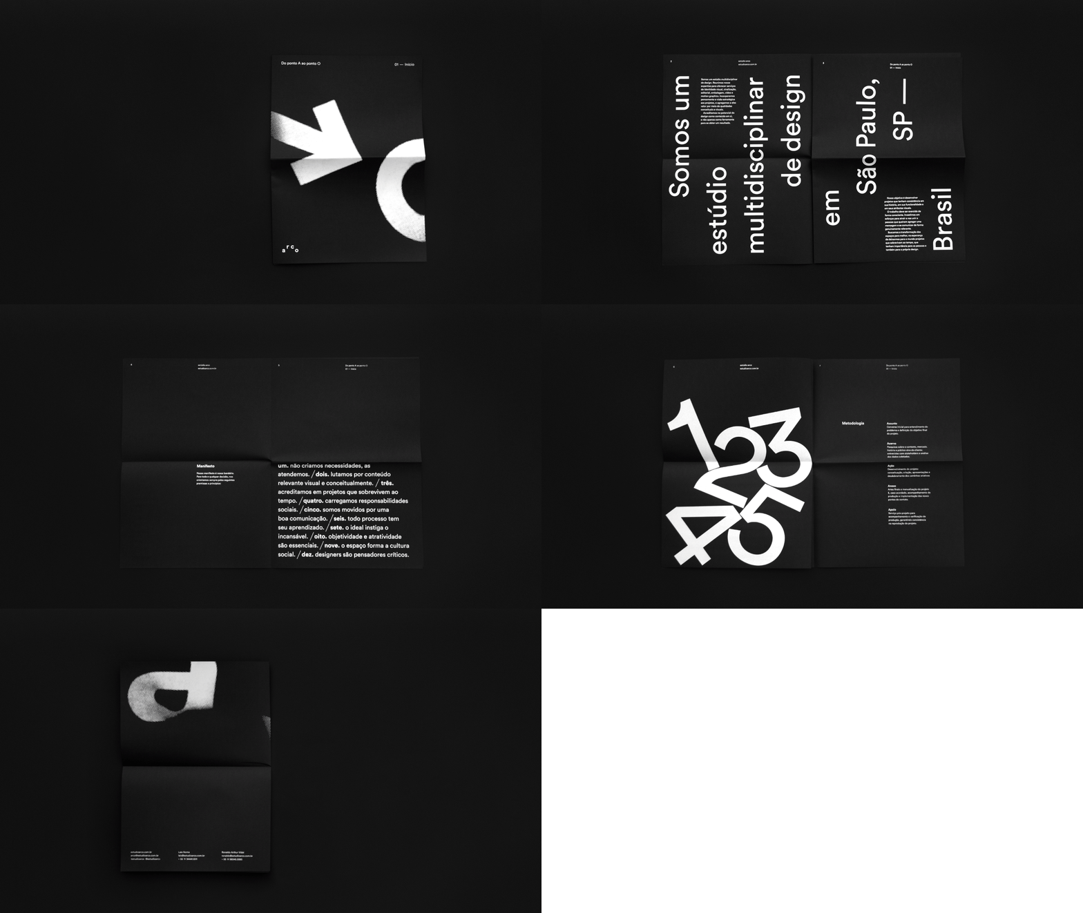
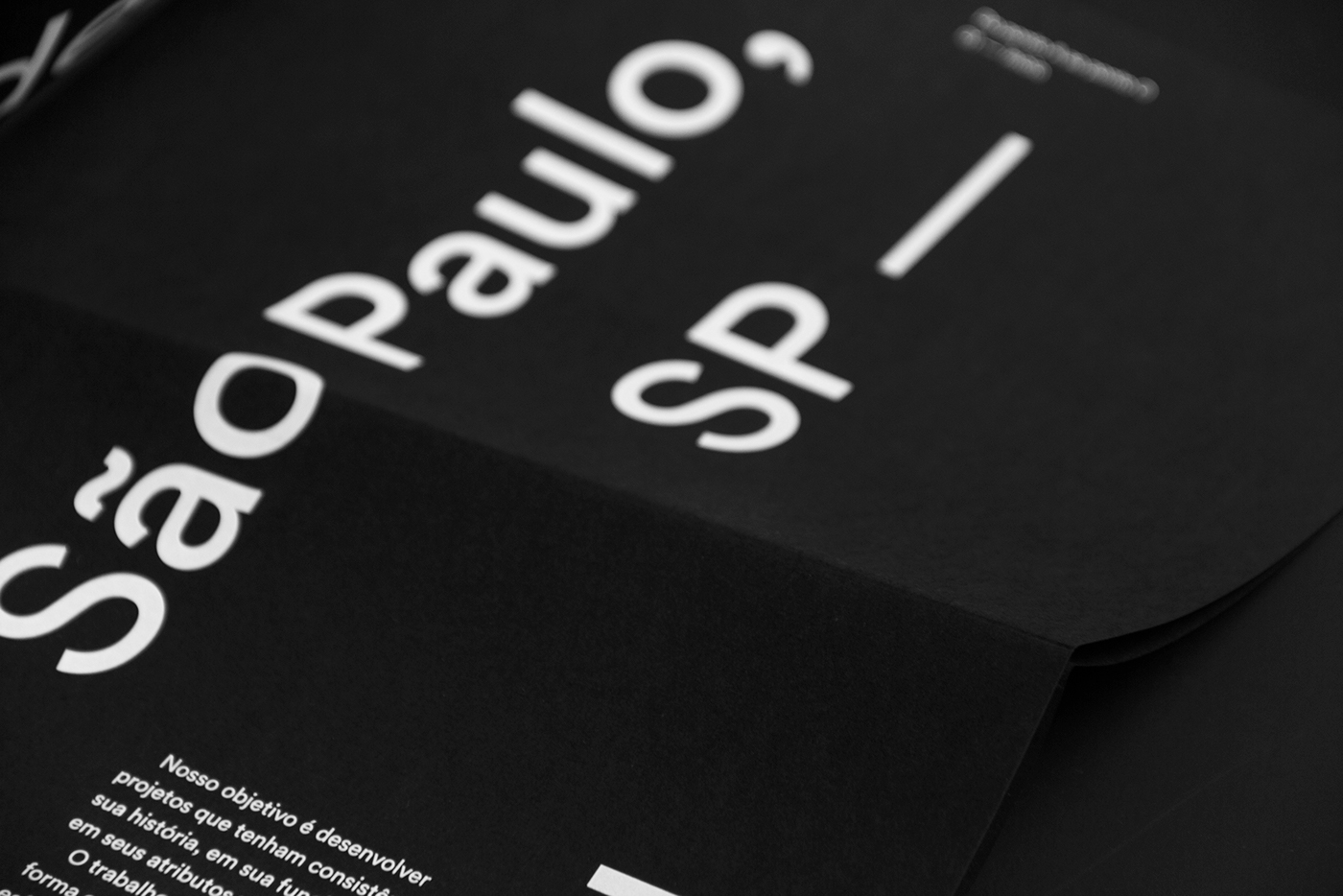
Working with the simplicity purpose, the whole identity is typographic and black and white, exhibiting a few graphic elements that reinforce the ideia of going from one point to another, adaptability and movement. The logo reflects the name; is a typographic logo system based on simplicity and flexibility of an arch.
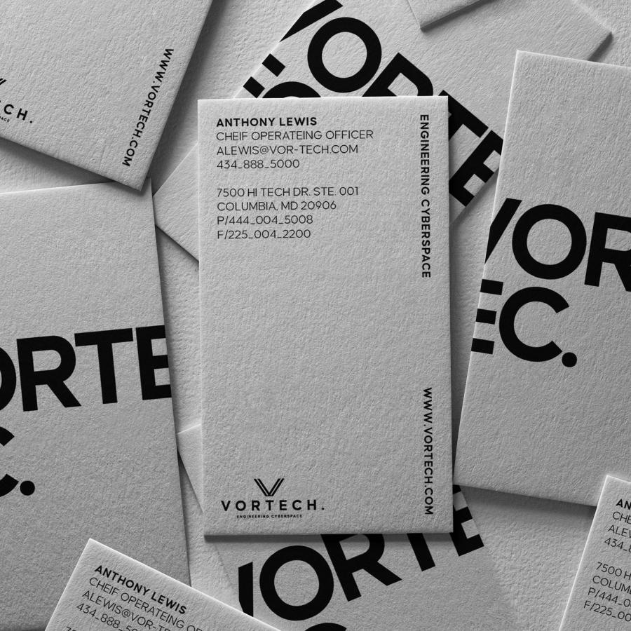
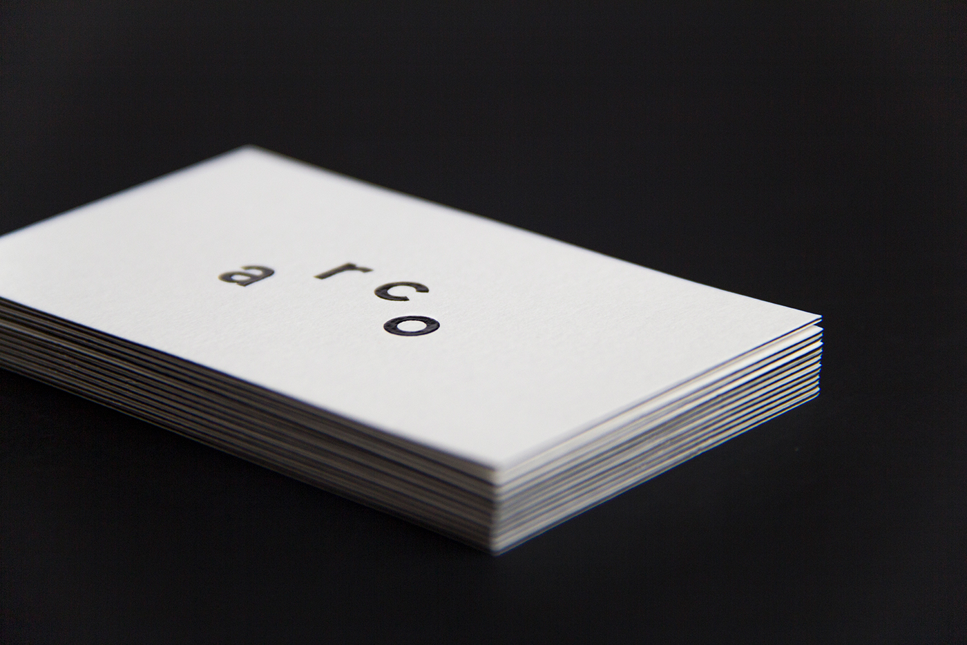
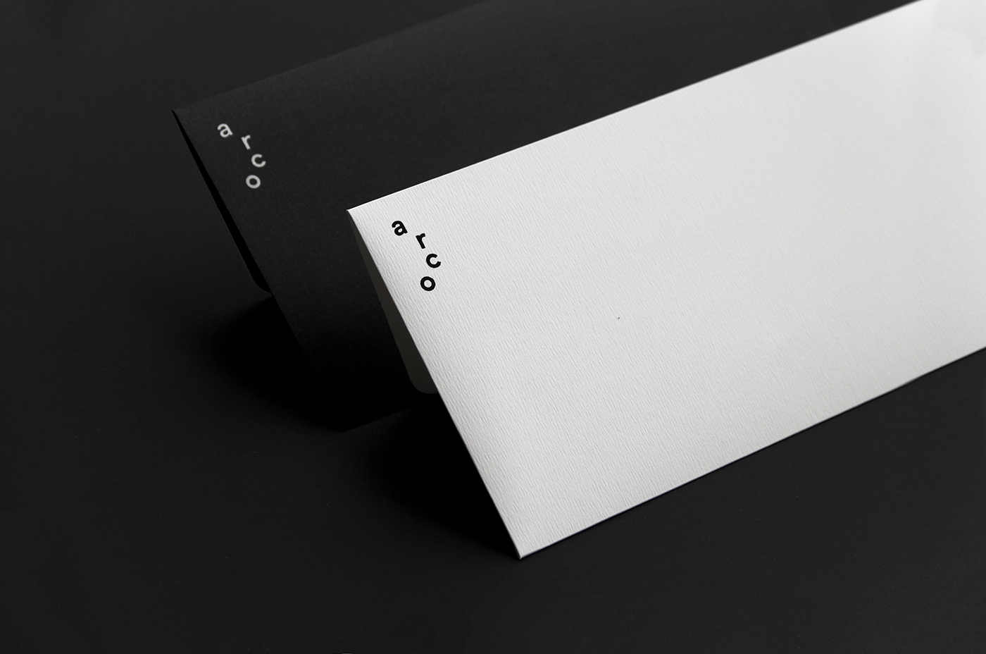
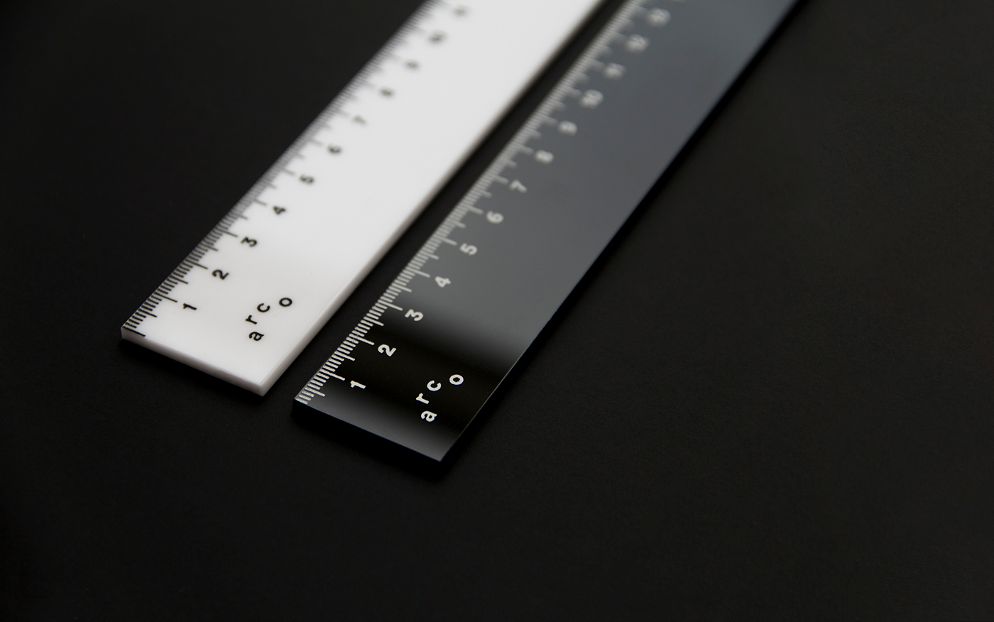
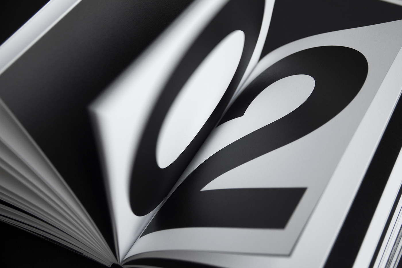
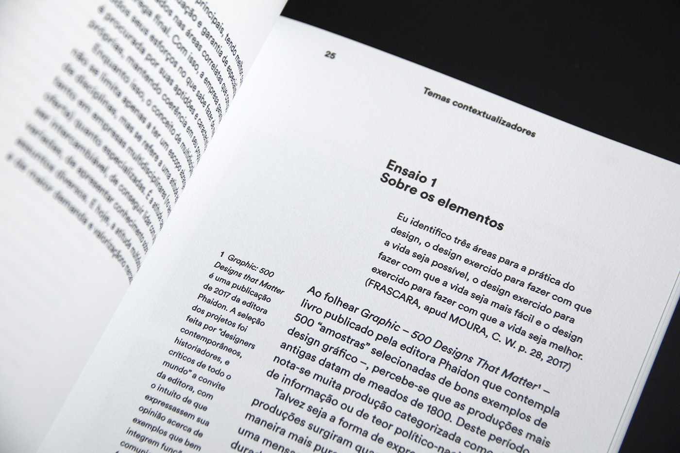
The identity was then spread to stationary, an editorial monograph, a presentation journal, a video, some motion experiments and other objects. The materials and finishings were handpicked and thought out, so they could play an important role in the project.
Brand Identity















For more information check out:
