by abduzeedo
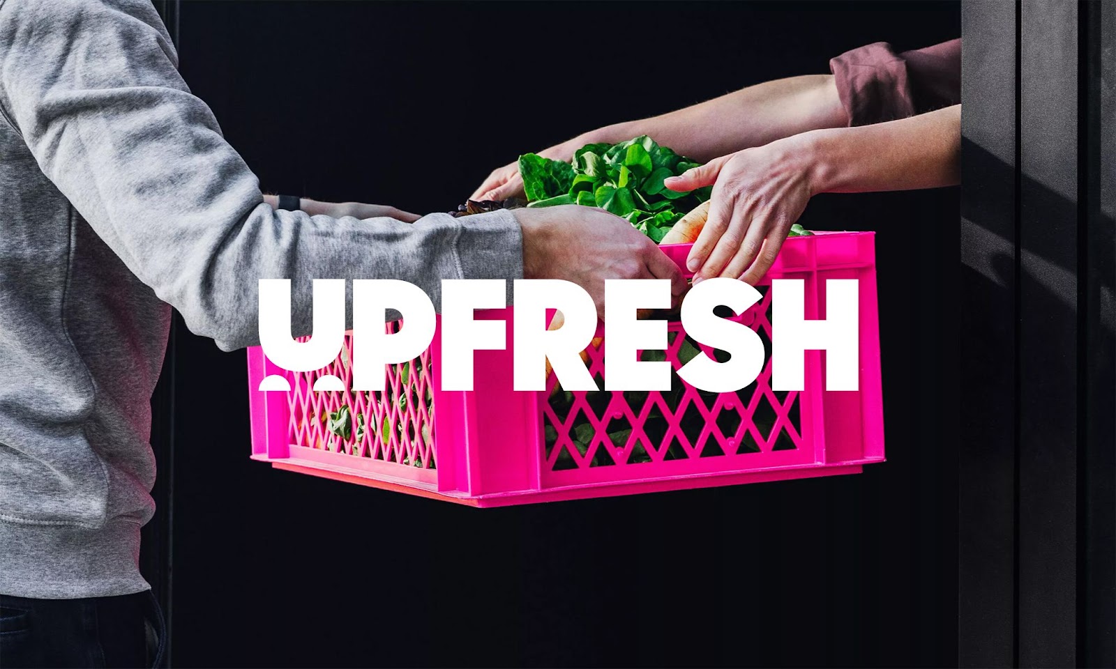
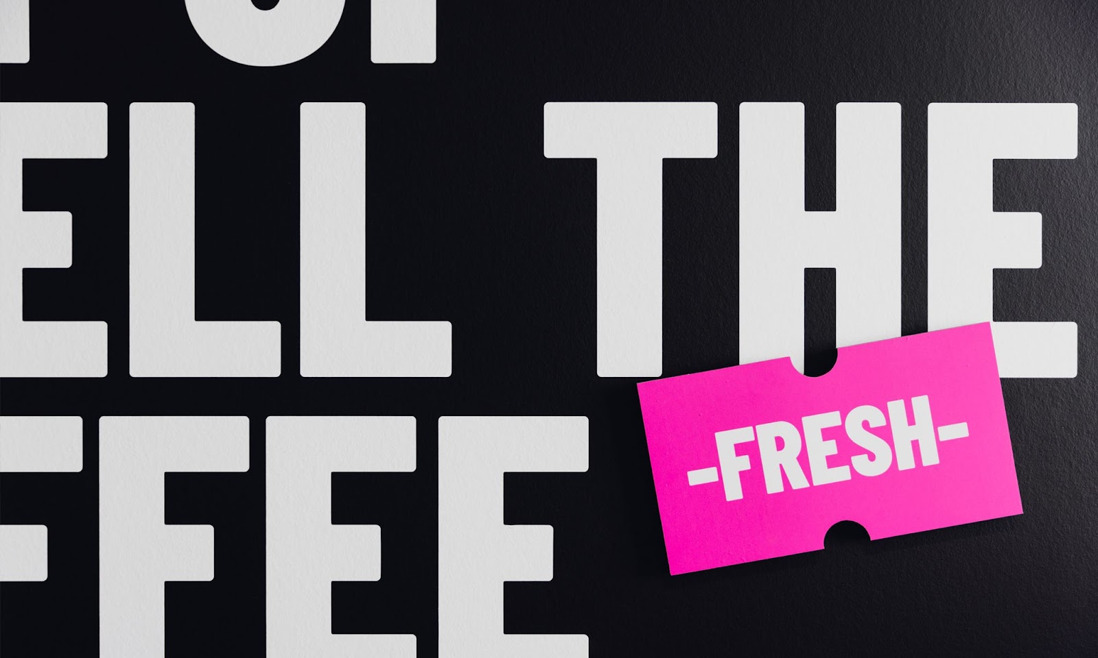
Skinning Branding Agency shared a branding and visual identity project for UpFresh. The UpFresh identity is progressive, dynamic, and distinctly positive, which is emphasized by the bright magenta.
Challenge
What should we serve? A clear brand story and brand architecture for UpFresh. The Belgian distributor of fresh food – formerly Fermette Food Group – was suffering from a confusing organisational structure and an outdated storyline. The range of brands, private labels, and services lacked clarity. The future was not present in the storyline. The result? A brand not speaking to existing or potential customers that wasn’t relevant in a changing market.
Brand strategy
The solution was a radical repositioning. Fermette Food Group is now a thing of the past. UpFresh, on the other hand, is fully committed to the future, together with the customer.
Why did we opt for such a radical shift? Because we discovered two opportunities during the strategic preliminary process. One, practically every competitor played up their heritage. So, there was clearly room in the market for a modern brand.
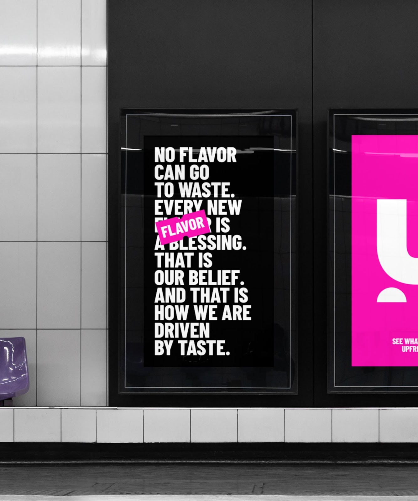
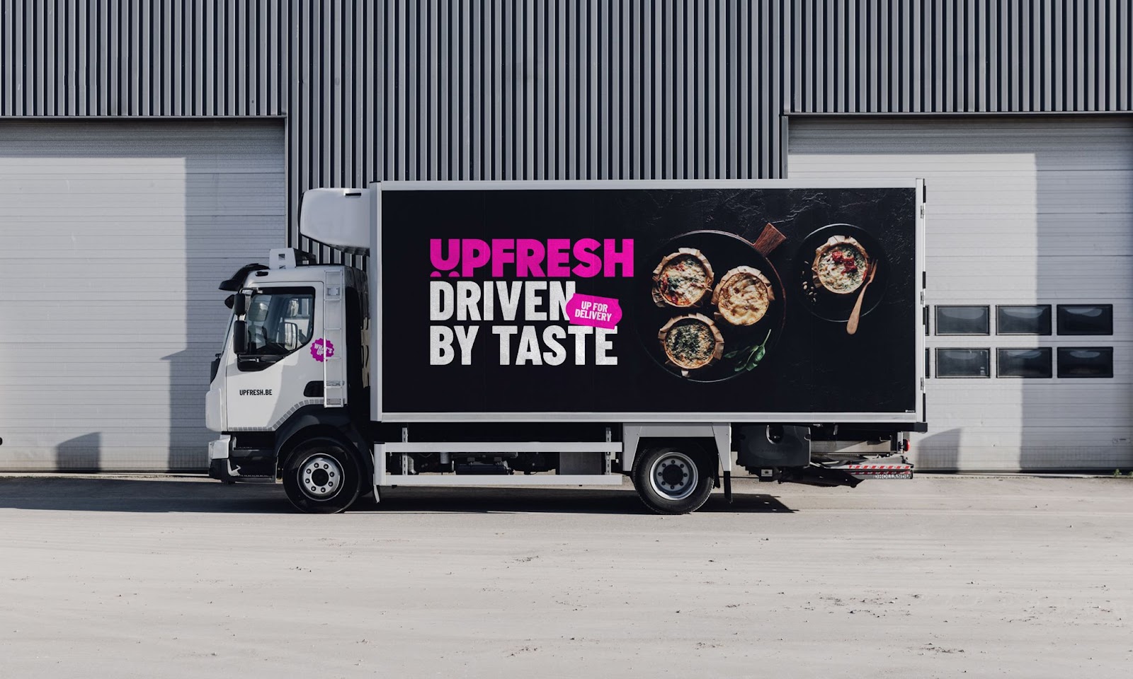
Two, shop managers needed a partner, but they only saw Fermette Food Group as a distributor. We got rid of this association thanks to the new positioning and brand architecture. Because UpFresh is more than just a supplier; it’s a brand that helps customers grow using a more sustainable and wider range of products, new taste initiatives, and fresh advice. All driven by taste.
Naming
Of course, a new positioning needs a new name. One that tastes like progressive modernity.
UpFresh is a combination of ‘upward’ and ‘fresh’. It emphasises the positive and constructive attitude of the fresh food expert. UpFresh thinks ahead, in terms of fresh food, smooth orders, and even smoother deliveries, smart distribution, the right support for the right people, etc. Head up, shoulders straight, and do what you do best.
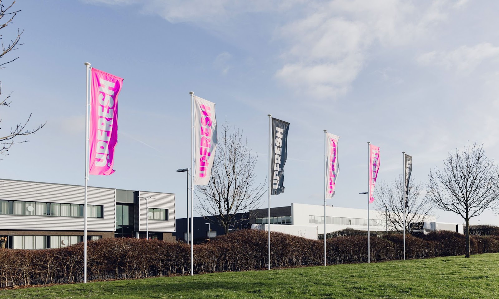
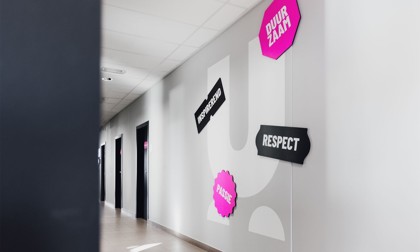
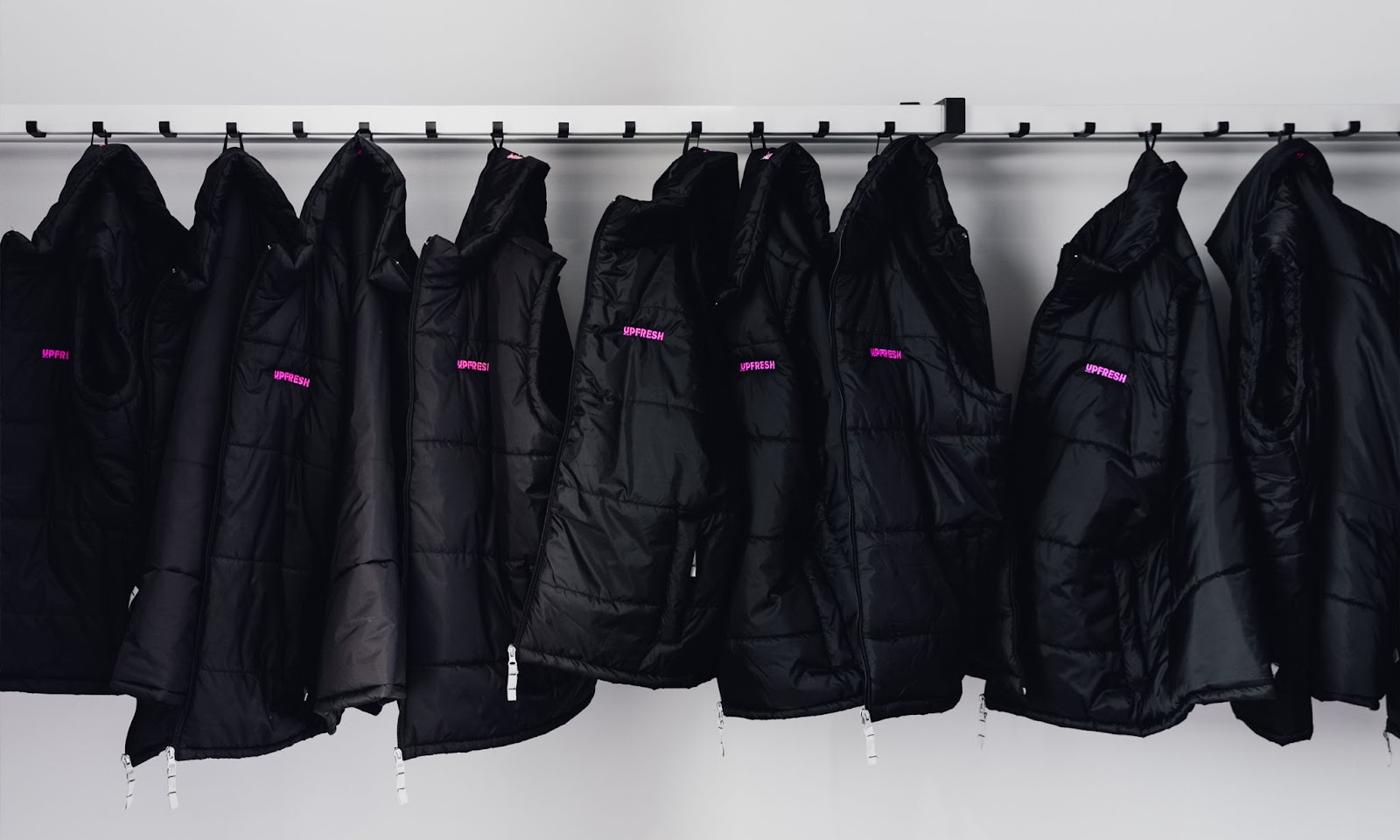
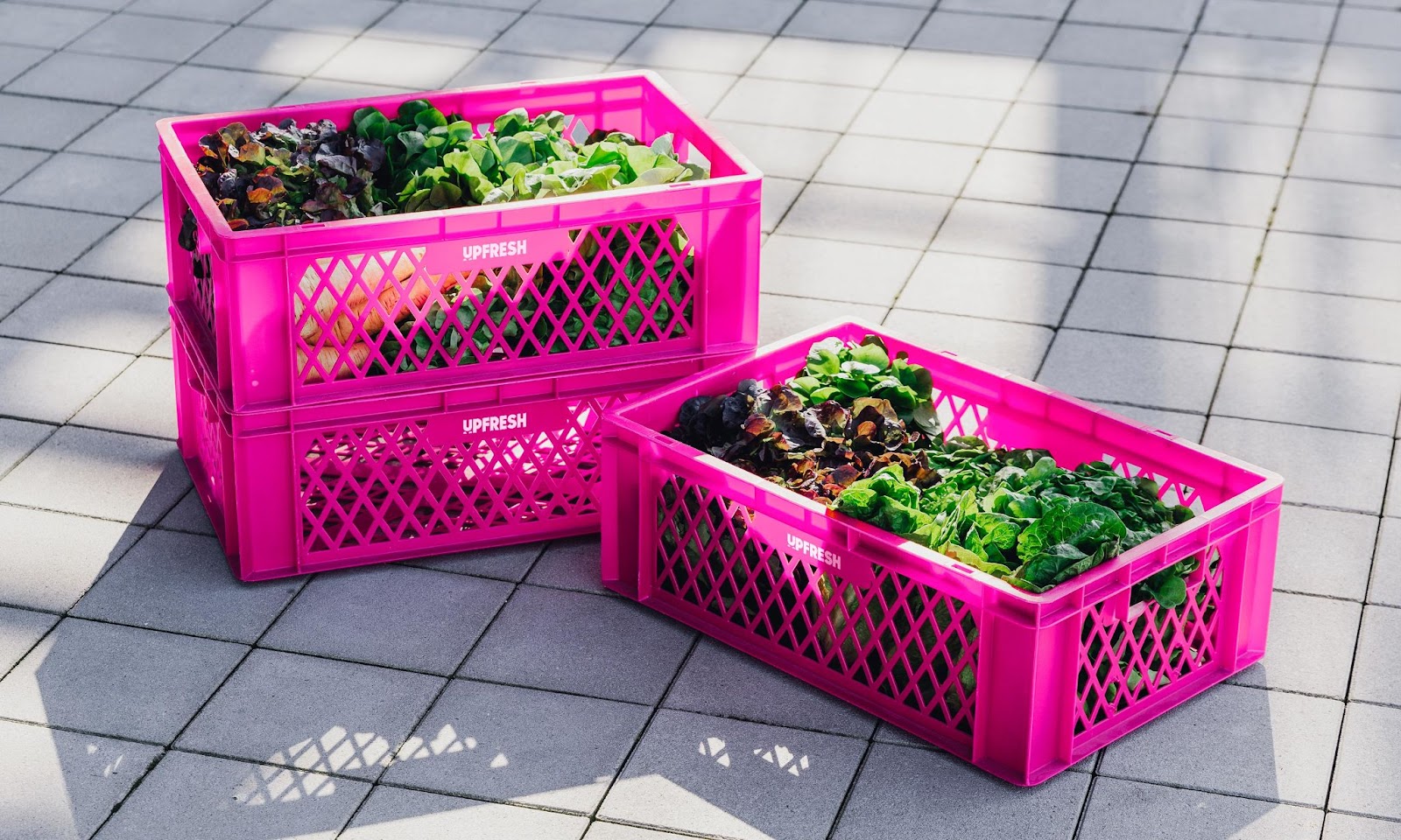
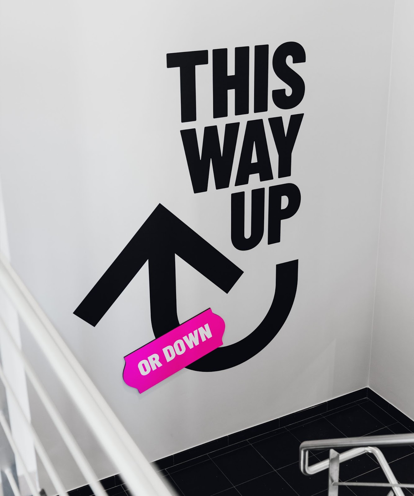
Brand Identity
The UpFresh identity is progressive, dynamic, and distinctly positive, which is emphasized by the bright magenta. The cheerful stickers, a nod to price stickers and numbers at the butcher’s, give the brand that extra special touch.
Verbal Identity
UpFresh’s progressive personality also determines the language and tone. The brand sounds clear and powerful, while being both activating and relaxing.
The words ‘up’ and ‘fresh’ dominate the taglines and titles. English and Dutch alternate in a smooth, simple tone that is confident, contemporary, and inviting. Spoken language is preferred over written language.
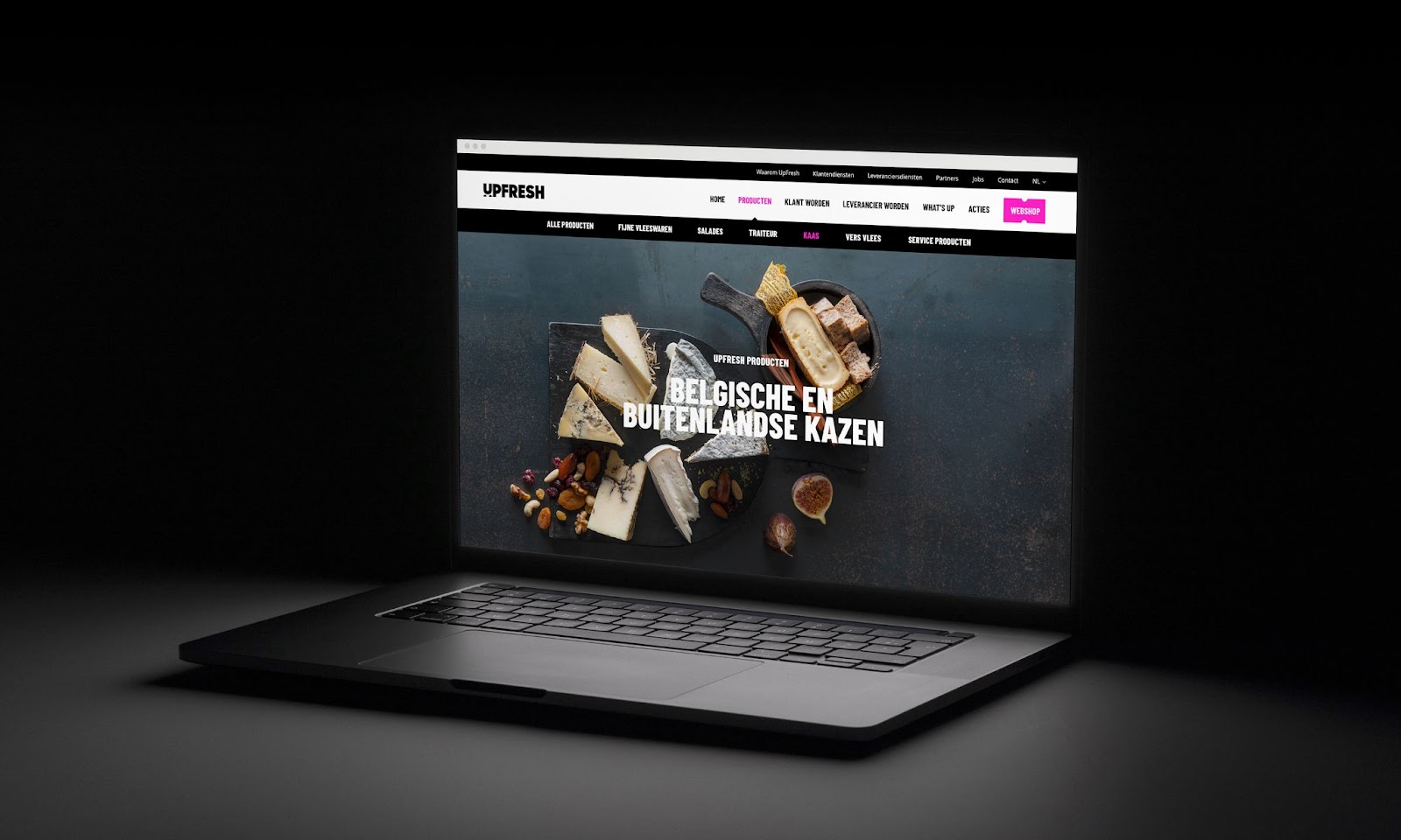
Online
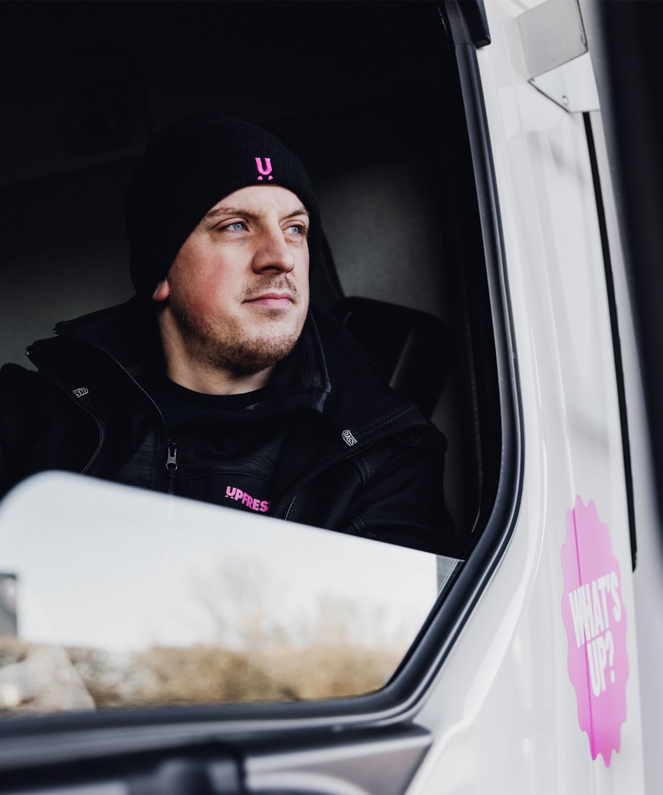
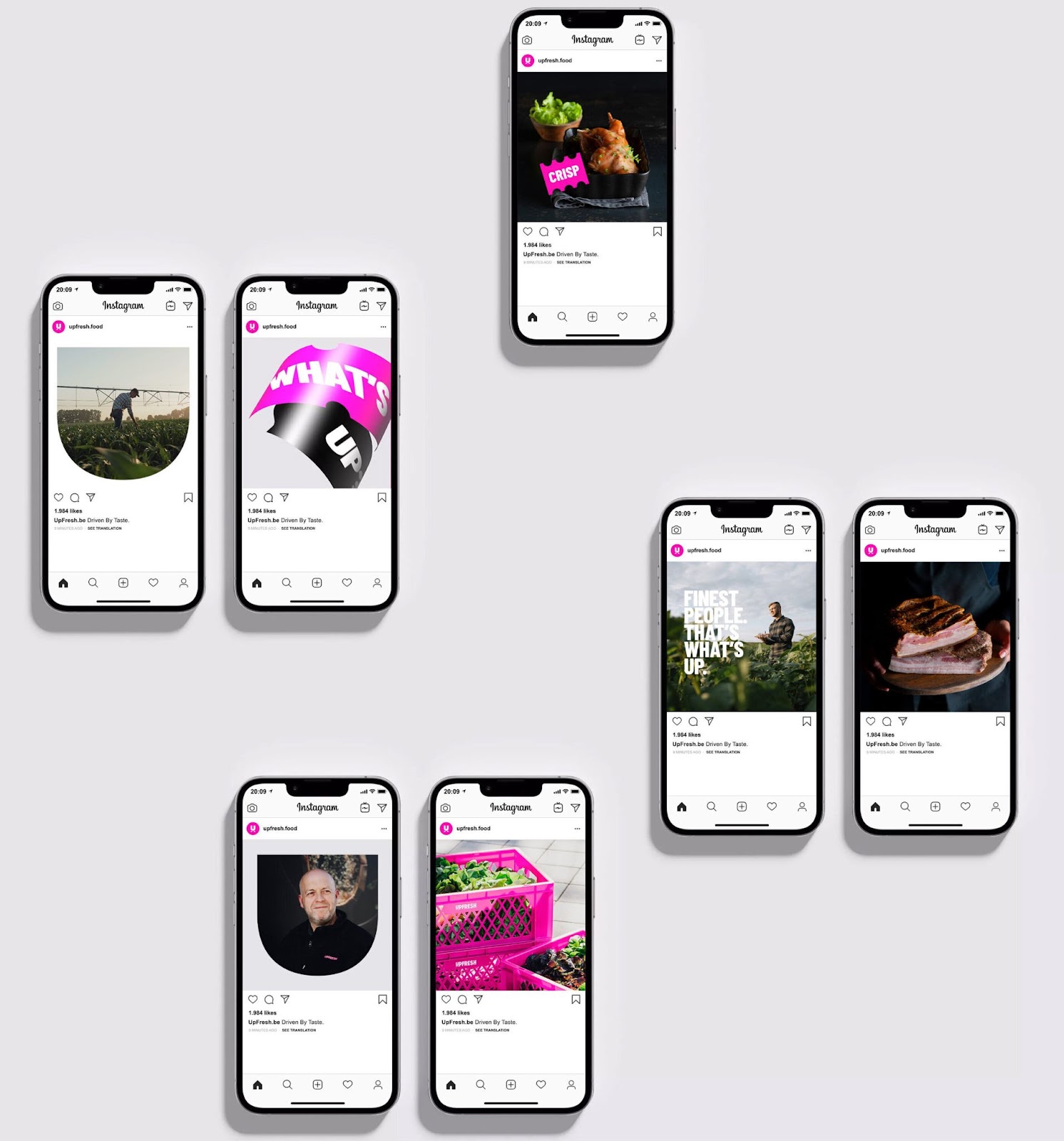
The online identity is focused on showing how UpFresh makes a difference to its customers and suppliers.
The core? The diverse range of fresh foods. Showcased by premium close-up photography in a dark, minimal setting. In the hands of a professional or straight from the field. Honest and flavourful.
The website focuses on service, advice, and benefits, both in text and images. You see employees and customers in action, in a natural and sincere manner. In this way, UpFresh not only gets a face, but the authenticity practically jumps off the screen.


For more information make sure to check out Skinning Branding Agency.


